How to Make a Squarespace Template Properly Mobile-Friendly
The short answer: Every Squarespace 7.1 template is already responsive, so the question is never "how do I make it responsive". It is "which of this template's sections had a mobile layout designed for them, and which just collapsed". Open Mobile View, walk the site section by section before you change any content, and sort every section into one of three buckets: leave it, rearrange it on the mobile grid, or replace it with a mobile-specific version.
This is a template-scoped job, and it is the last stage of how to customise a Squarespace template. If you have a symptom instead — a section overflowing, text too small, a layout that changed by itself — start at Squarespace mobile responsive issues. What follows is the audit and the order of operations for taking a purchased or inherited template and making its mobile experience genuinely good.
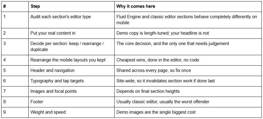
The working order
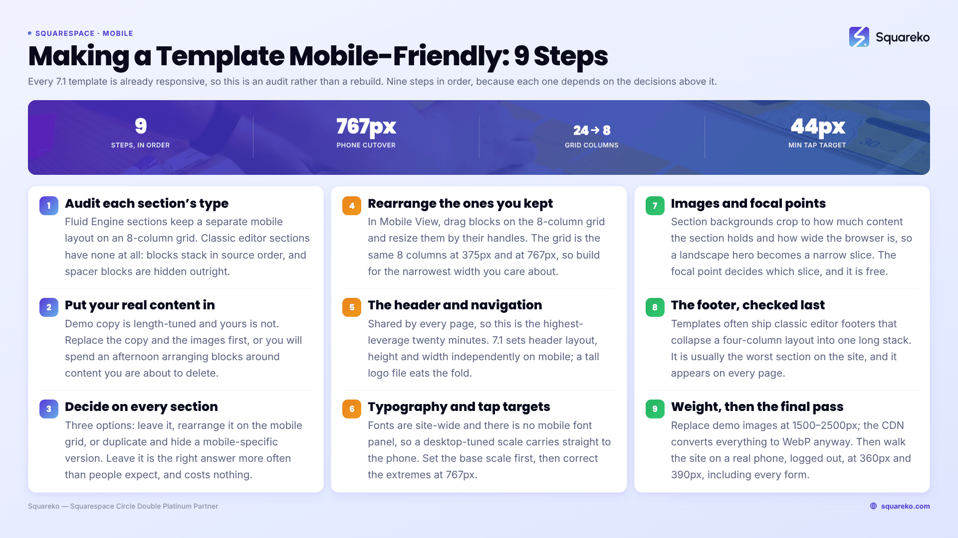
Do these in sequence. Every step out of order creates rework, because the later ones depend on decisions made in the earlier ones.
Step 1 — Audit what the template actually gives you
Click Edit, then the Mobile View icon, and scroll the whole site. You are not fixing anything yet; you are classifying.
For each section, hover it and check whether it is a Fluid Engine section or a classic editor section. Fluid Engine sections show a grid when you drag a block; classic editor sections show drop zones between blocks. The distinction decides everything that follows:
Fluid Engine sections keep a separate mobile layout. The grid is 24 columns on desktop and 8 on mobile, pivoting at 768px. Positioning and sizing on one view do not affect the other.
Classic editor sections have no mobile layout at all. Blocks stack into a single column, in source order, and the only lever is the order of the blocks themselves. Spacer blocks are hidden on mobile entirely, which is why classic sections built with spacers collapse strangely.
Then check whether the shop actually designed the mobile layouts, or left Squarespace's automatic arrangement. The tell is a hero section: a designed mobile layout has the heading, subheading and button sized for an 8-column grid with sensible gaps. An undesigned one has the desktop proportions squashed — a full-width heading at desktop size, a button floating far from it, and a lot of dead vertical space.
Write the list down. On a typical eight-page template, three or four sections need real work and the rest are fine.
One more thing to note during the audit: which sections repeat across pages. Template shops build a services page, an about page and a contact page from a small vocabulary of section designs, so the same three-column layout may appear on five pages. Fixing it once and saving it as a Saved Section is faster than fixing it five times — but saved sections are independent copies, so re-adding one does not update the others. Fix, save, then replace the rest deliberately.
Step 2 — Put your real content in before you judge anything
This is the step people skip, and it invalidates everything done before it.
Template demo copy is written to fit. Your headline is longer, your service names are longer, your team has five people instead of three, and your photographs are a different aspect ratio. A Fluid Engine mobile layout that was perfect with "Design that works." breaks the moment it holds "Straightforward, evidence-led financial planning for people who would rather not think about it."
So: replace the copy and the images first, then audit the mobile layout. Doing it the other way round means arranging blocks around content you are about to delete.
One Fluid Engine rule that catches everyone here — adding or deleting a block while in Mobile View adds or deletes it on desktop too. Only position and size are independent between the two views. If you need something that exists on one view and not the other, that is a duplicate-and-hide job, not an editing job.
Step 3 — The decision to make on every section
Three options, and the right one is usually obvious once you name them.
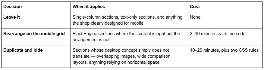
Leave it is the correct answer more often than people expect. A section that stacks cleanly into one column and reads well does not need attention because it looks different from desktop.
Duplicate and hide means building a second section with a mobile-appropriate layout and showing one section per breakpoint. It is more robust than fighting a single section into two shapes, and it is the only reliable way to get genuinely different content on mobile. The mechanics are in how to hide a section on mobile in Squarespace.
Use it sparingly. Every duplicated section is a second copy to keep updated, and Squarespace serves both to the browser — hiding with display: none removes the section visually but not from the page weight. A page with four duplicated sections carries eight sections' worth of images on both views, which is exactly the wrong trade on the connection a phone is likely to be using.
There is a fourth option people reach for and should not: upgrading a classic editor section to Fluid Engine purely to get a mobile layout. It works, but Squarespace is explicit that an upgraded section cannot be reverted once the page is saved, and the desktop layout usually shifts during the conversion. Upgrade when you want the section rebuilt anyway, not as a mobile fix.
Step 4 — Rearranging Fluid Engine mobile layouts
In Mobile View, drag blocks on the 8-column grid and drag their handles to resize. Add rows at the bottom of the section if you need vertical space.
Three things worth knowing while you do it:
Fluid Engine writes its positions as inline and per-section styles. Each section carries its own <style> block containing rules like .fe-block-<id>{grid-area:…}, alongside inline styles on the elements. Those beat anything in a linked stylesheet, so any CSS you write to reposition a Fluid Engine block needs !important — and usually should not be written at all, because the editor does the job properly.
Work at the narrowest width you care about. The mobile grid is the same 8 columns at 375px and at 767px, so a layout that fits a 390px phone will be comfortable on anything larger.
Vertical rhythm is the thing that reads as "designed". Most stock mobile layouts are too airy — the blocks are spread across too many rows because they inherited desktop proportions. Pulling them together, so the heading, paragraph and button read as one group, does more for the mobile experience than any other single change.
Step 5 — The header and navigation
The header is shared by every page, so this is the highest-leverage twenty minutes in the whole job.
Squarespace 7.1 lets you set the header's layout, height and width independently on mobile, from Edit site header → Edit Design while in Mobile View. Drop shadow, border, background style and which elements appear are shared across both views. The full set of controls is in how to edit a Squarespace template header.
For a purchased template, three checks:
Logo height. Templates ship logos sized for desktop. A tall logo file inflates the mobile header and eats the fold.
The button. A header button always appears below the navigation links in the mobile menu, regardless of layout. Check it is still reachable and still looks deliberate.
The open menu. Click the burger and read it as a visitor. Stock mobile menus are frequently under-sized.
/* Template mobile header: cap the logo, tighten the bar, and make the overlay menu readable. */
@media screen and (max-width: 767px) {
  .header-title-logo img { max-height: 34px; }
  #header .header-announcement-bar-wrapper {
    padding-top: 10px;
    padding-bottom: 10px;
  }
  .header-menu-nav-item a { font-size: 1.5rem; }
}
Step 6 — Typography and tap targets
Fonts and sizes in Squarespace 7.1 are site-wide. There is no mobile font panel, so a template's desktop-tuned type scale carries straight down to the phone, where a 72px display heading becomes a three-line wall.
Set the base scale in Site Styles → Fonts first, then correct the extremes at the breakpoint. Squarespace 7.1's mobile breakpoint is 767px:
@media screen and (max-width: 767px) {
  h1 { font-size: 2.1rem; line-height: 1.15; }
  h2 { font-size: 1.65rem; line-height: 1.2; }
  p  { font-size: 1rem; line-height: 1.55; }
  /* Tap targets: 44px is the practical minimum for a thumb */
  .sqs-block-button-element { min-height: 44px; line-height: 44px; }
}
Paste it into Website → Website Tools → Custom CSS, available on every Squarespace plan. Two related notes: set letter spacing to 0px or higher on every font format, because negative tracking that reads as elegant on desktop closes gaps entirely at small sizes; and if your issue is specifically that body text is unreadably small, text too small on mobile in Squarespace covers it in depth.
Step 7 — Images, focal points and the footer
Set a focal point on every image the template ships. Section background images crop automatically based on how much content the section holds and how wide the visitor's browser is, so a landscape hero becomes a narrow vertical slice on a phone. The focal point decides which slice. This is free and it is the single most under-used control in Squarespace 7.1 — see how to change a Squarespace banner image.
The footer is usually the worst section on the site, because templates often ship classic editor footers that collapse a four-column layout into one long stack. Check it last but do check it — it appears on every page. How to customise a Squarespace footer covers the mobile side.
Step 8 — Weight, and the final pass
Template demo images are the largest single cost you inherit. Replace them at 1500–2500px wide — 2500px is the maximum Squarespace serves, and the CDN converts everything to WebP regardless of the source format, so uploading a 5000px PNG buys nothing.
For a sense of what good looks like: across 54 Squareko-built sites measured in August 2026 (Playwright/Chromium lab test, cloud datacenter, unthrottled, single run per site), the median mobile LCP was 2.01s with 74% under Google's 2.5s threshold, and the median page weighed 3.0 MB across 93 requests. A template site that has not had its demo images replaced routinely lands at double that weight.
Then do one final pass, on a real phone, logged out, at 360px and 390px. Check: every heading, every button, the open mobile menu, every form, and the checkout if you have one. Anything still wrong at that point is a symptom rather than a design decision, and belongs in Squarespace mobile responsive issues.
Where this stops
Making a Squarespace template mobile-friendly is mostly a sorting exercise: classify each section, rearrange the few that need it, fix the header and type scale once, and replace the demo images. Nine sections out of ten need nothing.
Where it gets genuinely hard is a template whose desktop concept depends on horizontal space — overlapping images, wide comparison tables, a booking flow built across three columns. Those need redesigning for mobile rather than rearranging, and that is design work, not editing. That is the sort of thing our Squarespace website support plans exist for. Most template sites, though, get to a good mobile experience in an afternoon with the order above and no code at all.
FAQ
-
Yes. Every Squarespace 7.1 template is responsive by default. The real question is whether the template shop designed the mobile layouts or left Squarespace's automatic arrangement. Open Mobile View and check the hero section — squashed desktop proportions mean nobody designed it.
-
Click Edit, then the Mobile View icon. Fluid Engine sections keep a separate mobile layout on an 8-column grid, so you can drag and resize blocks there freely. Classic editor sections have no mobile layout — blocks stack in source order and only their order can change.
-
Position and size are independent between the two views, so rearranging on mobile does not affect desktop. Adding or deleting a block does affect both. If you need content on one view only, duplicate the section and hide one per breakpoint instead.
-
Fluid Engine sections whose desktop design relies on horizontal space — side-by-side image and text, overlapping elements, wide comparison layouts. Single-column and text-only sections almost never need attention. Classic editor sections cannot have a separate mobile layout at all.
-
Because demo copy is length-tuned to the layout. A longer headline, a different image ratio or an extra team member changes how blocks fill the 8-column mobile grid. Always replace the demo content first, then audit the mobile layout, not the other way round.
-
Open the shop's live demo on a real phone rather than resizing a desktop browser, and look at the hero, any side-by-side sections and the footer. Squashed desktop proportions and a stacked four-column footer mean you will be redesigning those sections yourself.

Author Bio
I'm Walid Hasan, a Certified Squarespace Expert and Squarespace Circle Platinum Partner with over 12 years of hands-on experience designing and optimizing high-performing websites. Over the years, I've had the privilege of building more than 2,000 Squarespace websites for clients around the world, always focusing on clean design, strong user experience, and conversion-driven results.