How to Customize a Squarespace Template Until It Looks Custom-Built
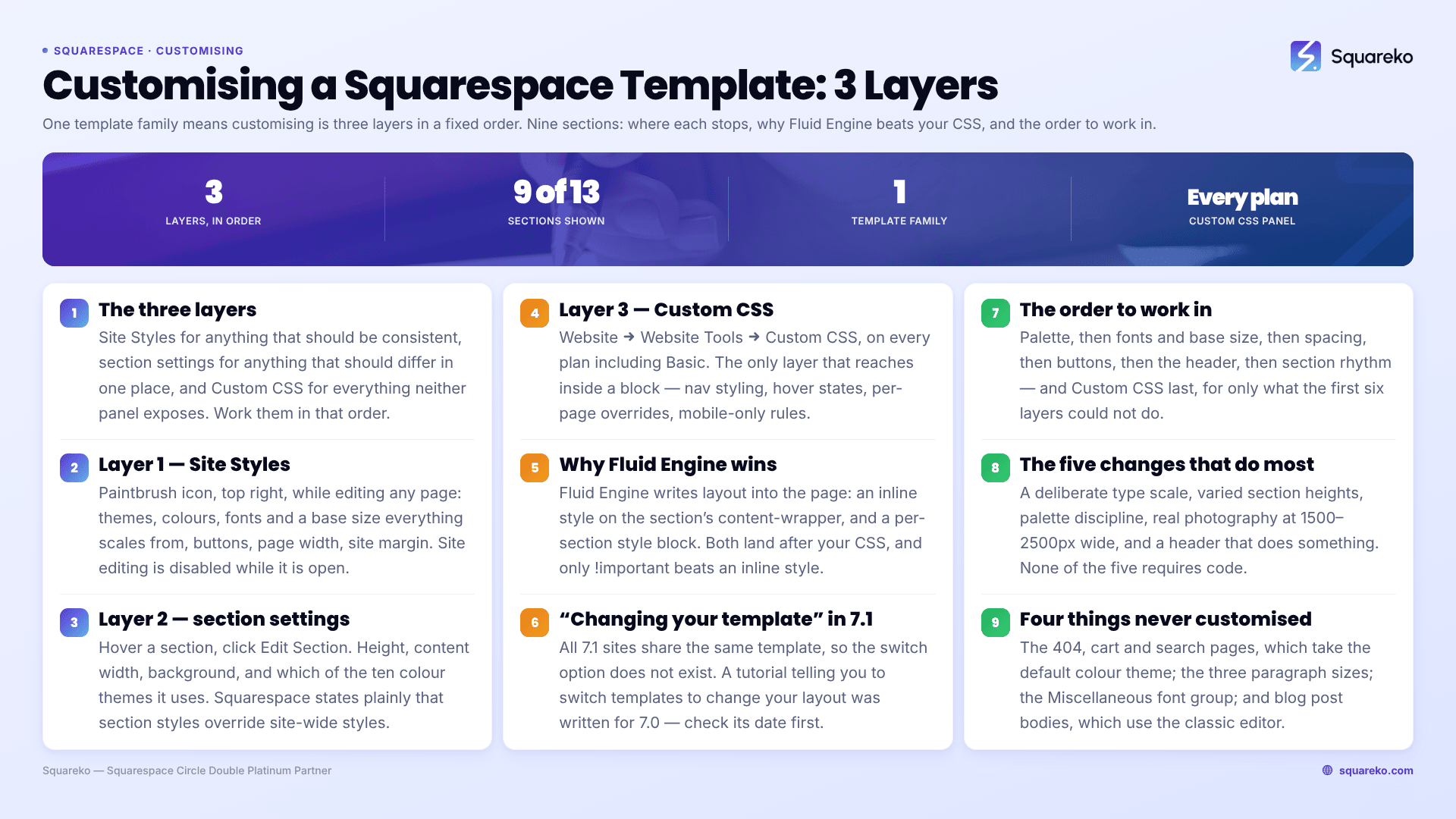
The short answer: Squarespace 7.1 has one template family, so customising a template means working three layers in a fixed order — Site Styles for anything that should be consistent, section settings for anything that should differ in one place, and Custom CSS for everything neither panel exposes. Sites that still look like a demo have usually only ever touched the first layer, and have left the spacing and type scale at their defaults.
Everything below is version 7.1. Where 7.0 behaves differently, it says so.
The three layers, and where each one stops
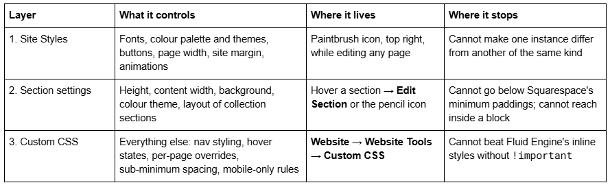
Work them in that order. Every hour spent in layer three before layer one is settled is an hour you will spend again, because changing the palette or the base font size afterwards moves the ground under every rule you wrote.
Layer 1 — Site Styles is for anything that should be consistent
Open Site Styles by clicking the paintbrush icon in the top-right corner while editing any page. Site editing is disabled while the panel is open; close it to move blocks again.
The panels that matter, in the order you should touch them:
Themes — preset packs (Professional, Bold, Playful and others) that set fonts, colours and button styles together. Useful as a starting point, then override the parts you disagree with.
Colors — a five-colour palette plus black and white, which generates ten colour themes. Covered in full in how to change colours in a Squarespace template.
Fonts — a font pack, then a Base Size. In Squarespace 7.1 all text scales relative to base size, so this single slider changes the feel of the site more than any font swap. Assign individual tweaks under Assign Styles. Full detail in how to change fonts in Squarespace.
Spacing — two tweaks, both site-wide. Page width (max) sets the maximum width your content can occupy. Site margin sets the gutter on either side, and unlike page width it does affect the header.
Buttons — the shape and style of Primary, Secondary and Tertiary buttons. Your header button inherits from these, and so does the overall corner radius of the header.
Animations — site-wide entrance animations. Restraint pays here.
Where Site Styles stops. It has no concept of "this one". You cannot give one H2 a different treatment from every other H2, you cannot restyle a single button, and you cannot move the navigation anywhere the header layout list does not already offer. Those are layer-two and layer-three problems.
One behaviour worth knowing before you start: saving a style change is not reversible. The undo arrow at the top of the panel works only until you click Save. There is no version history for styles.
Layer 2 — Section settings override Site Styles for one section
Click Edit in the top-left of the site preview, hover the section you want, then click Edit Section or the pencil icon. Squarespace states plainly that section styles override site-wide styles, which is exactly what you want them for.
What you get per section:
Section height — a slider, plus a minimum that Squarespace enforces. This is the single biggest lever on whether a page reads as designed or as filled in.
Content width — Full or Inset, controlling whether content runs to the site margin or sits in from it.
Background — colour, image, video or an animated background art option; images can be Full bleed or Inset, and an inset image gets an inset border colour you can set per theme.
Colours — which of the ten colour themes this section uses.
Two traps in this layer are worth naming, because both cost people an afternoon.
Changing a section's colour theme resets colour changes inside that section. Squarespace documents this: applying a theme resets all colours for the section, including per-word text colours you set with the text toolbar. Set the theme first, then colour individual words.
Collection sections style by layout type, not by instance. If you have two blog sections both using the masonry layout, restyling one restyles both. The same applies to portfolio, products and events sections. If two blog listings genuinely need to look different, they need different layouts or CSS scoped by collection ID.
Layer 3 — Custom CSS is the only layer that reaches inside a block
The Custom CSS panel is at Website → Website Tools → Custom CSS, and it is available on every Squarespace plan, including Basic. This surprises people, because code injection is not — that requires Core or above. CSS and JavaScript have different plan rules, and most of what you want for template customisation is CSS.
At the bottom of the panel is Manage custom files, which accepts images and font files and gives you a CDN URL you can paste straight into a rule.
What genuinely needs CSS, rather than being CSS for its own sake:
/* Tighten every heading's letter spacing — the fastest way to stop a default font pack reading as a default font pack */
h1, h2, h3, h4 {
  letter-spacing: -0.02em;
}
/* Restyle navigation links, which Site Styles only partially exposes */
.header-nav-item a {
  text-transform: uppercase;
  font-size: 0.8rem;
  letter-spacing: 0.08em;
}
/* Style the current page's nav link — no panel setting exists for this */
.header-nav-item--active a {
  background-image: none;
  opacity: 0.6;
}
/* Scope a change to one page using its collection ID, which appears as the id on the  element in your browser inspector */
#collection-6421a9f0c1e8b2001d7a4c33 h1 {
  font-size: 4rem;
}
Squarespace's own position is that custom code "falls outside the scope of our support", so anything you write here is yours to maintain. That is an argument for fewer, better-commented rules, not for avoiding CSS.
The full set of template-scoped snippets — headers, footers, banners, nav, buttons, section padding — lives in Squarespace template CSS: 30 snippets.
Why Fluid Engine beats the CSS you just wrote
This is the most common reason a customisation "doesn't work", and it is not a bug.
Fluid Engine does not put your section layout in a stylesheet. It writes it into the page. Inspect any Fluid Engine section on a live 7.1 site and you will find two things: an inline style attribute on the section's .content-wrapper carrying the vertical padding, and a <style> block emitted immediately before the grid, containing rules scoped to a class like .fe-69f0990cb8d3d5768677c000.
Both of those land after your Custom CSS in the cascade. The per-section <style> block wins on document order; the inline attribute wins outright regardless of specificity. !important is the only thing that overrides an inline style.
The same block also tells you the grid: 24 columns on desktop, 8 on mobile, with the pivot written as @media (min-width: 768px) — which is the other side of Squarespace 7.1's 767px mobile breakpoint. Write your media queries at max-width: 767px and they line up with Squarespace's own. Write them at 768px and they fight.
More on the editor itself in the Squarespace Fluid Engine guide.
"Changing your template" does not mean in 7.1 what it meant in 7.0
Squarespace 7.0 had template families — Brine, Bedford, Pacific, Five, Brine's many variants — and each family had its own style tweaks, its own header behaviour and its own sidebar rules. Switching families genuinely changed what you could do.
Squarespace 7.1 has one. In Squarespace's own words: "All sites in version 7.1 share the same template. That means they all have the same style options and features… There isn't a need to switch templates, so that option isn't available in version 7.1."
Three consequences follow, and they cause most of the confusion on this keyword:
A tutorial that tells you to switch templates to change your layout is written for 7.0. Check the publication date and the screenshots before you follow it.
A premium 7.1 "template" is a starting site, not a skin. You install it by duplicating the seller's demo site into your account, or by importing a supplied file, then customising it with the three layers above. There is no swapping it out afterwards without rebuilding pages. See how to install a Squarespace template you've purchased.
If your fonts and colours changed unexpectedly, you did not "change template". Something moved in Site Styles, or you duplicated a site with a different palette. Fonts and colours changed after switching templates covers the recovery.
The order to work in
Palette first. Every theme, button and header colour derives from it. Changing it last means revisiting everything.
Fonts and base size second. Base size changes every measurement on the page, including how much room your section heights need.
Spacing third — page width (max) and site margin. These decide how wide the site feels before you have placed a single block.
Buttons fourth. The header inherits its shape from them.
Header fifth. Layout, elements, fixed behaviour, background style. See how to edit your Squarespace header.
Section rhythm sixth — heights, content widths, alternating colour themes down the page. This is where a site stops looking like a demo.
Custom CSS last, and only for what the first six could not do.
The five changes that do most of the "custom-built" work
Having rebuilt a lot of sites that arrived looking like their demo, these five account for most of the difference:
A deliberate type scale. Default font packs ship with H1–H4 sizes that sit too close together. Widen the gap between H1 and H3, tighten heading letter spacing slightly, and raise paragraph line height. Nothing else changes perceived quality this cheaply.
Varied section heights. Every section left at the default height is the clearest visual signature of an untouched template. Make the hero tall, the following section short, the next medium.
Palette discipline. Five colours, applied through themes rather than custom picks per element. Sites that look expensive usually use fewer colours, not more.
Real photography at the right size. Upload at 1500–2500px wide; 2500px is the largest Squarespace will serve, and filenames cannot be changed after upload. Weight matters: across 54 Squareko-built sites measured in August 2026 (Playwright/Chromium lab test, cloud datacenter, unthrottled, single run per site), median page weight was 3.0 MB across 93 requests and median mobile LCP was 2.01s — image discipline is most of that budget.
A header that does something. A call-to-action button, a considered layout, and a background style that suits the first section. The header is on every page; it is the highest-leverage element on the site.
Four things people never customise, and always should
These are not obscure. They are just buried far enough down the panels that most sites ship with the defaults.
The 404 page, cart page and search page. Squarespace 7.1 applies your site's default colour theme to the built-in 404 page, the shopping cart page, the order confirmation page, the built-in search page, the announcement bar and the product quick view. You cannot assign a different theme to those pages. If your default theme is still the one the site was created with, those pages will look nothing like the rest of the site. Find the default by adding a blank section to any page and reading the theme label it picks up.
Paragraph sizes. Squarespace 7.1 has three paragraph sizes, not one — they appear in the markup as sqsrte-large, the default, and sqsrte-small. Most sites use only the middle one. Using the large size for an intro paragraph and the small size for captions gives a page hierarchy without adding a single heading.
The Miscellaneous font group. In the Fonts panel, Miscellaneous governs the text that is neither heading nor paragraph — product prices, menu block navigation, and other content metadata such as blog dates and categories. Leaving it at the default is one of the quieter reasons a customised site still has patches that look untouched.
Blog post bodies. Blog posts in Squarespace 7.1 use the classic editor, not Fluid Engine. Layout inside a post is rows and columns, and blog list styling is controlled by the blog section's layout tweaks rather than by the post. Plan post styling separately from page styling; they do not share a mechanism.
Customising a premium template you bought
A purchased Squarespace 7.1 template is a fully built site — sections, demo copy, placeholder images, a palette and a font pairing — delivered either as a site you duplicate into your account or as an import file. The customisation job is therefore different from customising a blank 7.1 site: you are editing someone else's finished decisions rather than making them from scratch.
The order that works:
Replace the palette before anything else. The demo's five colours are doing more work than you think; every theme on every section derives from them, so swapping them updates the whole site in one move.
Replace the fonts, then re-check the base size. A different typeface at the same base size can change line counts enough to break section heights the designer tuned.
Swap images last, once the layout is settled, and at 1500–2500px wide.
Read the template's own CSS before you add yours. Premium templates usually ship with Custom CSS already in the panel. Adding rules underneath it without reading it is how people end up with three rules fighting over the same selector.
Do not delete sections you have not looked at on mobile. Fluid Engine's mobile layout is separate, and a section that looks redundant on desktop is sometimes the one carrying the mobile hero.
What customisation will not fix
Customisation is styling. It does not fix an unclear offer, a homepage that buries the thing people came for, or navigation with eleven top-level items. If you are customising because the site is not converting, the problem is more often information architecture than typography — and no amount of CSS reaches it.
It also will not make an overloaded page fast. A template does not have a speed; the images, embeds and third-party scripts you add to it do.
Mobile is a separate design, not a smaller one
Two mobile rules to keep in mind while you customise a Squarespace 7.1 template.
Fluid Engine keeps separate desktop and mobile layouts per section. Repositioning a block on desktop does not reposition it on mobile. Switch to the Mobile View icon and arrange it there.
The header is partly independent. Squarespace lets you set the header's layout, height and width separately for mobile; other header design changes — drop shadow, border, background style — apply to both views at once.
Everything else responds automatically, which is usually fine and occasionally not. How to make a Squarespace template properly mobile-friendly covers the cases where it is not.
Where this stops
The three layers cover almost everything. Palette, type scale, spacing, section rhythm and a considered header will take a stock 7.1 site a long way past looking stock, and none of it requires code.
Where it gets genuinely difficult is when a customisation has to survive Fluid Engine — a header that changes state on scroll, a section that breaks the grid, a layout that behaves differently on three breakpoints. Those need someone reading the cascade rather than pasting snippets, and they are the ones that quietly break at the next platform update.
That is the kind of work our Squarespace website support plans exist for. Most of what is on this page you can do yourself in an afternoon; it is worth doing that first, and calling someone only for the part that fights back.
FAQ
-
Almost entirely, yes. Site Styles controls fonts, colours, buttons, page width and site margin; section settings control height, content width, background and colour theme per section. Custom CSS is only needed for things no panel exposes, such as navigation hover states or per-page overrides.
-
No, and you do not need to. Squarespace states that all 7.1 sites share the same template and that the switching option does not exist in 7.1. Every layout difference between 7.1 sites comes from sections, styles and content, not from a template choice.
-
Click the paintbrush icon in the top-right corner while editing any page. From there you reach the Themes, Fonts, Colors, Spacing, Buttons and Animations panels. Site editing is disabled while Site Styles is open, so close the panel to move blocks again.
-
Because Site Styles is site-wide by design. To change one section only, use its section settings, which override site-wide styles. To change one page only, scope a Custom CSS rule to that page's collection ID, which appears as the id on the body element.
-
The Custom CSS panel is available on every Squarespace plan, including Basic. Code injection is different — that requires Core or above. Most template customisation is CSS, so plan level is rarely the blocker people expect it to be.
-
Fluid Engine writes layout into the page rather than the stylesheet: an inline style attribute on the section's content wrapper, plus a per-section style block. Both land after Custom CSS in the cascade, so !important is usually required to override section padding or block positioning.

Author Bio
I'm Walid Hasan, a Certified Squarespace Expert and Squarespace Circle Platinum Partner with over 12 years of hands-on experience designing and optimizing high-performing websites. Over the years, I've had the privilege of building more than 2,000 Squarespace websites for clients around the world, always focusing on clean design, strong user experience, and conversion-driven results.