How to Edit Your Squarespace Header (10 Custom Layouts)
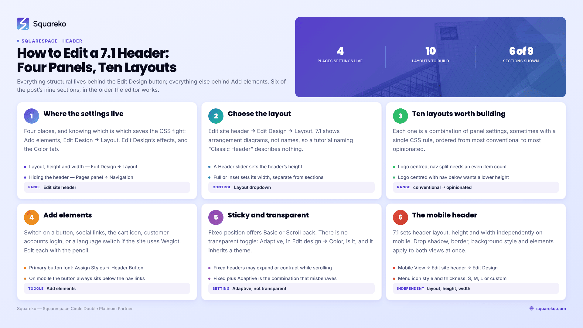
The short answer: Click Edit in the top-left of your site preview, hover the header, then click Edit site header. Everything structural — layout, height, width — lives behind the Edit Design button in the bottom-right of that editor, which is the button most people never press. Everything else (button, social links, cart, account login, language switch) lives behind Add elements.
In Squarespace 7.1, the header is one component shared by every page, and it is the highest-leverage element on the site because it is the only one every visitor sees. It is step five of the working order in how to customise a Squarespace template, and the footer that mirrors it is covered in how to customise a Squarespace footer.
The four places header settings actually live
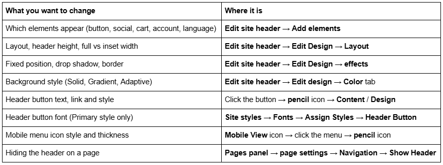
That last row is worth knowing before you start fighting CSS: you can turn the header off per page, and collection pages such as blogs and stores are the exception — they do not have the option.
Choosing a header layout
Open Edit site header, click Edit Design, then open the Layout dropdown. Squarespace 7.1 presents the layouts as arrangement diagrams rather than names, so ignore any tutorial that lists "Classic Header" or "Sidebar Header" as options — those names do not exist in the panel. If you want to know which layout a site is using, inspect the <header> element and read the layout value inside its data-current-styles attribute; a centred navigation reads as navCenter, for example.
Alongside the layout dropdown, you get two controls that matter more than the layout itself:
A Header slider that sets the header's height.
Full or Inset, setting the header's width. Inset pulls the header in to the site margin; Full runs it edge to edge. This is separate from your section content widths, and mismatching them is a common reason a header looks bolted on.
Sliders between the layout diagrams control the spacing between links and other elements.
Ten header layouts worth building
Each of these is a combination of panel settings, sometimes with one CSS rule. They are ordered from most conventional to most opinionated.
1. Logo left, navigation right. The default for a reason. Works with any content width, reads instantly, and leaves room for a button.
2. Logo left, navigation right, plus a call-to-action button. Add elements → Button on. Set the button link and text via the pencil icon, then Design → Primary / Secondary / Tertiary. Remember the header button's shape comes from your site-wide button styles.
3. Logo centred, navigation split either side. The strongest layout for brands with a wordmark rather than a symbol. Needs an even number of nav items to look deliberate; five items always look wrong here.
4. Logo centred, navigation below. Taller, editorial, good for content sites. Pair it with a reduced header height so it does not eat the fold.
5. Inset header over a full-bleed banner. Set the header width to Inset and the first section's background to Full bleed. The header then floats inside the image rather than sitting on top of it.
6. Transparent header over a hero image. Set the background style to Adaptive. The first section's background shows through, and the header adopts that section's colour theme. Covered in detail below.
7. Fixed header that reappears on scroll up. Fixed position on, style set to Scroll back. The header hides going down and returns going up — it buys back vertical space on long pages without losing the navigation.
8. Bordered header. Turn Border on, set thickness to S, position bottom, and pick a low-opacity palette colour. A one-pixel rule under the header is often all that separates a site that looks designed from one that does not.
9. Blurred glass header. Background style Solid, then lower the header opacity and enable the blur. The background blur is a real setting, not CSS, and Squarespace notes some browsers will not render it.
10. Minimal header, no navigation. For a landing page: hide the header entirely on that page via Pages panel → page settings → Navigation → Show Header, then put the logo in the first section. This is the only genuinely reliable way to get a single-purpose page in 7.1.
Adding elements to the header
Click Add elements inside the header editor and switch on what you need:
Button — one call to action. On mobile it always appears below the navigation links, regardless of layout.
Social links — styleable via the pencil icon.
Shopping cart icon — with icon style and border options.
Customer accounts login.
Language switch — available if the site uses Weglot.
Each element can then be selected and edited with the pencil icon. Two details that catch people:
The header button's font is set somewhere else. If the button uses Primary styling, its text follows a dedicated Header Button tweak at site styles → Fonts → Assign Styles → Header Button. Set it to Secondary or Tertiary and it follows your normal button styles instead.
The button's colour depends on your background style. With Solid and a theme, it follows that theme. With Solid and a custom colour, or with Gradient, it follows the site's default colour theme. With Adaptive, it follows the colour theme of the top section on each page — which means on a site with mixed section themes you have to style the header button in every theme it can land on.
Logo, site title and the announcement bar
Three header details that are set outside the header editor, and are worth getting right before you tune anything else.
A logo replaces the site title, but you should still set both. Squarespace is explicit about this: search engines use the site title for search results and browser tabs unless you have set a separate SEO title. A site running a logo with no title set is throwing away the most-read piece of text on the site.
Upload the logo bigger than you need and cap it with CSS. Squarespace serves images from its CDN at up to 2500px wide and converts them to WebP regardless of the source format, so a generous upload costs you almost nothing in weight. What it can cost you is header height, because a tall logo file inflates the header — cap it with max-height on .header-title-logo img rather than re-exporting the file. Filenames cannot be changed after upload, so name it properly first.
The announcement bar always matches the header's colour theme — see how to change colours in a Squarespace template for the theme system itself.
There is no independent control for it. If the announcement bar is the wrong colour, the fix is in the header's background settings or in that colour theme, not in the announcement bar panel. It also sits above the header inside the same wrapper, which is why so many header CSS selectors are named .header-announcement-bar-wrapper.
Sticky, transparent, and the combination that misbehaves
Fixed. In the header editor, click Edit Design, switch Fixed position on, and choose a style. Basic keeps the header at the top of the browser permanently. Scroll back shows it only when the visitor scrolls up. Squarespace notes that fixed headers of either style may expand or contract slightly while scrolling, depending on the device.
Transparent. Set the background style to Adaptive in Edit design → Color. There is no toggle called "transparent" — Adaptive is it. The background of the first section on each page shows through, and the header inherits that section's colour theme, which is how you get dark navigation over a light hero and light navigation over a dark one without doing anything.
The combination. Fixed and Adaptive together is the most-asked question on this keyword, and it is asked because the two settings do not always cooperate: users report the header regaining a background colour once the fixed position is on. The panel-only fix is to try Scroll back rather than Basic. If it still fills in, this is the rule that resolves it:
/* Keep a fixed header transparent, but let the open mobile menu keep its own background so links stay readable */
.header:not(.header--menu-open) .header-announcement-bar-wrapper {
  background: transparent !important;
}
/* Dropdown folders inherit the header background — clear them too */
.header-nav-folder-content {
  background: transparent !important;
}
Test that logged out and on a page whose first section is an image, not a colour. Transparent headers fail most visibly where the image has a light patch exactly where the navigation sits — which is a photography problem, and better fixed with a gradient scrim on the section than with more CSS.
The mobile header
Squarespace 7.1 lets you set the header's layout, height and width independently on mobile. Everything else — drop shadow, border, background style, elements — applies to both views at once.
To edit it: click Edit, click the Mobile View icon in the top-right, hover the header and click Edit site header, then Edit Design.
To restyle the burger icon: in Mobile View, click the mobile navigation menu, click the pencil icon, choose a Menu Icon style, and set thickness with S, M, L or a custom value.
If the mobile menu will not open at all, that is a different problem — see Squarespace mobile menu not working.
The mobile layout has its own internal identifier too — logoLeftNavRight and similar — visible in the same data-current-styles attribute if you need to confirm what a site is using.
Squarespace 7.1's mobile breakpoint is 767px, so any CSS you add for the mobile header belongs in a max-width: 767px media query:
/* Shrink the logo and tighten the header on mobile only */
@media screen and (max-width: 767px) {
  .header-title-logo img { max-height: 34px; }
  #header .header-announcement-bar-wrapper {
    padding-top: 10px;
    padding-bottom: 10px;
  }
}
/* Larger links in the mobile overlay menu */
.header-menu-nav-item a {
  font-size: 1.6rem;
}
/* Full-width call-to-action inside the mobile menu */
.header-menu-cta a {
  display: block;
  width: 100%;
  text-align: center;
}
What the panel will not do, and the CSS for it
Four things the header editor genuinely cannot do in Squarespace 7.1.
/* 1 — Style the current page's navigation link. There is no panel setting for an active state. */
.header-nav-item--active a {
  background-image: none;
  opacity: 0.55;
}
/* 2 — Change navigation letter spacing and case independently of your site-wide font tweaks. */
.header-nav-item a {
  text-transform: uppercase;
  font-size: 0.78rem;
  letter-spacing: 0.1em;
}
/* 3 — Restyle dropdown folders, which follow the header background and have no separate controls. */
.header-nav-folder-content {
  border-radius: 0;
  box-shadow: none;
  padding: 8px 0;
}
/* 4 — Reduce header padding below what the height slider allows. */
#header .header-announcement-bar-wrapper {
  padding-top: 10px;
  padding-bottom: 10px;
}
Paste these into Website → Website Tools → Custom CSS, which is available on every Squarespace plan including Basic. More template-scoped snippets are in Squarespace template CSS: 30 snippets.
One thing CSS cannot do: change what is in the header. Navigation links come from the Pages panel, so reordering the menu, renaming a link or adding one is a Pages panel job, not a stylesheet job.
Where this stops
Layout, height, width, elements, fixed behaviour, background style and the mobile header are all panel settings, and between them they cover the overwhelming majority of header work in Squarespace 7.1. Four short CSS rules cover most of the rest.
Where headers get genuinely difficult is state. A header that is transparent at the top of a hero, solid once you scroll, dark on light pages and light on dark ones, with a logo that swaps at each state, is four interacting behaviours plus a mobile variant — and it is the single most common thing we are sent that has been half-built and then abandoned.
That is the kind of work our Squarespace website support plans exist for. Most readers will get what they want from Edit Design in ten minutes, though, so open that first.
FAQ
-
Click Edit in the top-left of your site preview, hover over the header, then click Edit site header. Add elements controls which features appear; Edit Design controls layout, height, width, fixed position, drop shadow and border; the Color tab controls the background style.
-
Open Edit site header, click Edit Design, and switch Fixed position on. Choose Basic to keep the header visible at all times, or Scroll back to show it only when the visitor scrolls up. No custom code is required in Squarespace 7.1.
-
Set the background style to Adaptive in Edit site header → Edit design → Color. There is no setting called transparent; Adaptive is it. The first section's background shows through the header, and the header adopts that section's colour theme automatically.
-
Sometimes, from the panel alone — try Fixed position with the Scroll back style plus an Adaptive background. Where the header fills in with a colour once fixed, one CSS rule forcing a transparent background on .header-announcement-bar-wrapper resolves it, excluding the open mobile menu.
-
Partly. Squarespace 7.1 lets you set the header's layout, height and width independently for mobile via the Mobile View icon. Drop shadow, border, background style and which elements appear are shared across both views and cannot be split.
-
Open the Pages panel, hover the page title and click the settings icon, open the Navigation tab, and switch Show Header off. Repeat per page. Collection pages such as blog and store pages do not have this option.

Author Bio
I'm Walid Hasan, a Certified Squarespace Expert and Squarespace Circle Platinum Partner with over 12 years of hands-on experience designing and optimizing high-performing websites. Over the years, I've had the privilege of building more than 2,000 Squarespace websites for clients around the world, always focusing on clean design, strong user experience, and conversion-driven results.