Squarespace Mobile Menu Not Working? 7 Fixes
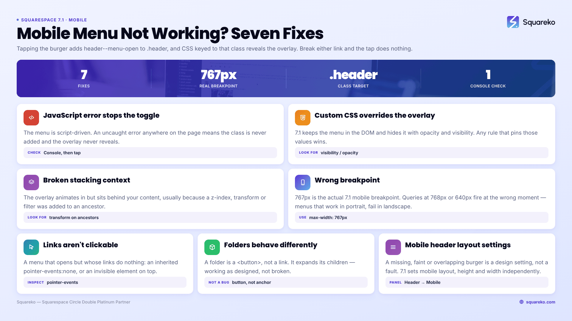
The Squarespace 7.1 mobile menu is almost never broken by Squarespace. Tapping the burger adds a header--menu-open class to the .header element, and CSS flips the .header-menu overlay from visibility: hidden to visible. If custom CSS overrides those properties, or a JavaScript error stops the class from being added at all, the tap does nothing. Before anything else, open the page in a private window and check the browser console for a red error.
Rule cache out first: hard refresh with Cmd + Shift + R or Ctrl + Shift + R, then test on a real phone rather than in the desktop editor's mobile preview. Then work the seven fixes below in order.
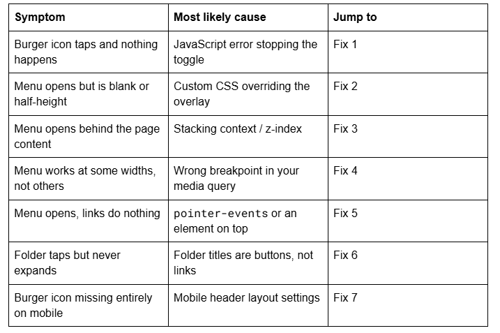
Quick diagnostic table
Fix 1 — Find the JavaScript error stopping the toggle
The Squarespace 7.1 mobile menu is JavaScript-driven. Tapping .header-burger runs a script that toggles the header--menu-open class on the .header element; the CSS that reveals .header-menu is keyed entirely to that class. If any script on the page throws an uncaught error before Squarespace's header script binds its listener, the class is never added and the burger becomes decorative.
How to confirm it in 20 seconds: open the live page in a private window, open the browser console, tap the burger and watch. If a red error appears — or if inspecting .header after the tap shows no header--menu-open class — this is your cause.
Injected scripts are the usual source. Remove your most recent addition from Website → Website Tools → Code Injection, then per-page injection, then Code Blocks, retesting after each. Whichever removal restores the menu contains the fault. The Squarespace code injection troubleshooting guide covers why a single snippet takes down everything after it, and how to keep each feature in its own <script> block so it cannot.
Fix 2 — Remove custom CSS that overrides the menu overlay
Squarespace 7.1 keeps the mobile menu in the DOM at all times and hides it with opacity and visibility. The reveal looks roughly like this:
.header--menu-open .header-menu {
  opacity: 1;
  visibility: visible;
}
Any custom rule that sets display: none on .header-menu, or overflow: hidden on a parent, or a fixed height on the header, will fight that. A menu that opens blank, half-height, or transparent is nearly always a CSS override rather than a Squarespace fault.
How to confirm it in 30 seconds: comment out the whole of Website → Website Tools → Custom CSS with /* */ and retest on a phone. If the menu works, the cause is in there. Uncomment in halves until it breaks again.
Rules copied from tutorials that force the burger menu onto desktop are the most common offender, because they restyle .header-burger, .header-nav and .header-menu together and often at the wrong breakpoint. If a rule you removed is one you need, the custom CSS troubleshooting order covers rewriting it with a durable selector.
Fix 3 — Fix the stacking context so the menu is not behind the page
If the overlay animates in but sits behind your content, the header has lost its place in the stacking order. This usually happens when custom CSS puts a z-index on a section, or gives an ancestor of .header a transform, filter or position: relative — any of which creates a new stacking context that traps the header inside it.
/* Lift the header and its open menu above page sections */
.header {
  z-index: 9999;
}
.header--menu-open .header-menu {
  z-index: 9999;
}
Confirm before you apply it: inspect the overlay and check its computed z-index against the section covering it. If a section is at z-index: 10 and the header resolves to auto, you have found it. Raising the header is the fix; raising individual sections is what caused it.
Fix 4 — Use 767px, the actual Squarespace 7.1 mobile breakpoint
Squarespace 7.1's mobile breakpoint is 767px. Media queries written at 768px, 800px or 640px fire at the wrong moment, which produces the confusing case where the menu works in portrait and fails in landscape, or works on one phone and not another.
/* Correct — matches Squarespace 7.1's own breakpoint */
@media screen and (max-width: 767px) {
  .header-menu-nav-item a { font-size: 1.25rem; }
}
Squarespace also renders two header variants, .header-display-desktop and .header-display-mobile, and swaps between them at that breakpoint. CSS written against .header-nav alone may be targeting the desktop variant, which is why it appears to do nothing on a phone.
Fix 5 — Make the menu links clickable again
A menu that opens correctly but whose links do nothing has one of two causes, and the inspector tells them apart instantly.
The first is pointer-events: none inherited from a custom rule — common in animation snippets that fade the header in and forget to restore interactivity at the end. The second is an invisible element sitting on top: a full-width section with a large z-index, or a transparent overlay from a popup or cookie banner.
How to confirm it in 15 seconds: open the menu, right-click a link and choose Inspect. If the highlighted element is not the link, something else is capturing the tap and the inspector has just named it.
/* Restore interactivity if an animation rule removed it */
.header--menu-open .header-menu,
.header--menu-open .header-menu a {
  pointer-events: auto;
}
Fix 6 — Understand what folders do in the Squarespace mobile menu
This one is usually working as designed, which is why it never gets resolved on the forum.
A navigation folder in Squarespace 7.1 is not rendered as a link. It is a <button> element — button.header-nav-folder-title — carrying the destination in a data-href attribute rather than an href. Tapping it expands the child pages; it does not navigate anywhere, deliberately, because on a phone a folder that navigated on tap would make its own contents unreachable.
So "my dropdown folder is not clickable on mobile" describes standard behaviour. What is not standard is a folder that does not expand at all — that is Fix 1 or Fix 2, because folder expansion uses the same header script and the same overlay.
If you genuinely need the folder title to lead somewhere, add a duplicate link as the first child page inside the folder. Scripting the button to navigate breaks the expand behaviour on touch devices, so a child page is the safer pattern.
Fix 7 — Check the mobile header layout settings in Squarespace 7.1
If the burger icon is missing, faint, or overlapping the logo, this is a design setting rather than a bug. Squarespace 7.1 lets you set the header's layout, height and width for mobile independently of desktop, and a mobile layout with too many elements can push the burger off the visible area.
To reach the settings: open the Pages panel, click Edit, hover the header and click Edit site header. Then click the Mobile View icon in the top-right, click Edit Design, and choose a Layout. Use the sliders for element spacing and header height, and set the width to Full or Inset.
For the icon itself, click the mobile navigation menu, click the pencil icon, choose a Menu Icon style, and set the line thickness with S, M or L. If the icon is invisible rather than absent, it is usually the same colour as the header background — the menu overlay colours live in Site Styles → Colours, under the colour theme's Menu Overlay section.
One related trap: on a Fluid Engine section, a block dragged to the very top of the mobile layout can sit under a transparent header and appear to swallow taps meant for the burger. Open Mobile View in the editor and move the block down, rather than adjusting the header in CSS.
Still not working?
Work the list in order — console error, custom CSS, stacking context, breakpoint, pointer events, folder behaviour, header settings. On the sites we are sent, the first two account for the clear majority.
If the menu is still failing with a clean console and no custom CSS, it is normally a conflict between an injected third-party script and Squarespace's own header script, which means reading the load order rather than trying selectors.
That is the kind of thing our Squarespace website support plans exist for — most mobile navigation faults we are sent are diagnosed inside a single support block. No obligation either way; the seven fixes above resolve the overwhelming majority on their own.
FAQ
-
Tapping the burger adds a header--menu-open class to the .header element, and CSS keyed to that class reveals the overlay. A JavaScript error from injected code stops the class being added, so the tap does nothing. Open the live page in a private window and check the browser console for a red error first.
-
Almost always custom CSS. Squarespace 7.1 keeps .header-menu in the DOM and hides it with opacity and visibility, so a rule setting display: none, a fixed header height, or overflow: hidden on a parent will empty it. Comment out your Custom CSS panel and retest on a phone.
-
A stacking context problem. Custom CSS that sets a z-index on a section, or a transform or filter on an ancestor of .header, traps the header below the content. Set z-index: 9999 on .header rather than raising the individual sections that caused it.
-
767px. Media queries written at 768px or 640px fire at the wrong point, which is why a menu can work in portrait and fail in landscape. Squarespace also swaps between .header-display-desktop and .header-display-mobile at that width, so desktop selectors will not match on a phone.
-
That is standard behaviour. In Squarespace 7.1 a folder title is a <button> element with a data-href attribute, not a link, so tapping it expands the child pages instead of navigating. If the folder needs a destination, add a duplicate link as the first page inside it.
-
Open the Pages panel, click Edit, hover the header and click Edit site header. Click the Mobile View icon in the top-right, then Edit Design, and choose a Layout. Layout, height and width can be set for mobile independently of desktop; most other design changes affect both.

Author Bio
I'm Walid Hasan, a Certified Squarespace Expert and Squarespace Circle Platinum Partner with over 12 years of hands-on experience designing and optimizing high-performing websites. Over the years, I've had the privilege of building more than 2,000 Squarespace websites for clients around the world, always focusing on clean design, strong user experience, and conversion-driven results.