Squarespace Template CSS: 30 Snippets That Change Everything
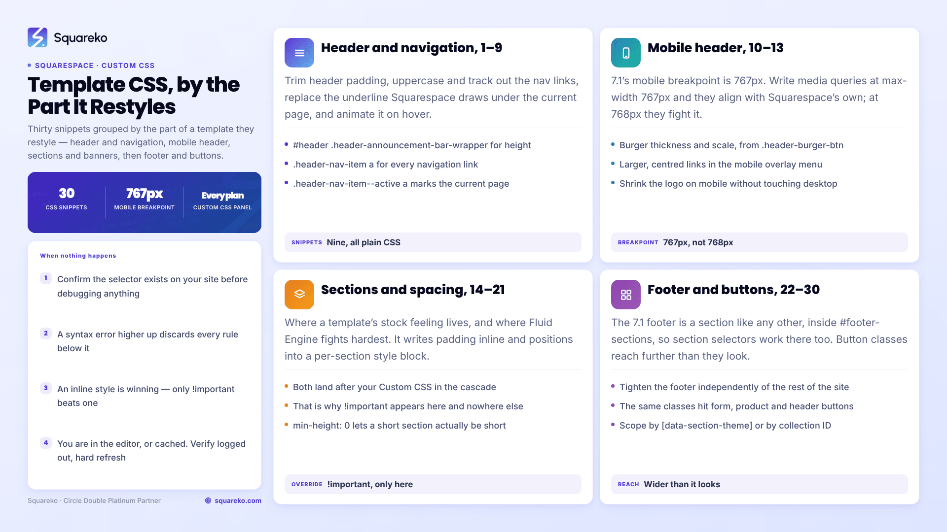
The short answer: Paste these into Website → Website Tools → Custom CSS. Every selector below was checked against live Squarespace 7.1 markup, not copied from a 7.0 tutorial. Where a snippet carries !important, it is because Fluid Engine writes that value as an inline style or a per-section <style> block, and nothing weaker overrides it.
The Custom CSS panel is available on every Squarespace plan, including Basic. Code injection is the thing that needs Core or above; CSS does not.
CSS is layer three of the three-layer model in how to customise a Squarespace template — reach for it after Site Styles and section settings, not before. This post is scoped to the parts of a template that make it look like a template — header, navigation, banners, sections, footer, buttons. For general-purpose Squarespace CSS covering blocks, forms and images, see Squarespace custom CSS examples.
Before you paste anything
Six rules that prevent most of the support requests this kind of post generates.
Verify selectors in your own inspector. Right-click an element, choose Inspect, and confirm the class exists on your site. Squarespace ships changes; a selector that is right today is a selector to re-check next year.
Comment on every rule. A commented rule is diagnosable in six months. An uncommented one gets deleted by whoever inherits the site.
One syntax error kills everything below it. CSS parses sequentially, so a missing closing brace silently discards every rule after it. If a batch of snippets stops working all at once, that is why.
Check the live site, logged out. The editor injects its own markup, so some rules behave differently there.
Know where the panel sits in the cascade. Squarespace loads the Custom CSS panel late — after its own stylesheets and after anything you put in Settings → Code Injection → Header. That is why the panel is the right place for almost all styling, and why CSS pasted into a code injection field is the thing most likely to lose an argument it should have won. What the panel does not beat is an inline style attribute, which is what Fluid Engine writes for section padding and block positioning.
Use Manage custom files for assets. It sits at the bottom of the Custom CSS panel and accepts images and font files. Click an uploaded file and Squarespace pastes its CDN URL wherever your cursor is — useful for background images, custom icons and @font-face declarations, and it saves hosting assets somewhere else.
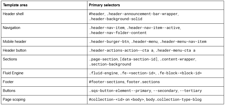
Here is the quick map of what you are targeting:
Header and navigation (snippets 1–9)
/* 1 — Reduce header height. The header inherits its padding from site styles; this trims it site-wide. */
#header .header-announcement-bar-wrapper {
  padding-top: 12px;
  padding-bottom: 12px;
}
/* 2 — Uppercase, tracked-out navigation links. */
.header-nav-item a {
  text-transform: uppercase;
  font-size: 0.78rem;
  letter-spacing: 0.1em;
}
/* 3 — Remove the underline Squarespace draws under the current page's nav link, and mark it with opacity instead. */
.header-nav-item--active a {
  background-image: none;
  opacity: 0.55;
}
/* 4 — Animated underline on nav hover, drawn from the left. */
.header-nav-item a {
  position: relative;
}
.header-nav-item a::after {
  content: " ";
  position: absolute;
  left: 0;
  bottom: -4px;
  width: 0;
  height: 1px;
  background: currentColor;
  transition: width 0.25s ease;
}
.header-nav-item a:hover::after {
  width: 100%;
}
/* 5 — Style dropdown folders: tighter, squared, no shadow. */
.header-nav-folder-content {
  border-radius: 0;
  box-shadow: none;
  padding: 8px 0;
}
/* 6 — Space the navigation links further apart. */
.header-nav-list .header-nav-item {
  margin-right: 2rem;
}
/* 7 — Cap the logo height so a tall logo file cannot inflate the header. */
.header-title-logo img {
  max-height: 48px;
  width: auto;
}
/* 8 — Give the header call-to-action button a distinct treatment from the site's other primary buttons. */
.header-actions-action--cta a {
  border-radius: 999px;
  padding: 0.7em 1.6em;
  letter-spacing: 0.04em;
}
/* 9 — Keep the header transparent while it is fixed, but let the mobile overlay menu keep its own background. */
.header--menu-open .header-announcement-bar-wrapper {
  background: initial;
}
.header:not(.header--menu-open) .header-announcement-bar-wrapper {
  background: transparent !important;
}
Panel settings come first for all of these; the full header editor walkthrough is in how to edit your Squarespace header. Snippet 9 exists because the built-in Adaptive header background and Fixed position do not always cooperate — the most-viewed forum thread on this keyword is precisely that complaint. Try the panel settings first; reach for CSS only if the combination misbehaves on your site.
Mobile header (snippets 10–13)
Squarespace 7.1's mobile breakpoint is 767px. Write media queries at max-width: 767px and they align with Squarespace's own; write them at 768px and they fight.
/* 10 — Thicken and shrink the burger icon on mobile. */
@media screen and (max-width: 767px) {
  .header-burger-btn .burger-inner > div {
    height: 2px;
  }
  .header-burger-btn {
    transform: scale(0.9);
  }
}
/* 11 — Larger, centred links in the mobile overlay menu. */
.header-menu-nav-item a {
  font-size: 1.6rem;
  letter-spacing: 0;
}
/* 12 — Full-width call-to-action button inside the mobile menu. */
.header-menu-cta a {
  display: block;
  width: 100%;
  text-align: center;
}
/* 13 — Shrink the logo on mobile only, without touching the desktop. */
@media screen and (max-width: 767px) {
  .header-title-logo img {
    max-height: 34px;
  }
}
Sections, spacing and banners (snippets 14–21)
This is where most of a template's "stock" feeling lives, and where Fluid Engine fights back hardest.
Fluid Engine writes vertical padding as an inline style on the section's .content-wrapper, and block positions into a per-section <style> block scoped to a class like .fe-69f0990c…. Both land after your Custom CSS in the cascade. That is why !important appears below and nowhere else in this post.
/* 14 — Reduce vertical padding on every section site-wide. */
.page-section .content-wrapper {
  padding-top: 40px !important;
  padding-bottom: 40px !important;
}
/* 15 — Remove Squarespace's minimum section height so short sections can actually be short. */
.page-section {
  min-height: 0 !important;
}

/* 16 — Tighten one section only. Get the ID from the section's data-section-id attribute in the inspector. */
section[data-section-id="69f0990c1ce0435a0a61a550"] .content-wrapper {
  padding-top: 0 !important;
  padding-bottom: 0 !important;
}
/* 17 — Less padding on mobile than desktop. */
@media screen and (max-width: 767px) {
  .page-section .content-wrapper {
    padding-top: 24px !important;
    padding-bottom: 24px !important;
  }
}
/* 18 — Give a banner section a dark scrim so white headline text stays legible over any photograph. */
section[data-section-id="69f0990c1ce0435a0a61a550"] .section-background::after {
  content: " ";
  position: absolute;
  inset: 0;
  background: linear-gradient(180deg, rgba(0,0,0,0.45), rgba(0,0,0,0.15));
}
/* 19 — Force a background image to sit at the top of its frame instead of centre, so faces are not cropped. */
.section-background img {
  object-position: top center !important;
}
/* 20 — A hairline divider between every section. */
.page-section + .page-section {
  border-top: 1px solid rgba(0,0,0,0.08);
}
/* 21 — Widen the content area beyond the site's max width for one section. Site margin still applies. */
section[data-section-id="69f0990c1ce0435a0a61a550"] .content-wrapper .content {
  max-width: 100%;
}
Before reaching for snippets 14–17, check the section's own Edit Section height and content-width controls. If the panel can do it, let the panel do it — panel values survive platform updates in a way CSS overrides do not. Use CSS when you need to go below Squarespace's enforced minimums, which is the one thing the panel genuinely cannot do.
Footer (snippets 22–25)
The 7.1 footer is a section like any other, wrapped in <footer class="sections" id="footer-sections">, so section selectors work there too. The panel side of footer work is in how to customise a Squarespace footer.
/* 22 — Tighten the footer independently of the rest of the site. */
#footer-sections .content-wrapper {
  padding-top: 32px !important;
  padding-bottom: 32px !important;
}
/* 23 — Subtle footer links that brighten on hover. */
#footer-sections a {
  opacity: 0.7;
  transition: opacity 0.2s ease;
}
#footer-sections a:hover {
  opacity: 1;
}
/* 24 — A top border on the footer, matched to the section above it. */
#footer-sections {
  border-top: 1px solid rgba(255,255,255,0.15);
}
/* 25 — Stack footer columns with more breathing room on mobile. */
@media screen and (max-width: 767px) {
  #footer-sections .content-wrapper {
    text-align: center;
  }
  #footer-sections .sqs-block {
    padding-bottom: 12px;
  }
}
Buttons and page-level scoping (snippets 26–30)
Squarespace 7.1 buttons come in three variants, and those classes appear on header buttons, form submits, product buttons and newsletter blocks alike — so a change here is wider than it looks.
/* 26 — Square off primary buttons and space the letters. */
.sqs-button-element--primary {
  border-radius: 0;
  letter-spacing: 0.06em;
}
/* 27 — A lift-on-hover treatment for primary buttons. */
.sqs-button-element--primary {
  transition: transform 0.2s ease, box-shadow 0.2s ease;
}
.sqs-button-element--primary:hover {
  transform: translateY(-2px);
  box-shadow: 0 6px 18px rgba(0,0,0,0.18);
}
/* 28 — Outline treatment for secondary buttons only. */
.sqs-button-element--secondary {
  background: transparent;
  border: 1px solid currentColor;
}
/* 29 — Restyle every section using the Darkest 1 colour theme.Theme names in the markup: white, white-bold, light, light-bold, bright, bright-inverse, dark, dark-bold, black, black-bold. */
[data-section-theme="black"] .sqs-button-element--primary {
  border: 1px solid rgba(255,255,255,0.4);
}
/* 30 — Scope anything to one page using its collection ID, which is the id on the  element. Durable alternative: the page-type class. */
#collection-6421a9f0c1e8b2001d7a4c33 h1 {
  font-size: 4rem;
  letter-spacing: -0.03em;
}
body.collection-type-blog.view-item .content-wrapper {
  max-width: 760px;
}
Snippet 30's second rule is worth adopting as a habit. Page-type body classes — collection-type-blog, collection-type-page, collection-type-products, plus view-list and view-item — are the most stable selectors on the platform, because Squarespace does not regenerate them. Collection IDs are stable too. Block IDs are not: delete and rebuild a block and Squarespace mints a new #block-yui_3_17_2_1_…, silently orphaning your rule.
Organising the Custom CSS panel so it survives
Thirty snippets is enough for a stylesheet to become unreadable, and an unreadable Squarespace Custom CSS panel is how sites end up with four rules quietly fighting over the same selector.
A structure that holds up on client sites:
/* ============================================
1. SITEWIDE TYPOGRAPHY
2. HEADER + NAVIGATION
3. SECTIONS + SPACING
4. BUTTONS
5. FOOTER
6. PAGE-SPECIFIC OVERRIDES
7. MOBILE (max-width: 767px)
Last edited: 2026-09-10 — WH
============================================ */
Four habits that go with it:
Keep every mobile rule in section 7. Media queries scattered through the file are the hardest thing to debug, because the rule that is winning is not near the rule you are reading.
Date the file. One comment at the top saying when it was last touched and by whom saves an hour the next time something breaks.
Never paste a snippet you cannot explain. If you do not know what a rule targets, you cannot tell whether the thing that broke last week was caused by it.
Note the block or section a fragile rule refers to. A comment reading /* hero section on /about */ next to a section-ID rule turns an orphaned selector into a two-minute fix.
Three patterns to avoid
Not everything that works is a good idea.
display: none on content you want indexed. Hiding a heading with CSS keeps it in the HTML, and Google is explicit that content hidden from users is treated with suspicion. If the text should not be there, delete the block.
Blanket !important. It is correct against Fluid Engine's inline styles and wrong almost everywhere else. A stylesheet where every rule carries it has no cascade left, so the next override has nowhere to go. If you need it on a rule that is not fighting an inline style, your selector is probably wrong.
Pinning to block IDs. #block-yui_3_17_2_1_1736597067313_15096 is a legitimate selector and a fragile one — the ID changes if the block is deleted and rebuilt, and sometimes if it is moved. Target the section or the page type instead, and reserve block IDs for genuinely one-off cases with a comment attached.
One more, which is less an anti-pattern than a misunderstanding: CSS cannot change what is in the HTML. It cannot reorder your navigation, add a link, change a heading level or insert content that search engines should read. Anything structural belongs in the editor, not the stylesheet.
When a snippet does not work
Five causes, in the order they are usually the problem.
The selector does not exist on your site. Inspect and confirm before debugging anything else.
A syntax error higher in the panel. Comment out the bottom half of your CSS; if the top half revives, the error is below. Repeat until you have the line.
An inline style is winning. Fluid Engine writes layout inline. Only !important beats an inline style, regardless of specificity.
You are looking at the editor. Verify logged out.
Cache. Hard refresh with Cmd/Ctrl + Shift + R, or use a private window.
The full diagnostic sequence, with the less common causes, is in Squarespace custom CSS not working.
Where this stops
Thirty snippets will restyle the visible chrome of a Squarespace 7.1 template — header, nav, sections, footer, buttons — and that is most of what people mean by making a template not look like a template. None of it needs a plan upgrade, and all of it is reversible.
Where CSS stops being the right tool is when the rules start fighting each other: a header that needs three states, a section that must break the Fluid Engine grid, a layout with different behaviour at three widths. At that point you are maintaining a stylesheet, not customising a template, and the failure mode is a site that quietly breaks at the next platform update.
That is the kind of work our Squarespace website support plans exist for. Most of what is on this page you can paste in yourself in an afternoon — do that first, and bring in help only for the rules that will not behave.
FAQ
-
Website → Website Tools → Custom CSS. The panel is available on every Squarespace plan, including Basic; code injection is the feature that requires Core or above. At the bottom of the panel, Manage custom files lets you upload images and font files and insert their URLs.
-
Fluid Engine writes layout into the page rather than the stylesheet — an inline style attribute on the section's content wrapper carrying its padding, plus a per-section style block for block positions. Both land after Custom CSS in the cascade, so !important is required to override them.
-
Try the section's own height control first. If you need to go below Squarespace's minimum, target .page-section .content-wrapper with padding-top and padding-bottom plus !important, and add min-height: 0 !important on .page-section to release the enforced minimum height.
-
Use the page's collection ID, which appears as the id on the body element in your browser inspector — for example #collection-6421a9f0c1e8b2001d7a4c33 h1 { }. For a whole page type, use the body classes instead: collection-type-blog, collection-type-page, collection-type-products.
-
767px. Fluid Engine's own generated stylesheet pivots at min-width: 768px, so max-width: 767px is the matching side of the same boundary. Media queries written at 768px overlap Squarespace's desktop rules and behave unpredictably.
-
Not really. Block IDs such as #block-yui_3_17_2_1_… regenerate when a block is deleted and rebuilt, orphaning your rule. Prefer section IDs, collection IDs or page-type body classes, all of which Squarespace keeps stable.

Author Bio
I'm Walid Hasan, a Certified Squarespace Expert and Squarespace Circle Platinum Partner with over 12 years of hands-on experience designing and optimizing high-performing websites. Over the years, I've had the privilege of building more than 2,000 Squarespace websites for clients around the world, always focusing on clean design, strong user experience, and conversion-driven results.