40 Squarespace Custom CSS Snippets You Can Copy Today
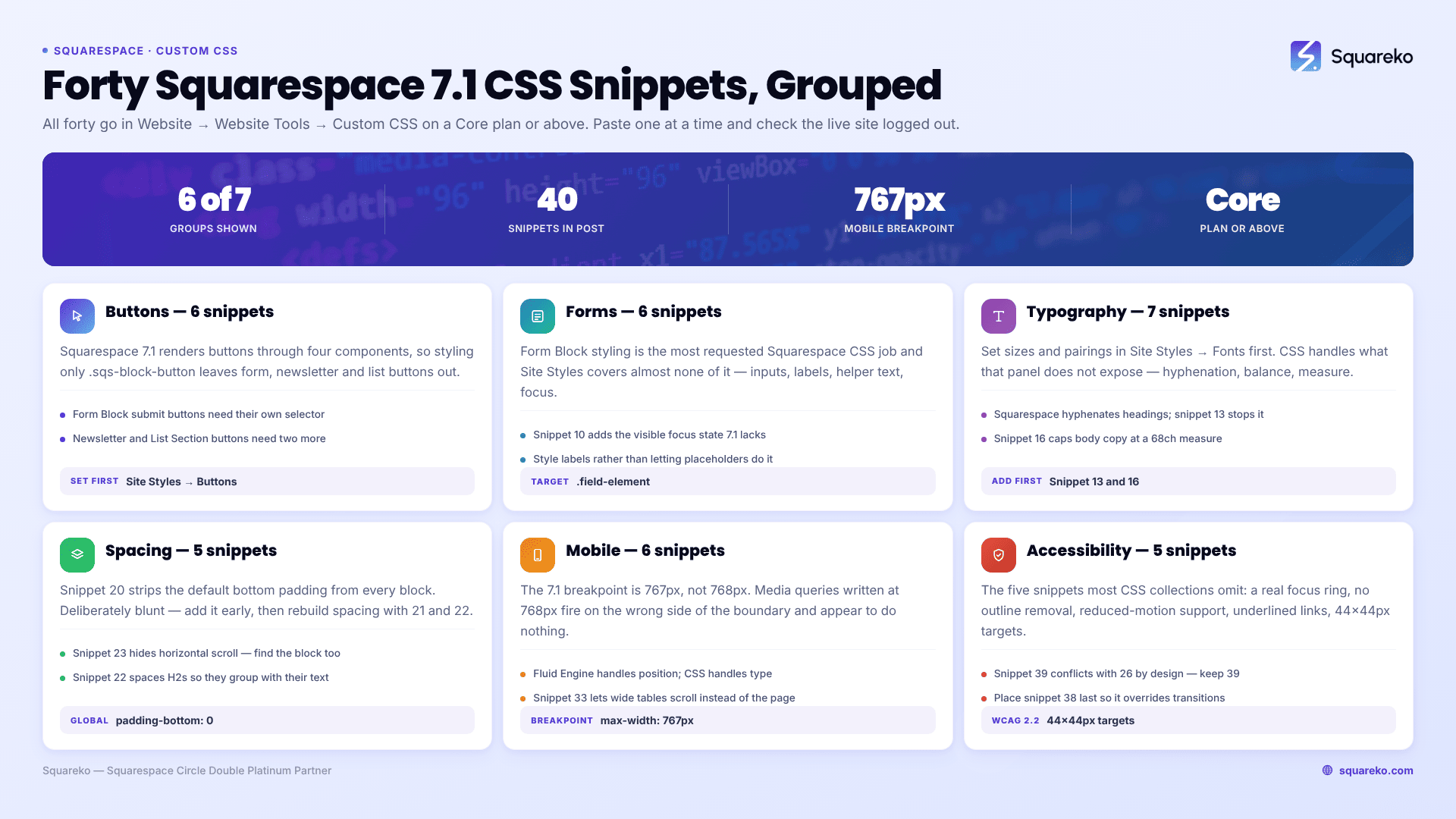
The short answer: Every snippet below goes in Website → Website Tools → Custom CSS, which requires a Core plan or above, and every one is written for Squarespace 7.1. Paste one at a time and check the live site logged out before adding the next — CSS parses sequentially, so a single unclosed brace silently kills every rule beneath it.
These forty are general-purpose: buttons, forms, typography, spacing, hover states, mobile and accessibility. Template chrome — headers, footers, banners and navigation — is a different job with different selectors, and it lives in our Squarespace custom CSS template guide.
Before you paste anything
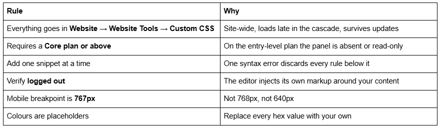
Where a snippet targets a specific element rather than a class, confirm the class in your browser inspector first — Squarespace 7.1 assigns different classes to different section types, and a selector that matches nothing is the most common reason CSS appears not to work at all. That failure mode and its eight relatives are covered in why Squarespace custom CSS stops working.
Buttons — 6 snippets
Squarespace 7.1 has three button styles — primary, secondary and tertiary — set globally in Site Styles → Buttons. Use CSS for the things Site Styles cannot do.
/* 1. Squarespace 7.1 — restyle every primary button block site-wide.
Where: Website > Website Tools > Custom CSS */
.sqs-block-button a.sqs-button-element--primary {
  border-radius: 2px;
  letter-spacing: 0.08em;
  text-transform: uppercase;
  font-size: 0.8rem;
}
/* 2. Squarespace 7.1 — give secondary buttons an outline instead of a fill, so priority between the two button styles is visible.
Where: Custom CSS */
.sqs-block-button a.sqs-button-element--secondary {
  background: transparent;
  border: 1px solid currentColor;
}
/* 3. Squarespace 7.1 — make tertiary buttons read as a text link with an underline, for low-priority actions.
Where: Custom CSS */
.sqs-block-button a.sqs-button-element--tertiary {
  padding-left: 0;
  padding-right: 0;
  background: transparent;
  text-decoration: underline;
  text-underline-offset: 0.25em;
}
/* 4. Squarespace 7.1 — style the submit button inside a Form Block, which is NOT covered by the button block selectors above.
Where: Custom CSS */
.form-wrapper .form-button-wrapper button,
.form-wrapper input[type=submit] {
  border-radius: 2px;
  letter-spacing: 0.08em;
  text-transform: uppercase;
  cursor: pointer;
}
/* 5. Squarespace 7.1 — style the Newsletter Block button, which uses its own selector again.
Where: Custom CSS */
.newsletter-form-button-wrapper .newsletter-form-button {
  border-radius: 2px;
  letter-spacing: 0.08em;
}
/* 6. Squarespace 7.1 — style buttons inside List Sections, which use the list-item button class rather than the block button class.
Where: Custom CSS */
.list-item-content__button {
  border-radius: 2px;
  letter-spacing: 0.08em;
}
Snippets 4, 5 and 6 exist because Squarespace 7.1 renders buttons through four different components. Styling only .sqs-block-button leaves form, newsletter and list buttons visibly inconsistent — one of the most common reasons a site looks half-finished.
Forms — 6 snippets
Form Block styling is the single most requested Squarespace CSS job, and Site Styles covers almost none of it.
/* 7. Squarespace 7.1 — restyle every form input, select and textarea.
.field-element is the input itself, inside the field list.
Where: Custom CSS */
.form-wrapper .field-list .field .field-element {
  background: transparent;
  border: 1px solid #d8d8d8;
  border-radius: 0;
  padding: 14px 16px;
  font-size: 1rem;
}
/* 8. Squarespace 7.1 — style form field labels (the question text).
Where: Custom CSS */
.form-wrapper .field-list .title {
  font-size: 0.85rem;
  letter-spacing: 0.05em;
  text-transform: uppercase;
  margin-bottom: 6px;
}
/* 9. Squarespace 7.1 — style the small helper text under a field.
Where: Custom CSS */
.form-wrapper .field-list .description,
.form-wrapper .field-list .field .caption {
  font-size: 0.8rem;
  opacity: 0.7;
}
/* 10. Squarespace 7.1 — give form fields a visible focus state. Squarespace's default is faint; this is an accessibility fix as well as a design one.
Where: Custom CSS */
.form-wrapper .field-list .field .field-element:focus {
  border-color: #1b2a4a;
  outline: 2px solid #1b2a4a;
  outline-offset: 2px;
}
/* 11. Squarespace 7.1 — set a sensible minimum height on the message textarea so it doesn't open as a single line.
Where: Custom CSS */
.form-wrapper .field-list textarea.field-element {
  min-height: 160px;
  resize: vertical;
}
/* 12. Squarespace 7.1 — lighten placeholder text without dropping below readable contrast.
Where: Custom CSS */
.form-wrapper .field-list .field .field-element::placeholder {
  color: #6b6b6b;
  opacity: 1;
}
Do not use placeholder text as a substitute for a label. Placeholders disappear on focus and are not reliably announced by screen readers; snippet 8 exists so labels can look good rather than be deleted.
Typography — 7 snippets
Set base sizes and font pairings in Site Styles → Fonts first. Use CSS only for what that panel does not expose.
/* 13. Squarespace 7.1 — turn off automatic hyphenation, which Squarespace applies to headings and breaks words awkwardly on narrow screens.
Where: Custom CSS */
p, h1, h2, h3, h4 {
  -webkit-hyphens: manual !important;
  -moz-hyphens: manual !important;
  -ms-hyphens: manual !important;
  hyphens: manual !important;
}
/* 14. Squarespace 7.1 — balance headline line breaks so a two-line heading splits evenly instead of leaving one orphan word.
Where: Custom CSS */
h1, h2, h3 {
  text-wrap: balance;
}
/* 15. Squarespace 7.1 — tighten letter-spacing on large headings, which web fonts almost always set too loose at display sizes.
Where: Custom CSS */
h1, h2 {
  letter-spacing: -0.02em;
  line-height: 1.1;
}
/* 16. Squarespace 7.1 — cap body copy at a readable measure of about 68 characters. Applies to text blocks, not headings.
Where: Custom CSS */
.sqs-block-html p {
  max-width: 68ch;
}
/* 17. Squarespace 7.1 — style the built-in Large and Small paragraph options from the text editor, rather than overriding font sizes per block.
Where: Custom CSS */
.sqsrte-large { line-height: 1.5; }
.sqsrte-small { letter-spacing: 0.04em; opacity: 0.75; }
/* 18. Squarespace 7.1 — colour bold text inside body copy with your accent, so emphasis reads as design rather than as shouting.
Where: Custom CSS */
.sqs-block-html p strong {
  color: #1b2a4a;
}
/* 19. Squarespace 7.1 — give bulleted lists room to breathe.
Where: Custom CSS */
.sqs-block-html ul li {
  margin-bottom: 0.5em;
  padding-left: 0.25em;
}
Snippet 16 is the highest-value rule on this page. Body text running the full width of a 1440px viewport passes 120 characters a line, and readers skim rather than read it.
Spacing and rhythm — 5 snippets
/* 20. Squarespace 7.1 — remove the default bottom padding Squarespace adds under every block, so you control spacing rather than inheriting it.
Where: Custom CSS */
.sqs-block {
  padding-bottom: 0 !important;
}
/* 21. Squarespace 7.1 — set consistent spacing between consecutive paragraphs in a text block.
Where: Custom CSS */
.sqs-block-html p + p {
  margin-top: 1.25em;
}
/* 22. Squarespace 7.1 — add space above every H2 in body copy so headings group with the text beneath them, not above them.
Where: Custom CSS */
.sqs-block-html h2 {
  margin-top: 2em;
  margin-bottom: 0.5em;
}
/* 23. Squarespace 7.1 — kill horizontal scroll caused by one over-wide element. A blunt fix; find the culprit block as well.
Where: Custom CSS */
html {
  overflow-x: hidden;
}
/* 24. Squarespace 7.1 — reduce the gap Squarespace leaves under an image block when it sits directly above text.
Where: Custom CSS */
.sqs-block-image {
  padding-bottom: 0 !important;
}
Snippet 20 is deliberately global and deliberately blunt. Add it early, then rebuild spacing intentionally with snippets 21 and 22 rather than fighting the default padding block by block.
Hover and interaction states — 5 snippets
/* 25. Squarespace 7.1 — subtle zoom on image blocks on hover. Keep the scale small; anything above 1.06 reads as a gimmick.
Where: Custom CSS */
.sqs-block-image img {
  transition: transform 0.5s ease;
}
.sqs-block-image:hover img {
  transform: scale(1.04);
}
/* 26. Squarespace 7.1 — animated underline on links inside body text, instead of the default instant underline.
Where: Custom CSS */
.sqs-block-html p a {
  background-image: linear-gradient(currentColor, currentColor);
  background-size: 0% 1px;
  background-repeat: no-repeat;
  background-position: 0 100%;
  transition: background-size 0.3s ease;
  text-decoration: none;
}
.sqs-block-html p a:hover {
  background-size: 100% 1px;
}
/* 27. Squarespace 7.1 — lift primary buttons slightly on hover.
Where: Custom CSS */
.sqs-block-button a.sqs-button-element--primary {
  transition: transform 0.25s ease, opacity 0.25s ease;
}
.sqs-block-button a.sqs-button-element--primary:hover {
  transform: translateY(-2px);
  opacity: 0.9;
}
/* 28. Squarespace 7.1 — fade an image on hover so overlaid text becomes readable. Pair with a text block positioned over the image.
Where: Custom CSS */
.sqs-block-image img {
  transition: opacity 0.4s ease;
}
.sqs-block-image:hover img {
  opacity: 0.75;
}
/* 29. Squarespace 7.1 — restyle the text selection highlight to your brand colour. Small detail, disproportionately noticeable.
Where: Custom CSS */
::selection {
  background: #1b2a4a;
  color: #ffffff;
}
Snippets 25 and 28 both target .sqs-block-image img. Use one or the other, not both — the second transition declaration overwrites the first.
Mobile-only tweaks — 6 snippets
Squarespace 7.1's mobile breakpoint is 767px. Media queries written at 768px fire on the wrong side of the boundary.
/* 30. Squarespace 7.1 — reduce heading sizes on mobile, where the desktop type scale is almost always too large.
Where: Custom CSS */
@media screen and (max-width: 767px) {
  h1 { font-size: 2rem; line-height: 1.15; }
  h2 { font-size: 1.5rem; }
}
/* 31. Squarespace 7.1 — make buttons full width on mobile so they are easy to hit and read as the primary action.
Where: Custom CSS */
@media screen and (max-width: 767px) {
  .sqs-block-button a.sqs-button-element--primary {
    width: 100%;
    text-align: center;
  }
}
/* 32. Squarespace 7.1 — remove the measure cap from snippet 16 on mobile, where it does nothing useful.
Where: Custom CSS */
@media screen and (max-width: 767px) {
  .sqs-block-html p { max-width: none; }
}
/* 33. Squarespace 7.1 — let wide tables scroll horizontally on mobile instead of forcing the whole page to scroll.
Where: Custom CSS */
@media screen and (max-width: 767px) {
  .sqs-block-markdown table,
  .sqs-block-html table {
    display: block;
    overflow-x: auto;
    white-space: nowrap;
  }
}
/* 34. Squarespace 7.1 — hide one specific block on mobile. Replace the block ID with the one from your inspector; block IDs regenerate if the block is deleted and rebuilt.
Where: Custom CSS */
@media screen and (max-width: 767px) {
  #block-yui_3_17_2_1_1699887432_12345 { display: none; }
}
/* 35. Squarespace 7.1 — tighten vertical spacing between blocks on mobile so pages don't scroll endlessly on a phone.
Where: Custom CSS */
@media screen and (max-width: 767px) {
  .sqs-block-html p + p { margin-top: 1em; }
  .sqs-block-html h2 { margin-top: 1.5em; }
}
Fluid Engine keeps separate desktop and mobile layouts per section, so block position on mobile is a layout job, not a CSS job. Use these snippets for type and spacing; use the mobile editor for anything positional, as covered in our Fluid Engine design tips.
Accessibility — 5 snippets
These are the snippets most Squarespace CSS collections omit, and they are the ones with the clearest right answer.
/* 36. Squarespace 7.1 — restore a strong, visible keyboard focus ring on every interactive element. :focus-visible shows it for keyboard users without adding an outline on mouse clicks.
Where: Custom CSS */
a:focus-visible,
button:focus-visible,
input:focus-visible,
textarea:focus-visible,
select:focus-visible {
  outline: 3px solid #1b2a4a;
  outline-offset: 3px;
  border-radius: 2px;
}
/* 37. Squarespace 7.1 — never remove focus outlines without a replacement. If existing CSS sets outline:none, this overrides it.
Where: Custom CSS, placed BELOW any rule that removes outlines */
*:focus-visible {
  outline-style: solid !important;
  outline-width: 3px !important;
}
/* 38. Squarespace 7.1 — respect the visitor's reduced-motion setting. Disables the hover and entrance transitions above for anyone who has asked their operating system to reduce motion.
Where: Custom CSS, placed LAST so it overrides earlier transitions */
@media (prefers-reduced-motion: reduce) {
  *, *::before, *::after {
    animation-duration: 0.01ms !important;
    animation-iteration-count: 1 !important;
    transition-duration: 0.01ms !important;
    scroll-behavior: auto !important;
  }
}
/* 39. Squarespace 7.1 — underline links inside body copy so they are distinguishable without relying on colour alone (WCAG 1.4.1).
Where: Custom CSS */
.sqs-block-html p a {
  text-decoration: underline;
  text-underline-offset: 0.2em;
}
/* 40. Squarespace 7.1 — enforce a 44x44px minimum tap target on buttons and form controls, per WCAG 2.2 Target Size (Minimum).
Where: Custom CSS */
.sqs-block-button a,
.form-wrapper .form-button-wrapper button,
.form-wrapper .field-list .field .field-element {
  min-height: 44px;
}
Snippet 39 conflicts with snippet 26 by design — 26 removes the underline in favour of a hover animation, which fails the non-colour-dependent link requirement. If accessibility matters more than the effect, keep 39 and drop 26.
When a snippet doesn't work
Three causes account for nearly all of it.
The selector matches nothing. Squarespace 7.1 assigns different classes to different section types, and code written for 7.0 frequently matches nothing at all. Inspect the element and confirm your selector appears in its real class list before changing anything else.
Something more specific is winning. If the rule appears in the inspector with a line through it, the CSS is loading and being beaten. Fluid Engine writes inline positioning styles directly onto blocks, and inline styles beat every stylesheet rule regardless of specificity — !important is the only override. If you need !important on most of your rules, the selectors are wrong.
A syntax error above it. If everything stopped working at once, this is why. Comment out the bottom half of the panel with /* */, see whether the top half recovers, and repeat until the line is isolated. Four or five rounds narrows a 500-line panel to the exact line.
Two housekeeping habits make a Squarespace CSS panel maintainable a year later. Keep the snippets grouped in the same order as this page — buttons, forms, typography, spacing, hover, mobile, accessibility — with a comment header above each group, because the panel has no folding and no search worth using. And put every media query at the bottom rather than nesting one beside each rule it modifies; when a mobile layout misbehaves, having all the 767px rules in one place turns a twenty-minute hunt into a thirty-second one.
One thing not to do: avoid pasting a snippet that targets a block ID like #block-yui_3_17_2_1_1699887432_12345 without a comment naming the block it refers to. Block IDs regenerate when a block is deleted and rebuilt, so a rule that stops working six months from now is undiagnosable unless you left yourself the note. Snippet 34 is the only one on this page that uses one, and it uses one because there is no alternative.
Using these well
Add snippets 13, 16, 20 and 36 first. Hyphenation off, a capped measure, controlled block spacing and a real focus ring will change more about how a Squarespace site reads than any of the hover effects. Everything else is refinement.
The point where CSS stops being the right tool is when you are writing forty rules to force a layout the section was never going to produce. At that stage the cheaper fix is the layout, not the stylesheet — which is what a custom Squarespace design engagement actually buys. Most sites never reach it; most sites need six of the forty above and a consistent button style.
FAQ
-
Website → Website Tools → Custom CSS. It applies site-wide and requires a Core plan or above, or a legacy Business or Commerce plan. Do not paste raw CSS into Code Injection without wrapping it in <style></style> tags, or it renders as visible text on the page.
-
Squarespace 7.1 renders buttons through four components with different selectors: button blocks use .sqs-button-element--primary, forms use .form-button-wrapper button, newsletter blocks use .newsletter-form-button, and list sections use .list-item-content__button. Styling one leaves the other three inconsistent.
-
Wrap the rules in @media screen and (max-width: 767px). Squarespace 7.1's mobile breakpoint is 767px, so a query written at 768px fires on the wrong side of the boundary. Fluid Engine block positioning is a layout job for the mobile editor, not a CSS job.
-
Only when overriding an inline style, which Fluid Engine writes directly onto blocks for layout. Inline styles beat every stylesheet rule regardless of specificity, and !important is the only override. If most of your rules need it, the selectors are matching the wrong elements.
-
Use :focus-visible with an outline and an offset on links, buttons, inputs, textareas and selects. It shows the ring for keyboard users without adding one on mouse clicks. Never remove focus outlines without providing a replacement — it makes a site unusable by keyboard.
-
Yes. .sqs-block-html p { max-width: 68ch; } caps body copy at roughly 68 characters a line, which is inside the readable 45–75 range. Remove the cap inside a 767px media query, since it has no effect on a phone and can cause odd wrapping.

Author Bio
I'm Walid Hasan, a Certified Squarespace Expert and Squarespace Circle Platinum Partner with over 12 years of hands-on experience designing and optimizing high-performing websites. Over the years, I've had the privilege of building more than 2,000 Squarespace websites for clients around the world, always focusing on clean design, strong user experience, and conversion-driven results.