17 Fluid Engine Tips That Make Squarespace Look Custom-Built
The short answer: Fluid Engine doesn't make a Squarespace site look templated — accepting its defaults does. The tells are almost all spacing. Sections that are all the same height, blocks left wherever they were dropped, and a mobile layout nobody rebuilt. Custom-looking work comes from a repeated column span, a repeated row rhythm, and exactly one deliberate break from the grid per page.
This post is about design decisions, not mechanics. If you need the mechanics first — how the grid works, how to convert a Classic section, what the pencil icon opens — read our Fluid Engine walkthrough and come back.
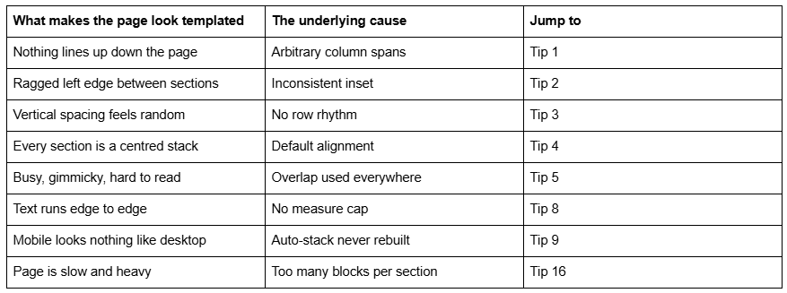
The tell, and the tip that fixes it
Tip 1 — Pick three column spans and use only those
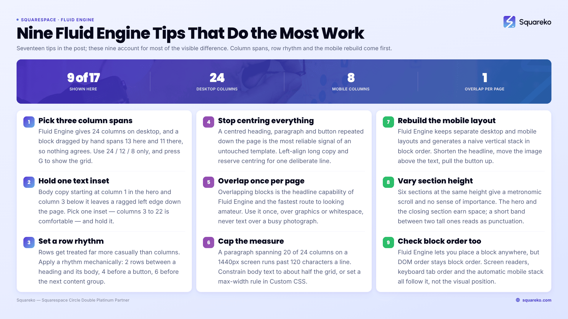
Fluid Engine in Squarespace 7.1 gives you a 24-column grid on desktop and an 8-column grid on mobile. Twenty-four is a generous number, and that generosity is the problem: a block dragged by hand ends up spanning 13 columns in one section, 11 in the next, 14 below that. Nothing agrees with anything.
Choose three spans and refuse the rest. On a 24-column grid, 24 / 12 / 8 (full, half, third) covers almost every layout a service site needs. Every block on the page then shares vertical edges, and shared vertical edges are most of what people mean when they say a site looks designed.
Press G while editing to show the grid and count the columns rather than eyeballing them.
Tip 2 — Hold one inset for text across every Fluid Engine section
Body copy that starts at column 1 in the hero, column 3 in the next section and column 2 below that produces a ragged left edge running the length of the page. Readers don't consciously notice it. They register it as "cheap".
Pick a single text inset — columns 3 to 22 on the 24-column desktop grid is comfortable — and hold it for every paragraph and heading on the page. Imagery and background art are allowed to break that line. Text is not.
Tip 3 — Set a row rhythm and snap everything to it
Fluid Engine rows are the vertical equivalent of columns, and they get treated far more casually. A heading sits 2 rows above its paragraph in one section and 5 rows above it in another, and the page reads as if three people built it.
Decide on a rhythm and apply it mechanically: 2 rows between a heading and its body text, 4 rows between a body block and a button, 6 rows before the next content group. Consistency here does more visible work than any font choice.
Tip 4 — Stop centring every Fluid Engine section
The single most reliable signal of an untouched Squarespace template is that every section is a centred column: centred heading, centred paragraph, centred button, repeat.
Vary the axis. Left-align long-form copy — centred text is measurably harder to read past two lines because every line starts in a different place. Reserve centring for short sections where it is a deliberate emphasis: a single-line statement, a closing call to action. A page that alternates between a left-aligned content section and a two-column split reads as composed rather than assembled.
Tip 5 — Overlap once per page, not once per section
Overlapping blocks is the headline capability of Fluid Engine and the fastest way to make a Squarespace page look amateur. Overlap on every section stops reading as intentional and starts reading as an accident.
Use it once, in the section you most want remembered — usually the hero or a single feature block. Two rules keep it looking deliberate: only overlap graphic elements over other graphics or over generous whitespace, never text over a busy photograph; and check the overlap at 1024px and 768px, where Fluid Engine scales the grid but not your judgement about legibility.
Tip 6 — Let exactly one element bleed past the section inset
Every Fluid Engine block sitting neatly inside the same margin is what a template looks like. One element that breaks out — an image running to the browser edge, a shape half-outside the content area, a number set oversized and hanging past the text column — creates the impression that someone made a decision.
One per page. Two starts to look like a mistake, and three looks like the layout collapsed.
Tip 7 — Choose Fill or Fit per image, never per habit
Fluid Engine image blocks offer FIT (the whole image, letterboxed into the cell) and FILL (the image cropped to fill the cell). Most templated-looking pages use FILL for everything because it looks tidier in the editor, and then crop the top of somebody's head on mobile.
Use FILL for texture, landscape and background-style imagery where the crop doesn't matter. Use FIT for anything with a subject that must survive intact — product shots, logos, headshots — or set the image's focal point before you fill. Then check the mobile layout, where the cell aspect ratio is completely different.
Tip 8 — Cap your measure at 45–75 characters per line
A paragraph spanning 20 of 24 columns on a 1440px screen runs to well over 120 characters a line. It is technically fine and practically unreadable, and it is the reason a lot of otherwise decent Squarespace pages feel like a wall.
Constrain body text blocks to roughly half the grid — 12 columns — and check the result at 1440px, not at whatever width your editor window happens to be. Headings can run wider; body copy cannot. If you would rather enforce it globally than block by block, a max-width rule in Website → Website Tools → Custom CSS does the same job site-wide.
Tip 9 — Rebuild the mobile layout rather than accepting the stack
Fluid Engine maintains separate desktop and mobile layouts for the same section, and the mobile one it generates for you is a naive vertical stack in block order. It is never wrong, and it is almost never good.
Switch to the mobile view and rebuild the sections that matter — hero, services, closing CTA at minimum. On the 8-column mobile grid, that usually means: shorten the headline block so it doesn't take four lines, move the image above the text rather than below it, and pull the button up so it sits within the first screen. This is the single highest-value half hour in a Fluid Engine build.
Tip 10 — Don't run every mobile block to the full 8 columns
On the mobile grid it is tempting to span all 8 columns with everything, because the screen is narrow and space feels scarce. The result is text pressed against both edges of the phone and a page with no breathing room
Leave the site margin doing its job and inset selected elements further — a testimonial at 7 of 8 columns, a button block at 6 — so the mobile layout has internal hierarchy rather than one uniform column of full-width things.
Tip 11 — Use empty grid cells as spacing, but use the same amount every time
Fluid Engine has no spacer block in the Classic sense; empty grid area is the spacer. That is fine, and it is why Fluid Engine spacing drifts so easily — nothing enforces consistency.
Write your rhythm down before you build (see Tip 3) and count rows rather than dragging until it looks right. Dragging until it looks right is how you end up with 3 rows here and 5 rows there in two sections that are meant to be identical.
Tip 12 — One primary button per Fluid Engine section
Squarespace 7.1 gives you primary, secondary and tertiary button styles in Site Styles → Buttons. They exist to express priority. Three primary buttons in one section expresses nothing.
Per section: one primary action, and at most one secondary. If a section genuinely needs three destinations, it is two sections or a list section, not three equal buttons.
Tip 13 — Vary section height deliberately
Six Fluid Engine sections all set to the same height produce a page with a metronomic scroll and no sense of importance. Section height is a hierarchy tool: the hero and the closing section earn more vertical space, a proof strip or a short statement earns much less.
Set height per section in the section editor, and let a short section be genuinely short. A 200px band between two tall sections reads as punctuation.
Tip 14 — Assign colour themes, don't pick colours section by section
Squarespace 7.1 colour themes are set in Site Styles → Colors, and each section is assigned a theme rather than styled individually. Sites that look coherent use three or four themes across the whole site and rotate them.
Sites that look templated do one of two things: leave every section on the default light theme, so the page has no rhythm at all; or set a different background colour on every section, so it has no relationships. Pick your themes once, then apply them.
Tip 15 — Use auto-layout sections where auto-layout is better
Fluid Engine is not the right tool for every section, and knowing that is a design decision. List sections, gallery sections and auto-layout content sections stay aligned responsively without any manual mobile work — three team members, four service cards, six logos. Hand-placing those in Fluid Engine gives you a layout you now have to maintain at two breakpoints for no visual gain.
Reserve Fluid Engine for the sections that need composition: the hero, a feature block with overlap, an editorial section where the layout is the point.
Tip 16 — Keep block count per section low, for weight as much as looks
Every Fluid Engine block is markup, and Fluid Engine writes inline positioning styles onto each one. Twelve blocks in a section is usually a section trying to be two sections.
There is a performance argument as well as a design one. Across 54 Squareko-built Squarespace sites measured in August 2026 (Playwright/Chromium lab test, unthrottled, single run per site), median page weight was 3.0 MB across 93 requests and median mobile LCP was 2.01s, with 74% under Google's 2.5s threshold. Those numbers hold because pages are built from a small number of composed sections rather than dozens of stacked blocks. Fluid Engine makes it very easy to go the other way.
Tip 17 — Check block order, not just block position
Fluid Engine lets you position a block anywhere on the grid, but the DOM order stays whatever the block order says it is. Two consequences: screen readers and keyboard tab order follow block order, not visual position; and the automatic mobile stack is generated from block order too.
Open the block order settings and put the blocks in the sequence a person would read them. A heading that sits visually above a paragraph but comes after it in block order is both an accessibility problem and the reason your mobile stack is in the wrong sequence.
Where to start if you only fix three things
Column spans (Tip 1), row rhythm (Tip 3) and the mobile rebuild (Tip 9). Those three account for most of the visible difference between a Fluid Engine page that looks custom and one that looks like the demo content it replaced. Everything else on this list refines what those three establish.
Where this stops being a tips problem is when the underlying layout is wrong — when the page has six sections doing the job of four, or when the hero is composed around imagery that was never going to work. No amount of grid discipline fixes a structure that isn't right, and that is the point at which a custom Squarespace design is the cheaper option rather than the expensive one. Most Fluid Engine pages don't need that; they need someone to count columns.
FAQ
-
Squarespace 7.1's Fluid Engine uses a 24-column grid on desktop and an 8-column grid on mobile. The two layouts are edited independently, so a block's desktop position has no effect on where it sits on mobile. Restricting yourself to a few repeated column spans is what makes a page look aligned.
-
Almost always inconsistent column spans and insets between Fluid Engine sections. A block spanning 13 columns above a block spanning 11 creates edges that don't agree. Pick three spans, hold one text inset across every section, and press G to check against the grid rather than judging by eye.
-
Use auto-layout sections — list, gallery, content — for repeating items like service cards, team members and logos, because they stay aligned responsively with no manual mobile work. Use Fluid Engine for sections where composition is the point: the hero, a feature block, an editorial layout.
-
For any section that matters, yes. Fluid Engine generates a mobile layout by stacking blocks in block order on the 8-column grid. It is never broken and rarely good. Rebuilding the hero, services and closing sections on mobile is the highest-value half hour in a Fluid Engine build.
-
Once per page, on graphic elements over whitespace or other graphics. Overlap on every section stops reading as a decision and starts reading as an accident. Never overlap body text on a busy photograph, and always check the result at 1024px and 768px before publishing.
-
Fewer than you think. A section with twelve blocks is usually two sections. Each Fluid Engine block adds markup and inline positioning styles, so block count affects page weight as well as visual clarity, and it doubles the mobile layout work you have to do afterwards.

Author Bio
I'm Walid Hasan, a Certified Squarespace Expert and Squarespace Circle Platinum Partner with over 12 years of hands-on experience designing and optimizing high-performing websites. Over the years, I've had the privilege of building more than 2,000 Squarespace websites for clients around the world, always focusing on clean design, strong user experience, and conversion-driven results.