How to Make a Squarespace Site Look Professional (Not Templated)
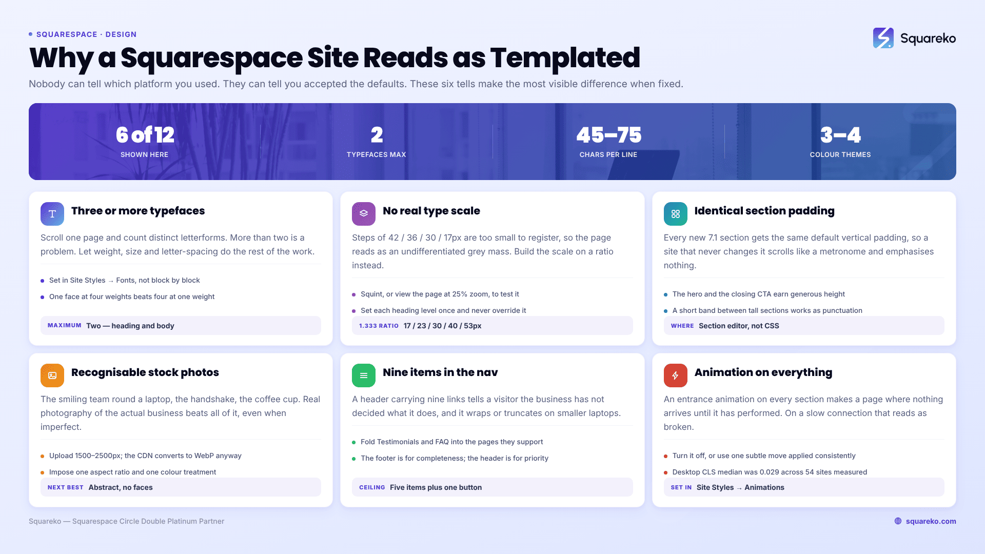
The short answer: Nobody can tell you're on Squarespace. What they can tell is that you accepted the defaults. A site reads as templated because of a short list of specific tells — four fonts instead of two, identical padding on every section, stock photography, and no size difference between the things that matter and the things that don't. Fix the tells and the platform becomes invisible.
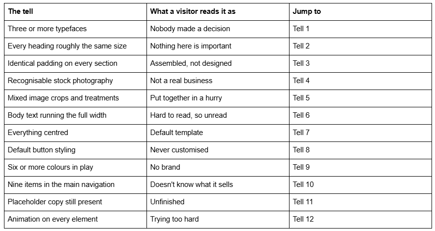
Here are the twelve, ordered by how much visible difference each one makes.
The twelve tells at a glance
Tell 1 — Too many typefaces
Squarespace 7.1 ships font packs in Site Styles → Fonts, and the temptation is to override them element by element until a page carries a heading face, a body face, a script for the testimonial and something else again for the button.
How to confirm it in ten seconds: scroll one page and count distinct letterforms. More than two and you have found a problem.
The fix: two typefaces maximum — one for headings, one for body — and let weight, size and letter-spacing do the rest of the work. A single well-set typeface at four weights looks more considered than four typefaces at one weight each. If you want a third, make it a genuine accent used once per page, never twice.
Tell 2 — No real type scale
This is the most common and least discussed reason a Squarespace site looks flat. The H1 is 42px, the H2 is 36px, the H3 is 30px, body is 17px. Every step is small, so no step registers, and the page reads as an undifferentiated grey mass.
How to confirm it: squint at the page, or view it at 25% zoom. If you cannot instantly tell which text is the headline, the scale is too tight.
The fix: build the scale on a ratio rather than by nudging. A 1.333 ratio from a 17px base gives roughly 17 / 23 / 30 / 40 / 53px — real, visible jumps. Set the base size in Site Styles → Fonts, then set each heading level once and never override it per block. Big headline, small everything else, is a more professional look than five middling sizes.
Tell 3 — Every section has identical padding
Squarespace 7.1 gives every new section the same default vertical padding, and a site that never changes it scrolls like a metronome. Nothing is emphasised because everything gets the same amount of space.
How to confirm it: scroll the homepage quickly. If the rhythm never changes, the padding never changed.
The fix: treat vertical space as hierarchy. The hero and the closing call to action earn generous height; a proof strip or a one-line statement should be deliberately short. Adjust section height in the section editor rather than in Custom CSS, so it survives future edits. A short band between two tall sections works like punctuation — it tells the reader a thought has ended.
Tell 4 — Stock photography anyone can recognise
Squarespace includes a Getty and Unsplash image library, which is genuinely useful and also the fastest way to look like nine other sites in your sector. The specific tell is people: the smiling team around a laptop, the handshake, the woman with the coffee cup.
The fix, in order of preference. Real photography of the actual business, even imperfect, beats everything. Failing that, use abstract or environmental stock — textures, materials, spaces without faces — which carries mood without claiming to be your team. If you must use stock people, use them once, and crop tightly enough that the image reads as a detail rather than a scene. Apply one consistent treatment to whatever you use (see Tell 5) so at least the set looks intentional.
Tell 5 — Image treatments that don't agree with each other
One image is a warm 4:3 photograph, the next is a cool square screenshot, the third is a portrait with a white background. Individually fine. Together they announce that the images were sourced one at a time as the page was built.
The fix: pick one aspect ratio family and one colour treatment and impose them. Squarespace image blocks let you set the crop, and Site Styles → Image Blocks controls block-level presentation. If the source images differ in temperature, a light uniform adjustment before upload — same warmth, same contrast — does more for perceived quality than any layout change. Upload at 1500–2500px wide; Squarespace serves a maximum of 2500px, and its CDN converts everything to WebP regardless of your source format, so upload quality rather than pre-optimised files.
Tell 6 — Body text running the full width of the screen
A paragraph spanning a 1440px viewport runs past 120 characters a line. Readers lose their place on the return sweep, so they skim, so the copy you paid for doesn't get read. It looks unprofessional because it is a professional mistake.
How to confirm it: count characters in one line of body copy on a wide monitor. Over about 90 and you have a problem.
The fix: constrain body text to roughly 45–75 characters. In Fluid Engine that means limiting the block to about half the 24-column desktop grid. Site-wide, a max-width rule in Website → Website Tools → Custom CSS does it in three lines. Headings can run wide; body copy cannot.
Tell 7 — Everything centred
Centred heading, centred paragraph, centred button, repeated eight times down the page. It is the default composition of nearly every Squarespace demo, and it is the reason a lot of sites feel interchangeable.
The fix: left-align body copy by default. Centred text is harder to read past two lines because each line starts in a different place, and it removes the vertical edge that makes a layout feel structured. Reserve centring for short, deliberate moments — a single-line statement, the closing call to action. Then vary the composition: a left-aligned section, then a two-column split, then a full-bleed image, reads as composed rather than stacked.
Tell 8 — Default button styling
Squarespace 7.1 has primary, secondary and tertiary button styles in Site Styles → Buttons, with controls for shape, fill, border and text style. Most templated-looking sites use one style for everything, at the default corner radius, with the default label text.
The fix: set the three styles so they visibly express priority, then use them that way — one primary action per section, secondary for the alternative, tertiary for the low-stakes link. Change the labels while you are there. "Learn More" is the single most common button label on the internet and it tells a visitor nothing; "See the pricing" tells them what happens next.
Tell 9 — Too many colours
Squarespace 7.1 organises colour into themes — sets of accent, light and dark values assigned per section in Site Styles → Colors. Sites that look coherent use three or four themes and rotate them. Sites that look templated either leave everything on the default light theme, so the page has no rhythm, or pick a different background per section, so the page has no relationships.
The fix: one dominant neutral, one accent, and enough tonal variation between themes to give the page rhythm. Assign themes at section level rather than colouring blocks individually. If more than three hues appear on one screen, one of them is wrong.
Tell 10 — A navigation with nine items in it
A main navigation carrying Home, About, Services, Portfolio, Blog, Testimonials, FAQ, Resources and Contact tells a visitor the business hasn't decided what it does. It also guarantees the nav wraps or truncates awkwardly on smaller laptops.
The fix: five items plus one button, maximum. Fold Testimonials and FAQ into the pages they support. Put Resources in the footer. If you have several service pages, use a folder rather than listing them all at the top level. The footer is the correct place for completeness; the header is for priority.
Tell 11 — Placeholder content that survived to launch
Demo copy in a section nobody scrolled to, an unedited 404 page, "Site Title" still in the browser tab, the default favicon, a contact form that still says "Thanks for reaching out!" in Squarespace's stock wording, an Instagram block pointing at a Squarespace demo account.
How to confirm it: open the site in a private window, logged out, and read every page top to bottom on a phone. Logged in, you skim past what you have seen a hundred times.
The fix: work a written list rather than trusting memory, and check the pages nobody visits during the build — 404, search results, the thank-you page after a form submission, and the footer.
Tell 12 — Animation on everything
Site Styles → Animations applies a site-wide entrance animation, and applied to every section it produces a page where nothing arrives until it has finished performing. On a slower connection it reads as broken rather than considered.
The fix: either turn it off entirely, or use one subtle animation — a short fade or a small upward move — applied consistently. Motion that draws attention to itself competes with the content it is meant to introduce. There is a measurement argument too: across 54 Squareko-built Squarespace sites measured in August 2026 (Playwright/Chromium lab test, unthrottled, single run per site, load-only CLS), median mobile CLS was 0.000 and 94% were under 0.1 — but desktop was weaker at a median 0.029, with only 80% in the good range. Entrance animations and late-loading imagery are the usual reason.
Where this leaves you
Fix them in order of visible return: type scale, section spacing, imagery, then the rest. Two typefaces, four real size steps, varied section heights and a coherent image set will change how a site is read more than any single clever layout.
What none of this fixes is a site whose structure is wrong — where the homepage doesn't say what the business does, or where the pages exist in an order nobody would choose. If you have worked this list and the site still doesn't hold together, the problem is usually the homepage structure rather than the styling, and that is the point where a custom Squarespace design is worth costing. Most sites don't get there; most sites need two fonts and a type scale.
FAQ
-
Usually four things at once: more than two typefaces, heading sizes too close together to create hierarchy, identical padding on every section, and recognisable stock photography. None is about the platform. Visitors cannot tell a site is Squarespace; they can tell the defaults were never changed.
-
Two. One for headings, one for body text, with weight, size and letter-spacing carrying the variation. A third typeface only earns its place as a genuine accent used once per page. Set them in Site Styles → Fonts rather than overriding fonts block by block.
-
Set a real type scale with visible jumps between heading levels, vary section heights so spacing expresses hierarchy, replace stock photography with real or abstract imagery under one consistent treatment, and cut the main navigation to five items. All four are Site Styles and section settings, no CSS required.
-
Sparingly, and never the recognisable ones with faces. Real photography of the actual business wins even when imperfect. If you use the built-in Getty and Unsplash library, prefer textures, materials and spaces over people, and apply one consistent colour treatment so the set looks deliberately chosen.
-
Roughly 45–75 characters. Body copy spanning a full 1440px screen runs past 120 characters a line, which makes readers lose their place on the return sweep and skim instead of reading. In Fluid Engine, constrain text blocks to about half the 24-column desktop grid.
-
Rarely. Site Styles → Animations applied to every section produces a page where nothing arrives until it has performed. One subtle fade used consistently, or none at all, reads as more confident — and reduces the layout shift that Squarespace sites tend to record on desktop rather than mobile.

Author Bio
I'm Walid Hasan, a Certified Squarespace Expert and Squarespace Circle Platinum Partner with over 12 years of hands-on experience designing and optimizing high-performing websites. Over the years, I've had the privilege of building more than 2,000 Squarespace websites for clients around the world, always focusing on clean design, strong user experience, and conversion-driven results.