Squarespace Homepage Design: The 7-Section Structure That Converts
The short answer: A service-business homepage needs seven sections in this order — Positioning, Proof Strip, Problem, Services, Process, Evidence, Close. Nothing else earns its place. Most Squarespace homepages fail not because a section is badly designed but because there are fourteen of them in no particular order, and the visitor leaves before reaching the one that would have converted them.
Squarespace's own homepage guidance deliberately declines to prescribe a structure. This is the structure.
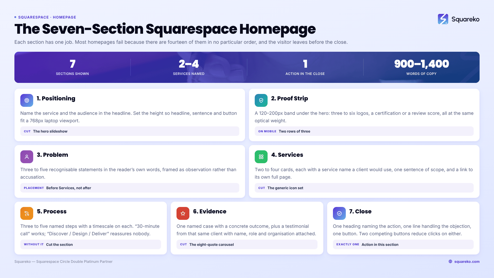
The seven sections at a glance
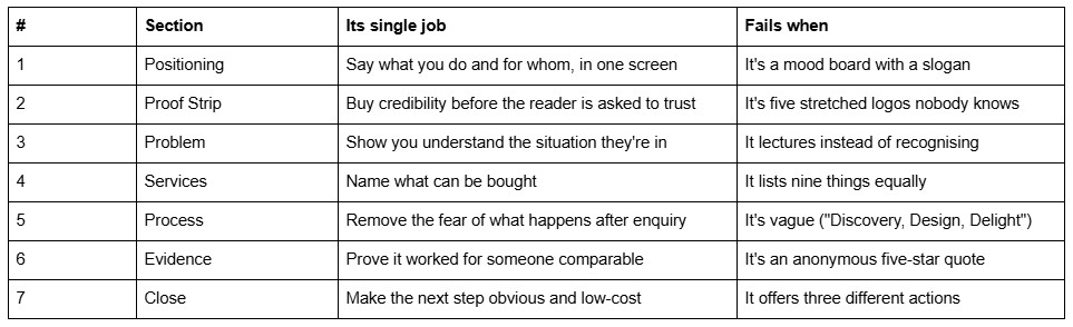
Seven sections is the target, not the ceiling. Six is fine. Twelve is a problem.
Section 1 — Positioning
Its job: answer what is this and is it for me before the visitor scrolls.
Every Squarespace homepage opens with a hero. Most heroes waste it on a brand statement — a photograph, a word like "Elevate", and a button saying "Learn More". A visitor arriving from Google with a task cannot tell whether they are in the right place.
What this section must contain: a headline naming the service and the audience; one sentence of qualification underneath; one primary button; and, if space allows, a single credibility line. That is all.
The headline is the whole section. "Squarespace websites for independent law firms" outperforms "Beautiful websites, thoughtfully made" every time, because it does the qualifying work instantly. If you are worried it sounds plain, that is the correct feeling — plain is the point.
On heroes and height. Set the section height so the headline, the sentence and the button are all visible on a 768px-tall laptop viewport without scrolling. Fill-screen heroes look impressive on a designer's monitor and push everything below the fold on the machines most visitors actually use.
Cut: the slideshow. Rotating hero slides split attention across three messages, and visitors reliably read the first and miss the rest. If three messages matter, one is the hero and two are sections.
Section 2 — Proof Strip
Its job: buy credibility cheaply, in a band of 120–200px, immediately after the hero.
This is the most commonly skipped section on a Squarespace homepage and it is close to free. A single short strip directly beneath the hero carrying client logos, publication names, a certification, a review score with a real count, or a plain number ("Fourteen years, 8,500 sites"). It changes how everything below it is read, because the visitor has already been given a reason to keep going.
What it must contain: three to six items, all rendered at the same optical weight, in one horizontal row on desktop. On mobile, two rows of three rather than a six-item scroll.
Fails when: the logos are unknown to the audience, sized inconsistently, or presented in colour against a background they were never designed for. Convert logos to a single flat tone so the strip reads as one object rather than six competing ones.
Section 3 — Problem
Its job: demonstrate that you understand the specific situation the visitor is in, before you propose anything.
This is the section that separates a homepage that converts from one that merely describes. Three or four short statements of the actual problem, in the reader's own words, not yours. "Your site was built four years ago by someone you can no longer reach." "You can update the text, but not without breaking the layout."
What it must contain: three to five recognisable statements, short enough to scan, framed as observation rather than accusation. A single sentence at the end that pivots to what you do about it.
Fails when: it turns into a lecture about why websites matter, or when it is written in the abstract. "In today's competitive market, first impressions count" recognises nobody. A visitor should read this section and think that's exactly it.
On placement: this belongs before Services, not after. A visitor who has just been shown their own problem reads the service list as a solution. A visitor who sees the service list first reads it as a menu they have to interpret.
Section 4 — Services
Its job: name the two to four things that can actually be bought, and route each to its own page.
This is where Squarespace's list sections earn their place. Two to four cards, each with a short service name, one sentence of scope, and a link. Auto-layout list sections stay aligned responsively without any manual mobile work, which matters more here than the compositional freedom of Fluid Engine.
What it must contain per card: the service name as a noun a client would use; one sentence describing what is included; a link to a full service page. Optionally a "from" price, which qualifies harder than anything else on the page.
Fails when: it lists nine services at equal weight. Nine equal options is the same as no recommendation, and the visitor picks none of them. If you genuinely offer nine, group them into three and let the service pages do the detail.
Cut: the icon set. Nine generic line icons above nine service names adds visual noise and zero information. Either use real imagery per service or use type alone.
Section 5 — Process
Its job: remove the fear of what happens after someone gets in touch.
Most enquiries are lost here, silently. The visitor is interested but does not know whether contacting you means a sales call, a two-hour meeting or a contract. Three to five named steps with a duration attached to each resolves it.
What it must contain: step names that describe an actual event, not a mood — "30-minute call", "Written proposal and fixed price", "Content and design, three weeks", "Launch and handover". Attach a timescale wherever you can. If your build takes six weeks, say six weeks here.
Fails when: the steps are abstractions. "Discover / Design / Deliver" is three words that could describe any business on earth and reassures nobody. The point of this section is specificity; without it, cut it.
Section 6 — Evidence
Its job: prove the process worked for somebody the visitor recognises as similar to themselves.
One case, not six. A named client, what the situation was, what was done, and one concrete outcome — a number, a launch, a measured change. Then a testimonial from that same client, with their name, role and organisation.
What it must contain: attribution. An anonymous five-star quote is worth almost nothing; "Sarah Bennett, Practice Manager, Hollis & Reed" is worth a great deal. A photograph of the person or of the work helps; a stock portrait actively hurts.
Fails when: it becomes a carousel of eight quotes. Carousels hide seven-eighths of their content behind an interaction almost nobody performs, and they introduce layout shift. Across 54 Squareko-built Squarespace sites measured in August 2026 (Playwright/Chromium lab test, unthrottled, single run per site, load-only CLS), median mobile CLS was 0.000 with 94% under 0.1, but desktop was weaker at a median of 0.029 with only 80% in the good range — auto-advancing carousels and late-loading testimonial imagery are among the common causes.
Section 7 — Close
Its job: state the single next step, in the visitor's terms, at the lowest possible cost to them.
One heading, one line of reassurance, one button. The heading should name the action, not the emotion: "Book a 30-minute call" rather than "Let's create something beautiful together". The reassurance line handles the objection that stops people clicking — no cost, no obligation, how long it takes, what happens next.
What it must contain: exactly one action. Two competing buttons in a closing section measurably reduce the number of people who take either.
Fails when: it offers "book a call, or download the guide, or sign up for the newsletter". If you want the newsletter signup, it goes in the footer.
What to cut from a Squarespace homepage
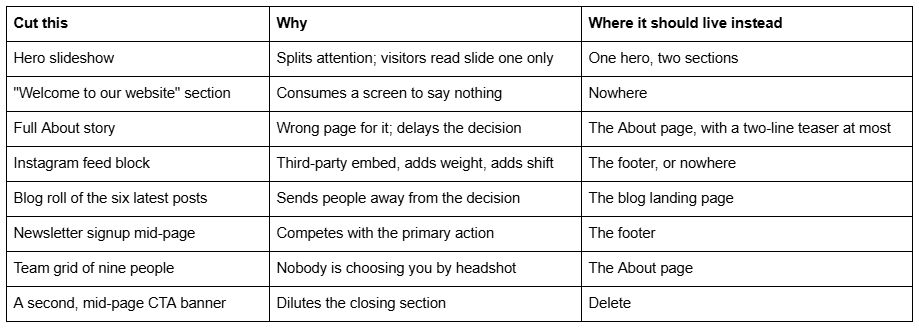
The rule underneath all of these: a homepage is not an index of the site. It is one argument, made once, in order. Everything that is not part of the argument belongs on the page that exists for it.
How long should a Squarespace homepage be?
Seven sections at honest length lands between 900 and 1,400 words of visible copy, and roughly four to six screens of scroll on a laptop. That is long enough to make the argument and short enough that the closing section gets reached.
The reliable test is not word count. Open the homepage on a phone, logged out, and count how many thumb-swipes it takes to reach the closing button. More than about eight and you have sections that are not carrying their weight — usually the About story, the blog roll, or a Process section written in abstractions.
Building it
Build sections 1, 4 and 7 first and publish with only those three if you have to. A homepage that says what you do, what can be bought and what to do next already outperforms most of its competition. Sections 2, 3, 5 and 6 are what turn an adequate homepage into one that converts, and they can be added a week at a time.
Where this becomes hard is the Positioning section, because writing one plain sentence that qualifies the right visitor and repels the wrong one is genuinely difficult, and no amount of layout work compensates for getting it wrong. If you have rewritten the headline six times and it still doesn't land, that is the part worth bringing someone into — it is usually a day of work with a custom Squarespace design engagement, and it decides how everything below it is read. The other six sections are structure, and structure you can build yourself from the list above.
FAQ
-
Seven, in order: Positioning, Proof Strip, Problem, Services, Process, Evidence, Close. Each has one job. The order matters more than the design — a visitor shown their own problem before the service list reads that list as a solution rather than as a menu they must interpret.
-
Six or seven. Twelve is the common failure, and it happens because a homepage gets treated as an index of the whole site. If a section is not part of the single argument you are making, it belongs on the page that exists for it — About, blog, or the footer.
-
A headline naming the service and the audience, one sentence of qualification, and one button — all visible on a 768px-tall laptop viewport without scrolling. Fill-screen heroes look impressive on a large monitor and push the qualifying sentence below the fold on most visitors' machines.
-
No. Rotating hero slides split attention across several messages, and visitors reliably read the first and miss the rest. If three messages genuinely matter, one becomes the hero and the other two become their own sections further down the page.
-
In the Evidence section, sixth of seven, after the Process section has explained what working with you involves. Use one attributed testimonial tied to a named client and a concrete outcome rather than a carousel of eight anonymous quotes, which hides most of its content and adds layout shift.
-
Roughly 900–1,400 words of visible copy, or four to six laptop screens. The better test is on a phone: count thumb-swipes to reach the closing button. More than about eight means some sections are not earning their place — usually the About story or a Process section written in abstractions.

Author Bio
I'm Walid Hasan, a Certified Squarespace Expert and Squarespace Circle Platinum Partner with over 12 years of hands-on experience designing and optimizing high-performing websites. Over the years, I've had the privilege of building more than 2,000 Squarespace websites for clients around the world, always focusing on clean design, strong user experience, and conversion-driven results.