How to Customise a Squarespace Footer in 7.1
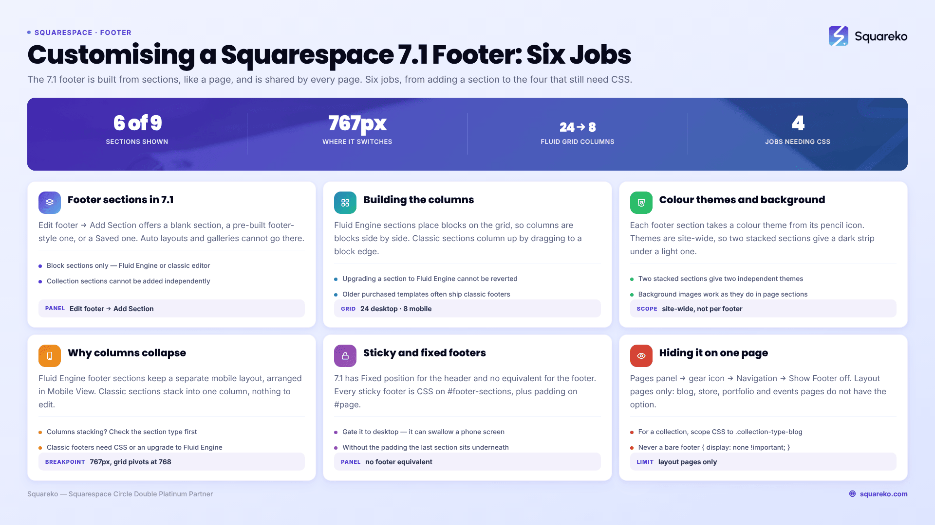
The short answer: Click Edit on any page, hover over the footer, and click Edit footer. From there, you are editing sections, not a single block area — click Add Section for a blank or footer-style block section, and the pencil icon on any section for its layout, background, and colour theme. The footer is shared by every page on the site, so one edit changes all of them.
Almost every footer complaint comes down to one of four things the panel will not do: pin the footer to the bottom of the viewport, keep columns side by side on mobile, tighten the padding below the minimum, or give a footer section a different look on one page. All four need CSS, and all four are covered below.
Before any of that, one warning. Most footer CSS targets on the web.Footer-inner,.Footer-blocks--top and similar. Those are Squarespace 7.0 Brine-family selectors, and they match nothing on a 7.1 site. In Squarespace 7.1 the footer wrapper is #footer-sections.
Where every footer setting actually lives
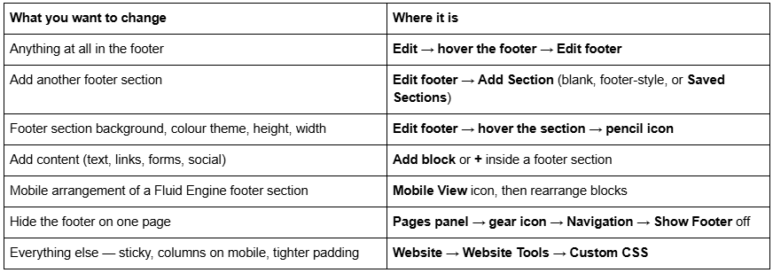
That last row is the honest summary of this post. The Squarespace 7.1 footer panel is genuinely capable, and the remaining gaps are small and well-defined.
Footer sections in Squarespace 7.1
The Squarespace 7.1 footer is built from sections, exactly like a page. Click Edit footer, then Add Section, and you get three choices: a blank section, a pre-built footer-style block section, or one of your Saved Sections.
Two things narrow what you can put there. Squarespace states plainly that you cannot add auto layouts or gallery sections to the footer, and collection sections cannot be added independently of their page at all. So a footer is block sections only — Fluid Engine or classic editor.
That still gives you most of what a footer needs: text, images, buttons, forms, newsletter blocks, social links, maps and code blocks. Squarespace's own Fluid Engine documentation confirms the footer is in scope: "Block sections in all page types, portfolio projects, and your site's footer can use Fluid Engine."
Multiple footer sections are the cleanest way to build the two-tier footer most sites want — a tall upper section with navigation columns and a newsletter signup, then a short lower strip with the copyright line and legal links. Two sections, two colour themes, no code.
One caution when you add a Saved Section to the footer: form and newsletter blocks lose their storage connections in the copy. Reconnect them before you publish, or you will collect submissions into nothing.
Sections are also how you get a footer that does not look like every other Squarespace footer. A purchased template usually ships one footer section with three text blocks in it. Splitting that into two or three sections costs nothing, gives each strip its own background and padding, and lets you drop a section entirely when a client decides the newsletter block is doing nothing.
Building a multi-column footer
There are two ways to get columns in a Squarespace 7.1 footer, and which one you have depends on the section type.
Fluid Engine footer sections use the drag-and-drop grid — 24 columns on desktop, 8 on mobile. You place each block where you want it, so "columns" are just blocks positioned side by side. This is the better option for any footer with more than three items, because you control the gaps exactly.
Classic editor footer sections use the older block-and-drop-zone system: drag a block to the left or right edge of another block and it forms a column. Older purchased templates often still ship classic editor footers. You can upgrade one to Fluid Engine from the section's Edit Section panel, but Squarespace is explicit that this cannot be reverted after saving the page, so duplicate the site or screenshot the layout first.
Two structural settings worth setting deliberately on each footer section, both under the pencil icon:
Background width — Full Bleed or Inset. Full Bleed runs the section's background edge to edge; Inset pulls it into the site margin. A footer set to Inset under a Full Bleed page section is one of the most common reasons a footer looks bolted on rather than designed.
Section height. Pick a preset or click … for a custom value. Most stock footers are too tall; a shorter lower strip reads as intentional.
A practical limit on Fluid Engine footers: the grid is generous, and it is easy to build a desktop footer with six columns of links that becomes a 900-pixel wall once the 8-column mobile grid takes over. Decide the mobile arrangement while you are still building the desktop one, not afterwards. Four columns of five links each is usually the ceiling for a footer that has to survive a 360px screen without a separate mobile layout.
Footer colour themes and backgrounds
Each footer section takes a colour theme, chosen with the pencil icon on that section. The themes themselves come from Site Styles → Colors, and they are site-wide — changing a theme's palette changes every section using it, in the footer and everywhere else. The theme system is covered in full in how to change colours in a Squarespace template.
That is why the two-section footer is worth building even when you only need one row of content. It gives you two independent colour themes stacked on top of each other, and a dark strip under a light footer (or the reverse) is most of what "custom footer design" actually means in practice.
Background images work in footer sections exactly as they do in page sections, including overlay opacity — see how to change a Squarespace banner image for the background panel in detail.
The mobile footer, and why columns collapse
Squarespace 7.1's mobile breakpoint is 767px, and the Fluid Engine grid pivots from 24 columns to 8 at 768px. What happens to your footer below that depends entirely on the section type:
Fluid Engine footer sections keep a separate mobile layout. Open Mobile View inside Edit footer and arrange the blocks for that grid. Nothing you do on mobile affects desktop.
Classic editor footer sections stack everything into a single column automatically. There is no mobile arrangement to edit.
That second line is the whole answer to the most-asked footer question on the forum: "my footer columns are stacking on mobile and I want them side by side." If the section is classic editor, no panel setting exists — either upgrade the section to Fluid Engine and lay it out on the mobile grid, or force the columns back with CSS.
The CSS route for a classic editor footer, using the real 7.1 wrapper:
/* Keep a two-column classic-editor footer side by side below 767px. Only use this on a footer with exactly two short columns. */
@media screen and (max-width: 767px) {
  #footer-sections .sqs-row .sqs-col-6 {
    width: 50% !important;
    float: left !important;
  }
  #footer-sections .sqs-row .sqs-col-6 .sqs-block {
    padding-left: 8px;
    padding-right: 8px;
  }
}
Test it on a real phone, not just the browser's device emulator. Two columns of navigation links survive this comfortably; a column containing a form or a logo usually does not.
If instead you want an entirely different footer on mobile, build two footer sections and hide one at each breakpoint — the same technique described in how to hide a section on mobile in Squarespace.
Sticky and fixed footers
Squarespace 7.1 has a Fixed position setting for the header. It has no equivalent for the footer. Every sticky footer on a 7.1 site is CSS, and there are three different things people mean by it.
1. A footer pinned to the bottom of the browser window at all times. This is what the forum answers usually give, and it is the one to be most careful with:
/* Pins the footer to the viewport permanently. On phones this can swallow a third of the screen — gate it to the desktop. */
@media screen and (min-width: 768px) {
  #footer-sections {
    position: fixed;
    bottom: 0;
    width: 100%;
    z-index: 9999;
  }
  #page { padding-bottom: 220px; }
}
The padding-bottom on #page is not optional. A fixed footer is removed from the document flow, so without it the last section of every page sits underneath the footer.
2. A footer the page scrolls away to reveal. This is the effect most people actually want, and it is cleaner:
/* The page content scrolls up and over a footer that sits behind it. */
#footer-sections {
  position: sticky;
  bottom: 0;
  z-index: 0;
}
#page {
  position: relative;
  z-index: 1;
}
Give your last page section an opaque background, or the footer will show through it.
3. A footer that sits at the bottom of the window on short pages. On a thin page — a thank-you page, a 404 — a normal footer can float halfway up the screen. This pushes it down without fixing it:
#siteWrapper {
  display: flex;
  flex-direction: column;
  min-height: 100vh;
}
#siteWrapper > footer {
  margin-top: auto;
}
All three need verifying logged out. The editor adds its own wrapper chrome, and fixed positioning behaves differently inside it.
Hiding the footer on a single page
Open the Pages panel, hover the page title, click the gear icon, click Navigation, and switch Show Footer off.
This works on layout pages only. Squarespace is explicit that collection pages — blog, store, portfolio, events — do not have this option. For those, the fallback is CSS scoped to the collection:
/* Hide the footer on one collection only */
.collection-type-blog #footer-sections {
  display: none;
}
Do not use a bare footer { display: none !important; } — that hides it everywhere, and it is the single most common reason a site suddenly loses its footer site-wide.
For a single layout page rather than a whole collection, scope the rule to that page's collection ID instead: #collection-6421a9f0c1e8b2001d7a4c33 #footer-sections { display: none; }. The collection ID is in the page's URL while you are editing it, and in the <body> class list in the inspector. Page-level Show Footer is still the better answer where it exists — CSS-hidden footers stay in the HTML, so their links are still crawled.
What the panel will not do, and the CSS for it
Four jobs the Squarespace 7.1 footer editor genuinely cannot do. Paste these into Website → Website Tools → Custom CSS, which is available on every Squarespace plan.
/* 1 — A hairline rule above the footer. There is no border control on the footer as a whole, only per section. */
#footer-sections {
  border-top: 1px solid rgba(0, 0, 0, 0.12);
}
/* 2 — Tighter footer padding than the height slider allows. */
#footer-sections .page-section .content-wrapper {
  padding-top: 24px !important;
  padding-bottom: 24px !important;
}
/* 3 — Centre everything in the footer on mobile only. Left-aligned footer columns look wrong once they stack. */
@media screen and (max-width: 767px) {
  #footer-sections .sqs-block { text-align: center; }
  #footer-sections .sqs-block-button { text-align: center; }
}
/* 4 — Smaller, quieter legal text in the bottom footer section. Replace the ID with your own section's data-section-id. */
[data-section-id="YOUR-SECTION-ID"] p {
  font-size: 0.75rem;
  opacity: 0.7;
}
To find a section's ID for that last rule, right-click the footer section, choose Inspect, and read the data-section-id attribute on the <section> element. More template-scoped snippets are in Squarespace template CSS: 30 snippets.
Where this stops
Footer sections, colour themes, Full Bleed versus Inset, section height, the Fluid Engine mobile layout and Show Footer between them cover almost all footer work in Squarespace 7.1. The four CSS rules above cover most of the remainder. The footer is step six of the working order in how to customise a Squarespace template, and it pairs with the header covered in how to edit a Squarespace template header.
Where footers get difficult is when they carry real functionality — a newsletter block wired to a mailing list, a multi-column navigation that has to survive on a 360px screen, and a sticky bar that must not cover the mobile checkout button. That combination is fiddly rather than hard, and it is the sort of thing our Squarespace website support plans handle in a single support block. Most readers will get what they want from Edit footer and one media query, though, so start there.
FAQ
-
Click Edit on any page, hover over the footer area, then click Edit footer. Use Add Section for a blank or footer-style block section, the pencil icon on a section for background, colour theme, height and width, and Add block to put content inside a section.
-
Yes. Inside Edit footer, click Add Section and choose a blank section, a pre-built footer-style block section, or a Saved Section. Auto layouts and gallery sections cannot be added to the footer, and collection sections cannot be added independently of their page.
-
Because the footer section uses the classic editor, which collapses everything to one column below 767px. Fluid Engine footer sections keep a separate mobile layout you can arrange in Mobile View. Upgrade the section to Fluid Engine, or force two columns with a max-width media query.
-
There is no panel setting — Squarespace 7.1 only offers Fixed position for the header. Use CSS on #footer-sections, either position: fixed; bottom: 0 with matching bottom padding on #page, or position: sticky; bottom: 0 for a footer the page scrolls over.
-
Open the Pages panel, hover the page title, click the gear icon, open Navigation and switch Show Footer off. Collection pages such as blog, store and portfolio pages do not have this option, so hide the footer there with CSS scoped to that collection type instead.
-
Almost always because the selector is a 7.0 Brine-family one. .Footer-inner, .Footer-blocks--top and .Footer-blocks--bottom match nothing on a 7.1 site. In Squarespace 7.1 the footer wrapper is #footer-sections, and each footer section carries its own data-section-id.

Author Bio
I'm Walid Hasan, a Certified Squarespace Expert and Squarespace Circle Platinum Partner with over 12 years of hands-on experience designing and optimizing high-performing websites. Over the years, I've had the privilege of building more than 2,000 Squarespace websites for clients around the world, always focusing on clean design, strong user experience, and conversion-driven results.