How to Change a Squarespace Banner Image (7.0 and 7.1)
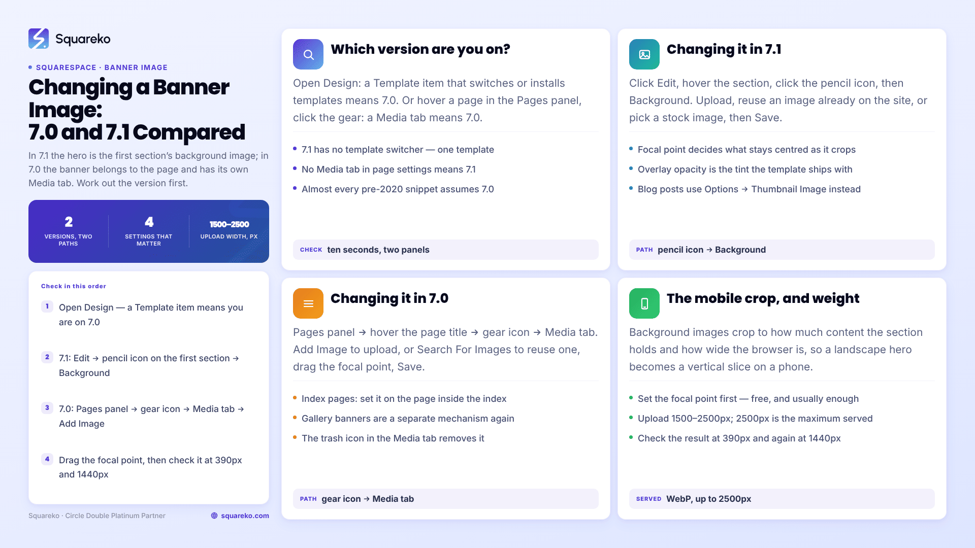
The short answer: It depends on your version, and the two are nothing alike. In Squarespace 7.1 there is no such thing as a banner — the hero is simply the first section's background image, changed with Edit → hover the section → pencil icon → Background. In Squarespace 7.0 the banner is a page-level setting: Pages panel → hover the page title → gear icon → Media tab.
If you follow a 7.0 tutorial on a 7.1 site you will hunt for a Media tab that does not exist. If you follow a 7.1 tutorial on a 7.0 site you will find no pencil icon on the banner. Work out which version you are on first — it takes ten seconds — then follow the matching half of this page.
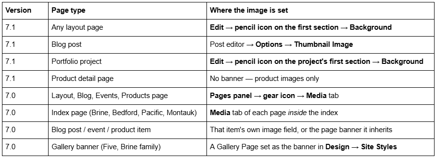
Where the banner image lives, by version and page type
Squarespace's own documentation lists banner support in 7.0 by template family — Adirondack, Bedford, Brine, Five, Montauk and Pacific all support page banners, and all six support video banners. Templates outside those families may have no banner concept at all, which is its own answer to "why is there no Media tab".
How to tell whether you are on Squarespace 7.0 or 7.1
Two reliable checks, either of which settles it in seconds.
Check the Design panel. Open Design. If there is a Template item that lets you switch or install templates, you are on Squarespace 7.0. Squarespace 7.1 has no template switcher, because every 7.1 site runs the same underlying template and the differences are style settings.
Check a page's settings. In the Pages panel, hover a page and click the gear icon. A Media tab means 7.0. No Media tab means 7.1.
This matters beyond banners. Almost every CSS snippet, class name and menu path written before 2020 assumes 7.0, and the two versions share very little markup. The version question comes up throughout how to customise a Squarespace template.
Changing a banner image in Squarespace 7.1
In Squarespace 7.1 the banner is a section background. Click Edit, hover the section, click the pencil icon, then click Background.
From the media source dropdown you can upload a new image, reuse an image already on the site, or pick a stock image or stock background. Replace the existing file, click Save, and the section updates.
Four settings in that same panel do most of the design work:
Focal point. Click and drag the circle on the image to set which part stays centred as the image crops. This is the single most useful control on the panel and the one most people never touch.
Overlay opacity. Sets the opacity of the colour overlay sitting on top of the background image. Turning it to zero removes the tint a template ships with; raising it is the fastest legitimate way to make white heading text readable over a busy photograph.
Background width — Full Bleed or Inset. Full Bleed runs edge to edge; Inset holds the image inside the site margin.
Section height. Pick a preset, or click … to set a custom height. This is the 7.1 answer to "how do I make my banner shorter", and it needs no CSS.
Squarespace 7.1 also offers image effects on section backgrounds: None, Liquid, Film grain, Parallax, Refracted circles and Refracted lines. Parallax is the one people arrive looking for. Use effects sparingly — they animate on scroll, which is exactly where a hero image is competing with your Largest Contentful Paint.
The same Background panel also takes video, so a video hero in Squarespace 7.1 is the same job with a different media source. Video backgrounds mute and loop automatically and fall back to a still frame on devices that block autoplay, which is why they should always be paired with an overlay dark enough to keep the heading readable against that still.
The section's colour theme controls the text colour over that image. If your heading disappears against a light photo, change the theme on that section rather than hard-coding a colour — the theme system is covered in how to change colours in a Squarespace template.
Blog post and portfolio banners in Squarespace 7.1
A Squarespace 7.1 blog post does not have a background image panel. Its banner is the post's thumbnail image, set in the post editor under Options → Thumbnail Image, and it has its own focal point.
Two Squarespace 7.1 behaviours worth knowing before you upload one. There is no alt-text field for a blog post's featured image — Squarespace uses the post title as its alt text, which is a decent argument for descriptive post titles. And filenames cannot be changed after upload, so name the file properly before it goes in.
Portfolio projects behave like layout pages: the first section of the project takes a background image through the same pencil → Background route.
Changing a banner image in Squarespace 7.0
In Squarespace 7.0 the banner belongs to the page, not to a section.
Open the Pages panel.
Hover the page title and click the gear icon.
Click the Media tab.
Click Add Image to upload from your computer, or Search For Images to reuse an image already on the site or add a stock image.
Drag the focal point circle to set the image's centre.
Click Save.
To remove a banner instead, hover the image in the Media tab and click the trash icon.
Index pages are the part that catches people. In Brine-family, Bedford, Pacific and Montauk templates, an index page is a container: the banner you see belongs to one of the pages inside the index, so you set it in that page's Media tab rather than on the index itself.
Gallery banners are a separate mechanism again in Five and some Brine-family templates, where a Gallery Page can be assigned as a rotating banner through Design → Site Styles. If your banner is a slideshow rather than a single image, that is what you are looking at, and swapping the image means editing that gallery.
All six banner-supporting families also accept video banners in the same Media tab, taking a YouTube or Vimeo URL rather than an uploaded file. That is worth knowing before you conclude a 7.0 banner cannot be changed: if the Media tab shows a video URL rather than an image, replacing the image does nothing until the video is removed.
Banner height in 7.0 is a template style tweak, not a page setting — it lives in Design → Site Styles, under a tweak whose name varies by family (Brine uses index and page banner height sliders). There is no universal path, which is one of the reasons 7.1 replaced the system.
Why the banner crops differently on mobile
Squarespace states it plainly for 7.1: "Background images crop automatically based on the amount of content in the section and the size of the visitor's browser screen." A wide landscape hero on a 1440px monitor becomes a narrow vertical slice of the same photo on a 390px phone, and whatever was interesting at the edges is gone.
Three fixes, in order of how often they are the right one.
1. Set the focal point. Free, instant, and enough perhaps three quarters of the time. Drag the focal point to the subject rather than the geometric centre. Then check the result at 390px and at 1440px, because a focal point that rescues the phone crop can push the subject uncomfortably far to one side on a wide monitor. The section's height setting interacts with this: a taller section on mobile shows more of the image's vertical range and often solves the crop on its own.
2. Override the crop on mobile with CSS. The focal point is applied as object-position, so you can change it at a breakpoint. Squarespace 7.1's mobile breakpoint is 767px:
/* Pull the mobile crop towards the top third of the image. Replace the ID with the section's own data-section-id. */
@media screen and (max-width: 767px) {
  [data-section-id="YOUR-SECTION-ID"] .section-background img {
    object-position: 50% 25% !important;
  }
}
3. Use a genuinely different image on mobile. Landscape and portrait crops of the same photograph are different photographs. The reliable route in Squarespace 7.1 is to duplicate the section, put the portrait image on the copy, and show one per breakpoint — the technique in how to hide a section on mobile in Squarespace. It costs one duplicated section and it never fights the platform.
The CSS-only alternative works but is more fragile, because it replaces the served <img> with a background image and loses the responsive srcset:
@media screen and (max-width: 767px) {
  [data-section-id="YOUR-SECTION-ID"] .section-background img { display: none; }
  [data-section-id="YOUR-SECTION-ID"] .section-background {
    background-image: url('YOUR-IMAGE-URL?format=1000w');
    background-size: cover;
    background-position: center;
  }
}
Get the image URL by right-clicking the uploaded image in the site and copying its address; the ?format=1000w parameter tells the Squarespace CDN which width to serve.
Banner image size, weight and legibility
Upload between 1500px and 2500px wide. Squarespace serves a maximum of 2500px, so a 4000px export is discarded bandwidth on upload and nothing on the page. Landscape orientation, no text baked into the file, and no borders — text in the image file cannot be read by search engines and will be cropped off on mobile.
Format barely matters on upload, because the Squarespace CDN converts and serves WebP unconditionally regardless of the source file or the browser's Accept header. Across 54 Squareko-built sites measured in August 2026 (Playwright/Chromium lab test, unthrottled, single run per site), a median of 86% of images were served as WebP, and 16 sites hit 100%.
Weight still matters, because the banner is almost always the Largest Contentful Paint element on the page. In that same lab measurement, the median mobile LCP was 2.01s and the median page weighed 3.0 MB across 93 requests — and the pages that missed Google's 2.5s threshold were, with few exceptions, the ones leading with an oversized hero. A 2000px JPEG at reasonable quality is the right target; a 2500px PNG of a photograph is not.
For legibility over a photograph, use overlay opacity first. Where you need a gradient rather than a flat tint — dark at the top for the navigation, clear at the bottom — one rule does it:
/* Gradient scrim over one section's background image */
[data-section-id="YOUR-SECTION-ID"] .section-background::after {
  content: " ";
  position: absolute;
  inset: 0;
  background: linear-gradient(
    to bottom,
    rgba(0, 0, 0, 0.55) 0%,
    rgba(0, 0, 0, 0.10) 60%,
    rgba(0, 0, 0, 0.35) 100%
  );
  pointer-events: none;
}
Paste it into Website → Website Tools → Custom CSS, which is available on every Squarespace plan, and check it logged out. More snippets of this kind are in Squarespace template CSS: 30 snippets.
Where this stops
Changing a Squarespace banner image is a two-minute job once you know which version you are on: pencil → Background in 7.1, gear → Media in 7.0. Focal point, overlay opacity and section height cover almost everything after that, and one media query handles the mobile crop.
Where it gets genuinely awkward is a 7.0 site with index-page banners, gallery banners and template tweaks all doing different things on different pages — usually a site that has been edited by four people over eight years. Untangling that is archaeology rather than design, and it is the most common banner job we are actually sent. That is what our Squarespace website support plans are for. On a 7.1 site, though, the panel does the whole job, so open the section editor first.
FAQ
-
There is no banner in Squarespace 7.1 — the hero is a section background. Click Edit, hover the first section, click the pencil icon, then click Background. Choose a new image from the media source dropdown, set the focal point, adjust overlay opacity, then save.
-
Only in Squarespace 7.0. Open the Pages panel, hover a page title, click the gear icon, and the Media tab sits alongside the other page settings. If there is no Media tab, the site is on Squarespace 7.1 and the image is set on the section instead.
-
Because background images crop automatically based on how much content the section holds and the width of the visitor's browser. Set the image's focal point first. If that is not enough, override object-position inside a max-width: 767px media query, or duplicate the section with a portrait image.
-
Yes. The reliable method in Squarespace 7.1 is to duplicate the section, set a portrait image on the copy, and show one section per breakpoint using the 767px mobile breakpoint. A CSS-only swap works too but replaces the responsive image with a background image.
-
Between 1500px and 2500px wide, landscape, with no text or borders baked into the file. Squarespace serves a maximum of 2500px, so larger uploads gain nothing. Filenames cannot be changed after upload, so name the file before uploading it.
-
Raise the Overlay Opacity slider in the section's Background panel — it controls the colour overlay over the image. For a gradient rather than a flat tint, add a ::after pseudo-element with a linear-gradient on that section's .section-background in Custom CSS.

Author Bio
I'm Walid Hasan, a Certified Squarespace Expert and Squarespace Circle Platinum Partner with over 12 years of hands-on experience designing and optimizing high-performing websites. Over the years, I've had the privilege of building more than 2,000 Squarespace websites for clients around the world, always focusing on clean design, strong user experience, and conversion-driven results.