Squarespace Templates for Educators
The short answer: An educator's website is a professional personal site, not a school site and not a course sales page. Before you choose a template, decide which of four jobs it does — being found, being booked to speak, distributing resources, or winning consulting work — because each produces a different page structure. Get that wrong and no template will rescue it.
Almost everything written about Squarespace templates for educators is actually written for institutions or for course sellers. If you run a school, that is a different guide — see Squarespace templates for schools and learning centres. If your main product is a paid course, start with Squarespace templates for course creators. This page is for the individual: the classroom teacher with a body of work, the lecturer, the curriculum designer, the literacy specialist, the education consultant.
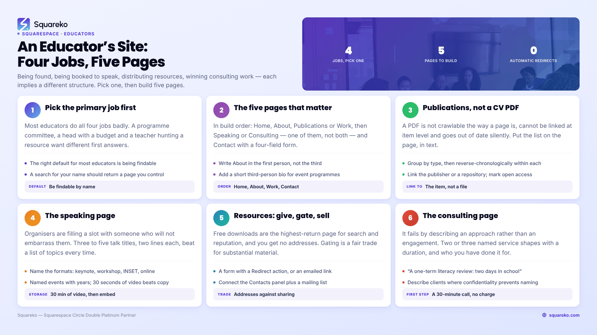
Four jobs an educator's site can do, and the structure each implies
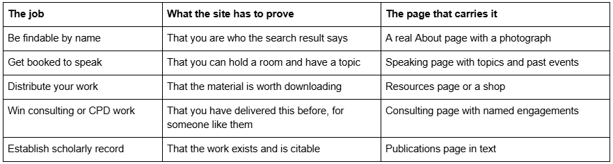
Decide what the site is for before you look at a single template
Most educators build a site that does all four jobs badly. The homepage tries to introduce a person, sell a workshop, promote a book and offer free downloads, and a visitor cannot tell within five seconds what they are supposed to do.
Pick a primary job and let the others be secondary. The test is who you want to arrive: a conference programme committee, a head teacher with a budget, a teacher looking for a lesson resource, or a journalist checking whether you are real. Those are four different visitors with four different first questions, and the homepage should answer one of them properly rather than all four partially.
The default, and the right default for most educators, is being findable. A search for your name should return a page you control, showing what you do, what you have written, and how to contact you. Everything else can be added later. That version of the site is four pages and a weekend.
The five pages an educator's site actually needs
In order of build priority:
Home. One sentence saying who you are and what you work on, a photograph, and three links to the pages below. Not a manifesto.
About. Your position, your institution or independent status, your qualifications with years, and your areas of work. Write it in the first person; third-person bios read as though someone else wrote them, which on a personal site is odd rather than authoritative. Include a short third-person version at the bottom for event programmes to copy — organisers will ask for it and you will save yourself twenty emails a year.
Publications or Work. Covered below. This is the page that makes an educator's site worth having.
Speaking or Consulting, depending on which of those you want more of. Build one, not both, until you have demand for both.
Contact. A form with four fields and, if you take enquiries from institutions, a line about how quickly you respond.
A blog is the sixth page and it is optional. It is worth having only if you will write in it — an education blog with three posts from 2024 does more harm than no blog. If you do write, note that Squarespace 7.1 blog pagination is cursor-based, capped at 20 posts per page, with no numbered pages, which is fine for the volume an individual educator produces.
Publications belong on a page, not in a PDF
The single most common mistake on educator and academic sites is linking a CV PDF and calling it a publications list.
A PDF is not crawlable in the way a page is, it cannot be linked to at the item level, it goes out of date silently, and nobody reads it on a phone. Put the list on the page, in text.
A workable structure for a Squarespace 7.1 page:
Group by type, then reverse-chronologically within each group. Books, then peer-reviewed articles, then chapters, then reports, then popular writing. An educator without peer-reviewed work should group by "Books", "Articles and essays", "Curriculum and resources" instead — the principle is the same.
One line per item, in a consistent citation format, with a DOI or a link where one exists. Link to the publisher's page or a repository copy, not to a file on your own site, unless you hold the rights.
Mark what is open access. It is the detail people actually scan for.
Add a one-line plain-English gloss under the three or four items you most want read. This is what separates an educator's site from a bare CV. "This is the paper on retrieval practice in mixed-attainment classes that the 2024 guidance drew on" is more useful than a citation.
Use plain text blocks and an Accordion block if the list is long — Accordion blocks in 7.1 render server-side, so the text inside them is crawlable, which is not true of every collapsible pattern people paste in as code.
Keep the CV PDF as well, linked from the About page, for the situations that genuinely require one. Just do not make it the only route to the list.
The speaking page: write it for the person booking, not for yourself
Conference organisers and CPD leads are doing a specific job: filling a slot with someone who will not embarrass them. A speaking page that helps them do that gets you booked.
What belongs on it, in order:
Three to five talk titles with a two-line description each. Not topics — titles. "What retrieval practice actually looks like in a mixed-attainment classroom" is bookable; "assessment" is not.
The formats you deliver. Keynote, half-day workshop, twilight session, staff INSET day, online. Say which.
Where you have spoken. Named events with years. Five real ones beat a vague claim about "schools across the country".
Video, if you have any. Thirty seconds of you in front of a room does more than any amount of copy. Squarespace includes 30 minutes of video storage across a site; beyond that, embed from YouTube or Vimeo rather than uploading.
A downloadable speaker pack. Headshot at high resolution, third-person bio at two lengths, talk titles. Organisers ask for exactly this every time.
The enquiry route. A form, not just an email address, so you capture the date and the audience in the first message.
What to leave off: fees, in most cases. Speaking fees vary too much by sector and budget to publish usefully, and an unqualified number loses you the engagements at both ends of the range. This is the opposite of the advice for tutors, where publishing a rate helps — see Squarespace templates for tutors and test-prep businesses for that case.
Resources: give them away, sell them, or gate them
Educators accumulate material — schemes of work, slide decks, assessment rubrics, reading lists — and there are three defensible things to do with it.
Give it away openly. A resources page of free downloads is the highest-return page an educator can build for search visibility and for reputation. Teachers share links to things that helped them, and links are the currency. The cost is that you get no email addresses.
Gate it behind a form. A Squarespace form block with a Redirect post-submit action pointing at the download, or an email-delivered link. Connect the Contacts panel plus a mailing list as storage destinations so the addresses are usable in Email Campaigns later. This is a fair trade if the resource is substantial. It is a poor trade for a two-page PDF, and it costs you the sharing.
Sell it. Squarespace 7.1 supports digital products, and several templates in the premium market include a Shop page ready for it. Worth being clear-eyed: an educator selling resources on their own site is competing with marketplaces that have the audience already. The reason to sell from your own site is margin and list ownership, not discovery. Most educators are better off giving material away from their own site and selling on a marketplace, then using the site to convert marketplace buyers into consulting enquiries.
If what you actually want to build is a structured, paid programme rather than a resource library, that is a course, and Squarespace 7.1 Course pages handle it natively — chapters and lessons, up to 250 lessons per course, a "Complete and continue" progression button, and access sold through pricing plans. Our guide to Squarespace templates for online courses covers the sales-page structure that goes in front of it.
The consulting page is the one that gets paid
An education consultant's site fails in a predictable way: it describes an approach rather than an engagement.
A head teacher or a trust lead reading your consulting page wants to know three things — what you would actually do, over what period, and who else you have done it for. Give them:
Two or three named service shapes with a duration. "A one-term literacy review: two days in school, a written report, and a twilight session with the department." Not "bespoke support tailored to your setting."
Named clients or, where confidentiality prevents it, described ones. "A three-form-entry primary in the North West, 2025" is credible and anonymous.
One short case study. The situation, what you did, what changed, with a number if you have one you can defend.
How the first conversation works. "A 30-minute call, no charge, to work out whether this is the right fit" removes the friction that stops institutional buyers enquiring.
The trap to avoid is publishing day rates without context. Institutional budgets vary enormously and the same two days of work is a bargain to one trust and impossible for another. A rate on the page turns a conversation into a filter before you have had a chance to scope the work.
Which template features matter for an educator
Squarespace 7.1 templates share the same block library and the same Site Styles system, so judge on page structure and on how the design behaves with a lot of text and not much photography. An educator's site is text-heavy by nature, and gallery-led templates fall apart without images.
Look for: an About page designed for one person rather than a team; a page structure that can absorb a long list without looking empty or cramped; a text-led testimonial or credentials layout; a blog; and, if you plan to sell anything, a Shop page.
Be wary of: templates built around a full-bleed photographic hero on every page, and anything so visually distinctive that it reads as a brand rather than a person.
In the Squareko range, Scholar is the closest structural fit — 11 pages tagged Fashion, Course and Shop, with a Portfolio, Gallery and Shop, which covers the publications-plus-resources shape. You can inspect it at the Scholar demo. Luminary is the alternative where courses are the point: 11 pages with a Courses page, Portfolio and Shop, at the Luminary demo. Neither is marketed at educators, which matters less than it sounds — a template labelled "for educators" at any shop is a category tag, not a different product.
Outside the Squareko range, Studio Mesa's Learnable is built specifically around course structure and is worth looking at if that is your direction, and Big Cat Creative and Applet Studio both carry personal-brand templates that adapt well. Squarespace's own free 7.1 templates are entirely adequate for a four-page findability site.
Keeping it current is most of the work
An educator's site is judged on freshness more than design. A speaking page whose most recent event is from two years ago actively costs you bookings, because a programme committee reads it as someone who has stopped being asked.
Build the maintenance in: add each publication when it appears rather than in an annual sweep; add each talk to the speaking page the week it is confirmed, not after it happens; and delete rather than archive anything that has aged badly. Note that changing a Squarespace blog post's URL slug creates no automatic redirect, ever — so if you rename a resource page after it has been shared, the old link breaks permanently unless you add the redirect yourself.
Where to start
Build four pages this weekend — Home, About, Publications, Contact — and put your name in the site title. That version outperforms an unfinished eight-page site indefinitely, and it is the version that shows up when someone searches your name before a meeting.
Bringing in help makes sense in one specific case: when you have an existing body of work scattered across an institutional profile, a repository, a Substack and an old site, and the job is consolidating it into one structure with the redirects handled properly. That is a migration problem rather than a design problem, and it is the kind of thing that goes wrong quietly if the URLs are not planned first.
Squareko's templates are $249, 9 to 15 pages depending on the template, delivered as a Squarespace contributor invitation rather than a file download, each with a Style Guide page and 60 days of email support. Installation onto an existing site is a paid add-on and takes around 48 hours. The range, including Scholar, is on the premium Squarespace templates page — and as at every shop, every demo image needs replacing before launch, because demo images are licensed to the shop's demo and never to the buyer.
FAQ
-
Five pages: a home page with one clear sentence about your work, an About page written in the first person with a third-person bio at the bottom for event programmes, a publications or work page in text, either a Speaking or a Consulting page, and a contact form. A blog only if you will actually write in it.
-
On a page, in text — not as a linked CV PDF. Group by type, reverse-chronologically within each group, one line per item in a consistent citation format with a DOI or publisher link. Mark open-access items, and add a plain-English gloss under the three or four you most want read.
-
Usually not. Institutional budgets vary too widely, and a published rate filters buyers before you have scoped the work. Publish named service shapes with durations instead — "a one-term literacy review: two days in school, a written report and a twilight session" — plus a free 30-minute scoping call.
-
Yes, Squarespace 7.1 supports digital products and many premium templates include a Shop page. Be realistic about discovery: your own site has no built-in audience. Most educators do better giving material away from their site, selling on a marketplace, and using the site to convert buyers into consulting enquiries.
-
No. Squarespace 7.1 templates share the same block library and Site Styles system, so structure matters more than the category label. Look for an About page built for one person, a layout that handles long text lists well, a blog, and a Shop page if you intend to sell. Avoid gallery-led templates that need photography you do not have.
-
Letting it go stale. A speaking page whose latest event is two years old reads as someone who has stopped being invited. Add publications and confirmed talks as they happen. Also note that changing a Squarespace page or post slug creates no automatic redirect, so renaming a shared resource page breaks the old link permanently.

Author Bio
I'm Walid Hasan, a Certified Squarespace Expert and Squarespace Circle Platinum Partner with over 12 years of hands-on experience designing and optimizing high-performing websites. Over the years, I've had the privilege of building more than 2,000 Squarespace websites for clients around the world, always focusing on clean design, strong user experience, and conversion-driven results.