Kid-Friendly Squarespace Templates for Family Businesses
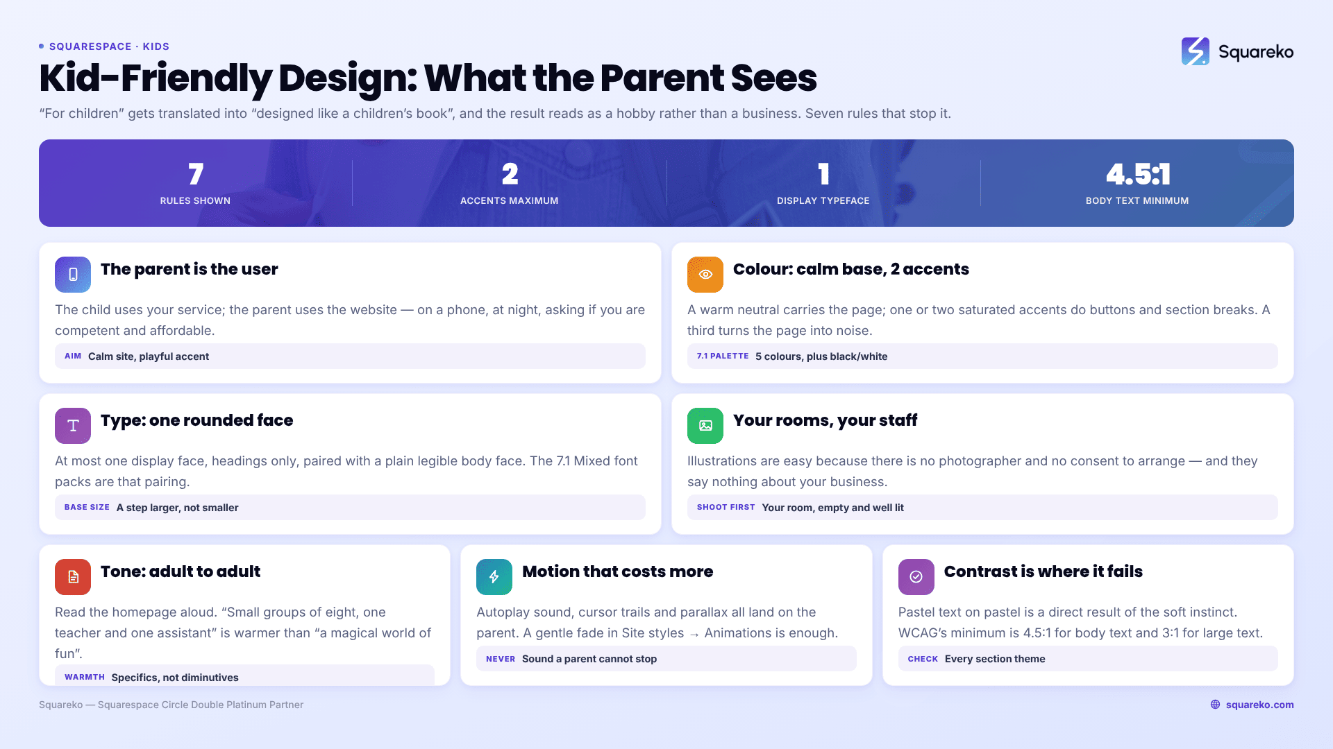
The short answer: The person reading a children's business website is a parent, not a child, and almost every kid-friendly design failure comes from forgetting that. The site needs to feel warm and safe to an adult making a spending decision on a phone. That means a calm base palette with bright accents rather than a full rainbow, one rounded typeface at most, photographs of your actual space, and copy written adult to adult.
This applies well beyond childcare. Party venues, soft-play centres, kids' classes and clubs, paediatric dentists and physiotherapists, children's retail, tutoring for younger years, holiday camps — all of them face the same problem, which is that "for children" gets translated into "designed like a children's book" and the result reads as a hobby rather than a business.
Here are the five dimensions that decide it, and the rule for each.
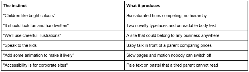
Where kid-friendly websites go wrong
The audience is the parent, and the parent is on a phone
Start here because it determines everything below.
The child is the user of your service. The parent is the user of your website. They are researching in the evening, on a phone, with limited patience, and they are trying to answer three questions: is this safe, is this competent, and can I afford it. Nothing about a rainbow gradient answers any of those.
The practical consequence is that a children's business website should look like a calm, warm, professional site with a playful accent — not a playful site with professional information buried in it. Warmth signals that you like children. Competence signals that you can be trusted with them. Sites that pursue only the first read as well-meaning and unqualified.
A useful sanity check before you touch anything: open your site on a phone, scroll to the point where the price or the enquiry form appears, and count the seconds. If a parent cannot get to "what does it cost and how do I book" in under fifteen seconds of scrolling, the design is serving the wrong audience.
Colour: a calm base, one or two bright accents
The strongest children's brands are not the most colourful ones. They are the ones that use a restricted palette confidently.
The pattern that works: a warm neutral base — cream, sand, soft grey, warm off-white — carrying most of the page, with one or two saturated accents used only for buttons, small shapes and section breaks. Two accents maximum. A third turns the page into noise and removes the hierarchy that tells a parent where to click.
Squarespace 7.1 makes this straightforward if you use the system rather than fighting it. Open Site styles → Colors. A 7.1 palette holds five colours plus black and white, and those colours feed a set of section colour themes — Lightest, Light, Bright, Dark and Darkest, each in a 1 and 2 variant — which you apply per section from the section editor's Colors tab. The discipline that keeps a kid-friendly site coherent is to build the whole page from the light themes and use a Bright theme for two or three sections at most: the primary call to action, and perhaps one band that breaks up a long page.
Colour choices that consistently work for children's businesses:
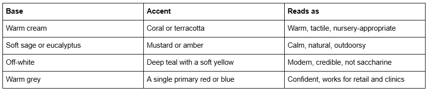
Choices to avoid: primary red, yellow and blue used together at full saturation, which is the visual shorthand for "generic children's clip art"; pastel-on-pastel, which fails contrast; and rainbow gradients, which date badly and make every button look equally important.
Typography: one rounded typeface, and only in the headings
Rounded typefaces are a legitimate tool. Novelty typefaces are not, and the line between them is where most children's websites fall over.
The rule: at most one distinctive display face, used only for headings, paired with a straightforward, highly legible face for body text. Squarespace 7.1's font packs come in Sans-serif, Serif and Mixed groups, and the Mixed packs are exactly this pairing. Open Site styles → Fonts, click Switch to browse packs, then use Assign Styles to adjust individual text groups such as Title or Button.
Three things that matter more than the typeface you pick:
Base Size. Squarespace 7.1 scales all text relative to a Base Size slider you set after choosing a font pack. Children's businesses skew towards parents reading quickly on phones, so err a step larger than the default rather than smaller.
Heading scale. Within the Fonts panel, Headings have individual sliders for Heading 1 through Heading 4. Set a real step between H1 and H2. Playful design without hierarchy is the fastest route to looking amateur.
Line length. A paragraph running the full width of a desktop screen is unreadable regardless of typeface. Keep body text columns narrow.
What to avoid: script and handwriting faces in body text; two display faces on the same page; all-caps headings in a rounded face, which loses the roundness that made you choose it; and Comic Sans, which is a genuinely well-designed typeface for its purpose and still signals "made by someone who was not thinking about it" to every parent who sees it.
Imagery: your actual space, your actual staff
This is the dimension with the largest gap between what shops sell and what works.
Templates in this category ship with cheerful vector illustrations, and illustrations are attractive because they are easy — no photographer, no consent forms, no bad lighting. They are also the reason so many children's websites are interchangeable. An illustration of a smiling cartoon child says nothing about your business. A photograph of your actual room, your actual equipment and your actual staff answers the "is this safe and competent" question in one glance.
The order of preference, for any children's business:
Photographs of your premises, empty and well lit. Nobody talks about this and it is the highest-return photography you can commission. A parent wants to see the room.
Photographs of your staff, named, looking at the camera. The single most trust-building element on a children's business website. Applet Studio's childcare case study makes exactly this point — the team section pairs each caregiver's photo, name and qualifications, and it does more work than any hero image.
Photographs of activity, with consent. Children in your space, with written parental consent per child, kept current and with a documented removal process. If consent is difficult, shoot hands and materials rather than faces — a close-up of paint, blocks or a craft table carries the same warmth without the problem.
Illustration as accent only. Small decorative marks, section dividers, icons. Not the primary imagery.
Whatever you use, remember that demo images in any premium template — from any shop — are licensed to the shop for its demo, not to you. Every one must be replaced before launch. Upload replacements at 1500-2500px wide; 2500px is the maximum Squarespace serves, and filenames cannot be changed after upload, so name them properly first.
Tone: write to the parent, adult to adult
Read your homepage aloud. If it sounds like you are talking to a four-year-old, rewrite it.
Baby talk on a children's business website is not charming to a parent; it reads as a business that has not thought about who is paying. Warmth comes from specificity, not from diminutives.
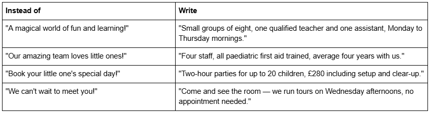
Notice that the right-hand column is warmer, not colder. Numbers and specifics are reassuring. Exclamation marks are not.
One structural point: put the practical information — ages served, hours, location, price, how to book — where a parent can find it without navigating. On a phone that means within the first two or three sections of the homepage, not on a separate page reachable only from a hamburger menu.
Motion and "fun" features that cost more than they add
Autoplay video with sound, bouncing elements, cursor trails, background music, and full-screen parallax are the features people add when they want a site to feel lively. Each of them has a cost that lands on the parent.
Motion has a real place — a gentle fade as sections come into view is fine and Squarespace 7.1 handles it natively in Site styles → Animations. What does not have a place is anything the visitor cannot escape, anything that delays the first meaningful paint, and anything that plays sound unprompted while a parent is browsing next to a sleeping child.
Weight matters too. Across 54 Squareko-built client sites measured in August 2026 — Playwright and Chromium, single run, cloud datacentre, unthrottled, load-only CLS, so lab data rather than field data — the median page weight was 3.0 MB across 93 requests, and median mobile LCP was 2.01 seconds with 74% under Google's 2.5-second "good" threshold. Sites in this category tend to be image-heavy by nature. Adding decorative video on top is where a children's site starts losing the parent who gave it four seconds.
Playful and accessible are not opposites
The most common accessibility failure in children's website design is pastel text on a pastel background, and it is a direct consequence of the "soft and gentle" instinct.
The standard to hold yourself to is WCAG's contrast minimum: 4.5:1 for normal body text, and 3:1 for large text — 18pt, or 14pt bold, and above. A soft yellow heading on cream will not come close. Check every colour theme you use, not just the default one, because Squarespace 7.1 applies themes per section and a combination that passes in a Light section can fail in a Bright one.
Three more that matter for this audience specifically:
Tap targets. Parents are frequently one-handed. Buttons need to be large and well spaced.
Text over images. A hero photograph with a headline over it is the most common failure point. Use a colour overlay, not a hope.
Alt text. Every image needs it. Note that Squarespace blog featured images have no alt-text field at all — the post title is used instead — which is worth knowing if you run a blog.
Which templates take a kid-friendly treatment well
Because Squarespace 7.1 templates share the same block library and the same Site Styles system, almost any template can be recoloured into a children's business site. What differs is the page structure and how much the design depends on photography you may not have.
In the Squareko range, Kiddo is the one built for this: 12 pages tagged Kids, Education and Childcare, with a Pricing page, a Gallery, a Blog and two legal pages. Its live demo is currently unavailable, so judge it on the page list rather than a walkthrough. If you want to see how a light, warm palette behaves on a real Squarespace 7.1 build before committing, the Relief demo and the Harmony demo are both worth opening — neither is a children's template, and that is precisely the point. A calm, well-spaced layout plus your palette and your photographs is what most family businesses actually need.
If you want a template explicitly marketed for this niche, Big Cat Creative, Applet Studio and the smaller Etsy shops all carry them, and Squarespace's own free 7.1 templates will take a kid-friendly palette perfectly well. Nobody's template will fix the four dimensions above for you.
The five-minute test
Open your site on a phone. Turn the brightness down to about a third, the way it is at nine in the evening. Can you read every heading and every paragraph? Can you find the price, the ages served and the way to enquire without opening the menu? Does the imagery show your actual space? Does any sentence sound like it is addressed to a child rather than to you?
If all four pass, the site is doing its job, and no template change will improve it much.
Where it is worth bringing someone in is the rebrand case — you have a palette and a logo, the site was built by someone else around different colours, and every section theme now fights the brand. Rebuilding a colour system across a 12-page Squarespace site is a couple of hours for someone who knows the theme structure and a frustrating weekend otherwise.
Squareko's templates are $249, 9 to 15 pages depending on the template, delivered as a Squarespace contributor invitation rather than a file download, each with a Style Guide page that documents exactly this kind of colour and type system so it stays consistent after handover. The range is on the premium Squarespace templates page. For the childcare-specific version of this — enrolment forms, waitlists and enquiry routing — see our guide to childcare Squarespace website templates.
FAQ
-
A warm neutral base — cream, sand, soft grey — carrying most of the page, with one or two saturated accents used only for buttons and section breaks. Two accents maximum. Full-saturation primary red, yellow and blue together read as generic clip art, and pastel on pastel fails contrast.
-
One distinctive rounded or display face in the headings only, paired with a highly legible face for body text. Squarespace 7.1's Mixed font packs are built as exactly this pairing. Avoid script faces in body copy, two display faces on one page, and all-caps headings in a rounded typeface.
-
Photographs, with illustration as accent only. A photograph of your actual room and named staff answers the safety and competence questions a parent is asking; a cartoon child does not. Where consent for photographing children is difficult, shoot hands, materials and the empty space instead of faces.
-
Restrict the palette, keep one display typeface, use real photography, write to the parent rather than the child, and hold text to WCAG's 4.5:1 contrast minimum. Warmth comes from specific detail — group sizes, staff qualifications, actual prices — not from exclamation marks.
-
WCAG sets a minimum of 4.5:1 for normal body text and 3:1 for large text, meaning 18pt or 14pt bold and above. Check every Squarespace colour theme you use, not only the default, because 7.1 applies themes per section and a pairing that passes in a Light section can fail in a Bright one.
-
No. Squarespace 7.1 templates share the same block library and Site Styles system, so any template can be recoloured. What differs is page structure — whether it includes a pricing page, a gallery and enough inner pages — and how heavily the design leans on photography you may not have yet.

Author Bio
I'm Walid Hasan, a Certified Squarespace Expert and Squarespace Circle Platinum Partner with over 12 years of hands-on experience designing and optimizing high-performing websites. Over the years, I've had the privilege of building more than 2,000 Squarespace websites for clients around the world, always focusing on clean design, strong user experience, and conversion-driven results.