Fluid Engine vs Classic Editor: Which Should You Use?
Use Fluid Engine. It is the default editor in Squarespace 7.1, it does everything the classic editor does apart from four specific image and text-wrap layouts, and it adds a separate mobile layout, overlapping blocks and free positioning on a 24-column grid. Keep classic editor sections only where you need one of those missing layouts, or where you have working custom CSS written against classic markup that you would rather not rewrite.
That is the verdict. The rest of this page is the specification behind it — what each editor can and cannot do, side by side, so you can check your own case rather than take the summary on trust.
If what you actually want is a recommendation for your particular site and skill level rather than a feature list, that's the job of classic editor or Fluid Engine: which is better for your site.
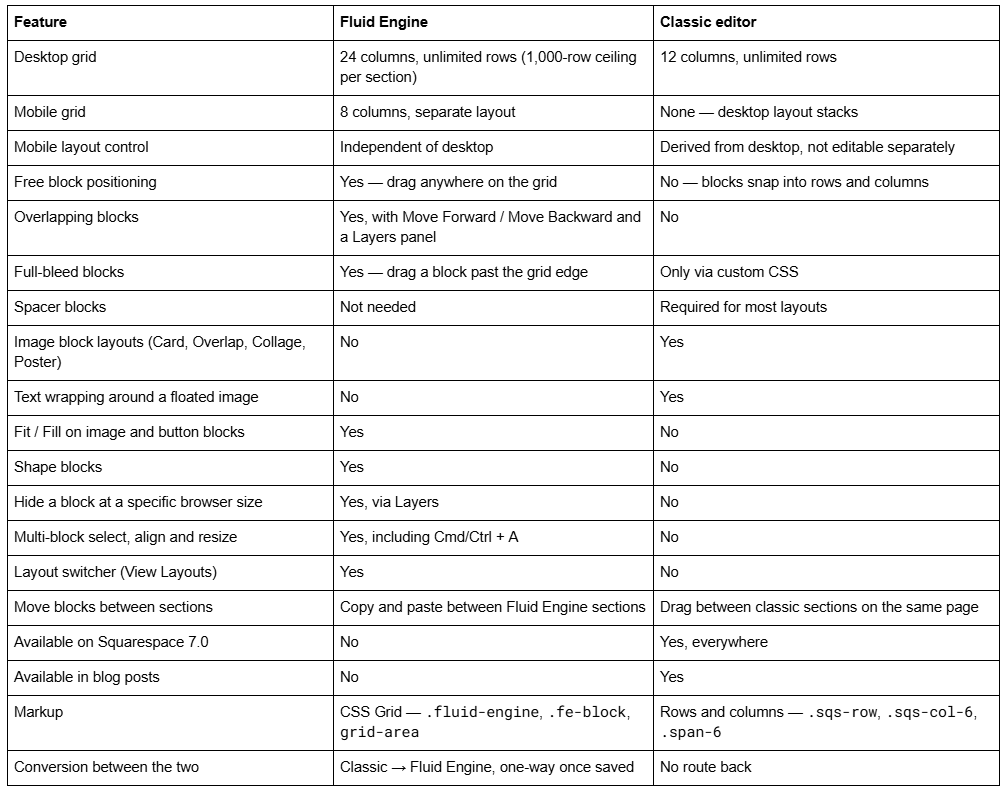
The master comparison table
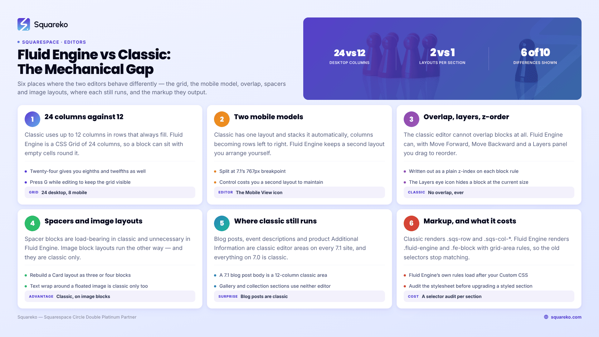
Grid: 24 columns vs 12 columns
The Squarespace classic editor uses an invisible grid of up to 12 columns and unlimited rows. Blocks sit inside rows; when you drop a block beside another one, the two share the row and resize relative to each other. You cannot leave a gap — the row always fills.
Squarespace Fluid Engine uses a real CSS Grid of 24 columns on desktop and 8 on mobile, with a flexible gutter column at each edge. Blocks store their own start and end coordinates, so a block can sit anywhere on the grid with empty cells around it. Press G while editing to keep the grid visible.
The doubled column count matters more than it sounds. Twelve columns gives you halves, thirds, quarters and sixths. Twenty-four gives you eighths and twelfths as well, which is the difference between "roughly a third" and a layout that lines up with the one above it.
Mobile: separate layout vs automatic stacking
This is the largest single behavioural difference between Fluid Engine and the classic editor.
Classic editor. There is one layout. Squarespace stacks it for mobile automatically: columns become rows, left to right. Spacer blocks are hidden on mobile on all 7.1 sites and most 7.0 sites. You influence the stacking order by how you group blocks when you place them, but you cannot edit the mobile layout directly.
Fluid Engine. There are two layouts per section, split at Squarespace 7.1's 767px breakpoint. Click the Mobile View icon while editing to switch to the mobile grid and arrange it independently. Moving or resizing a block in one view does not touch the other. Editing block content — text, links, images — changes both.
Neither model is strictly better. Fluid Engine gives you control and hands you a second layout to maintain; the classic editor gives you no control and nothing to maintain. On a section that is a simple vertical stack of full-width blocks, automatic stacking is genuinely the better outcome. On anything with columns, image overlays or asymmetry, Fluid Engine's separate mobile layout is the only way to get a sane phone result.
The full breakpoint behaviour is covered in Fluid Engine mobile editing.
Overlap, layers and z-order
The Squarespace classic editor cannot overlap blocks. Every block occupies its own space in a row.
Fluid Engine can. Drag a text block on top of an image block and both render, with the block toolbar exposing Move Forward and Move Backward to set which is on top. The Layers icon in the top-left corner of a Fluid Engine section opens the full stack as a list you can drag to reorder — faster than clicking Move Forward six times when a section has a dozen blocks.
Fluid Engine writes the result as a plain z-index on each block's grid rule, so the stacking order is visible in the page source if you ever need to debug it.
Layers has a second job: click the eye icon beside a block to hide it at the browser size you are currently editing at. That is the supported way to serve a shorter headline to phones. The classic editor has no equivalent.
Spacer blocks and image layouts
Spacer blocks. In the Squarespace classic editor, spacer blocks are load-bearing. They are how you centre a block, how you set a column width, and how you stop two text blocks merging into one. In Fluid Engine they are unnecessary — you position and size blocks directly on the grid — and most Fluid Engine builds contain none.
Image block layouts. This runs the other way, and it is the classic editor's clearest remaining advantage. The classic editor offers Inline, Poster, Card, Overlap and Collage layouts on image blocks: preset arrangements of image, caption and text in a single block. Squarespace's documentation is explicit that image blocks added to Fluid Engine sections have no built-in layout options, and suggests recreating the effect by overlapping an image block with text and button blocks. That works, but it is three or four blocks to position instead of one, and you position them twice — once for desktop and once for mobile.
Text wrapping. Floating an image inside a text block so the copy wraps around it is a classic editor behaviour with no Fluid Engine equivalent.
Fit and Fill. Fluid Engine adds a Design-tab control on image and button blocks: Fill stretches the content to the block's edges, Fit keeps padding around it and exposes alignment controls. Image blocks default to Fit, button blocks default to Fill. The classic editor has neither.
Shape blocks. Solid colour shapes, no image upload. Fluid Engine only.
Editing controls each editor gives you
The two editors differ in what you can do while a page is open, not just in what the output looks like.
Fluid Engine only:
Multi-block selection. Drag across the section background to highlight several blocks, or press Cmd/Ctrl + A to select every block in the section. Then move, resize or Align Group the whole set at once.
Symmetric resize. Hold Cmd/Ctrl while dragging a resize handle and the block grows from both sides.
Grid toggle. Press G to pin the grid on.
Size-match indicators. Yellow guides appear when a block matches the width, height or both of another block in the section, and a yellow vertical line marks the exact horizontal centre.
View Layouts. Hover a section and click View Layouts to see alternative arrangements of the same blocks. One click applies it; undo reverts.
Row Count and Gap. In Edit Section → Design, Row Count sets the grid height — the only section style that can differ between desktop and mobile — and Gap sets the padding between blocks, with custom vertical and horizontal values behind the ... menu.
Classic editor only:
Cropping handles. Inline and poster image blocks, carousel galleries, map blocks, SoundCloud blocks and spacer blocks all have a drag handle to change height. Hold Shift while dragging to move in 20-pixel increments; double-click the handle to undo the crop.
Section Height, Content Width and Content Alignment in section styles, rather than Fluid Engine's Row Count and Fill Screen.
Two constraints apply to both, and catch people out in Fluid Engine more often. Squarespace's stated minimum editing window is 1280 × 768 — below that, block handles crowd and the grid preview compresses. And if a Fluid Engine block refuses to resize, check the Page Width (Max) site style: a low value limits how wide a block can become.
Which Squarespace 7.1 areas still use the classic editor
Fluid Engine is not everywhere, and this table answers the question most comparison posts skip.
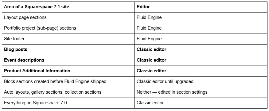
Blog posts are the one that surprises people. A Squarespace 7.1 blog post body is a classic editor content area — 12-column grid, spacer blocks, automatic mobile stacking, no overlap, no separate mobile layout. If you have been trying to drag a block into position inside a post and it keeps snapping into a row, that is why.
You can still add new classic editor sections deliberately on a layout page: Edit → Add Section → + Add Blank → Classic Editor. For pre-built classic layouts, scroll to the bottom of the section menu and click Made with Classic Editor.
Markup and custom CSS
If you write CSS, this is the section that decides how much work a conversion costs you.
Classic editor markup is rows and columns:
<div class="row sqs-row">
<div class="col sqs-col-6 span-6"> ... </div>
<div class="col sqs-col-6 span-6"> ... </div>
</div>
Fluid Engine markup is CSS Grid:
<div class="fluid-engine fe-678617c7cf28ed1a1e1e1524">
<div class="fe-block fe-block-yui_3_17_2_1_1736862061587_601121"> ... </div>
</div>
with block positions emitted as grid-area rules in a <style> block inside the section, and a @media (min-width: 768px) variant for the desktop layout.
Three consequences:
Any classic-editor CSS keyed to .sqs-row, .sqs-col-* or .span-* stops matching the moment a section is upgraded. Those elements no longer exist in a Fluid Engine section.
Fluid Engine's own rules load after your Custom CSS. Your Custom CSS panel is a linked stylesheet in the <head>; Fluid Engine's block rules sit in the <body>. At equal specificity, the later rule wins, so !important is usually required to reposition a Fluid Engine block.
Section height and content padding are literal inline styles on the section wrapper (style="min-height: 45vh;") and the content wrapper. Inline styles beat any stylesheet rule regardless of specificity.
Fluid Engine also replaces the section on upgrade, so custom code keyed to a specific data-section-id will need updating. Broader CSS debugging is covered in Squarespace custom CSS not working.
Converting between the two
There is one route and it runs in one direction. Click Edit on the page, then Upgrade in the top-left corner of a classic editor section, and it becomes a Fluid Engine section.
Squarespace's own note is blunt: it is not possible to revert an upgraded section after saving the page. Undo works while you are still editing; once you save, the classic version is gone. If a classic section is taller than the 1,000-row grid limit, the conversion splits it into multiple Fluid Engine sections.
There is no Fluid Engine → classic editor conversion at all. The nearest thing is adding a fresh classic editor section and rebuilding the content in it by hand.
Full detail on both directions: how to switch a section to Fluid Engine and can you switch back to the classic editor.
The short version
Fluid Engine is the more capable editor on every axis except image block layouts and text wrap. The classic editor's remaining role in Squarespace 7.1 is those specific layouts, legacy sections that already work, and the three areas — blog posts, events, product Additional Information — where Squarespace has not yet extended Fluid Engine.
Mixing both on one page is normal and visitors cannot tell. What costs you is converting a page full of custom-styled classic sections without checking what the CSS was keyed to first.
That check is where most of the difficulty lives on an established site, and it is slow work by hand — you have to read what each section actually outputs rather than guess from the editor. That's the sort of thing our Squarespace website support plans exist for. No obligation either way; on a site without heavy custom CSS, upgrading section by section and checking mobile as you go is a job you can do yourself in an afternoon.
FAQ
-
Fluid Engine positions blocks freely on a 24-column CSS Grid with a separate 8-column mobile layout, and allows overlapping. The classic editor snaps blocks into a 12-column row-and-column structure, stacks automatically on mobile, and cannot overlap blocks. Fluid Engine is the Squarespace 7.1 default.
-
Yes. Blog posts, event descriptions and product Additional Information still use the classic editor, as do any block sections created before Fluid Engine shipped. You can also add new classic sections deliberately: Add Section → + Add Blank → Classic Editor.
-
No. Spacer blocks exist to create width and gaps in the classic editor's row structure. In Fluid Engine you size and position blocks directly on the grid, so spacers serve no purpose. They remain necessary in blog posts, which still use the classic editor.
-
No. Classic editor blocks occupy their own space within a row and cannot sit on top of each other. Overlap is a Fluid Engine feature, controlled with Move Forward and Move Backward in the block toolbar or by dragging blocks in the Layers panel.
-
Any rule keyed to .sqs-row, .sqs-col-* or .span-* stops matching, because Fluid Engine replaces that markup with CSS Grid. Rules targeting a specific data-section-id also need updating, since the section is replaced during the upgrade.
-
Up to 12 columns and unlimited rows, on an invisible grid. Fluid Engine uses 24 columns on desktop and 8 on mobile, with a flexible gutter column at each edge, and shows the grid on screen when you press G while editing.

Author Bio
I'm Walid Hasan, a Certified Squarespace Expert and Squarespace Circle Platinum Partner with over 12 years of hands-on experience designing and optimizing high-performing websites. Over the years, I've had the privilege of building more than 2,000 Squarespace websites for clients around the world, always focusing on clean design, strong user experience, and conversion-driven results.