How to Use Fluid Engine in Squarespace (Beginner to Advanced)
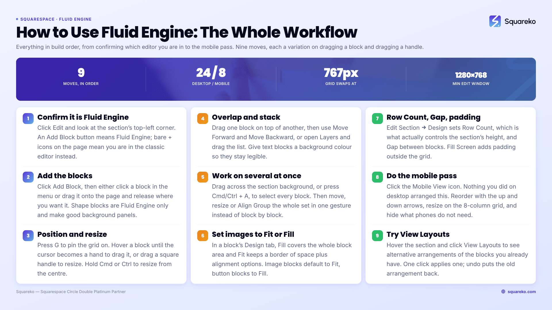
To use Fluid Engine in Squarespace 7.1: click Edit on the page, click Add Block in the top-left corner of a section, then drag the block anywhere on the grid and drag its corner handles to resize. Press G to keep the grid visible while you work. Everything else — overlap, full-bleed, alignment, grid height — is a variation on those two gestures, and the mobile layout is a second, separate pass.
Here is the whole workflow in build order, from the first block to the mobile pass.
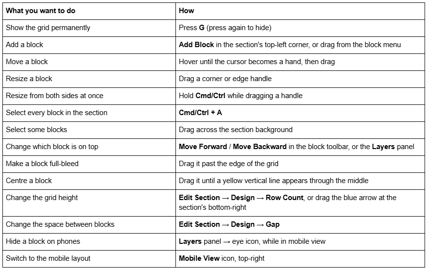
The Fluid Engine controls in one table
Step 1 — Confirm the section is actually Fluid Engine
Fluid Engine only runs in block sections on Squarespace 7.1. Before you try any of this, check which editor you are in.
Click Edit on the page and look at the top-left corner of the section:
An Add Block button, and a grid that appears when you drag — Fluid Engine.
No button, just + icons on the page — classic editor.
If you are inside a blog post, an event description or a product's Additional Information tab, it will always be the classic editor — Fluid Engine is not available in any of those. Squarespace 7.0 sites have no Fluid Engine at all.
One more prerequisite that is easy to overlook: Squarespace's stated minimum editing window is 1280 × 768. On a smaller window the block handles crowd together and drag targets get unreliable. If Fluid Engine feels fiddly, check your browser window size before you blame the editor.
Step 2 — Add blocks
Click Add Block in the top-left corner of the section. The block menu opens; click a block, or type in the search field at the top of the menu to find one.
Two ways to place it:
Click the block in the menu and it drops into the section with placeholder content.
Drag the block from the menu onto the page and release it where you want it. Guidelines show where it will land.
To edit what is inside a block, click it and then click the pencil icon, or just double-click it.
Shape blocks are worth knowing about early. They are Fluid Engine only, and they give you a solid colour rectangle, circle or other shape without uploading an image — useful as a background panel under a text block.
Step 3 — Position and resize blocks on the grid
Press G first. Working with the grid hidden is the single biggest cause of layouts that look almost aligned.
Squarespace Fluid Engine gives you 24 columns on desktop and 8 on mobile, with rows that stretch when content grows. Blocks snap to those cells.
Moving. Hover over a block until the cursor becomes a hand, then drag. If the hand does not appear, click the block first. Because Fluid Engine preserves the balance of a section, moving one block occasionally nudges a neighbour — that is expected, not a bug.
Resizing. Hover a square handle on the block's outline until the cursor becomes an arrow, then drag to change width, height or both. Hold Cmd or Ctrl while dragging and the block resizes symmetrically from its centre.
Alignment help. Yellow indicators appear when the block you are resizing matches the width, the height, or both, of another block in the section. A yellow vertical line through the middle of the grid means the block is horizontally centred; drop it there and Fluid Engine may nudge its size slightly to make the centring exact.
Full-bleed. Drag a block past the edge of the grid and it resizes to the edge of the section's content width. Image blocks set to Fill may crop differently to achieve it.
If a block refuses to get wider, check the Page Width (Max) site style. A low maximum width limits how far a Fluid Engine block can be dragged. Raise it and the block will resize.
Step 4 — Overlap blocks and control the stacking order
Overlapping blocks is the capability the classic editor never had, and it is how you build text over an image without a background image or custom CSS.
Drag one block on top of another. The block toolbar then shows Move Forward and Move Backward — click to change which block is in front. On a section with many overlapping blocks you may have to click several times.
Faster route: click the Layers icon in the section's top-left corner. That opens a list of every block in the section, top to bottom. Hover an entry to highlight the block on the page; drag entries up and down to reorder the whole stack in one gesture.
Two things that make overlap readable:
Text blocks accept a background colour. Set one so the text stays legible over a busy image.
Block alignment is independent of block size. With a block selected, the toolbar alignment icons position the content horizontally and vertically inside the block's boundaries. Image blocks and button blocks set to Fill have no alignment options, because their content already fills the block.
Step 5 — Work with several blocks at once
This is the advanced move most people never find, and it is the one that saves the most time.
Drag across the empty background of the section to draw a selection box over several blocks. Or press Cmd/Ctrl + A to select every block in the section.
With a selection active:
Drag any one of them and the whole set moves, preserving its internal layout.
Click Align Group in the toolbar, then pick an alignment, to align the whole set.
Click Move Backward or Move Forward to send the whole set behind or in front of everything else.
Drag a resize handle and every selected block resizes together.
You can also copy and paste blocks between Fluid Engine sections on the same site. You cannot move blocks between separate content areas — a footer block cannot be dragged into a blog post, for example.
Set images and buttons to Fit or Fill
Fluid Engine adds a control to image blocks and button blocks that the classic editor does not have. Select the block, click the pencil icon, then open the Design tab and choose Fit or Fill.
Fill makes the content cover the whole block area, touching the edges of adjacent blocks. On an image block this crops the image to the block's proportions.
Fit keeps a border of space around the content and exposes alignment options beneath, or in the block toolbar.
Image blocks default to Fit; button blocks default to Fill.
The practical rule for buttons: switch them to Fit and give them a generous block. A Fill button stretches to whatever width you dragged, so when the grid compresses on a narrow laptop the label wraps onto two lines. A Fit button only takes the width its text needs, and the block around it absorbs the compression instead.
Step 6 — Set the grid height, gap and section padding
Hover the section and click Edit Section, then open the Design tab.
Row Count sets how many rows the grid has, which is what actually controls the section's height in Fluid Engine. The minimum depends on how many blocks you have and how they are arranged, so Squarespace will not let you shrink it below the content. You can also drag the blue arrow icon at the bottom-right corner of the section on the page to do the same thing visually.
Row Count is the one section style that can be set differently on desktop and mobile.
Gap sets the padding between blocks in the grid. Choose no gap, a preset, or click ... to set custom vertical and horizontal values separately. Vertical and horizontal gaps do not have to match, and on text-heavy sections a larger vertical gap usually reads better.
Fill Screen adds padding outside the grid. Switch it on and two more controls appear: Height (small, medium, large, or a custom value) and Alignment, which decides whether the extra space goes above the content, below it, or is split between the two. Leave Fill Screen off if you want the section to be exactly as tall as its grid.
Step 7 — Do the mobile pass
Squarespace Fluid Engine keeps a separate mobile layout for every section, split at Squarespace 7.1's 767px breakpoint. Nothing you did in steps 3 to 6 has arranged the mobile view for you.
Click the Mobile View icon in the top-right corner while editing.
Reorder quickly by selecting a block and clicking ↑ or ↓ to move it above or below the adjacent block. Much faster than dragging when a section is a simple stack.
Resize and reposition exactly as on desktop. The mobile grid is 8 columns wide instead of 24.
Set mobile-specific designs on blocks that support them: select a block, open the Design tab, and the changes you make there apply to the mobile layout only. Blocks without mobile overrides pass their design changes to both layouts.
Hide a block on phones with the Layers panel's eye icon. Hidden blocks show dimmed in the list.
Adjust Row Count independently for mobile.
The rule to remember: editing block content — text, links, image, button label — changes both layouts. Moving or resizing changes only the layout you are in.
Add a new block to the desktop layout after you have tidied mobile and Squarespace will place it in the mobile layout as close to the desktop position as it can. On overlapping sections that guess is often wrong, so check mobile every time you add a block rather than once at the end. The breakpoint detail is in Fluid Engine mobile editing.
Try a different arrangement without rebuilding
Hover the section and click View Layouts. Squarespace shows alternative arrangements of the blocks you already have; click a preview to apply it. If the button is greyed out, there are no suggestions for that section.
Save to keep the new layout, or undo to go back. It is a fast way to break a section you have been staring at for too long.
Where Fluid Engine gets slow
Fluid Engine is quick until a section has fifteen blocks, three of them overlapping, and a mobile layout that has drifted from the desktop one. At that point the fastest fix is usually to simplify the section rather than to keep nudging it — split it in two, or rebuild the crowded part with fewer, larger blocks.
If a section has stopped responding to drags entirely, or blocks jump back after you resize them, that is a different problem: Fluid Engine not working covers the specific causes.
The point at which this stops being a self-service job is usually a site where Fluid Engine sections, legacy classic sections and custom CSS all have to coexist — the editor behaves normally, but every change has a side effect somewhere else. That's the kind of thing our Squarespace website support plans exist for. No obligation either way; the grid, the Layers panel and a disciplined mobile pass cover the overwhelming majority of Fluid Engine work.
FAQ
-
Click Edit on the page, then click Add Block in the top-left corner of the section. Pick a block from the menu or search for it. You can also drag a block from the menu directly onto the page. Double-click any block, or click it and then the pencil icon, to edit its content.
-
Drag the block past the edge of the grid. It resizes to meet the edge of the section's content width, producing a full-bleed effect. Image blocks set to Fill may crop differently to achieve it. If the block will not widen, raise the Page Width (Max) site style.
-
Drag one block on top of another in a Fluid Engine section, then use Move Forward and Move Backward in the block toolbar to set which is in front. For sections with several overlapping blocks, open the Layers panel and drag entries to reorder the whole stack at once.
-
Hover the section, click Edit Section, open the Design tab and change Row Count. You can also drag the blue arrow icon at the section's bottom-right corner. Row Count is the only section style that can differ between the desktop and mobile layouts.
-
Press G to toggle the grid on and off. Press Cmd/Ctrl + A to select every block in the section. Hold Cmd/Ctrl while dragging a resize handle to resize a block symmetrically from its centre.
-
Usually the Page Width (Max) site style is set too low, which limits how wide a Fluid Engine block can become. Some blocks also resize only in one dimension — a form block's height is set by its number of fields, not by dragging.

Author Bio
I'm Walid Hasan, a Certified Squarespace Expert and Squarespace Circle Platinum Partner with over 12 years of hands-on experience designing and optimizing high-performing websites. Over the years, I've had the privilege of building more than 2,000 Squarespace websites for clients around the world, always focusing on clean design, strong user experience, and conversion-driven results.