What Makes a Good Service Business Website? 9 Non-Negotiables
The short answer: A good service business website does four things in sequence — it tells a stranger within one screen what you do and who for, gives them exactly one obvious next step, proves you can be trusted with specifics rather than adjectives, and loads fast enough on a phone that none of that gets a chance to fail. Everything else is preference. These nine criteria are the testable version of that.
They are ordered the way a visitor meets them, not by how important they feel to the business owner.
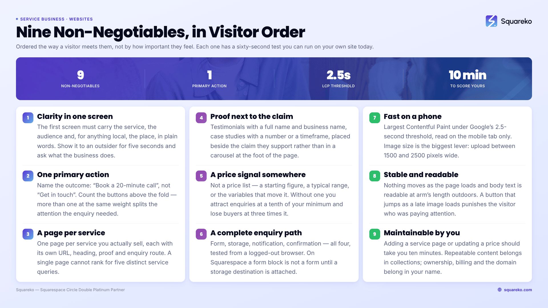
Score your own site in ten minutes
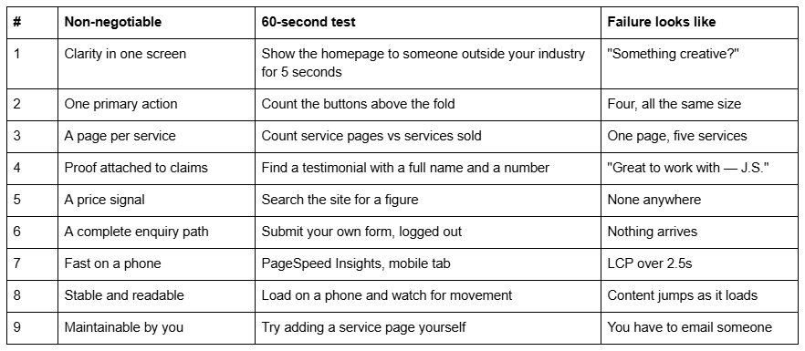
1. A stranger knows what you do, who it's for, and where, within one screen
The first screen has one job: let someone decide, in a few seconds, whether you are the right kind of business for them. That means the service, the audience and — for anything local — the place, in plain words, in the H1 or immediately beneath it.
The reasoning. Almost all of your first-time traffic arrives from search or a referral with a question already formed. They are not browsing; they are checking. If the first screen carries a mood rather than an answer — "Considered spaces", "Elevated wellness" — the visitor has to work to find out what you sell, and a proportion of them go back to the results page instead. In analytics that looks like ordinary bounce, which is why it goes unfixed for years.
The test. Show your homepage to someone outside your industry for five seconds, then ask what the business does and who it's for. If they hesitate, the first screen is failing.
Being specific costs you nothing. "Bookkeeping for UK construction firms" does not exclude anyone who was ever going to hire you; it just stops the people who weren't.
2. There is exactly one primary action, and it names the outcome
One action per page, given the strongest visual weight, phrased as what actually happens: "Book a 20-minute call", "Request a quote", "Check availability for June".
The reasoning. Two mechanisms are at work. Vague buttons — "Learn more", "Get in touch" — ask the visitor to imagine what happens next, and imagining is friction at the exact moment you want none. Competing buttons split attention: a page offering a newsletter signup, a portfolio link, a shop link and an enquiry form at equal weight gives the enquiry a quarter of the attention it would otherwise have had.
The test. Count the buttons above the fold on your homepage. More than one at the same visual weight is a fail.
Secondary actions are fine — as text links, or lower down. The rule is about hierarchy, not about having only one link on the page. Repeat the same primary action at the end of the page rather than inventing a second one.
3. Every service you actually sell has its own page
One page per service, each with its own URL, its own heading, its own proof and its own enquiry route. A /services index that links to them is fine; a /services page that is all of them is not.
The reasoning. This is the one criterion that costs you in two directions at once. In search, a single page cannot rank for five distinct service queries — there is no title, no H1 and no depth for any of them, so you compete for none of them properly. On the page, a visitor who arrived for one service reads about four they don't want, which reads as unfocused rather than versatile.
The test. Count the services you actively sell, then count the pages dedicated to them. If the second number is smaller, that gap is the work.
If you sell eleven things and three of them earn the money, build three pages. Coverage for its own sake creates thin pages, and thin pages are ignored rather than ranked.
4. Proof sits next to the claim it supports, and it has names in it
Testimonials with a full name and a business name. Case studies with a number or a timeframe. Credentials where they are relevant. Each placed beside the specific claim it backs, not collected in a carousel at the foot of the page.
The reasoning. Proof works by being verifiable and specific. Strip the name and the outcome and you have a sentence you could have written yourself, and readers treat it as exactly that — while it still occupies the space real proof could have used. Placement matters as much as content: a quote about turnaround speed does its work beside the paragraph about turnaround speed, and does very little in a carousel three screens later.
The test. Find one testimonial on your site with a full name and a specific outcome in it. If you can't, you have decoration rather than proof.
Three real, specific, attributed testimonials outperform twelve anonymous ones. This is also where photographs of actual people belong — real faces, real premises, real work. A stock team on an About page undoes the credibility that everything else on the site was building.
5. There is a price signal somewhere
Not necessarily a price list. A starting figure, a typical range, or the two or three variables that move the price.
The reasoning. The argument against publishing prices is that it starts a conversation. It does — just not a useful one. Without a signal you attract enquiries from people whose budget is a tenth of your minimum, and lose buyers at three times your minimum who assumed you were cheap and went to someone who looked more expensive. The first group costs you time; the second costs you the work.
The test. Use your own site search, or Ctrl+F on the services pages, and see whether a figure appears anywhere.
Where genuine variability makes a number impossible, publish the shape instead: "most projects run between X and Y depending on the number of pages and whether copywriting is included." That does the same filtering job.
6. The enquiry path is complete, and someone is watching the end of it
Form, storage, notification, confirmation. All four, tested from outside.
The reasoning. This is where the largest silent losses happen on service business websites, and it is invisible from the front end. On Squarespace specifically, a form block is not a form until it has a storage destination attached — Squarespace requires at least one, and without it visitors physically cannot submit. There is no error, no bounce, no record. Separately, notifications sent from form-submission@squarespace.info filter into spam routinely, so enquiries can arrive perfectly and still be read by nobody.
The test. Submit your own form from a logged-out browser, on a phone, then check both the inbox and the storage destination. Do this monthly, not once.
Add a confirmation the visitor can see. Squarespace lets a form show a post-submit message or redirect to a thank-you page; the redirect is better, because it removes any ambiguity for the visitor and gives you a URL you can count as a conversion. And keep a native destination — the Contacts panel or a mailing list — connected alongside any third-party one, because Google Drive and Mailchimp connections are OAuth grants and they expire.
7. It loads fast on a phone, on a bad connection
Largest Contentful Paint under Google's 2.5-second threshold on mobile, measured on the mobile tab, not the desktop one.
The reasoning. Speed is not a design preference; it is the gate everything else passes through. Your hero image is almost always the LCP element, and a visitor who leaves during the wait never reaches the clarity, the proof or the call to action you spent the budget on. It is also a ranking input, so the cost compounds.
The test. Run the URL through PageSpeed Insights and read only the mobile results.
The single biggest lever is image size. On Squarespace, upload between 1500 and 2500 pixels wide — 2500px is the maximum the platform serves, so anything larger is wasted bytes — and set filenames before upload, because they cannot be changed afterwards. The Squarespace CDN serves WebP unconditionally, so format conversion is not your job.
For a benchmark: across 54 Squareko-built Squarespace sites measured in August 2026 (Playwright/Chromium lab test, cloud datacenter, unthrottled, one run per site), median mobile LCP was 2.01 seconds, with 74% under the 2.5-second threshold and 96% under four seconds, at a median page weight of 3.0 MB across 93 requests. That is lab data rather than field data from real visitors — real-world numbers on slow connections will be worse — but it establishes that a media-heavy Squarespace site can sit inside the threshold when images are sized properly.
8. Nothing moves as the page loads, and the text is readable
Stable layout, adequate contrast, body text large enough to read on a phone without pinching.
The reasoning. Layout shift is the most irritating failure on a service site because it punishes the people who were paying attention: the visitor reaching for a button that jumps as a web font or a late image loads, and tapping the wrong thing. Google measures this as Cumulative Layout Shift. Readability failures are quieter but just as costly — pale grey body text at 13px reads as stylish on a designer's monitor and as unreadable on a phone in daylight.
The test. Load the site on a real phone and watch the first two seconds. Then read a full paragraph at arm's length outdoors.
Across the same 54 Squareko-built sites, median mobile CLS was 0.000, with 31 of 54 recording exactly zero shift and 94% under 0.1. Desktop was noticeably weaker — median 0.029, with only 80% in the "good" band — so stability is worth checking on both, and a claim that Squarespace sites never shift would be overstating it.
9. You can maintain it without hiring anyone
Adding a service page, publishing a post, updating a price or swapping a testimonial should be things you can do yourself in ten minutes.
The reasoning. A website that requires a developer for routine changes stops being updated, and a site that stops being updated stops earning. That is the actual mechanism behind "our website is out of date" — not neglect, but friction. It is also a commercial risk: if the only person who can edit the site is a contractor who has moved on, every small change becomes a negotiation.
The test. Try adding a new page yourself, using the same section patterns as your existing ones. If you can't, or if it comes out looking different, the site was built as bespoke pages rather than as a system.
Two things make the difference in practice. Repeatable content — services, posts, case studies — should live in collections that render consistently, not as hand-built one-off pages. And on Squarespace, ownership, billing and the domain should sit in your name, with designers invited at Settings → Permissions & Ownership → Invite Contributor rather than sharing your login.
What to do with this list
Score your own site against the nine, honestly, and count the failures. Criteria 6, 7 and 8 are mechanical — you can test and usually fix them in an afternoon. Criteria 1 to 5 are decisions about what the business says, and they are where nearly all of the gain is; they are also the ones a designer cannot make for you.
The cluster around this post goes deeper on each: the 7-section homepage structure is criteria 1 and 2 in practice, making a Squarespace site look professional covers 4 and 8, and 15 Squarespace mistakes that cost enquiries is this list read backwards, with the platform traps named.
Most sites fail three or four of the nine, and most of those failures are fixable on the site you already have. The case for rebuilding is narrower than agencies usually admit: it is when criterion 3 or 9 fails structurally — one page carrying every service, or a site built as bespoke pages that cannot be extended without a designer. Patching around either of those means paying twice. That is the situation our custom Squarespace design work exists for. If your structure holds and only the message is wrong, rewrite the message first; it is cheaper and it is usually the bigger lever anyway.
FAQ
-
Clarity about what you do and who for within one screen, one primary action per page, a separate page for each service you sell, proof with real names attached to specific claims, a price signal, a tested enquiry path, and fast, stable mobile performance. Nine criteria in total, all testable.
-
A signal, yes. Without one you attract enquiries far below your minimum and lose buyers who assumed you were cheap. It does not have to be a price list — a starting figure, a typical range, or the two or three variables that move the price does the same filtering job
-
Yes, for each service you actively want to sell. One page cannot rank for five distinct service queries, and a visitor who came for one service reads about four they don't want. If you sell eleven things and three earn the money, build three pages rather than eleven thin ones.
-
Largest Contentful Paint under Google's 2.5-second threshold, measured on the mobile tab of PageSpeed Insights. Across 54 Squareko-built Squarespace sites measured in August 2026 in a Playwright lab test, median mobile LCP was 2.01 seconds with 74% under the threshold.
-
Specifics. Full names on testimonials, outcomes with numbers or timeframes, real photographs of real people and premises, and proof placed beside the claim it supports rather than in a carousel at the bottom. Anonymous praise and stock team photos actively reduce trust rather than building it.
-
Test it rather than judging it. Show the homepage to someone outside your industry for five seconds, count the buttons above the fold, submit your own enquiry form logged out, and run the URL through PageSpeed Insights on mobile. Four tests, ten minutes, and most sites fail at least one.

Author Bio
I'm Walid Hasan, a Certified Squarespace Expert and Squarespace Circle Platinum Partner with over 12 years of hands-on experience designing and optimizing high-performing websites. Over the years, I've had the privilege of building more than 2,000 Squarespace websites for clients around the world, always focusing on clean design, strong user experience, and conversion-driven results.