Squarespace Fluid Engine Mobile Editing: The Rules Nobody Explains
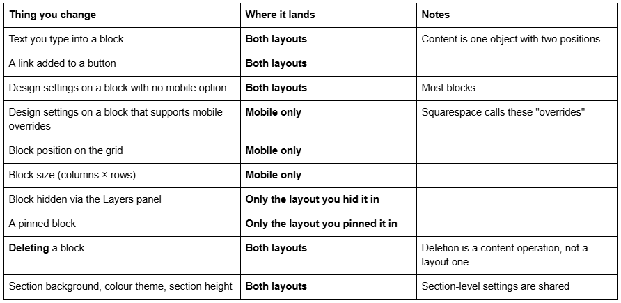
The short answer: Fluid Engine stores two separate layouts per section — one for desktop, one for mobile — and mobile editing only touches the mobile one. Content is shared; position, size, visibility and certain design settings are not. Almost every "mobile editing is broken" complaint in Squarespace 7.1 comes from not knowing which side of that line a given control sits on.
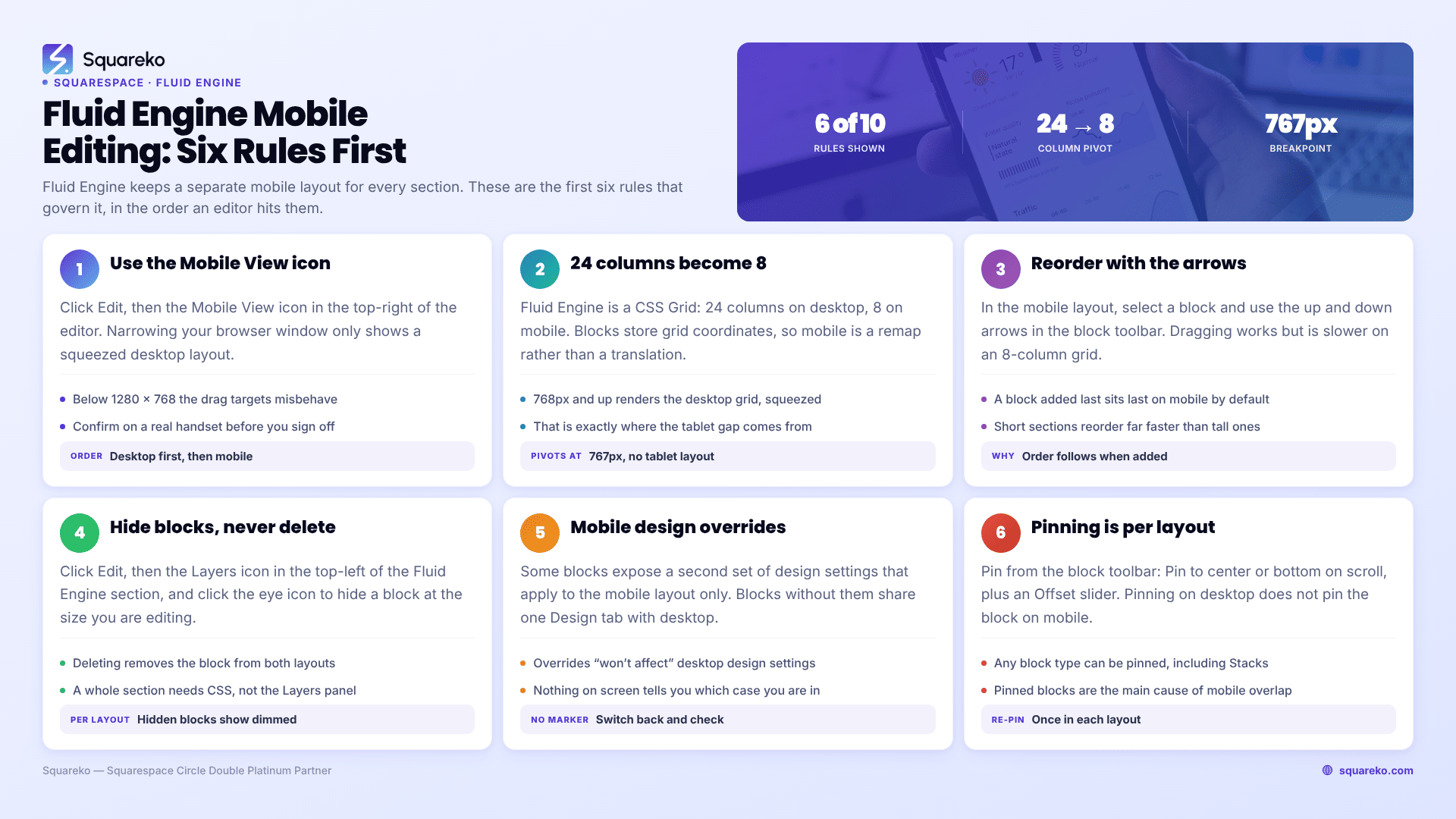
Here are the ten rules that govern it, in the order you actually hit them.
What the mobile layout shares with desktop, and what it doesn't
Print this table and you will avoid most of the frustration.
Rule 1 — Switch to the mobile layout with the Mobile View icon, not by resizing your browser
In Squarespace 7.1, click Edit on the page, then click the Mobile View icon in the top-right corner of the editor. That is the only thing that puts Fluid Engine into mobile-layout editing mode. Narrowing your browser window shows you a narrower desktop layout; it does not open the mobile layout for editing.
Two related constraints matter here. First, Squarespace states that for the best editing experience you should use a browser window at least 1280 pixels wide and 768 pixels tall. Below that, editor controls start colliding and drag targets behave unpredictably — which is why "Fluid Engine mobile editing is buggy on my laptop" is so often a window-size problem on a 1280×800 screen with a large dock and browser chrome eating the vertical space.
Second, Squarespace is explicit that Device view "is not 100% accurate for every phone or tablet." Treat the mobile preview as a working canvas, then confirm on a real handset before you call the layout finished.
The order of operations matters more than anything else in this list:
Build and finish the desktop layout for the section.
Switch to Mobile View and arrange the mobile layout.
Save, then load the live page on a real phone.
Only then move to the next section.
Doing it in that order once is faster than doing it in any other order twice.
Rule 2 — The Fluid Engine grid changes shape on mobile: 24 columns become 8
Fluid Engine is a CSS Grid. Squarespace's engineering team documented the design decision plainly: they chose to "expose a 24-column grid on desktop and an 8-column grid on mobile, each with sensibly sized rows."
Every block stores an x/y coordinate pair for where it starts and another for where it ends — grid cells, not pixels. So a block that spans 12 of 24 desktop columns (half the width) cannot span 12 columns on mobile, because mobile only has 8. Squarespace has to remap it, and the remap is an approximation, not a translation.
The grid pivots at Squarespace 7.1's standard mobile breakpoint of 767px — below that width the 8-column mobile layout renders, at 768px and above the 24-column desktop layout renders. There is no third layout in between. That single fact explains the "tablet gap" complaint: on a 900px-wide iPad you are looking at the desktop layout squeezed, not a tablet layout, so text blocks that needed three lines at 1440px need two at 900px and leave a row of empty space behind.
Rule 3 — Reorder blocks on mobile with the up and down arrows, not by dragging
In the mobile layout, select a block and use the ↑ and ↓ buttons in the block toolbar. Pressing ↑ moves the block above the block currently sitting on top of it; ↓ moves it below the block beneath it.
Dragging works, but on an 8-column grid it is the slower and less reliable of the two — blocks snap into neighbouring cells, push siblings into new rows, and you spend more time undoing than arranging. The arrows do one clean swap per press.
This is also the fix for the most common confusion in Fluid Engine mobile editing: the initial mobile order does not follow your desktop layout, it follows the order in which blocks were added to the section. A caption you added last will sit last on mobile even if you dragged it to the top-left on desktop. Nothing is broken; you just have to set the order once.
One structural habit prevents most of this work. Build a page as several short Fluid Engine sections rather than one tall one. A section with four or five blocks reorders in under a minute; a section with twenty blocks becomes a puzzle, because every arrow press shifts something else. Short sections also give you section-level controls — background, colour theme, top and bottom padding — at a useful granularity, and they let you hide or reorder a whole band of content later without touching individual blocks.
Rule 4 — Hide blocks per breakpoint with the Layers panel, not by deleting them
Fluid Engine has a native per-breakpoint visibility control and most people never find it.
Click Edit on the page, then click the Layers icon in the top-left corner of the Fluid Engine section. That opens a list of every block in the section. Click the eye icon next to a block to hide it at the browser size you are currently editing. Hidden blocks are excluded from that layout and display dimmed in the layers list so you can find them again.
It works in both directions: hide a text-heavy block from mobile visitors while keeping it on desktop, or hide a desktop block and keep a mobile-only alternative visible.
What you must not do is delete the block instead. Deleting is a content operation — it removes the block from the section entirely, in both layouts. If you have ever deleted something in mobile view and watched it vanish from desktop, this is why. Note that the Layers panel hides blocks. To hide an entire section on mobile you need CSS — that is covered in hide a section on mobile in Squarespace.
Rule 5 — Some blocks accept mobile-only design overrides
Certain block types expose a second set of design settings that apply to the mobile layout only. Squarespace calls these overrides, because they override what the desktop layout specifies. When you are in the mobile layout and you change something in a block's Design tab, Squarespace's documentation is explicit: those changes "won't affect your design settings in the desktop layout."
The catch is that not every block has them. If a block has no mobile-specific design option, the Design tab you are editing is the shared one, and your change lands on desktop too. There is no visual marker distinguishing the two cases, so the safe habit is: make the change, then switch back to desktop view and look. Two seconds of checking beats discovering it a week later.
Rule 6 — Pinning is per-layout in Fluid Engine
Pinning holds a block in place while the rest of the section scrolls past it. Select a block, click the pin icon in the block toolbar, then choose Pin to center on scroll or Pin to bottom on scroll and set the Offset slider. Any block type can be pinned, including Stacks. Remove pin in the same toolbar undoes it.
The rule that catches people: pinning does not cross layouts. Squarespace states it directly — "When you pin a block in the desktop layout, it won't pin the block on mobile and vice versa." If you want the effect on phones, switch to the mobile layout and pin it again there.
Pinned blocks are also the single most common source of overlap on small screens, because a pinned element holds its position while neighbouring blocks reflow underneath it. Test pinned mobile sections on a real device, not just in the editor.
Rule 7 — Blocks added after you edit the mobile layout land approximately, not correctly
Once you have customised a mobile layout, Squarespace no longer rebuilds it from scratch. New blocks you add afterwards "display in the mobile layout as similarly to the desktop layout as possible" — an approximation on an 8-column grid, dropped into a layout you have already hand-arranged.
Practically, that means every time you add a block to a Fluid Engine section, you owe that section a mobile check. Build the desktop layout completely first, then do the mobile pass. Reversing the order means doing the mobile pass twice.
Rule 8 — Fluid Engine writes inline styles, so CSS needs !important
Fluid Engine's positioning is emitted as inline style values on the block itself. Inline styles beat every stylesheet rule regardless of specificity — the only thing that overrides them is !important. If you are writing custom CSS against a Fluid Engine section and nothing happens, this is usually why.
/* Squarespace 7.1 mobile breakpoint is 767px — not 768px, not 640px */
@media screen and (max-width: 767px) {
  section[data-section-id="YOUR-SECTION-ID"] .sqs-block-image {
    margin-top: 0 !important;
  }
}
Use it deliberately. Before reaching for !important, ask whether the mobile layout itself can do the job — repositioning a block in the editor is more durable than a CSS rule that fights Fluid Engine's own output every render. More on selector problems in Squarespace custom CSS not working.
Rule 9 — Blog posts are not Fluid Engine, so there is no mobile layout to edit
Fluid Engine covers block sections on pages, portfolio projects, and your site's footer. Blog posts are not built in Fluid Engine — they use the classic editor, where content simply stacks vertically on mobile in source order. There is no Mobile View layout to arrange, no Layers panel and no reorder arrows inside a blog post.
If your blog post looks wrong on mobile, the fix is CSS or content restructuring, not mobile layout editing. This trips up a lot of people who assume every page in 7.1 behaves the same way. It does not.
Rule 10 — You cannot properly edit Fluid Engine layouts from a phone or tablet
Squarespace supports editing through Chrome on Android and Safari on iOS and iPadOS, and the Squarespace app covers a good deal of content editing. But Fluid Engine layout work needs the 1280×768 minimum window, and grid drag targets on a touchscreen are unforgiving.
Do layout work on a desktop or laptop. Use the phone for what it is genuinely good at — checking the result on a real screen, at real reading distance, on a real connection.
The five mistakes that account for most of the support requests
Editing mobile before desktop is finished. Every new desktop block forces another mobile pass.
Building one enormous section instead of several. Short sections reorder cleanly on mobile; a 20-block section does not.
Deleting instead of hiding. Use the Layers eye icon.
Writing media queries at 768px or 640px. Squarespace 7.1 breaks at 767px.
Signing off in the Device view. It is a preview, not a device. Check a real handset.
When mobile editing isn't the answer
Work the rules in order and most Fluid Engine mobile problems resolve inside the editor. If a layout still collapses on real devices after you have set the mobile arrangement, the cause is usually somewhere else — a section-level setting, a template-level constraint, or custom CSS fighting the grid. Start with the 10 most common Squarespace mobile responsive issues before you write any more code.
If you have a site where dozens of sections need a mobile pass and you would rather not spend a weekend on it, that is the kind of work our Squarespace website support plans cover — mobile layout sweeps are one of the more common requests we get, and they are usually a single support block per page template. Most readers will not need that; the ten rules above are the whole of it.
FAQ
-
No. Block position, size, visibility and mobile-specific design overrides apply only to the layout you are editing. Text content, button links, section backgrounds and design settings on blocks without a mobile override are shared, so those changes do appear on both desktop and mobile.
-
Switch to Mobile View, select a block, and use the up and down arrows in the block toolbar. Up moves the block above the one on top of it, down moves it below the one beneath it. Dragging works but is slower and less predictable on the 8-column mobile grid.
-
Click Edit, then the Layers icon in the top-left corner of the Fluid Engine section. Click the eye icon beside the block to hide it at the current browser size. Hidden blocks appear dimmed in the layers list. Deleting a block instead removes it from both layouts.
-
Fluid Engine's default mobile order follows the order in which blocks were added to the section, not where they sit in the desktop layout. A block added last will appear last on mobile regardless of desktop position. Set the order once using the reorder arrows.
-
Eight. Squarespace exposes a 24-column grid on desktop and an 8-column grid on mobile, so every block position has to be remapped rather than translated. The layout pivots at the 767px mobile breakpoint, and there is no separate tablet layout — screens of 768px and wider render the desktop grid, compressed.
-
Not reliably. Squarespace recommends a browser window at least 1280 pixels wide and 768 pixels tall for editing, and Fluid Engine's grid drag targets are difficult on touchscreens. Use a desktop or laptop for layout work and your phone for verifying the result.

Author Bio
I'm Walid Hasan, a Certified Squarespace Expert and Squarespace Circle Platinum Partner with over 12 years of hands-on experience designing and optimizing high-performing websites. Over the years, I've had the privilege of building more than 2,000 Squarespace websites for clients around the world, always focusing on clean design, strong user experience, and conversion-driven results.