Squarespace Design Templates: What Separates Good from Forgettable
Almost every Squarespace design template looks good in a thumbnail, because a thumbnail hides the two things that decide quality: hierarchy and how the design behaves with worse photographs than the demo. A good template makes one thing dominant on every screen and survives your own imagery. A forgettable one is a stack of evenly weighted sections held together by professional photography you will never have. Six criteria separate them, and you can check all six inside a demo in ten minutes.
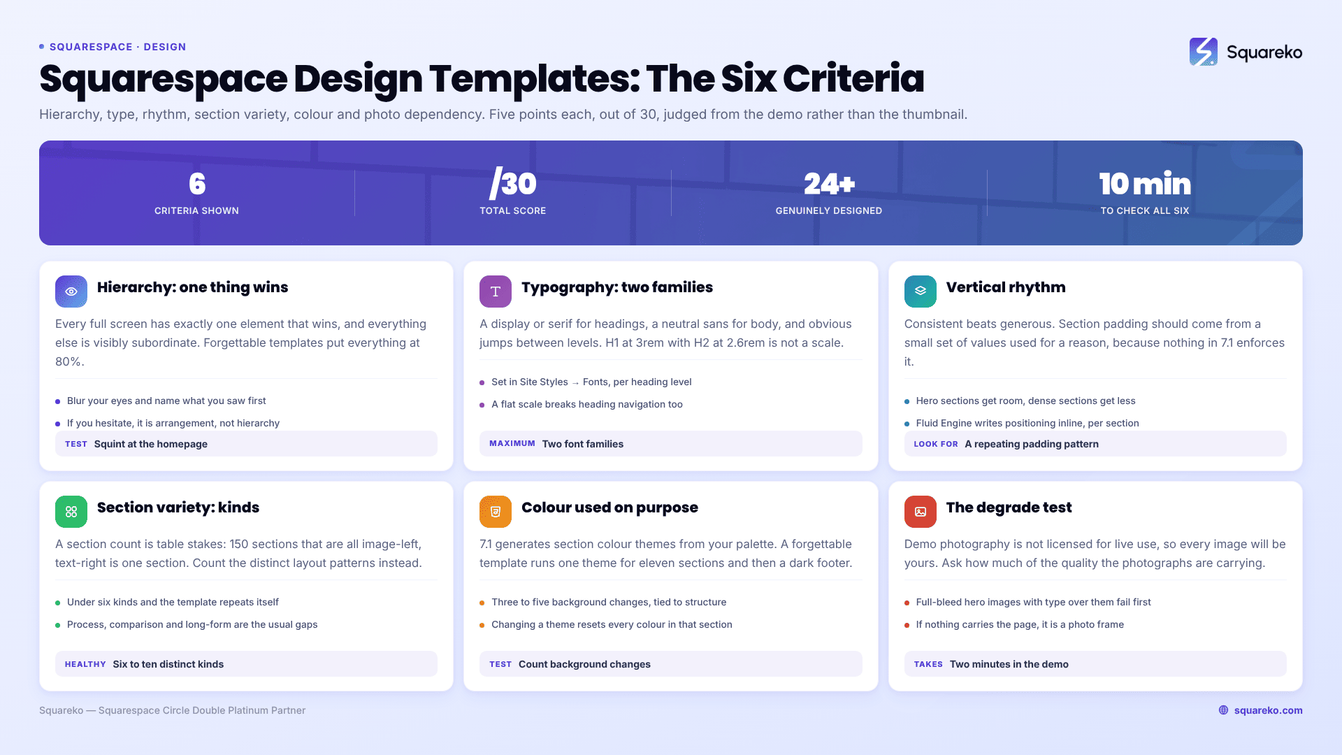
The six criteria at a glance
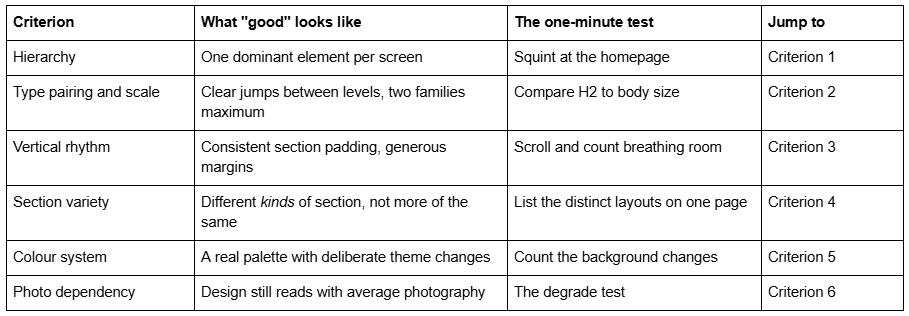
Criterion 1 — Hierarchy: one thing wins on every screen
Hierarchy is the ranking of importance in a layout, and it is the difference between a page that reads and a page that is looked at. On a well-designed Squarespace template, every full screen has exactly one element that wins — a headline, an image, a price, a button — and everything else is visibly subordinate.
Forgettable templates fail this in a specific and consistent way: everything is at 80% emphasis. The heading is large but not large. The image is big but so is the block of text next to it. The button is styled but sits at the same visual weight as the paragraph. Nothing is quiet, so nothing is loud.
The test: open the demo, blur your eyes or step back a metre, and scroll one screen at a time. On each screen, name the thing your eye landed on first. If you hesitate, or if the answer is "the picture, I suppose", the template has no hierarchy — it has arrangement.
Why this matters more on Squarespace 7.1 than it looks. Fluid Engine gives you a drag grid, which makes it trivially easy to flatten hierarchy without noticing: you nudge a heading down, widen a text block, and the composition the designer built quietly stops working. A template with strong hierarchy is more robust to your edits, because the gaps between levels are large enough to survive being narrowed.
Criterion 2 — Typography: two families, and real jumps between sizes
Squarespace 7.1 handles type through Site Styles → Fonts, where you apply a font pack and then adjust base size, letter spacing, line height, text transform and weight per heading level. That is a genuinely capable system, and it is also where most templates are quietly mediocre.
Three things distinguish good typography in a Squarespace design template.
Two families, at most. A display or serif face for headings, a neutral sans for body. Three families is almost always one too many, and the third is usually doing a job that weight or letter-spacing could have done.
A real scale. The jump from paragraph to H3 to H2 to H1 should be obvious at a glance. If H2 and H3 are within a few pixels of each other, the reader cannot use the hierarchy, and worse, neither can a screen reader user who is navigating by heading level. Templates that set H1 at 3rem and H2 at 2.6rem have a scale on paper and none in practice.
Deliberate line length and line height. Body text should sit at roughly 60 to 80 characters per line. Squarespace's full-width sections will happily run a paragraph across 1,400 pixels if nobody constrains it, and a 140-character line is unreadable regardless of how nice the font is. Look at the demo's longest text section: if you have to move your head to read a line, the template has a measure problem you will inherit.
The test: find a page in the demo with a heading, a subheading and a paragraph in sequence. If you can tell all three apart without reading them, the type scale works.
Criterion 3 — Vertical rhythm: whitespace is a system, not a gap
Whitespace is the most misread quality signal in web design. The common belief is "more is better". The accurate version is consistent is better — sections that share a padding value, headings that sit the same distance from the text they introduce, image margins that repeat.
In Squarespace 7.1 this is controlled by section height and padding, set per section, with Fluid Engine writing positioning values inline onto elements. That per-section control is exactly why rhythm breaks: nothing enforces consistency, so a template built without a rule will have a 120px gap here and a 64px gap two sections down for no reason.
What good looks like: section padding that clearly comes from a small set of values — say generous, medium and tight — applied for a reason. Hero sections get room. Dense information sections get less. The pattern repeats down the page and across pages.
What forgettable looks like: every section the same height regardless of content, so a three-word heading gets the same 600px as a full services list. Or the reverse — content crammed edge to edge because the designer filled the space rather than composing it.
The test: scroll the demo homepage at normal speed. If the page feels like it has a pulse — expand, contract, expand — the rhythm is deliberate. If it feels like a conveyor belt, it is not.
One measurable consequence worth noting: layouts with disciplined spacing and reserved image space tend to hold their layout while loading. Across 54 Squareko-built client sites measured in August 2026 — a Playwright/Chromium lab test, cloud datacentre, unthrottled, single run per site, load-only CLS, not field data — median mobile CLS was 0.000, with 31 of 54 sites recording exactly zero layout shift. Desktop is weaker (median 0.029, 80% under 0.1), so this is not a claim that layouts never shift; it is that composed spacing and shift-resistant layouts tend to travel together.
Criterion 4 — Section variety: kinds, not counts
Nearly every premium Squarespace shop advertises a section count. Squareko's own range states 150+ pre-designed sections on every template — a figure that is identical across all 24 and therefore cannot tell you anything about any one of them. Big numbers in this category are table stakes, not evidence.
The useful question is variety of kind. A template with 150 sections that are all "image left, text right" in fourteen colourways has one section. A template with thirty sections covering genuinely different jobs has thirty.
The jobs a business site actually needs a section for:
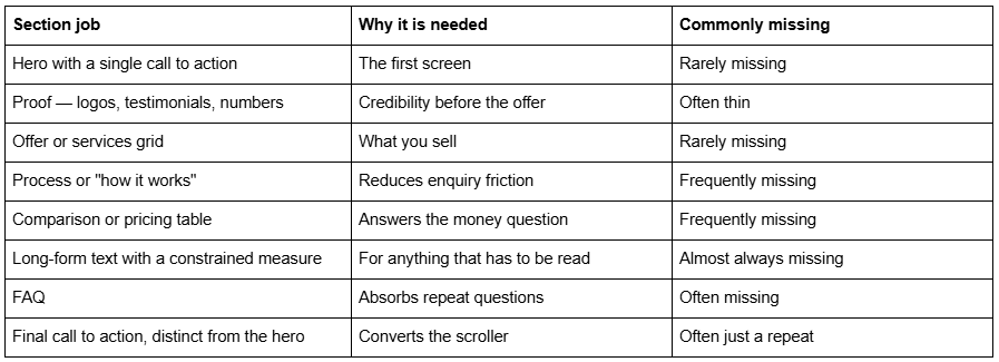
The test: open the demo homepage and write down the distinct layout patterns, ignoring colour and imagery. Under six, the template will start repeating itself as soon as you add pages. Six to ten is healthy.
Also check the pages, not just the sections. Page counts across the Squareko range run from 9 pages (Justify) to 15 pages (WeDecorefy), and the templates that feel designed rather than assembled are usually the ones shipping a worked detail page — a Project Details page, a Service Details page — instead of an index that links to nothing.
Criterion 5 — The colour system: a palette used on purpose
Squarespace 7.1 generates a set of section colour themes from your palette, named across two types — Lightest, Light, Dark and Darkest in variants 1 and 2, plus Bright options. Type 1 themes apply black or white text over palette colours; type 2 themes use the leftmost palette colour for all text and headings. You then assign a theme per section.
That system is the single most powerful design tool in Squarespace, and it is the one most templates barely touch. A forgettable template uses one theme — white — for eleven sections in a row, and then a dark footer.
What good looks like: background changes that mark structural transitions. The hero is one theme; the proof band beneath it is another; services return to the first; the call to action is the darkest or brightest theme on the page. The colour changes tell you where you are in the argument.
A practical warning that belongs in every evaluation. Squarespace's documentation is explicit that changing a section's colour theme resets all colours for that section, including any custom text colours you set inside blocks. So if a template's look depends on hand-coloured text inside a section rather than on the theme system, one theme change will destroy it — and you will not be able to undo the individual overrides quickly. Templates built on themes are maintainable. Templates built on manual overrides are a trap.
The test: scroll the demo and count the background colour changes on the homepage. Zero to one means the palette is decorative. Three to five, tied to structure, means someone designed it.
Criterion 6 — The degrade test: how it looks with your photographs
This is the criterion that predicts disappointment better than the other five combined, and no roundup runs it.
Template demos are professionally photographed, and the images are not yours. Squarespace's Working with Demo Content documentation states that under the Terms of Service demo content "is meant for inspiration only, and you don't have a license to use any sample images or content on your live site" — and third-party shops apply the same restriction to their photography. Every image you are looking at will be replaced by one of yours.
So the real question about any Squarespace design template is: how much of its quality is carried by the photography, and how much by the design?
How to run the degrade test in a demo, in two minutes:
Open the demo on a phone.
Scroll through and, for each image section, imagine your actual photograph in that slot — the one you have, not the one you wish you had.
Count the sections that stop working. Full-bleed hero images with type overlaid are the first to fail: a busy or badly lit photo makes the type unreadable and there is nowhere to hide.
Now ask what carries the page if you removed the images entirely. If the answer is "nothing", the template is a photo frame.
Templates that pass the degrade test lean on type, colour theme changes, generous margins and structural contrast, and use imagery as support rather than as substrate. Templates that fail it are the ones that look most impressive in the thumbnail grid, which is precisely why the thumbnail grid is a bad way to shop.
Two practical notes if imagery is going to do heavy lifting anyway. Upload at 1500–2500px wide — 2500px is the maximum Squarespace serves — and set the filename before uploading, because filenames cannot be changed afterwards. The Squarespace CDN serves WebP unconditionally regardless of the format you uploaded, so file format is not something you need to manage; dimensions and count are. Across those same 54 measured Squareko sites, median page weight was 3.0 MB across 93 requests, and images are where that budget goes.
The scoring sheet
Score any Squarespace design template out of 30. Five points per criterion, judged from the demo rather than the thumbnail.
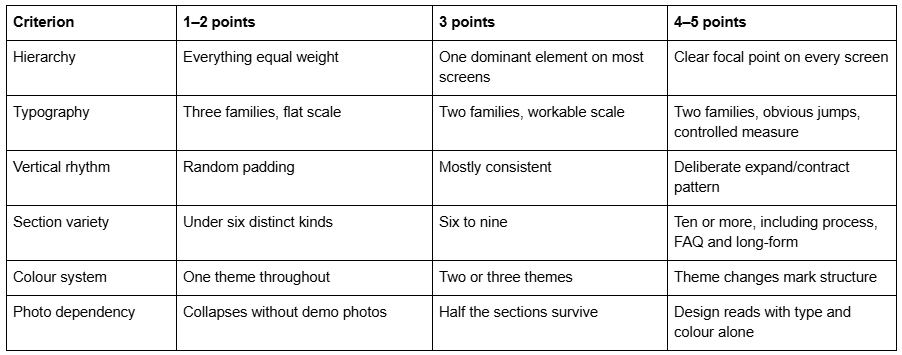
Anything at 24 or above is genuinely designed. Anything at 15 or below is a photo frame with a menu on top, and it will look like a different product the day you swap the images.
What to do with the score
Run all six criteria against two or three shortlisted templates rather than one. The scores matter less than where they diverge — one template will usually win on section variety and lose badly on photo dependency, and that trade-off tells you what you are actually choosing between.
Then weight the criteria for your situation. If you have a professional photographer booked, photo dependency barely matters and section variety should decide it. If your imagery is going to be phone photos of real work, invert that: pick the type-led template every time, even if it places second in the thumbnail grid.
And be honest about what a template cannot fix. A template supplies hierarchy, a type scale, a rhythm and a colour system. It cannot supply a proposition, and no amount of whitespace makes a vague offer clear. Nearly every Squarespace site that reads as forgettable is forgettable in its copy first and its layout second.
If you want the criteria applied to named templates with verdicts rather than a method to apply yourself, the Squarespace template review series does that, and professional Squarespace templates covers which designs read as credible to a business audience.
Where hiring makes sense is when the score keeps coming out low for a reason a template cannot address — you need a layout Squarespace does not ship as a section, or the design has to carry a brand system that already exists and no template matches. That is a build. If it is a well-composed starting point you need, the Squareko premium template range publishes working demos and real page lists so you can run all six criteria before spending anything, which is the point of publishing the method rather than the shortlist.
FAQ
-
Judge six things in the demo, not the thumbnail: whether one element dominates each screen, whether the type scale has obvious jumps, whether section padding follows a pattern, how many genuinely different section kinds exist, whether background colour themes mark structure, and whether the design survives ordinary photography.
-
Almost always the photography. Demo images are professionally shot and are not licensed for your live site, so every one gets replaced. Templates that rely on full-bleed hero imagery with type overlaid degrade hardest. Choose a type-led template if your imagery will be average.
-
Two families is the working maximum — one for headings, one for body. A third usually does a job that weight, size or letter-spacing could do better. What matters more than the count is the scale: if H2 and H3 are nearly the same size, the hierarchy exists on paper only.
-
Squarespace 7.1 generates themes from your palette — Lightest, Light, Dark and Darkest across two types, plus Bright variants — and you assign one per section. Note that changing a section's theme resets every colour in that section, including custom text colours set inside blocks.
-
No. Section counts are advertised identically across whole catalogues — all 24 Squareko templates state 150+ pre-designed sections — so the number cannot discriminate between them. Count distinct section kinds on one demo page instead. Under six and the template will repeat itself quickly.
-
Consistency matters more than quantity. Good templates draw section padding from a small set of values applied for a reason: generous around heroes, tighter around dense information. A page where every section is the same height regardless of content has spacing, not rhythm.

Author Bio
I'm Walid Hasan, a Certified Squarespace Expert and Squarespace Circle Platinum Partner with over 12 years of hands-on experience designing and optimizing high-performing websites. Over the years, I've had the privilege of building more than 2,000 Squarespace websites for clients around the world, always focusing on clean design, strong user experience, and conversion-driven results.