What Makes a Squarespace Template Look Professional (Not Templated)
The short answer: Almost never the template. A Squarespace site looks templated because of six things the owner did after installing it — inconsistent type sizes, uneven spacing between sections, too many accent colours, mixed image treatments, the same section layout repeated down every page, and demo copy left in place. All six are fixable in an afternoon in Squarespace 7.1, and none of them require a more expensive template.
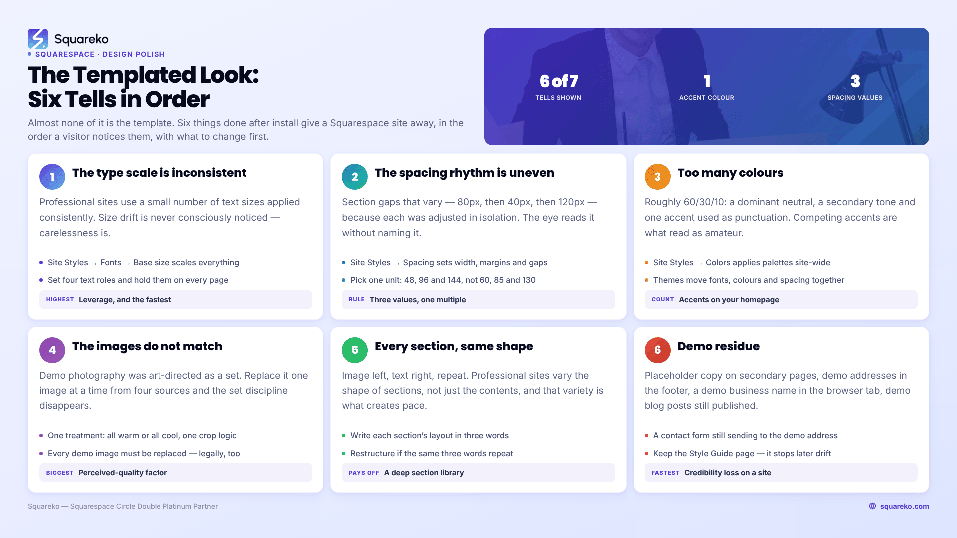
Here are the tells, in the order they give a site away, with what to change first.
Audit your own site in two minutes
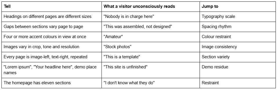
If three or more of those apply, the template is not your problem.
Tell 1 — The typography scale is inconsistent
This is the single biggest giveaway and the fastest to fix.
Professional sites use a small number of text sizes, applied consistently. Templated-looking sites use whatever size looked right on each page when it was built — an H2 on one page, an H1 styled down on another, a paragraph bumped up to look like a heading on a third. Visitors do not consciously notice size drift. They notice that the site feels careless.
What Squarespace 7.1 gives you. Open Site Styles by clicking the paintbrush icon while editing any page, or via Website → Design → Site styles, then Fonts.
Base size is the important control. In Squarespace 7.1 your text scales from the font's base size — change it and everything else scales proportionally. This is the single highest-leverage typography control on the platform, and most people never touch it.
Size contains individual sliders for Heading 1 through Heading 4 and other text types, so you can tune the interval between levels once, globally.
Assign Styles lets you set specific text groups such as Title or Button, rather than restyling text block by block.
What to change first. Decide on four text roles and never exceed them: page title, section heading, sub-heading, body. Set them in Fonts, then go through every page and make sure each piece of text is using one of those four, not a manually resized one-off. A site with four consistent text sizes reads as more designed than a site with eleven carefully chosen ones.
On font count. Two typefaces is the professional default — one for headings, one for body. Squarespace's font packs are pre-paired for exactly this reason and are a better starting point than choosing two fonts yourself. Three typefaces is defensible if one is used only for a single accent purpose. Four is a tell.
Tell 2 — The spacing rhythm is uneven
Spacing is what separates sites that feel calm from sites that feel cramped, and it is almost entirely invisible until it is wrong.
The templated look comes from section gaps that vary — 80px above one section, 40px above the next, 120px above the third — because each was adjusted in isolation while building that page. The eye reads the inconsistency even though it cannot name it.
What Squarespace 7.1 gives you. Site Styles → Spacing controls page width, site margins and section spacing. Individual sections can then be adjusted in the editor, and Fluid Engine sections have their own height controls.
What to change first. Pick a spacing unit and multiply it. If your standard gap between sections is 96px, then a tighter relationship is 48px and a bigger break is 144px — not 60, 85 and 130. Three values, all multiples of one number, used everywhere. Then check the inside of sections: the gap between a heading and the paragraph under it should be smaller than the gap between that paragraph and the next heading. When those two are equal, or reversed, the page loses its grouping and everything reads as one undifferentiated block.
The mobile half of this job. Squarespace 7.1 keeps a separate, independently editable mobile layout for every Fluid Engine section. Desktop spacing does not carry across proportionally. A site with immaculate desktop rhythm and cramped mobile spacing is a site most of whose visitors see the cramped version — check every section at mobile width, not just the homepage.
Tell 3 — Too many colours
Amateur sites are colourful. Professional sites are restrained and use colour as punctuation.
The reliable ratio is roughly 60/30/10: a dominant neutral, a secondary tone, and one accent used sparingly — for buttons, links and the occasional emphasis. What makes a site look templated is three or four accent colours competing, usually because each was added to make one particular section "pop".
What Squarespace 7.1 gives you. Site Styles → Colors offers curated palettes as well as custom values, applied site-wide. Site Styles → Themes goes further, offering preset packs — Professional, Bold and Playful among them — that adjust fonts, colours and spacing together as a coherent set. For most people a Theme is a better starting point than adjusting fifteen individual settings.
What to change first. Count the distinct accent colours currently visible on your homepage. If the answer is more than one, remove until it is one. Then check your buttons: every primary button on the site should be the same colour, and secondary buttons should be visually quieter, not a different hue. Buttons in four colours is one of the most reliable amateur signals there is.
On contrast. Body text at low contrast — light grey on white — reads as designed to designers and as unreadable to everyone else, including anyone over 45 and anyone on a phone in daylight. Keep body text properly dark. This is an accessibility requirement as well as an aesthetic one.
Tell 4 — The images do not match each other
Image consistency does more for perceived professionalism than any other single factor, and it is where the gap between a template demo and a real site usually opens up.
The demo photography in any template — free or premium — was art-directed as a set: same photographer, same light, same colour grading, same crop discipline. Replace it with images sourced one at a time from four different places, and the set discipline disappears even if each individual image is good.
What to change first.
Pick a treatment and hold it. All warm or all cool. All shot on location or all on a plain ground. Consistent crop logic — if your team photos are square, all of them are square.
Match resolution. One soft, low-resolution image among sharp ones is more noticeable than a site of uniformly average photos.
Replace every demo image. Not just visually — legally. Demo photography in premium Squarespace templates is licensed for the demo, not for you. Squareko's published terms state demo images are copyright-protected and not licensed for use on live or client websites, and this is standard across the market.
Two Squarespace-specific mechanics worth knowing. Upload images at 1500-2500px wide — 2500px is the largest size Squarespace serves, so anything bigger is wasted weight. And set the filename before uploading, because Squarespace filenames cannot be changed after upload. The Squarespace CDN converts and serves WebP automatically regardless of your source format, so there is no need to convert files yourself.
Tell 5 — Every section is the same shape
Open most templated-looking Squarespace sites and scroll. Image left, text right. Image right, text left. Image left, text right. Full width photo. Repeat.
That alternating pattern is the default because it is the easiest thing to build, and it is instantly recognisable as such. Professional sites vary the shape of sections, not just their contents — a full-bleed image, then a tight three-column grid, then a single centred statement with a lot of air around it, then a list, then a quote.
What to change first. Scroll your longest page and write down the layout of each section in three words. If the same three words appear more than twice in a row, restructure. The variety is what creates pace, and pace is what keeps someone scrolling.
This is where a template's section library earns its money. Squareko templates include 150+ pre-designed sections, and the point of that number is not the sections you use as-is — it is having enough distinct shapes to build a page that does not visibly repeat. If you are using a free Squarespace template, the full 7.1 section library is available to you too; it just isn't pre-arranged, so the variety is your job rather than the designer's.
Tell 6 — Demo residue
The fastest credibility loss on any Squarespace site, and it happens on real live sites constantly.
Check for all of these before you launch:
Placeholder headlines and body copy still in place on secondary pages
Demo addresses, phone numbers and opening hours in the footer
A demo business name still in the browser tab, because the site title was never changed
Demo social links in the footer pointing at the template's accounts
The template's demo blog posts, still published
A contact form that still sends to the demo email address
The 404 page and Style Guide page left as shipped
The last one is worth a note in the other direction. The Style Guide page — which sits in the Not Linked section on Squareko templates and documents the type scale, colour values, button styles and spacing rules — should be kept, not deleted. It is what stops the drift described in tells 1, 2 and 3 from happening six months from now when you add a page and guess at a heading size.
Tell 7 — Too much of everything
The last one is the hardest, because it does not look like a mistake while you are making it.
A homepage with eleven sections is not more persuasive than one with five. It is less. Every additional section dilutes the one message the page should be making and pushes your call to action further from the fold. The same is true of navigation: more than seven top-level items and visitors stop reading the menu and start scanning it.
There is also a measurable cost. Across 54 Squareko-built client sites measured in August 2026 — Playwright/Chromium lab test, cloud datacentre, unthrottled, single run per site, load-only CLS, so lab data rather than field data — median page weight was 3.0 MB across 93 requests, with median mobile LCP at 2.01s and 74% under Google's 2.5s "good" threshold. Page weight on Squarespace is driven almost entirely by how many image-heavy sections you stack. Restraint is a performance decision as well as a design one.
What to change first. Cut your homepage to five or six sections: what you do, proof, how it works, who it is for, and a single clear next step. Everything you removed almost certainly deserves its own page, where it will be read properly rather than scrolled past.
What to change first, in order
If you only do four things, do these, in this order:
Set the base font size and fix your four text roles. Highest leverage, fastest, and it makes everything else easier to judge.
Standardise section spacing to three values, all multiples of one number. Then check every section at mobile width.
Cut to one accent colour and make every primary button match.
Replace every image with a consistent set — same treatment, same crop logic, same resolution, all yours.
None of that requires a different template, a designer, or a line of Custom CSS.
When the template really is the problem
Occasionally it genuinely is — not because the template is bad, but because it was built for a different shape of business. A template with three service pages will never comfortably hold twelve. A template with no case-study layout will never make a consultancy's proof look convincing. If you have applied all seven fixes above and the site still fights you, the mismatch is structural.
If that is where you are, the premium Squarespace templates we build ship 9 to 15 real pages, 150+ sections and a Style Guide page documenting the type scale and colour values, so the consistency described above is set from day one rather than reconstructed later. And if your page inventory doesn't fit any template on the market — multi-level navigation, memberships, a real integration — the honest answer is custom Squarespace design rather than another $249. Most sites that look templated, though, don't have a template problem. They have four afternoons of tidying ahead of them.
FAQ
-
Usually because of inconsistent typography sizes, uneven section spacing, too many accent colours and mixed image treatments — not because of the template itself. Visitors read those inconsistencies as carelessness without being able to name them. All four are fixable in Site Styles without changing template or writing any Custom CSS.
-
Open Site Styles by clicking the paintbrush icon while editing a page, or via Website → Design → Site styles, then Fonts. Adjust the base size and all other text scales relative to it. The Size section has individual sliders for Heading 1 to Heading 4, and Assign Styles targets specific groups such as Title or Button.
-
Two is the professional default — one for headings, one for body. Squarespace font packs are pre-paired for exactly this and are a safer starting point than choosing two yourself. Three is defensible if the third serves one narrow accent purpose. Four or more reliably reads as amateur.
-
One dominant neutral, one secondary tone and one accent, roughly a 60/30/10 split. The most common amateur signal is three or four accent colours competing because each was added to make one section stand out. Every primary button on the site should be the same colour.
-
Upload at 1500-2500px wide. Squarespace serves a maximum of 2500px, so anything larger is wasted page weight. Set the filename before uploading, because Squarespace filenames cannot be changed afterwards. The Squarespace CDN converts and serves WebP automatically, so there is no need to convert files yourself.
-
No. Demo photography in premium Squarespace templates is licensed for the demo, not for you. Squareko's published terms state demo images are copyright-protected and not licensed for use on live or client websites, and this is standard across the premium template market. Replace every one before launch.

Author Bio
I'm Walid Hasan, a Certified Squarespace Expert and Squarespace Circle Platinum Partner with over 12 years of hands-on experience designing and optimizing high-performing websites. Over the years, I've had the privilege of building more than 2,000 Squarespace websites for clients around the world, always focusing on clean design, strong user experience, and conversion-driven results.