Squarespace Site Styles Explained (Every Panel and Setting)
The short answer: Site Styles in Squarespace 7.1 sets site-wide defaults, not final values. Open it at Website → Site Styles, or by clicking the paintbrush icon while editing any page. Almost everything in it is global — change a heading font and every heading on the site moves. When a Site Styles change appears to do nothing, something more local has overridden it: a section setting, the text toolbar, or Fluid Engine's inline layout values.
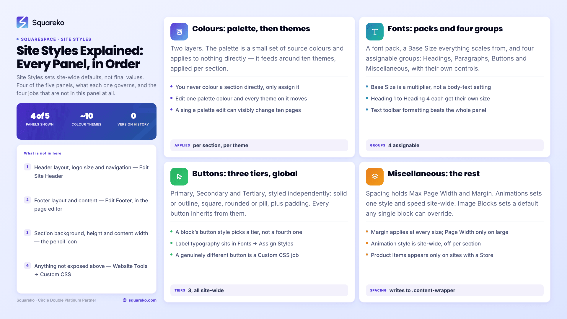
Every Site Styles panel at a glance
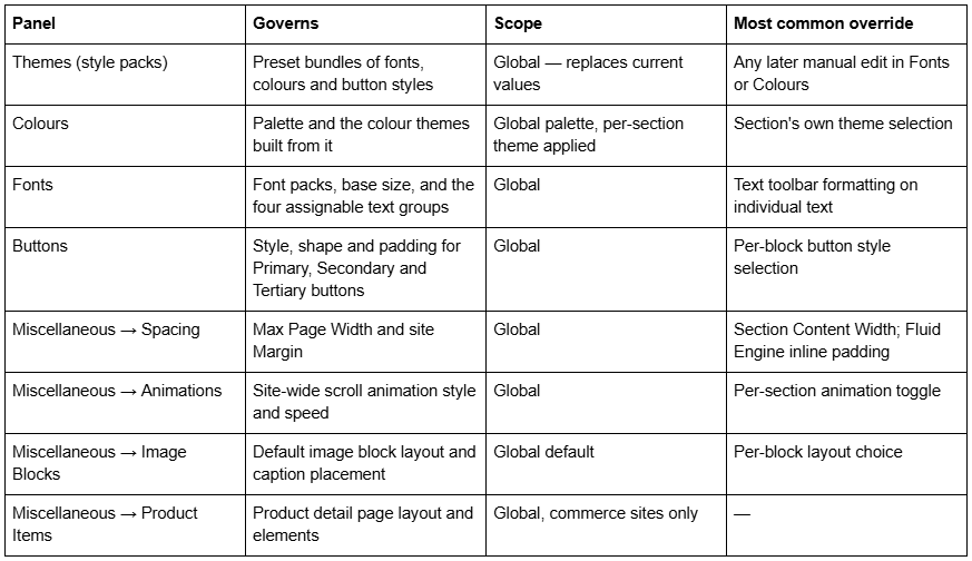
Squarespace reorganises this panel periodically — Spacing and Animations used to sit at the top level and now live under Miscellaneous — so if a tutorial's menu path does not match what you see, search the panel by what the control does rather than where an article said it was.
Themes and style packs: the fastest way to overwrite your own work
Themes, presented as style packs with names like Professional, Bold and Playful, are bundles of font, colour and button settings applied in one click. They are useful at the start of a build and dangerous later, because applying one replaces the values you have already set.
Squarespace 7.1 has one template family — there is nothing to switch between — so style packs are the closest thing to "changing template" that exists on the version. They change presentation only. No content, page or section is affected.
There is no version history for Site Styles. Squarespace's own documentation is explicit that once you save, "it's not possible to revert to a previous version unless you reset to defaults." Record your font names, sizes and hex codes somewhere outside Squarespace before you try a style pack.
Colours: a palette, then themes built from it
The Colours panel has two layers, and confusing them is the most common source of "I changed the colour and nothing happened".

You do not colour a section directly. You assign it a theme, and the theme's values come from the palette. Change one palette colour and every section using a theme built on it updates at once. That is the intended behaviour and it is why a single palette edit can visibly change ten pages.
Individual themes can be edited so that a specific element — a button fill, a link colour — differs from the generated default. Those edits are global to the theme, not to the section, so a change made while looking at one section changes every section using that theme.
Fonts: font packs, base size, and four assignable groups
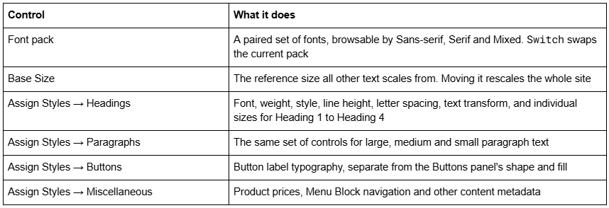
Two things routinely surprise people here.
Base Size is a multiplier, not a body-text setting. Nudging it changes headings, paragraphs and buttons together. If you only want body copy larger, change it under Assign Styles → Paragraphs instead.
The text toolbar wins. Squarespace's documentation states that changing text format in the text toolbar overrides the styles set in Site Styles. Any text where someone once clicked a size or colour button carries a local override that no Site Styles change will move. This is the single most common reason one heading refuses to follow the rest. The fix is to select that text and clear the local formatting, not to write CSS. There is more on this in the guide to changing fonts in Squarespace.
Buttons: three tiers, set globally
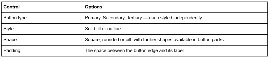
Every button on the site inherits from these three tiers. A block-level "button style" selector chooses which tier a button uses; it does not create a fourth style. If you need a genuinely different button in one place, that is a Custom CSS job targeting .sqs-button-element--primary inside a specific section.
Miscellaneous → Spacing: the two width controls people hunt for

Margin is an explicit amount of space held on both sides of your content and it does not scale with the viewport. Max Page Width only matters on large monitors. Both are global, both write to the .content-wrapper element around every section's content, and both are overridden per section by that section's Content Width control in its Format tab. Full-bleed layouts are covered separately in how to create a full-width section in Squarespace.
Miscellaneous → Animations: one setting for the whole site

Fade fades content in on scroll; Scale zooms it from smaller to larger; Slide moves it up from below; Clip reveals it line by line from the left; Flex adds movement to headings, links, buttons and the navigation bar. The choice is site-wide — there is no per-page animation style — though individual sections can have animations switched off.
Animation is the setting most likely to cost you a Core Web Vitals score if it is used on above-the-fold content. Across 54 Squareko-built sites measured in August 2026 (Playwright/Chromium lab test, unthrottled, single run per site), median mobile CLS was 0.000, and the sites that recorded shift were disproportionately ones animating hero content.
Miscellaneous → Image Blocks and Product Items
Image Blocks sets the default layout for image blocks across the site — Inline, Poster, Card, Overlap, Collage or Stack — plus caption placement. It is a default, not a lock: any individual image block can be set to a different layout, and that choice wins.
Product Items appears only on sites with a Store. It governs the product detail page layout: image position, gallery behaviour and which elements appear. It has no effect on product blocks placed elsewhere on the site.
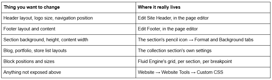
What Site Styles does not control
This is where most searches for "Site Styles explained" actually end up.
The override order, top to bottom
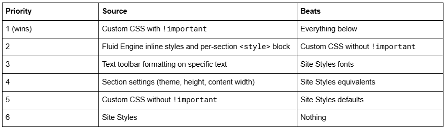
Fluid Engine sits above Custom CSS in this list because it writes layout values as inline style attributes and into a <style> block rendered per section. Inline styles beat any linked stylesheet regardless of selector specificity, and !important is the only thing that overrides them. That is why a Site Styles spacing change can appear to do nothing inside a Fluid Engine section: the section is not reading your default, it is reading its own stored grid coordinates. In that case the correct fix is the section's own controls, not more CSS. If your CSS is being ignored entirely rather than outranked, work through why Squarespace custom CSS stops working.
Using the panel well
Set Colours and Fonts first, before building pages, because both are global and both cascade into every section you subsequently create. Leave Spacing until the layout exists — Max Page Width is much easier to judge against real content. Treat style packs as a starting point only, and write down your palette and font settings before applying one, because there is no undo.
Where this becomes a real project rather than an afternoon is a site that has accumulated local overrides — toolbar-formatted text on forty pages, three near-identical colour themes, CSS fighting Fluid Engine. Normalising that back to a clean set of global styles is what our Squarespace website support plans are for. If your site is still young, the panel above is genuinely all you need.
FAQ
-
Website → Site Styles in the main menu, or click the paintbrush icon in the top-right corner while editing any page. Both open the same panel. Spacing and Animations now sit inside a Miscellaneous group rather than at the top level, which is why older tutorials give a menu path that no longer matches.
-
Global. Changes made in Site Styles apply site-wide by design. Per-page and per-section differences come from section settings, colour theme assignment, the text toolbar and Fluid Engine layouts — not from Site Styles itself. Cover pages are the one exception; each is styled separately.
-
Because that text carries local formatting. Squarespace states that changing text format in the text toolbar overrides the styles set in Site Styles. Select the heading, clear the toolbar formatting, and it will start following the global style again. No CSS is needed.
-
No. There is no version history for Site Styles, and Squarespace's documentation says changes cannot be reverted except by resetting to defaults. Record your font names, base size and hex codes outside Squarespace before experimenting, particularly before applying a style pack.
-
A generated combination of background, text, button and link colours built from your palette. You assign a theme to a section, header or footer rather than colouring elements directly. Editing a theme changes every section using it, which is intentional and often surprising.
-
Fluid Engine stores block positions as grid coordinates and writes them as inline styles plus a per-section <style> block. Inline styles beat any linked stylesheet, so global spacing defaults do not reach inside a Fluid Engine grid. Adjust the section's own Format settings instead.

Author Bio
I'm Walid Hasan, a Certified Squarespace Expert and Squarespace Circle Platinum Partner with over 12 years of hands-on experience designing and optimizing high-performing websites. Over the years, I've had the privilege of building more than 2,000 Squarespace websites for clients around the world, always focusing on clean design, strong user experience, and conversion-driven results.