How to Create a Full-Width Section in Squarespace
The short answer: In Squarespace 7.1 the section background is already edge to edge — it is the content that isn't. Content sits inside a .content-wrapper element that carries a horizontal padding from your Site Styles margin and a max-width from Page Width. A full-bleed background needs no code. Full-width content needs three lines of CSS on that wrapper, and on Fluid Engine sections those lines need !important.
Work out which of the two you actually want before you write anything.
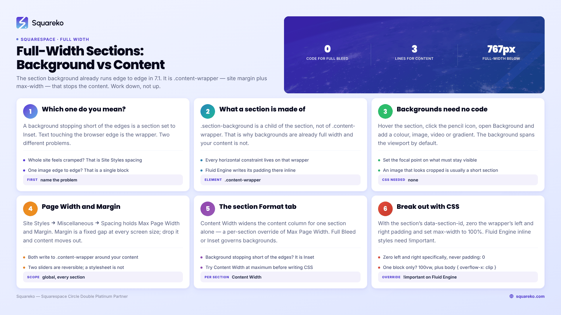
Which "full width" do you mean?
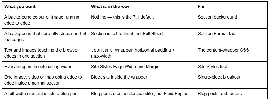
What a Squarespace 7.1 section is actually made of
Every page section in Squarespace 7.1 renders roughly like this. Open your inspector on any section and you will see it:
<section data-section-id="65f1a2b3c4d5e6f7a8b9c0d1" class="page-section ...">
<div class="section-border">
<div class="section-background"><!-- colour, image or video --></div>
</div>
<div class="content-wrapper" style="padding-top:12vmax;padding-bottom:12vmax">
<div class="content">
<div class="fluid-engine fe-65f1a2b3c4d5e6f7a8b9c0d1"><!-- your blocks --></div>
</div>
</div>
</section>
Two things matter here.
.section-background is a child of the <section>, not of .content-wrapper. That is why backgrounds are already full width and content is not.
.content-wrapper is where every constraint lives: left and right padding from the Site Styles margin, a max-width from Page Width, and — on Fluid Engine sections — inline top and bottom padding written by the editor. Inline styles beat anything in a linked stylesheet no matter how specific your selector is, which is the whole reason !important keeps appearing in Squarespace 7.1 full-width snippets.
Note the data-section-id. That attribute is the safest handle you have for targeting one section, because unlike a block ID it does not regenerate when you edit the blocks inside it.
Full-bleed backgrounds need no code in Squarespace 7.1
If all you want is a colour band or a photograph running the full width of the browser, stop before you open the CSS panel.
In the page editor, hover the section and click the pencil icon, then open Background. Add a colour, image, video or gradient. The .section-background element spans the whole viewport width by default in Squarespace 7.1, so the result is already full-bleed.
Two adjustments worth making while you are in there:
Focal point. Squarespace crops background images to the section's shape, and the amount of cropping depends on the section height and the browser width. Set the focal point on the part of the image that must stay visible — this is the single most common reason a hero photograph looks fine on desktop and decapitated on a phone.
Section Height, in the Format tab. A background image that looks cropped is usually a section that is too short, not an image that is too small.
Squarespace's own guidance is that images over 2,500px on the longest edge can cause problems on mobile devices, and 2,500px is the widest size its CDN serves anyway. Upload background images at 1,500–2,500px wide and no larger.
Set Page Width and Site Margin before you write any CSS
If your complaint is that the whole site feels cramped, the fix is global and it is not code.
Go to Website → Site Styles → Miscellaneous → Spacing. Two controls live there:

Margin is the one people mean. It does not scale with the viewport — it is an explicit amount of space held on both sides of your content on every device. Drop it towards zero and every section on the site moves closer to the edges. Raise Max Page Width and content stretches further on wide monitors.
Do this before writing per-section CSS. Changing two sliders is reversible; a stylesheet full of !important overrides is a maintenance liability you will still be reading in a year. This is the same order of operations described in the guide to customising a Squarespace template — Site Styles, then section settings, then CSS, and never the other way round.
The section Format tab: Content Width, and Full Bleed vs Inset
Each section in Squarespace 7.1 has its own Format tab, reached through the same pencil icon. It carries two width-related controls that people frequently miss because they are looking for a site-wide setting.
Content Width widens or narrows the content column for that section alone, on a numeric scale. This is a per-section override of Max Page Width and it is the correct tool when one section needs to be wider than the rest.
Full Bleed / Inset governs the section background. Full Bleed runs the background to the browser edges. Inset holds it inside the site margin, so the background sits as a card with the page colour showing around it.
If your background has stopped short of the edges and you did not write any CSS, this setting is why.
Break one section's content out of the wrapper with CSS
When Content Width at its maximum still is not enough — you want text or an image touching the browser edge — you have to remove the wrapper's constraints on that one section.
Get the section ID first. In the browser inspector, find the <section> element and copy the value of data-section-id.
Then in Website → Website Tools → Custom CSS:
/* Full-width CONTENT for one section only. Replace the ID with your own data-section-id value. */
section[data-section-id="65f1a2b3c4d5e6f7a8b9c0d1"] .content-wrapper {
  padding-left: 0 !important;
  padding-right: 0 !important;
  max-width: 100% !important;
}
section[data-section-id="65f1a2b3c4d5e6f7a8b9c0d1"] .content-wrapper > .content {
  max-width: 100% !important;
  padding-left: 0 !important;
  padding-right: 0 !important;
}
Zero the left and right padding specifically, not padding: 0. Most snippets circulating for this use the shorthand, which also wipes the top and bottom padding that Fluid Engine writes inline to control section height — so the section collapses and people then add a fixed height back in a second rule to compensate. Two properties instead of one avoids the whole detour.
On a Fluid Engine section there is a further layer. Fluid Engine emits a per-section <style> block that defines the grid, including gutter tracks on each edge, driven by a custom property. Zeroing the wrapper padding moves the grid to the edges but leaves those gutter tracks. To go genuinely edge to edge:
section[data-section-id="65f1a2b3c4d5e6f7a8b9c0d1"] .fluid-engine {
  --grid-gutter: 0px !important;
}
Check the custom property name in the inspector on your own section before you rely on it. Fluid Engine's grid CSS is generated markup — Squarespace's engineering team has said publicly that it structured the grid data model so column counts and related values can be changed later — so treat anything you read out of a generated <style> block as verified-today rather than permanent.
Why Fluid Engine sections need !important and classic sections often don't
This is the part that sends most people round in circles, so it is worth stating plainly.
Squarespace 7.1's Fluid Engine positions blocks on a CSS grid — 24 columns on desktop, 8 on mobile — and writes the positioning into a <style> block rendered inside the page, plus inline style attributes on individual elements. Your Custom CSS loads as a linked stylesheet. An inline style beats a linked stylesheet regardless of selector specificity, and the only thing that overrides it is !important.
Classic-editor sections, which is what blog posts and older pages still use, put far less into inline styles. That is why a snippet copied from a 2021 tutorial works on a blog post and does nothing on a Fluid Engine section, and why the same snippet works once someone adds !important and calls it a Squarespace bug.
Fluid Engine also keeps separate desktop and mobile layouts for every section. A width fix applied on desktop does not automatically apply to the mobile arrangement, because the mobile arrangement is a different set of grid coordinates. Always check the mobile view in the editor after a layout change rather than assuming CSS handled it. If your CSS is being ignored entirely rather than overridden, work through why Squarespace custom CSS stops working before adding more !important.
Make one block full width inside a normal section
Sometimes the section is fine and only one element — an image, a video embed, a map — needs to break out. Get the block ID from the inspector (id="block-…") and use the viewport-width pattern:
/* One block breaks out of its container, edge to edge */
#block-yui_3_17_2_1_1699887432_12345 {
  position: relative;
  width: 100vw;
  left: 50%;
  margin-left: -50vw;
}
/* Optional: keep the inner content from stretching indefinitely */
#block-yui_3_17_2_1_1699887432_12345 .sqs-block-content {
  max-width: 1600px;
  margin: 0 auto;
}
The element is pushed to the horizontal centre of its parent with left: 50%, then pulled back by half a viewport width. It works inside any container, which is what makes it the right tool for blog posts.
Block IDs are the most fragile selector on the platform — delete and rebuild the block and Squarespace mints a new one. Leave a comment above the rule saying which block it targets so a dead rule is diagnosable later.
Full width inside a blog post, a footer or a summary block
Blog posts in Squarespace 7.1 are built in the classic editor, so there is no Fluid Engine grid and usually no data-section-id to hang CSS on. The post body sits in a .sqs-layout container with its own max-width. Use the single-block breakout above, scoped to the blog collection so it cannot leak onto other pages:
body.collection-type-blog #block-yui_3_17_2_1_1699887432_12345 {
  position: relative;
  width: 100vw;
  left: 50%;
  margin-left: -50vw;
}
Footers behave the same way. The footer is a classic-editor region wrapped in its own .content-wrapper, so the wrapper snippet works there too if you target #footer-sections .content-wrapper rather than a section ID.
The horizontal scrollbar you just created
100vw includes the width of the vertical scrollbar. On Windows and on browsers with permanent scrollbars, a 100vw element is therefore a little wider than the visible page, and the page gains a horizontal scrollbar.
The usual fix circulating on forums is overflow-x: hidden on body. Do not use it — creating a scroll container on body or html silently breaks position: sticky, which is what your announcement bar and sticky header rely on. Use clip instead, which does not create a scroll container:
body { overflow-x: clip; }
If you need to support browsers without overflow: clip, avoid 100vw altogether and use the .content-wrapper method from earlier — it never exceeds the page width, so the scrollbar problem does not arise.
Check it on mobile before you call it done
Squarespace 7.1's mobile breakpoint is 767px. Three things routinely go wrong on phones after a full-width change:
Text touching the screen edge. Full-bleed text is a design choice on a 27-inch monitor and a legibility failure on a 390px screen. Put the padding back below the breakpoint.
A different Fluid Engine layout. The mobile grid has 8 columns and its own block positions, so the desktop result is not a preview of the mobile one.
Background cropping. A shorter section on mobile crops more of a background image. Adjust the focal point, or raise mobile section height.
@media screen and (max-width: 767px) {
  section[data-section-id="65f1a2b3c4d5e6f7a8b9c0d1"] .content-wrapper {
    padding-left: 6vw !important;
    padding-right: 6vw !important;
  }
}
Across 54 Squareko-built sites measured in August 2026 (Playwright/Chromium lab test, unthrottled, single run per site), median mobile CLS was 0.000 — but full-bleed media is one of the reliable ways to lose that, because an image breaking its container without a reserved aspect ratio shifts everything below it while it loads. Keep image blocks in blocks rather than replacing them with raw <img> in a code block.
Getting it right the first time
Work down, not up: background settings, then Site Styles spacing, then the section's Format tab, then CSS on .content-wrapper, and only then a 100vw breakout on a single block. Each step is less reversible than the one before it.
Where this stops being a five-minute job is a site that already has a hundred lines of inherited layout CSS, where zeroing one wrapper's padding cascades into three other sections. Untangling that means reading the cascade rather than adding to it, and it is the kind of thing our Squarespace website support plans handle in a single block of time. Most full-width requests, though, are one section and four lines — try the snippets above first.
FAQ
-
Section backgrounds are already full width in Squarespace 7.1 — add a colour or image in the section's Background settings and it runs edge to edge. If your background stops short, the section's Format tab is set to Inset rather than Full Bleed. Only the content needs CSS.
-
Target the section by its data-section-id and set padding-left: 0 !important, padding-right: 0 !important and max-width: 100% !important on its .content-wrapper. Zero the sides only — the shorthand padding: 0 also removes the vertical padding Fluid Engine writes inline for section height.
-
Fluid Engine writes layout values into a per-section <style> block and inline style attributes. Inline styles beat any linked stylesheet regardless of specificity, so Custom CSS is ignored unless you add !important. Classic-editor sections use fewer inline styles, which is why the same snippet works on blog posts.
-
Website → Site Styles → Miscellaneous → Spacing. Max Page Width caps how wide the content column gets on large screens; Margin holds a fixed gap on the left and right at every screen size. Both are global — they apply to every page on the site.
-
A 100vw element includes the vertical scrollbar's width, so it is slightly wider than the visible page. Add body { overflow-x: clip; } rather than overflow-x: hidden, which creates a scroll container and breaks sticky headers and announcement bars.
-
Yes. Blog posts use the classic editor, so target the block ID with position: relative; width: 100vw; left: 50%; margin-left: -50vw; and scope it with body.collection-type-blog. Block IDs regenerate if the block is deleted and rebuilt, so comment the rule.

Author Bio
I'm Walid Hasan, a Certified Squarespace Expert and Squarespace Circle Platinum Partner with over 12 years of hands-on experience designing and optimizing high-performing websites. Over the years, I've had the privilege of building more than 2,000 Squarespace websites for clients around the world, always focusing on clean design, strong user experience, and conversion-driven results.