Squarespace Template Not Responsive on Mobile? Fixes
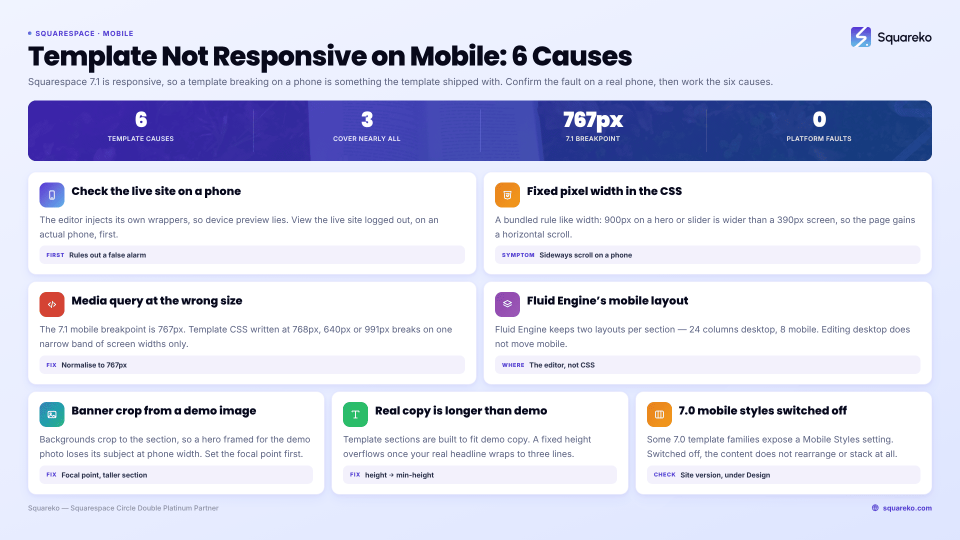
The short answer: Squarespace 7.1 itself is responsive, so a purchased template breaking on mobile is not the platform failing — it is something the template shipped with. In practice, that is nearly always one of three things: fixed pixel widths in the template's bundled Custom CSS, media queries written at the wrong breakpoint, or Fluid Engine mobile layouts the designer arranged around demo content you have since replaced.
This post covers faults that arrived with the template. For mobile problems on any Squarespace site — cache, editor-only rendering, block stacking, viewport — see Squarespace mobile responsive issues, which own the general causes.
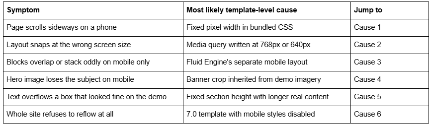
Quick diagnostic table
Before working the list, confirm the fault is real: view the live site logged out on an actual phone, not just the editor's device preview. The Squarespace editor injects its own wrapper markup, so the preview is an approximation.
Cause 1 — A fixed pixel width in the template's bundled CSS
A premium Squarespace template is not a file you install. In Squarespace 7.1 there is one template family, so what you bought is a 7.1 site with sections, Site Styles values and a block of Custom CSS. Everything the template does to your layout is editable, and anything breaking on mobile is in one of those three places.
The most common offender is a rule like width: 900px or min-width: 1100px written for a hero, a gallery row or a testimonial slider. On a 390px screen that element is wider than the viewport, and the page gains a horizontal scroll.
How to confirm it in 30 seconds. Paste this at the very bottom of Website → Website Tools → Custom CSS, load the site on a phone-width window, and every element wider than the screen is outlined:
/* Diagnostic only — remove after use */
* {
  outline: 1px solid red !important;
}
The outermost red box that extends past the screen edge is the culprit. Find the matching rule in the template's CSS and either delete it or scope it above the breakpoint:
@media screen and (min-width: 768px) {
  .template-hero { width: 900px; }
}
Replace fixed widths with max-width wherever you can. max-width: 900px behaves identically on desktop and shrinks correctly on a phone.
Cause 2 — The template's media queries use the wrong breakpoint
Squarespace 7.1's mobile breakpoint is 767px. Template CSS written against a generic framework often uses 768px, 640px or 991px instead. The result is a narrow band of screen widths where Squarespace has switched to its mobile arrangement but the template's CSS has not, or the reverse — layouts that look broken on exactly one device and fine on every other.
Search the template's Custom CSS for max-width: inside @media and normalise anything close to the breakpoint:
/* Matches Squarespace 7.1's own mobile breakpoint */
@media screen and (max-width: 767px) {
  .template-columns { display: block; }
}
If the template also targets tablets, use 768px–1023px as the intermediate band so the two queries meet without a gap.
Cause 3 — Fluid Engine keeps a separate mobile layout you have not edited
This is the cause most template buyers never find, because nothing about it looks like an error.
Fluid Engine in Squarespace 7.1 maintains two independent layouts per section — a 24-column desktop grid and an 8-column mobile grid — and stores block positions as coordinates on each. Squarespace's engineering team designed it this way deliberately, so that mobile can be arranged bespoke rather than derived.
The consequence for a purchased template: the designer arranged both layouts around their demo content. When you edit the desktop layout, the mobile layout does not follow. When you add a block, it is placed on the mobile grid automatically and often lands overlapping something.
The fix is in the editor, not in CSS. Open the section, switch to the mobile view using the device toggle at the top of the editor, and rearrange the blocks there. CSS applied to a Fluid Engine section has to fight inline styles and a per-section <style> block, so it needs !important on every rule and it still will not move a block to a different grid cell.
Cause 4 — The banner crop was chosen for the template's demo image
Squarespace crops section background images to fit the section, and the amount of cropping depends on the section height and the browser width. A wide landscape hero that frames its subject centrally on desktop can lose that subject entirely at phone width.
Template demo images are also not licensed for your use, so every one of them has to be replaced — and a replacement with a different aspect ratio crops differently from the original.
Three fixes, in order of preference:
Set the focal point. In the section's Background settings, drag the focal point onto the part of the image that must stay visible. This is free and it survives future edits.
Raise the section height in the section's Format tab. Squarespace's own guidance is that a cropped background is usually a section that is too short.
Use a different image below the breakpoint if the composition simply does not work at portrait ratios.
Upload background images at 1,500–2,500px wide. Squarespace's CDN serves a maximum of 2,500px, and its documentation notes that images over 2,500px on the longest edge can cause problems on mobile devices.
Cause 5 — Real content is longer than the demo content
Template sections are frequently built with a fixed section height, or with CSS setting a height rather than a min-height, because the demo copy was written to fit. Replace "Your headline here" with a real seven-word headline and the text overflows its container — usually only on mobile, where the same text wraps to three lines instead of one.
Look for height: in the template's Custom CSS and change it to min-height: wherever the element contains text. In the editor, check every section's Format tab for a fixed height and prefer the automatic option.
This is also the reason to replace demo copy before fine-tuning mobile layouts rather than after. Arranging an 8-column grid around placeholder text guarantees a second pass.
Cause 6 — A 7.0 template with mobile styles switched off
If you bought a template several years ago, or inherited a site, it may be on Squarespace 7.0 rather than 7.1. Some 7.0 template families expose a Mobile Styles setting, and Squarespace's documentation is explicit that if mobile styles have been disabled, "your site content won't rearrange or stack on mobile."
That produces the most dramatic version of this fault: a desktop layout shrunk to fit, with unreadable text and no reflow at all. Check the site's version first — 7.0 sites have a template name under Design; 7.1 sites do not, because 7.1 has a single template family. If mobile styles are off, switching them back on resolves it in one click.
Longer term, a 7.0 template is a maintenance liability. The version update tool moves a 7.0 site to 7.1 in place without affecting content, orders, SEO settings or URL mappings — but it is permanent, and it commonly leaves the Custom CSS commented out afterwards, which needs uncommenting by hand.
Working the list
Run the outline diagnostic first — it resolves the horizontal-scroll cases in a couple of minutes, and horizontal scroll is what most people mean by "not responsive". Then check breakpoints, then the Fluid Engine mobile layouts, then banners. Across 54 Squareko-built sites measured in August 2026 (Playwright/Chromium lab test, unthrottled, single run per site), 53 run Squarespace 7.1, and the mobile faults we are sent on those sites are overwhelmingly bundled CSS rather than anything the platform did.
If a template's CSS is long, undocumented and fighting Site Styles in three places at once, unpicking it is a cascade-reading job rather than a settings job. That is what our Squarespace website support plans exist for. Most template mobile faults, though, are one fixed width and one wrong breakpoint — start there.
FAQ
-
Yes. Squarespace 7.1 resizes and rearranges content for smaller screens automatically, and every section supports a separate mobile layout. A purchased template failing on mobile is failing because of something it added — bundled CSS, a fixed section height, or a mobile layout arranged around demo content.
-
An element is wider than the viewport, almost always a fixed pixel width in the template's Custom CSS. Add * { outline: 1px solid red !important; } temporarily, view at phone width, and the outermost box extending past the edge is the cause. Replace width with max-width.
-
Fluid Engine keeps two independent layouts per section — a 24-column desktop grid and an 8-column mobile grid. Editing the desktop arrangement does not change the mobile one. Switch to the mobile view with the device toggle in the editor and rearrange blocks there.
-
Squarespace crops section backgrounds to fit, and the crop depends on section height and browser width. Set the focal point onto the part of the image that must stay visible, or raise the section height in the Format tab. Keep uploads between 1,500 and 2,500px wide.
-
767px. Squarespace 7.1's own mobile breakpoint is 767px, so a template media query written at 768px or 640px leaves a band of screen widths where the platform has switched layouts and the template CSS has not.
-
Partly. Check whether the template's Mobile Styles setting has been disabled — Squarespace states that with mobile styles off, content will not rearrange or stack on mobile. Beyond that, moving the site to 7.1 with the version update tool is the durable fix.

Author Bio
I'm Walid Hasan, a Certified Squarespace Expert and Squarespace Circle Platinum Partner with over 12 years of hands-on experience designing and optimizing high-performing websites. Over the years, I've had the privilege of building more than 2,000 Squarespace websites for clients around the world, always focusing on clean design, strong user experience, and conversion-driven results.