Why Your Squarespace Mobile Layout Looks Different (And How to Fix It)
This is not a bug. Squarespace 7.1's Fluid Engine deliberately maintains two separate layouts for every section — one on a 24-column desktop grid, one on an 8-column mobile grid. The two share content but not position, size, or visibility. Mobile diverging from desktop is the system working as designed; what you are missing is that the mobile layout is yours to edit, and until you edit it Squarespace is guessing.
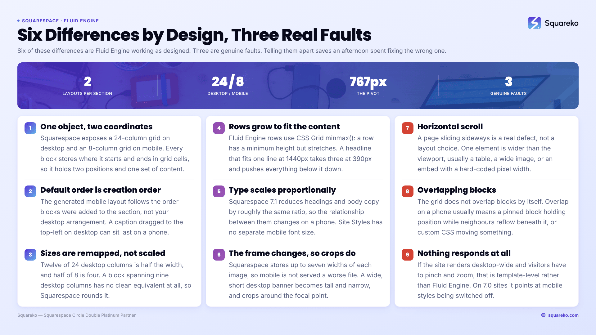
Expected behaviour, or a genuine fault?
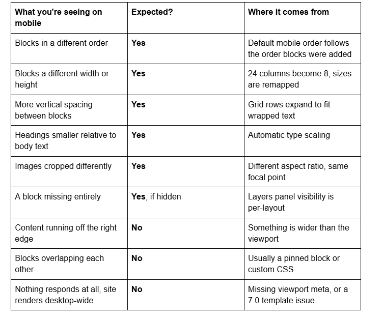
The first six rows are Fluid Engine. The last three are faults, and they are covered at the end.
The model: one set of content, two sets of coordinates
Squarespace's engineering team described the decision directly — Fluid Engine exposes "a 24-column grid on desktop and an 8-column grid on mobile, each with sensibly sized rows." Every block stores an x/y coordinate pair for where it starts and another for where it ends, in grid cells rather than pixels.
So a block is one object with two coordinate pairs. Change the text and both layouts get the new text, because there is one text. Move the block on desktop and only the desktop coordinates change, because there are two positions.
The grid pivots at Squarespace 7.1's mobile breakpoint of 767px. Below that, the 8-column mobile coordinates render. At 768px and above, the 24-column desktop coordinates render. There is no third layout, which is a separate and frequently surprising fact: tablets get the desktop layout, compressed.
Reason 1 — Default mobile order follows creation order, not desktop position
When Squarespace 7.1 generates a mobile layout for a section you have not edited, it does not read your desktop arrangement top-to-bottom and reproduce it. The default ordering follows the order in which blocks were added to the section.
This is why a caption dragged to the top-left of a desktop layout can appear last on mobile. Nothing has gone wrong; the mobile layout has simply never been told what you intended.
Fix it once, in Mobile View, with the ↑ / ↓ arrows in the block toolbar. Squarespace also notes that blocks added after you edit the mobile layout will "display in the mobile layout as similarly to the desktop layout as possible" — an approximation dropped into a layout you arranged by hand, which is why every new block earns a quick mobile re-check.
Reason 2 — Block sizes have to be remapped from 24 columns to 8
A block spanning 12 of 24 desktop columns occupies exactly half the width. On mobile there are only 8 columns, so half the width is 4 — but a block spanning 9 desktop columns (37.5%) has no clean equivalent at all. Squarespace rounds.
The visible result is that three blocks sitting neatly side by side on desktop become full-width, stacked, and slightly differently proportioned on mobile. That is the grid doing what an 8-column grid can do, not a rendering failure. If the proportions matter, set them explicitly in the mobile layout.
Reason 3 — Rows grow to fit content, so vertical spacing shifts
Fluid Engine rows use CSS Grid's minmax() — a row has a minimum height but stretches if its content needs more. At 390px wide, a headline that fitted one line on desktop takes three, and the row expands to hold it, pushing everything below it down.
That is why mobile spacing rarely matches desktop spacing proportionally. Fighting it with fixed heights makes things worse — a fixed height that fits three lines of a headline on an iPhone 15 will clip it on a device with a slightly narrower viewport or a larger accessibility text setting.
Adjust block sizes in the mobile layout instead, or use section top and bottom padding, which is a section-level setting shared by both layouts. Shorter sections help here too: a section with four blocks absorbs a wrapped headline gracefully, a section with twenty accumulates the shift down its whole height.
Reason 4 — Text scales automatically, and not always the way you'd choose
Squarespace 7.1 scales type for smaller screens without you doing anything, and the scaling is proportional. A heading set very large on desktop is reduced by roughly the same ratio as body copy, so the relationship between headings and paragraphs changes on a phone even though both got smaller.
Squarespace 7.1's Site Styles has no separate mobile font-size control. The two real levers are reducing the desktop size that mobile scales from, or setting mobile sizes explicitly at the 767px breakpoint — covered in fixing text that's too small on mobile.
Reason 5 — Images crop differently because the shape of the frame changes
Squarespace stores up to seven widths of each uploaded image and picks the best fit for the visitor's screen, so mobile is not being served a worse file. What changes is the frame. A banner that is wide and short on desktop becomes tall and narrow on a phone, and the crop happens around the image's focal point.
Set the focal point in Image settings to whatever must survive the crop, and reduce section height in the mobile layout so less cropping is needed at all.
The three cases where it genuinely is a fault
Everything above is Fluid Engine behaving normally. These are not.
Horizontal scroll. If the page slides sideways on a phone, one element is wider than the viewport — typically a table, a wide image, or a third-party embed with a hard-coded pixel width. That is a real defect and it has a real fix.
Overlapping blocks. Fluid Engine's grid does not overlap blocks by itself. Overlap on mobile usually means a pinned block — pinning is per-layout, and a block pinned on mobile holds position while neighbours reflow underneath it — or custom CSS repositioning something. Unpin, or remove the rule, and check again.
Nothing responds at all. If the site renders at desktop width on a phone and the visitor has to pinch and zoom, that is not a Fluid Engine question. It points at a template-level problem, and on version 7.0 sites specifically at mobile styles being disabled — Squarespace's own guidance notes that when mobile styles are off, "visitors must pinch and zoom to navigate your site."
A useful separator: Fluid Engine divergence is per section and looks considered-but-wrong. Genuine faults are site-wide or produce something no layout engine would ever choose, like text sliding under an image. If the same problem appears on every page of the site, stop looking at layouts.
The triage list for all three is Squarespace mobile responsive issues.
Making mobile match desktop on purpose
You have three levers, in order of how often they are the right one:
Edit the mobile layout. Reorder with the arrows, resize against the 8-column grid, use per-block mobile design overrides where a block offers them. Full detail in the Fluid Engine mobile editing rules.
Hide or swap. Remove a block from one layout with the Layers panel eye icon, or hide a whole section with CSS at 767px — see how to hide a section on mobile.
Write CSS. Last resort, at max-width: 767px, and remember Fluid Engine's inline positioning means you will often need !important.
A site with a lot of sections is a lot of small decisions rather than one hard problem, which is why a mobile pass is usually a couple of hours of unglamorous work rather than a rebuild. If you would rather not spend those hours, that is the sort of job our Squarespace website support plans handle routinely. Most people reading this will get there faster on their own now that the model makes sense.
FAQ
-
It has separate mobile and desktop layouts, not separate sites. Fluid Engine stores two coordinate sets for every block in a section — one for the 24-column desktop grid, one for the 8-column mobile grid. Content is shared; position, size and visibility are not.
-
Yes. Block position, block size, per-breakpoint visibility in the Layers panel, pinning, and mobile design overrides all apply only to the layout you are editing. Text content, button links and section-level settings such as background and padding are shared across both.
-
Because Squarespace's default mobile ordering follows the order blocks were added to the section, not their desktop positions. Until you open Mobile View and reorder with the up and down arrows, you are looking at a generated guess rather than a decision.
-
Squarespace 7.1 scales type automatically for smaller screens, proportionally. A very large desktop heading shrinks by roughly the same ratio as body text, so the relationship between them changes. There is no separate mobile font-size control in Site Styles; use CSS at 767px.
-
Fluid Engine has only two layouts. Anything 768px and wider gets the desktop layout compressed, not a tablet layout. Text that needed three lines at 1440px needs two at 900px, and the grid row it was assigned stays the same height, leaving gaps.
-
You cannot make it identical — 8 columns cannot reproduce a 24-column arrangement. You can make it deliberate: reorder and resize blocks in Mobile View, use section padding for spacing, and set mobile type sizes with CSS at the 767px breakpoint.

Author Bio
I'm Walid Hasan, a Certified Squarespace Expert and Squarespace Circle Platinum Partner with over 12 years of hands-on experience designing and optimizing high-performing websites. Over the years, I've had the privilege of building more than 2,000 Squarespace websites for clients around the world, always focusing on clean design, strong user experience, and conversion-driven results.