5 Squarespace Design Tips for Music Producer Websites That Stand Out
Key Takeaways For 5 Squarespace Design Tips for Music Producer Websites
Lead with audio: Put your best tracks front and center on your homepage—don't make visitors hunt for your sound.
Dark themes convert better: Dark design isn't just trendy for music sites; it's psychologically proven to draw focus and increase engagement.
Simplicity wins: Limit your navigation to 5 core pages max; too many options confuse visitors and kill conversions.
Use full-width visuals: Hero sections with video backgrounds or large images create mood and instant credibility.
Make CTAs impossible to miss: Your booking button needs to appear multiple times—top nav, hero, sidebar, footer—and it needs to stand out.
Your music producer website is your first impression. In a crowded industry where talent alone isn't enough, smart music producer website design tips for Squarespace can be the difference between a visitor who books you and one who scrolls past. We've worked with dozens of music producers at Squareko, and we've seen what works—and what tanks.
The reality? Most music producer websites fail for the same reasons. They bury their best work. They use light themes that feel corporate. Navigation is buried under lazy design. And the biggest mistake: their booking or contact button is anywhere except where clients actually look.
This post covers five design tips that actually move the needle. Each one addresses a specific problem we see in music websites, and each one comes with tactical advice you can implement today. Whether you're on Squarespace already or planning your first site, these strategies will help you build a website that converts visitors into clients.
By the end, you'll understand what makes a good music producer website, when to use dark themes, and how to structure your site so your best work gets noticed.
1. Lead With Sound, Not Just Visuals
Your homepage has about 3 seconds to grab attention. The biggest mistake we see? Music producers hiding their audio player below the fold or burying it in a portfolio page. Your sound should be the hero.
What does this mean practically? Put a high-quality audio player or embedded SoundCloud/Spotify widget at the top of your homepage. Make it the first thing visitors interact with. Not a logo. Not a nav menu. Your music.
Here's why this works: When someone visits a music producer's website, they're asking one question:
Does this person have the sound I need? Answer that immediately. Let them hit play in the first 5 seconds.
On Squarespace, you have options. You can embed an audio player using Squarespace's native music player, pull from SoundCloud (which integrates cleanly), or use Spotify's embed. Each has trade-offs. Squarespace's native player is the cleanest and gives you full control. SoundCloud is great if you want to leverage that platform's audience. Spotify embeds look polished but limit interactivity.
The best practice? Feature 3-5 of your strongest tracks. Not your entire discography. This isn't a jukebox; it's a showcase. Think of it like a film producer showing a highlight reel, not full cuts.
And here's a pro tip: Set those tracks to play quietly on autoload with volume controls visible. Don't blast sound at visitors—that's abrasive. But subtle background music as they scroll creates mood and keeps them engaged. It's the difference between a static webpage and an experience.
Also consider the metadata. Label each track with the genre, BPM, and mood. Deep House (126 BPM, Moody) tells browsers exactly what they're getting. This is especially important if you produce multiple genres or work with different moods for different use cases.
2. Dark Themes Convert Better for Music Brands
This one surprises people, but the data is clear: dark themes outperform light themes for music and entertainment brands. There's psychology here, and there's also practical advantage.
Psychologically, dark themes do several things simultaneously. First, they create contrast. Your visuals—album art, video, text—pop more against darkness. Second, they signal premium and creative industries. Think about music streaming apps, professional DAWs, and high-end studios. They all use dark interfaces. Your website inherits that perception when you go dark.
Third, dark themes reduce cognitive load. White backgrounds are bright and fatiguing for extended periods. Dark backgrounds are easier on the eye, which means visitors stay longer, scroll more, and engage deeper. This translates to lower bounce rates and longer session duration—both ranking signals for Google.
Practically, a dark theme on Squarespace is straightforward. You have two paths: use Squarespace's built-in dark mode templates (they have several designed for music and creative brands), or customize a template with CSS and Squarespace's design tools.
The best dark themes for music producers aren't pure black. They're dark gray or very dark blue (#1a1a1a or #0f1419). Why? Pure black can feel harsh on screen and create too much contrast. A slightly warmer dark gray feels more premium and less straining.
Add strategic color accents. Maybe a bright cyan, gold, or neon color for CTAs and highlights. The contrast between the dark base and a single bright accent color is powerful. It draws the eye exactly where you want it.
Lighting matters too. Ensure your hero images and video backgrounds are exposed properly against the dark background. Underexposed images disappear into darkness. Well-lit, professional shots stand out and command attention.
One more consideration: dark themes can hurt readability if your font color isn't right. Use white or very light gray text, but not pure white on pure black—it can cause eye strain. Aim for #ffffff or #f5f5f5 on dark backgrounds. Test it yourself. If your eyes hurt after reading a paragraph, the contrast is too harsh.
3. Keep Your Navigation Ruthlessly Simple
Too many options kill conversions. This is true across all industries, but especially for music producer websites where visitors are there to do one thing: listen and decide whether to work with you.
The 5-page rule is golden here. Limit your main navigation to 5 core pages maximum. Here's what those typically are:
Home – Hero section with audio player, brief intro, and social proof
Portfolio / Work – Your best tracks, projects, and credits
About – Your story, background, and why clients should work with you
Services – What you offer (production, mixing, mastering, etc.) and pricing
Contact – The booking form or calendar link
That's it. No blog page. No FAQ page nested in the main nav. No separate Media Kit or Testimonials page cluttering your menu. Those belong in the footer or as internal pages (not in the main navigation).
Why does this matter?
Every navigation option is cognitive friction. More options mean more thinking. More thinking means more bounce rate. Visitors to music producer websites aren't shopping around for information. They want to know if you're the right fit and how to hire you. Make that path obvious.
On Squarespace, keep your main navigation clean. Use dropdowns sparingly. If you absolutely need subpages (like Services with Production, Mixing, and Mastering sub-options), use a single dropdown. Don't create nested dropdowns—they're a UX nightmare on mobile.
For mobile, this principle is even more important. On phones, a 5-item nav becomes the difference between a mobile menu that feels lightweight and one that feels overwhelming. Keep it tight.
Here's a tactical move: Hide secondary pages from the main nav but include them in your footer. Your privacy policy, terms, and maybe a detailed FAQ can live in the footer. This keeps your main nav clean while maintaining the full site structure Google needs to index you properly.
4. Use Full-Width Imagery and Video to Set the Mood
Music is visceral. Your website should feel that way too. Don't use tiny images floating in a standard layout. Go full-width with your visuals. Make them breathtaking.
Full-width hero sections are non-negotiable for music producer websites. Your hero (the first thing visitors see) should be a high-quality image or video that fills the entire width and height of the screen. It sets the tone for everything below.
For music producers, this usually means one of three approaches:
Option 1: Static Hero Image. This is the safest option. Use a professional, high-resolution image that represents your sound. For an electronic producer, maybe a moody studio shot or abstract visuals in your color palette. For a hip-hop producer, maybe a raw, energetic image. The image needs to be at least 1920px wide and optimized for web (compressed but not pixelated). Use a tool like ImageOptim or TinyPNG to keep load times fast.
Option 2: Video Background. This is more dramatic. A looping video background (15-30 seconds, no sound) creates movement and energy. Examples: studio footage, live session footage, abstract visuals synced to your color palette. The trade-off is file size. A video background on homepage can slow your site down if not optimized. Use a 5-10MB H.264 MP4, hosted on a CDN or Squarespace's servers. Provide a fallback static image for slow connections.
Option 3: Animated GIF or Cinemagraph. A middle ground. A subtle animated GIF doesn't impact load time like video but adds motion and energy. Think of a cinemagraph—a photo with one element moving in a loop. A studio light flickering. Headphones swaying. It's more subtle than full video but more engaging than a static image.
On top of your hero visual, overlay your brand name, a compelling headline, and a CTA button. The overlay should use a semi-transparent dark background (rgba(0,0,0,0.4) or similar) so your text is readable against busy visuals. On Squarespace, you can create this effect using sections and background overlays.
Below your hero, use additional full-width sections with images or video. Don't default to the Squarespace standard layout with narrow content blocks. Think about how YouTube, Instagram, and SoundCloud use full-width visuals. Copy that pattern.
One more point: make sure your images are mobile-optimized. Responsive image crops matter. A stunning hero image on desktop can become unreadable on mobile if the important parts aren't in the center. Test on multiple devices before launch.
5. Make Your Booking / Contact Obvious at Every Scroll Point
This is the most important tip and the one most music producer websites get wrong.
Your booking button, calendar link, or contact form needs to be visible at multiple scroll points. Not just once. Not on a Contact page buried in the nav. Everywhere.
Here's a practical structure:
Top navigation (sticky): A Book Now or Get in Touch button in your header. Make it stick to the top as visitors scroll so it's always visible. Use a contrasting color (bright accent color against dark background).
Hero section: Below your hero image, place a large CTA button. Book a Session or Hire Me with clear copy.
After portfolio section: Once visitors have heard your work, place another CTA. Ready to work together? Get in touch.
Sidebar (if applicable): If you have a sidebar on portfolio or blog posts, include a Contact or Book call-out box.
Footer: Your footer should have a final CTA. Start your project today with a link to your booking page or contact form.
Pop-up or exit-intent: This is aggressive, but consider an exit-intent pop-up—a small modal that appears when someone moves to leave. Before you go, book a free consultation. On Squarespace, you can create this with custom code or third-party integrations.
The goal is friction-free booking. The moment someone decides they want to work with you, they should be able to take the next step without hunting for a contact page.
On Squarespace, set this up using:
A sticky header with a navigation menu that includes a prominent button
Acuity Scheduling or Calendly embedded directly on your site (no redirects to external sites—keep them on your domain)
A well-designed contact form using Squarespace's Form Block, not a separate contact page
Clear copy on every CTA. Don't say Submit. Say Book a Mixing Session or Let's Talk About Your Project.
A/B test your CTA copy. Book Now might convert better than Get in Touch for some audiences. Test different button colors. Don't assume. Measure.
What Makes a Good Music Producer Website?
Before we go deeper into design, let's answer the foundational question: what actually makes a good music producer website?
A good music producer website does four things exceptionally well:
1. It showcases your sound immediately. Visitors should hear your best work in the first 5 seconds without clicking multiple times. No hunting. No loading third-party embeds from elsewhere. Your sound, front and center.
2. It establishes credibility fast. This means social proof. Client testimonials, logos of artists you've worked with, streams, awards, or press mentions. People want to know you've delivered results for others. Include this prominently.
3. It makes booking frictionless. A visitor decides they want to work with you. What happens next? They should be able to book a consultation, see your rates, or start a project in under 30 seconds. No confusion. No email required (though email should be available). Direct booking is conversion gold.
4. It feels professional and on-brand. Your website should reflect your sound and your market. A dark, moody aesthetic for a cinematic composer feels right. A bright, energetic aesthetic for a pop producer feels right. Your design shouldn't fight your music.
Most music producer websites fail because they miss at least one of these. They have great audio but buried CTAs. Or clear navigation but weak social proof. Or easy booking but weak design. The best sites nail all four.
Dark vs. Light Theme: Which Is Right for Your Music Brand?
This is the question we get most often at Squareko, so let's break it down with a clear comparison.
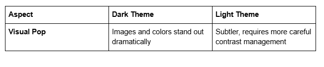
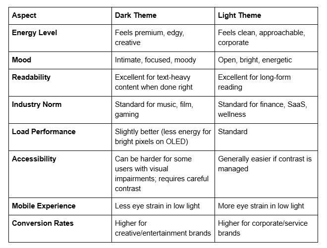
Our recommendation: If your target audience is other musicians, producers, labels, or creative professionals, go dark. If your target is brands, corporations, or mainstream listeners shopping for music for ads/media, light can work. But for most music producers targeting other industry professionals, dark wins.
If you're torn, here's the real advice: test both. Launch with one, measure your analytics after 30 days, then A/B test the other version. Your data will tell you which performs better for your specific audience.
One more tactical note: you don't have to choose 100% dark or 100% light. Many of the best music producer websites use a mostly dark theme with light sections for contrast. Your hero is dark. Your testimonial section is light. Your pricing is dark. This creates visual rhythm and keeps visitors engaged.
Common Design Mistakes Music Producers Make
Let's get real about what kills music producer websites. These are mistakes we see constantly:
Mistake 1: Autoplay audio at full volume. Nothing makes someone leave faster than unexpected sound blasting from their speakers. If you use autoplay (which we don't recommend), keep volume at 20-30% and make mute controls obvious.
Mistake 2: Burying your best work. Your strongest track should be on your homepage, not on a portfolio page three clicks deep. Lead with strength.
Mistake 3: Outdated production credits. Nothing hurts credibility like a Recent Work section listing songs from 2019. Keep your portfolio fresh. If you don't have recent work, that's a separate problem to solve offline.
Mistake 4: Vague pricing. Rates available upon request is terrible copy. Tell people what a basic session costs. Even if you're flexible, give them a starting point. Transparency builds trust. Vagueness feels sneaky.
Mistake 5: Slow load times. A gorgeous website that takes 5 seconds to load loses visitors. Optimize your images aggressively. Use a CDN. Limit video backgrounds. Test your load time on 4G connections, not just fiber. Use Google PageSpeed Insights and act on the feedback.
Mistake 6: No mobile optimization. Your website will get 60-70% mobile traffic. If your site looks terrible on phones, you're leaving money on the table. Test everything on iPhone and Android.
Mistake 7: Unclear CTAs. Vague buttons like Learn More don't convert. Be specific: Book a Mixing Session, Download My Rate Card, Schedule a Call.
Mistake 8: Too much music. Streaming 10 tracks on page load kills your site speed. Limit to 3-5 high-quality selections. Quality over quantity.Avoid these, and you're already ahead of 80% of music producer websites out there.
Your Music Producer Website Deserves Design That Converts
We've covered five concrete design tips: leading with sound, using dark themes, keeping navigation simple, leveraging full-width visuals, and making CTAs impossible to miss. We've also answered the big questions about what makes a good music producer website, when to use dark vs. light design, and what mistakes to avoid.
But here's the truth: designing a music producer website that actually converts takes more than tips. It requires strategic thinking about your audience, your sound, your market position, and your goals. It requires testing, iteration, and ongoing optimization.
At Squareko we specialize in Squarespace web design for music producers, creatives, and artists. We've built dozens of music producer websites, and we've learned exactly what drives bookings, inquiries, and client relationships. We know the difference between a website that looks beautiful and a website that actually works.
If you're ready to build a music producer website that stands out—one that showcases your sound, builds credibility, and converts visitors into clients—let's talk. We offer a free 30-minute discovery call where we'll discuss your sound, your goals, your target audience, and what a professional music producer website could do for your career. No pressure. No sales pitch. Just honest conversation about your website and your vision.
From custom website design to SEO strategy, we help businesses launch a site that looks professional and performs better.

About the Author
I'm Walid Hasan, a Certified Squarespace Expert and Squarespace Circle Platinum Partner with over 12 years of hands-on experience designing and optimizing high-performing websites. Over the years, I've had the privilege of building more than 2,000 Squarespace websites for clients around the world, always focusing on clean design, strong user experience, and conversion-driven results.