5 High-Converting Design Elements Every Course Creator Website Needs on Squarespace
Introduction
Your course website is your digital storefront. It's where prospective students decide whether your course is worth their time and money. But here's the reality: most course creator websites fail to convert visitors into enrolled students because they're missing critical design elements that build trust and urgency.
This isn't about fancy animations or trendy aesthetics. It's about intentional design that guides visitors toward enrollment. When course creators work with us at Squareko, we focus on one thing: removing friction from the enrollment journey. We've discovered that certain design patterns—when implemented correctly on Squarespace—consistently drive higher conversion rates across course categories, from coaching programs to technical certifications.
In this guide, I'll walk you through the five high-converting design elements that every successful Squarespace course website needs. Whether you're launching your first course or redesigning your existing site, these principles will immediately impact your enrollment numbers. Each element answers a specific question about why your course website should include it, helping you understand not just the what but the why behind each strategy.
Key Takeaways 5 High-Converting Design Elements Every Course Creator Website Needs on Squarespace
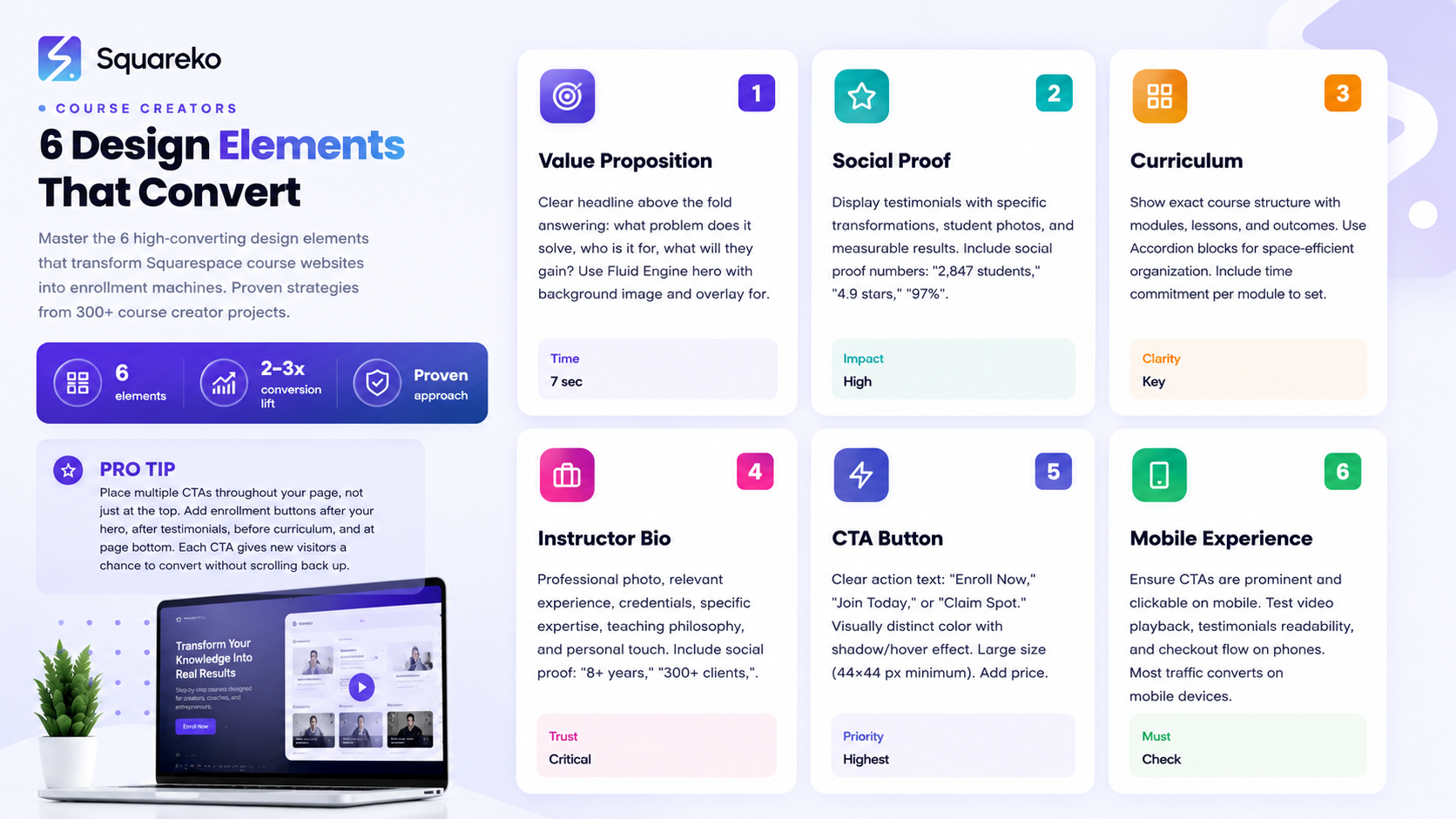
A clear value proposition above the fold (visible without scrolling) communicates your course's unique benefit within seconds and reduces visitor bounce rates
Social proof through testimonials, student results, and instructor credentials dramatically increases trust and conversion rates
A compelling curriculum preview that shows exactly what students will learn removes the biggest barrier to enrollment: uncertainty
A professional instructor bio humanizes your brand and positions you as the credible authority students are paying for
A friction-free enrollment CTA with clear next steps increases conversion by removing confusion about how to buy
Why Does Your Course Website Need a Clear Value Proposition Above the Fold?
Your visitors have seven seconds—maybe less. That's the average time someone spends on your homepage before deciding to stay or bounce. If they don't immediately understand what your course is about and why it matters to them, they're gone.
A clear value proposition above the fold answers three questions instantly:
What problem does this course solve?
Who is this course for?
What will they gain by taking it?
On Squarespace, you can create this with a powerful hero section using the Fluid Engine. Start with a high-quality background image or video that emotionally connects to your course topic. A course on building e-commerce businesses might use an image of a thriving online store. A fitness coaching program might show transformation results. The visual should reinforce your message without overwhelming it.
Layer your headline over that background. Your headline should be specific, not generic. Instead of Learn Web Design, try Launch Your Design Agency and Hit $5K Monthly Revenue in 12 Weeks. The second one immediately tells someone whether this course is for them.
Below the headline, add a short subheadline (one sentence, max) that reinforces the main benefit or eliminates a common objection. Then include your primary CTA button—but we'll talk about that more in element five.
Here's a Squarespace-specific implementation tip: Use Squarespace's section background options to add a subtle color overlay to your hero image. A semi-transparent dark overlay (30-50% opacity) makes your text more readable without dimming the image so much that it loses impact. Test this with your actual headline text to ensure legibility.
The Fluid Engine also allows you to control spacing precisely. Don't bunch your value proposition too tightly. Give it breathing room. A hero section that spans 60-70% of the viewport (with white space below) feels premium and converts better than a cramped design that immediately forces scrolling.
Why Does Your Course Website Need Social Proof and Testimonials?
Social proof is the psychological principle that people trust the experiences of others. When someone visits your course website, they're asking subconsciously:
Is this real?
Do people actually benefit from this course?
Testimonials and social proof answer that question louder than any claim you can make about yourself.
The most effective testimonials for course websites include three elements:
A specific transformation or result (not vague praise like great course!)
The student's starting situation (so prospects identify with them)
The student's name, photo, and optionally their role or business (this proves they're real people)
For example: I was struggling to attract clients without giving heavy discounts. After completing Walid's Squarespace design course, I raised my rates 40% and actually got more bookings. My average project value increased from $3K to $5.2K. This testimonial works because it's specific, measurable, and relatable to similar prospects.
On Squarespace, create a dedicated testimonials section using either the Quote block or a custom layout with the Fluid Engine. We recommend a carousel or grid layout that displays three to four testimonials prominently. Include a high-quality photo for each testimonial (even headshots count—they humanize the proof more than anonymous text).
Add social proof numbers above your testimonials: Join 2,847 students, 4.9-star average rating, 97% student satisfaction. These metrics are powerful psychological signals that your course delivers results.
Video testimonials convert even better than written ones. If you have three to five students willing to record a short 30-60 second video testimonial, embed one or two of these on your homepage. Don't require users to click play autoplay short testimonial videos (on mute) so the motion catches attention and demonstrates real people speaking about the course.
Here's an implementation consideration: place social proof high on your page, ideally within the first two sections after your hero. A visitor shouldn't have to scroll significantly to see that other people have succeeded with your course.
Why Does Your Course Website Need a Compelling Course Preview and Curriculum Section?
A compelling curriculum section shows the exact structure of your course: modules, lessons, key topics, and the progression. This removes the biggest objection: What am I actually getting for my money?
Here's how to structure this section for maximum conversion:
First, give a brief overview of what the course covers in two to three sentences. Then, organize the curriculum by module or section. For each module, list three to five key lessons or topics. You don't need to list every single lesson—that can feel overwhelming—but show enough detail that a prospect understands the scope.
Include outcomes for each module when possible. Instead of just listing Module 3: Advanced Photography Techniques, add By the end of this module, you'll master composition, lighting, and post-processing to shoot professional-quality photos. This reframes the curriculum from a checklist into a progression of skills.
On Squarespace, use the Accordion block for curriculum sections. This is perfect because it's space-efficient and interactive. Visitors can click to expand each module and see what's inside. The act of clicking into each module increases engagement with your content—they're no longer passively reading but actively exploring what they'll learn.
Alternatively, create a custom grid layout with cards for each module. Each card shows the module name, number of lessons, estimated time commitment, and key topics. Add a subtle hover effect (Squarespace allows this with code) so cards feel interactive.
Here's what really moves the needle: include the estimated time commitment for the entire course and per module. Complete in 8 weeks, 10-15 hours per week is much clearer than no timeline at all. Some prospects are time-constrained and need to know upfront whether this fits their schedule.
One more conversion tip: if your course includes bonuses (templates, frameworks, lifetime access to community, monthly group calls), list those clearly in this section. Bonuses are a major value driver that prospects often overlook if they're not explicitly highlighted.
Why Does Your Course Website Need a Professional Instructor Bio Section?
Here's a fact about online education: students pay for access to you, not just the information. The information exists everywhere online for free. What they're investing in is your expertise, your teaching style, and your ability to guide them.
A professional instructor bio section builds credibility and authority. It answers the question: Why should I learn from this person?
Your bio should include:
A professional photo (not casual, not outdated)
Your relevant experience and credentials (10+ years in the field, certifications, degrees)
Your specific expertise (what you're known for in your niche)
Your teaching philosophy or approach
A personal touch that makes you relatable (mention a specific challenge you overcame, why you started teaching, what you're passionate about)
For example: Walid is a Squarespace design expert with 8+ years of experience helping creative professionals launch high-converting websites. He's designed custom sites for over 300 course creators, coaches, and service-based businesses. His courses have trained 2,800+ designers to build premium brands on Squarespace. When he's not designing, he's experimenting with new Squarespace features and sharing insights on building online businesses.
This bio works because it's specific (8+ years, 300+ clients, 2,800+ students), credible (mentions exact numbers and outcomes), and personal (shows personality and genuine interest).
On Squarespace, use a two-column Fluid Engine layout for your instructor section. Place your professional photo on one side and your bio text on the other. Keep the photo visible—don't hide it below the fold. The photo is a trust signal; students want to see who they're learning from.
Add social proof within this section too. Include any relevant awards, certifications, publications, or recognition in the background. If you've been featured in major media, mention it: Featured in Forbes, Entrepreneur, and The New York Times. If you have a popular podcast or YouTube channel, mention your following: Host of the 'Course Creator Secrets' podcast with 50K+ monthly listeners.
Consider adding a quote from a well-known figure in your industry who endorses your work, if you have it. This adds another layer of third-party credibility.
Why Does Your Course Website Need a Frictionless Enrollment CTA?
All the other design elements don't matter if your CTA doesn't work. By work, I mean it removes every possible barrier to students clicking and completing the enrollment process.
Here's what kills conversions: confusion. Unclear CTAs that say Learn More or Explore Course don't tell visitors what happens when they click. They also don't create urgency.
Your primary CTA should say exactly what happens next. Enroll Now, Start Course, Join Today, or Claim Your Spot are clear. These phrases remove uncertainty.
Make your CTA button visually distinct. Use a contrasting color that stands out from your design but still feels intentional. On Squarespace, you can add a shadow or hover effect to your button to make it feel interactive and clickable.
Size matters too. Your CTA button should be large enough to click comfortably on mobile (at least 44x44 pixels) and notice on desktop. Don't make it so small that it blends in with body text.
Create multiple CTAs throughout your page. Don't rely on a single button at the top. Add CTAs after your value proposition, after testimonials, before your curriculum section, and definitely at the bottom of the page. Each CTA gives a new visitor a chance to convert without forcing them to scroll back up.
Here's a crucial conversion tactic: include your price near your CTA buttons. Hiding the price is a red flag. When prospects see Enroll Now without knowing the cost, they often assume it's expensive (or cheap and therefore low-quality). Being transparent about price removes this objection and qualifies your visitors upfront. Only people who see the price and still want to buy will enroll—meaning better student quality.
On Squarespace, you can use the Pricing Table block to display your course tiers, or create custom cards showing price, what's included, and the CTA. Add urgency when appropriate: 50 spots remaining, Enrollment closes Friday, or Early-bird pricing ends in 3 days (only if true).
After someone clicks your CTA, what happens? Ideally, they go to a checkout or payment page where they complete enrollment in fewer than three clicks. Every additional step increases cart abandonment. Test your checkout process on mobile—most course website traffic comes from mobile devices.
What Makes a Squarespace Course Website Convert Better Than Competitors?
The difference between a course website that converts 2% of visitors versus 5% often comes down to Squarespace-specific implementation details.
Squarespace's platform provides tools that naturally support conversion-focused design when used correctly. The Fluid Engine allows pixel-perfect control over spacing, alignment, and responsive behavior. This means your course website looks intentional and polished on every device—and polished design builds trust.
Squarespace also includes built-in analytics through Google Analytics integration, allowing you to track which pages and CTAs drive enrollment. You can see exactly where visitors drop off and iterate your design accordingly.
Native integrations with email marketing platforms (Mailchimp, Klaviyo) and payment processors (Stripe, PayPal) mean your enrollment workflow stays streamlined. Visitors don't jump to multiple tools—they buy directly on your site, then enter your email sequence.
Another advantage: Squarespace templates are designed with conversion in mind. Unlike completely custom-coded sites, Squarespace templates follow UX best practices by default. Your testimonials auto-align properly, your forms function reliably across browsers, and your mobile experience works perfectly without extra debugging.
Speed matters for conversion. Squarespace automatically optimizes images, caches content, and serves your site through a global CDN. Faster page load = better SEO = more organic traffic and lower bounce rates.
When Should You Hire a Professional Squarespace Designer for Your Course Website?
Building your course website yourself on Squarespace is absolutely possible. The platform is intuitive enough for beginners. But a professional designer brings strategy to your design choices.
Here's when hiring makes sense: when you're serious about course enrollment and have a meaningful number of potential students. If your course sells for $497 or more, the cost of professional design typically pays for itself within the first 10-15 enrollments.
A professional Squarespace designer does more than make your site look nice. They research your target audience, audit competitor websites, test conversion elements, and iterate based on performance data. They know which Squarespace features to use and which to avoid. They build your email integrations and payment flows. They implement SEO best practices so you actually get organic traffic to your site.
If you already have a decent Squarespace site but you're stuck with low conversion rates, a designer can diagnose the problem. Maybe your value proposition isn't clear. Maybe your testimonials are weak. Maybe your CTA is hard to find. A fresh set of expert eyes identifies these issues quickly.
Ready to Build a High-Converting Course Website on Squarespace?
If you're a course creator looking to increase enrollments, the five design elements in this guide are non-negotiable. But implementing them correctly requires both design skill and conversion strategy. That's where Squareko comes in.
At Squareko, we specialize in building high-converting course websites on Squarespace that attract qualified students and drive consistent enrollment. We've worked with course creators across coaching, online education, creative services, and digital products—and we've seen firsthand how the right design can double, triple, or even quadruple enrollment rates.
Here's what we do differently: instead of building a beautiful website and hoping it converts, we build conversion into every design choice. We research your audience. We audit your competitors. We structure your messaging to speak directly to your ideal student's desires. We design each element—hero section, social proof, curriculum, instructor bio, and CTAs—with conversion psychology in mind. We test and iterate based on real visitor behavior.
Whether you're launching your first course or scaling an existing program, we can help. Our process starts with a free discovery call where we understand your course, your audience, and your enrollment goals. Then we develop a custom Squarespace design strategy tailored to your specific needs.
If you're ready to build a course website that doesn't just look good but actually converts visitors into enrolled students, let's talk. Book a free discovery call with Squareko—no obligation, no sales pitch. Just a conversation about your course and your goals. Visit Squareko or reply to this message to get started.
Frequently Asked Questions
-
A good course website on Squarespace combines clarity with trust-building. Your design should immediately communicate what the course teaches, who it's for, and what results students can expect. Visually, it should feel professional—not expensive, but intentional. Navigation should be simple. CTAs should be obvious. Testimonials and instructor credibility should be visible quickly. The site should load fast and function perfectly on mobile. Most importantly, every design choice should serve conversion, not just aesthetics.
-
Start with a clear headline that speaks to your student's desired outcome, not just the course topic. Follow with social proof (testimonials, student results, numbers). Show the curriculum so prospects know exactly what they'll learn. Include instructor credibility. Add multiple CTAs with your price visible. Remove any unnecessary navigation that might distract from enrollment. Test everything on mobile. Use high-quality images that evoke emotion and connection. Keep copy conversational, not salesy. Test, measure, iterate.
-
It depends on your business model. A dedicated landing page works well if you have one course and want laser-focused messaging. A full website with multiple pages works better if you plan to launch multiple courses, offer different tiers, or provide community features. Squarespace works beautifully for both approaches. Many successful course creators use a full website with a dedicated course sales page as a key section. This approach builds long-term brand authority while still optimizing specifically for course sales.
-
Very important. Your course website is your primary sales tool. Most course students find you through Google, social media links, or direct traffic—all leading to your website. A poorly designed site can reduce enrollment by 60-80% compared to a well-designed one. The design communicates whether you're professional and trustworthy. It either removes objections or introduces them. It either makes enrollment obvious or confusing. If you're serious about course revenue, professional website design isn't optional—it's essential.
-
Squarespace supports embedded video natively. You can add videos from YouTube or Vimeo directly into any block. For hero sections, you can set a video background. Upload your video to YouTube or Vimeo first (both are free), then grab the embed code and paste it into Squarespace. Don't host video files directly on Squarespace—it slows your site. Instead, use a video hosting platform and embed it. This keeps your site fast while delivering high-quality video.
-
Start with a hero section with your value proposition and primary CTA. Follow with a social proof section (testimonials or results). Add a curriculum preview section showing what students will learn. Include an instructor bio building credibility. End with another CTA and frequently asked questions. Keep total page length between 3,000-4,000 words. Use white space generously to avoid overwhelming visitors. Keep sections scannable with clear headings. Use images or videos every 300-400 words of text to maintain visual interest. Test on mobile to ensure perfect responsiveness.
-
Yes, but with a caveat. Squarespace's native course functionality is limited compared to dedicated course platforms like Teachable or Kajabi. You can sell course access through Squarespace and host simple content, but if you need complex features like detailed progress tracking, certificates, or extensive community features, consider integrating Squarespace with a dedicated course platform. Many successful course creators use Squarespace for their website and sales page, then use another platform to host and deliver course content. This gives you the best of both worlds: Squarespace's design capabilities and a specialized platform's course features.

From custom website design to SEO strategy, we help businesses launch a site that looks professional and performs better.

About the Author
I'm Walid Hasan, a Certified Squarespace Expert and Squarespace Circle Platinum Partner with over 12 years of hands-on experience designing and optimizing high-performing websites. Over the years, I've had the privilege of building more than 2,000 Squarespace websites for clients around the world, always focusing on clean design, strong user experience, and conversion-driven results.