5 Essential Website Pages for Streamers on Squarespace
Introduction
Your Squarespace website is your digital home base. Unlike social media platforms where algorithms constantly change and you don't own the audience, your website is the one place where you're fully in control. But here's the challenge: most streamers and video creators don't know what pages they actually need to make their website work for them.
We work with dozens of creators at Squareko, and the ones who grow fastest aren't necessarily the biggest names. They're the ones with strategically designed websites that answer the right questions at the right time. They have pages that convert casual viewers into sponsors, that showcase their work, and that build trust with potential brand partners.
In this guide, I'm going to walk you through the exact 5 essential pages every streamer and video creator should have on their Squarespace website. We'll cover not just what each page should include, but why each one matters to your growth, how to structure it for maximum impact, and the mistakes to avoid. By the end, you'll have a clear roadmap for building a creator website that actually generates results.
Key Takeaways 5 Essential Website Pages for Streamers on Squarespace
Your home page is your brand hub—it needs a clear hero section, social proof, and a single compelling call-to-action
A media kit page turns casual browsers into sponsors by displaying your audience stats, demographics, and past partnerships
A content hub (video library) keeps visitors on your site longer and gives algorithms a reason to recommend you
A shop or merchandise page opens a new revenue stream beyond sponsorships and ad revenue
Your about page builds trust and authority, explaining to brands why they should work with you
Proper linking between pages creates a user journey that feels intentional and professional
Why Your Website Structure Matters More Than You Think
Before we dive into the specific pages, let's talk about why this structure matters at all. You might be thinking, I have an Instagram, TikTok, and YouTube—do I really need a website?
The answer is yes, and here's why:
You own your audience on your website. Every follower on Instagram or TikTok is technically Instagram's audience. They control the algorithm, the features, the reach. Your website? That's yours.
Brands prefer a dedicated media kit. When a potential sponsor researches you, they want professional stats and data. Your website delivers that immediately. A media kit on your website converts curious followers into paying sponsors faster than any DM.
A website improves your search visibility. Your YouTube videos might rank, but your website in Google can rank for broader creator-related queries. Video creator in [your niche] or streamer website pages could bring potential sponsors to you organically.
It positions you as a business, not just a creator. There's a psychological shift when someone lands on your professional website versus your social media. You're no longer just someone posting content—you're a creator with a business infrastructure.
A website centralizes your ecosystem. Your shop, your media kit, your past work, your contact form—they all live in one place. This makes you look more professional and makes it easier for brands and fans to engage with you on your terms.
Now that we've covered the why, let's get into the specific pages you need.
Page #1: Home Page—Your Brand Hub
Your home page is the first impression. In a typical Squarespace setup, you have 5-10 seconds to convince a visitor to stay. If they don't see what you're about immediately, they'll leave.
What Your Home Page Needs
A hero section that answers Who are you and what do you do?
This isn't the place for creativity that's unclear. Your hero section (the large banner at the top) should include:
A professional photo or video of you
One clear headline (Gaming Content Creator & Twitch Streamer)
A subheading that adds context (Building the biggest RPG community online)
One primary call-to-action button (more on this in a moment)
The best home pages avoid being too text-heavy. Your photo should do half the talking. If you stream, consider a short video clip as your hero background instead of a static image—Squarespace handles this beautifully and keeps users engaged.
Social proof visible immediately
Below your hero, include:
Logo bars of brands you've worked with (sponsorships)
A handful of testimonials from brands or other creators
Subscriber/follower counts (if they're impressive—over 100K+)
Awards or recognition (if applicable)
This answers the unspoken question: Why should I care about this creator?
Clear navigation to your key pages
Your navigation menu should have 4-6 items max:
Home
Videos / Content Hub
Media Kit (Sponsor With Me)
Shop / Merch (if you have one)
About
Contact
Too many menu items overwhelm visitors. Every page should be findable in 2 clicks.
A content preview section
Embed 2-4 of your recent videos or stream clips. This shows that you're active and gives visitors an immediate sample of your content. Squarespace's video blocks integrate seamlessly with YouTube and Twitch.
A single, strong primary CTA
This is crucial. Your primary CTA should be one thing. It could be:
Watch My Latest Videos
Sponsor This Channel
Subscribe
Work With Me
Choose based on your primary business goal. Most creators benefit from leading with sponsorship or content. Pick one and commit.
A secondary CTA in the footer
After users scroll through your home page, your footer should have a secondary CTA—often a newsletter signup or Contact button.
Design Tips for Your Home Page
Use consistent branding. If you have a logo and color scheme, apply it everywhere. Squarespace templates make this easy with theme settings.
Keep it fast. Large videos and 20 high-resolution images slow down your page. Compress images before uploading.
Mobile-first thinking. Most of your traffic will be mobile. Test your home page on a phone and make sure the text is readable and buttons are tappable.
Update it every 3 months. Your home page should reflect your current work and partnerships. Old testimonials or outdated stats hurt your credibility.
Real Example Structure
A strong creator home page from a Squareko client looks like this:
Hero section (15% of viewport)
Brand logos / social proof (10%)
Recent video embeds (25%)
Short bio or about me section (15%)
Testimonials (15%)
CTA section (10%)
Footer with newsletter signup (10%)
This structure takes visitors on a journey: Who is this? → What do they make? → Should I trust them? → How do I connect?
Page #2: Media Kit Page—Your Sponsorship Pitch
This page is your revenue multiplier. A professional media kit page is the difference between I'd love to work with you but your rates aren't public and Sign me up.
Brands need data. They need to understand your audience. They need to know what you're charging. Your media kit page answers all three questions in one organized, professional place.
What Your Media Kit Page Needs
Your key stats front and center
At the top of this page, display:
Total followers / subscribers (across platforms)
Average viewers per stream or average YouTube views
Monthly reach (if you have analytics)
Average engagement rate (comments, likes, shares divided by followers)
Years active in your niche
Why does this matter? Brands use these numbers to calculate ROI. They want to know: If we pay this creator $5,000, how many people will see our brand?
A detailed audience breakdown
This is where creators often miss the mark. Brands don't just care about size—they care about who your audience is. Include:
Age ranges
Geographic breakdown
Gender split (if relevant to your niche)
Audience interests
Income levels (if you know them)
If you stream or create video content, pull this directly from YouTube Analytics, Twitch Analytics, or TubeBuddy. If you don't have exact data, conduct a simple poll in your Discord or on your stream and extrapolate.
A showcase of past brand partnerships
List every brand you've worked with—with permission. Include:
Brand logos (if they're comfortable with it)
1-2 sentence description of the partnership
The month/year of the partnership
A testimonial quote (if the brand is willing)
This answers the brand's question: Have other companies worked with you? Were they happy? If you're early in your career and don't have many partnerships, be honest. Instead, list brands you admire or brands your audience loves. This shows awareness.
Your service offerings and rates
This is the part most creators avoid. Don't. Transparency builds trust.
Offer tiered packages or specific rate cards. For example:
Sponsorship Packages:
Bronze: $500 — Logo placement on your stream overlay, 1 social media mention
Silver: $1,500 — Logo + 30-second sponsor read on stream, product review, 3 social media posts
Gold: $5,000 — Full integration, 5-minute detailed segment, exclusive content, testimonial, ongoing promo
Or if you prefer per-deliverable pricing:
Sponsored stream (1-2 hours): $2,000
Dedicated video / deep product review: $3,000
Social media integration package (5 posts + stories): $1,200
The exact numbers depend on your audience size and engagement. A general rule: streamers charge $10-100 per thousand viewers. So a 10K average viewership might command $100-1,000 per sponsorship, depending on niche and engagement.
A downloadable media kit PDF
Brands often want to pass your media kit to their team or save it for later. Offer a downloadable PDF version of your page. Squarespace makes this simple with a file block.
A clear CTA to inquire
End with: Ready to partner? Let's talk.
Design Tips for Your Media Kit
Use data visualization. Instead of just listing "45% of my audience is ages 18-24," create a simple pie chart or bar graph. Squarespace supports this with code blocks or you can embed Google Charts.
Keep it scannable. Use short headings, bullet points, and plenty of white space. Brands often skim media kits.
Update it quarterly. Your stats change. A media kit from 6 months ago looks outdated and hurts your credibility.
Be honest about engagement. A brand would rather work with a creator with 50K engaged followers than 500K disengaged ones. Quality matters more than quantity.
What Makes a Media Kit Conversion-Ready
The best media kits we've seen at Squareko follow this principle: every section answers a specific brand question.
Who is this creator? → Your bio and social proof Who watches them? → Audience demographics How many people see them? → Viewership stats and reach Have others worked with them? → Past partnerships How much does it cost? → Rate card How do I say yes? → Clear CTA
Page #3: Content & Video Hub Page—Your Archive
This page serves two purposes: it keeps visitors on your site longer (reducing bounce rate, which helps SEO), and it gives you a library to showcase your best work.
Many creators skip this page, thinking YouTube or Twitch is enough. But here's the advantage of your own content hub: you control the layout, you can embed playlists, and you can organize content by topic in a way that your platform's algorithms might not.
What Your Content Hub Page Needs
A clear organizational structure
Organize your content by:
Series or topic
Date (newest first)
Performance (most-viewed first)
Audience preference (based on your analytics)
The goal is to help visitors find content they want to watch without friction.
Embedded videos, not links
Use Squarespace's YouTube or Twitch embed blocks. When videos are embedded directly on your site, visitors stay on your page and watch. If you link them away, you lose that engagement.
Subscribe CTAs within the content section
Between video embeds or at the bottom of the content hub, include "Subscribe on YouTube" and "Follow on Twitch" buttons. This is a conversion point where interested viewers take the next step.
Playlist or video filtering options
If you have a lot of content, use Squarespace's gallery blocks or custom filters (requires a bit more setup, but is worth it). Visitors should be able to filter by category and find what they're looking for in under 30 seconds.
A short intro section
At the top of this page, include:
What kind of content you create (1-2 sentences)
Where to watch your live streams (linked to Twitch/YouTube)
Your upload schedule (if you have one)
For example: I create detailed gaming walkthroughs and strategy guides for RPGs. I stream live every Tuesday and Thursday at 8 PM EST on Twitch. New edited videos every Sunday on YouTube.
A Most Popular or Editor's Picks section
At the very top, before your full archive, feature 3-5 of your best videos. These might be:
Your most-viewed videos
Your personal favorites
Evergreen content that still drives traffic
Recent videos worth showcasing
This is your chance to direct traffic to the content that matters most to you or your sponsors.
Design Tips for Your Content Hub
Thumbnails matter. Make sure all embedded videos have clear, readable thumbnails. Squarespace displays YouTube thumbnails automatically, which usually look professional.
Load time matters. Embedding 50 videos on one page will slow it down. Use pagination (Show 10 per page, load more) or separate pages by category.
Mobile responsiveness. Test the content hub on a phone. Video embeds should be responsive and not take up the entire mobile screen.
Update regularly. Your content hub should reflect your current work. If your last video was 6 months ago, this page signals that you're inactive.
Real Example: Content Hub Structure
A content hub from one of our Squareko clients is structured like this:
Hero section: Latest Videos
Featured video(s) (1-3)
Filter/category buttons
Video grid (12 videos, paginated)
Subscribe for more CTA
Footer CTA to media kit ("Sponsor my channel")
This structure keeps visitors engaged and naturally guides them toward either subscribing or exploring your sponsorship options.
Page #4: Shop & Merch Page—Your Revenue Engine
Not every creator needs a shop. But if you have an audience of 10K+ and they're engaged, a merch or digital product shop can generate significant income.
This page transforms casual fans into paying customers. It's the difference between 100% of your revenue coming from sponsorships and diversifying with product sales, digital downloads, or courses.
What Your Shop Page Needs
A clear product catalog
If you're selling physical merchandise:
T-shirts, hoodies, hats
Mousepads or desk accessories
Collectibles or limited edition items
Signed items or exclusive merchandise
You don't need to manufacture these yourself. Services like Printful, Merch by Amazon, or Teespring handle production and shipping. You upload designs, set margins, and earn per sale.
Digital product options (often more profitable)
Consider offering:
Exclusive YouTube access or extended content
Digital downloads (overlays, alerts, emotes for streamers)
E-books or guides in your niche
Presets or templates (if you're a designer, editor, or photographer)
Wallpapers or digital art
Discord server access or community membership
Digital products have 80-95% profit margins, so even small sales add up.
Product descriptions that sell
Each product listing should include:
Clear product photo
50-100 word description
Key benefits or use cases ("Show your support while staying cool," "Exclusive design only available here")
Price
Size/color options
Customer reviews (if you have them)
A storytelling element
Why did you create this product? Use the product pages to tell a story.
For example: "I designed this hoodie because I wanted my community to have something that represents who we are. The color palette comes from my channel branding. Each sale goes toward funding better stream equipment and more content."
Social proof in the form of reviews
If you're using Shopify or Squarespace's native shop, enable customer reviews. A few authentic 5-star reviews (Shipped fast! Great quality!) convert better than no reviews at all.
A clear returns/shipping policy
Be transparent about:
Shipping timeline
Return window
Refund process
This reduces friction and cart abandonment.
Design Tips for Your Shop
High-quality product photos. If you're selling physical products, photo quality directly impacts sales. Invest in good lighting and clear, multiple-angle shots.
Easy checkout process. Squarespace's shop is designed to be frictionless. Don't add unnecessary steps. Cart → Checkout → Payment should take under 2 minutes.
Mobile optimization. Most shop traffic comes from mobile. Make sure product images are clear on small screens.
Email capture for abandoned carts. Squarespace can email customers who leave without checking out. This recovers lost sales.
Making Your Shop Feel Natural (Not Salesy)
The mistake many creators make is turning their website into a pure sales machine. Your shop should feel like a natural extension of your community, not a hard sell.
Where to place shop CTAs:
In your footer (subtle)
On your about page (as a way to support you)
On your content hub (limited edition drops)
In an email newsletter (to your most engaged fans)
Avoid:
Aggressive pop-ups selling merch
Cluttering your home page with shop links
Making prices the focal point (focus on the story/value instead)
A shop feels right when it's a 3-5% conversion from your traffic, not a 50% bounce because people just wanted to watch your content.
Shop Revenue Reality
With 50K engaged followers:
Monthly merch revenue: $500-2,000 (depending on product type and margins)
Monthly digital product revenue: $1,000-5,000 (higher margins, lower volume)
With 100K+ engaged followers:
Monthly merch revenue: $2,000-10,000+
Monthly digital product revenue: $3,000-20,000+
These numbers vary wildly by niche. Gaming and fitness communities buy more merch than other niches.
Page #5: About & Brand Story Page—Your Trust Builder
Your about page is where skeptics become believers. This is the page where a potential brand partner decides if you're someone they want to work with. It's also where fans connect with you on a personal level.
Most creator about pages are boring. They're a paragraph or two of generic information. The best ones tell a story.
What Your About Page Needs
Your origin story
Why did you start creating content? What was the moment or motivation?
For example:
I started streaming because I couldn't find anyone talking about competitive Valorant strategy in depth. Three years later, that community is 150K strong.
I've been creating YouTube videos about sustainable fashion for 5 years. What started as a hobby is now a full-time business.
I grew up wanting to make videos. I saved up for equipment at 16, taught myself editing, and now my channel gets 2M monthly views.
This humanizes you. It shows you're not just chasing clout—you're genuinely invested in your niche.
Your values and mission
What do you stand for? What's your creator mission?
For example:
My mission is to make competitive gaming accessible to everyone, regardless of skill level.
I create content that educates and entertains. Every video is fact-checked and backed by research.
My community values inclusivity, respect, and continuous learning. We don't tolerate toxicity.
Brands want to work with creators whose values align with theirs. Be clear about what you stand for.
Your accomplishments and milestones
Include:
Subscriber/follower milestones
Awards or recognition
Brand partnerships
Community impact
Media features or press mentions
This answers: Has this creator actually succeeded?
Why brands should work with you
Don't just list your stats. Explain your value. For example:
Brands work with me because my audience is highly engaged. My average livestream has 15K viewers with a 8% chat participation rate—significantly above platform averages. My audience trusts my recommendations, and I only partner with products I genuinely believe in. That authenticity translates to real conversions for sponsors.
Or:
I'm not just a creator—I'm a community builder. My Discord has 20K active members. When I recommend something, my community listens. Brands get access to a laser-focused, engaged audience that's ready to buy.
Your community values
What makes your community special? Why do people stick around?
My community is filled with supportive creators helping each other grow. We celebrate wins, support through losses, and hold each other accountable. Brands that work with me aren't just getting a creator—they're getting access to a community that genuinely cares.
A personal touch
Include a professional photo of you. If possible, a photo that shows personality—smiling, in your element, something authentic.
Optionally, include:
A few personal facts (where you're from, hobbies outside of content creation)
Your favorite type of content to create
What you're working toward next
Social links and contact information
At the bottom of your about page, include links to:
YouTube
Twitch
Instagram
Discord
TikTok (if applicable)
Email
Make it easy for people to follow or contact you.
A CTA to your media kit
End with: Interested in partnering? Check out my media kit or contact me.
Design Tips for Your About Page
Use storytelling format. Organize chronologically (how you started) or thematically (your journey, your impact, your future).
Break up text with images. Include 3-5 images throughout: a professional headshot, photos of you creating content, community moments, etc.
Keep it scannable. Use short paragraphs, bold key phrases, and subheadings.
Be authentic. Don't try to sound corporate if that's not your brand. Use your natural voice.
About Page Formula That Works
Attention-grabbing headline.
Origin story (2-3 paragraphs)
What you do now (1 paragraph)
Your impact / accomplishments (bullets or short paragraphs)
Why your community loves you (1-2 paragraphs)
Why brands work with you (1 paragraph)
Personal touch / fun facts (optional)
What's next for you
CTA to contact or media kit
Social links and contact info
This structure creates a journey: Oh, this is interesting → Oh wow, they've accomplished a lot → I get why people follow them → They seem like someone I'd want to work with → Let me contact them.
Bonus: Contact & Bookings Page
This page is simpler but crucial. It's where serious inquiries happen.
What Your Contact Page Needs
A contact form with these fields:
Name
Email
Company (if applicable)
Message/Inquiry Type (partnership, sponsorship, general inquiry, booking)
Message
Phone number (optional)
Clear response time expectations
I respond to partnership inquiries within 48 hours or For urgent bookings, email my manager directly at [email].
Alternative contact methods
Email address
Business inquiries email (separate from personal)
Manager/agent contact (if you have representation)
Discord invite (for community members)
What NOT to do:
Don't use Contact as your only media kit download or sponsorship inquiry page. You need a dedicated media kit page (Page #2).
Don't be mysterious about pricing. If someone's inquiring, they want to know ballpark figures.
Page Architecture Tips: How to Link These Pages Together
Having 5 great pages means nothing if they're isolated islands. Your site should feel like a cohesive ecosystem where visitors naturally flow from one page to the next.
Navigation Structure
Your main navigation menu should be: Home → Videos → Media Kit → Shop (optional) → About → Contact
Keep it to 5-6 items. Anything more is overwhelming.
Internal Linking Strategy
From Home Page:
Hero CTA → Videos or Media Kit (depending on your goal)
Brand logos section → Media Kit (if they click a logo, they want to know about partnerships)
Footer → Content Hub and Newsletter signup
From Videos Page:
Subscribe buttons → External (YouTube/Twitch)
Video descriptions → Related videos on your site
Footer CTA → Media Kit or Shop
From Media Kit:
CTA → Contact form
Brand logos → Links to those brands (optional, but shows transparency)
Past partnership examples → Link to relevant content on your Videos page (if applicable)
From Shop:
Product descriptions → Related content on your Videos page
Why I created this → Your About page
Footer → Media Kit (for sponsorships)
From About Page:
Your accomplishments → Link to specific videos that showcase those accomplishments
Why brands work with me → Media Kit
Social links → External platforms
From Contact:
Back links to Media Kit, Shop, and Videos
The Ideal User Journey
Depending on visitor type, here are the natural flows:
Potential Sponsor: Home → Media Kit → Contact
Casual Fan: Home → Videos → About → Subscribe/Follow
Community Member: Home → Videos → Shop → Discord
Content Student (trying to learn): Home → About → Videos (specific series) → Contact (for collab inquiry)
Your navigation and internal links should make all these journeys feel natural and intuitive.
Internal Link Anchor Text Best Practices
Use descriptive anchor text, not click here.
Good: Check out my latest gaming walkthroughs Bad: Click here
Good: Read my media kit to see rates and sponsorship options Bad: Media Kit
This helps with SEO and makes the site more scannable.
Common Mistakes Creators Make with Their Website Structure
After working with hundreds of creators at Squareko, we've identified patterns in what kills conversion and what drives results.
Mistake #1: Confusing Navigation Menu
The Problem: Creators add too many items to their navigation. Some add: Home, Videos, Media Kit, Shop, Blog, Podcast, About, Contact, Newsletter, Discord, FAQ, Resources, Merch, and more.
Why it fails: Visitors feel overwhelmed. They can't find what they're looking for. The main actions (watch content, inquire about sponsorship) get buried.
The Fix: Keep your nav to 5-6 items max. Everything else goes in the footer or as a secondary menu.
Mistake #2: No Clear Primary CTA
The Problem: The home page has 10 different CTAs competing for attention. Subscribe here, Download my guide, Check out my merch, Join my Discord, Book a call.
Why it fails: When everything is a priority, nothing is. Visitors don't know what action you want them to take.
The Fix: Choose ONE primary goal per page. On your home page, it's probably Watch my content or Sponsor this channel. Everything else is secondary.
Mistake #3: Media Kit Hidden or Too Hard to Find
The Problem: Brands looking for partnership info have to dig. There's no direct Media Kit link in the nav, or it's buried under About.
Why it fails: You lose sponsorship inquiries because brands can't find your rates.
The Fix: Make Media Kit or Sponsor With Me a top-level nav item. Make it obvious.
Mistake 4: Outdated Content
The Problem: The home page shows old testimonials. The about page lists outdated accomplishments. The videos section hasn't been updated in 6 months.
Why it fails: Outdated sites signal that you're inactive or don't care. Brands assume your engagement is old too.
The Fix: Update your site quarterly. Refresh testimonials, stats, and featured content every 3 months.
Mistake 5: Weak About Page
The Problem: The about page is one paragraph of generic information: Hi, I'm a streamer who likes gaming. Thanks for visiting.
Why it fails: Brands don't trust you because they don't understand your story or why they should care.
The Fix: Tell a real story. Explain your origin, your values, your accomplishments, and why your community is special.
Mistake 6: No Content Hub, Just Links to YouTube
The Problem: Instead of embedding videos on their site, creators just put YouTube links. Click here to watch → external YouTube.
Why it fails: All traffic leaves your site immediately. Your bounce rate goes to 95%, which hurts SEO and doesn't build engagement.
The Fix: Embed videos directly on a content hub page. Keep visitors on your site as long as possible.
Mistake 7: Shop Feels Forced or Spammy
The Problem: Merch CTAs are everywhere. Pop-ups, aggressive banners, lots of BUY NOW messaging.
Why it fails: It alienates your audience. People came to watch content or learn about partnerships, not be sold to aggressively.
The Fix: Make the shop accessible from nav and footer, but don't make it the centerpiece unless that's your primary revenue goal.
Mistake 8: Contact Form is Broken or Missing
The Problem: A brand wants to inquire about partnership, but the contact form requires fields that don't make sense, or it's not connected to email, or it's buried.
Why it fails: Lost sponsorship opportunities because the brand couldn't reach you.
The Fix: Test your contact form yourself. Make sure emails arrive. Make it obvious where to find it.
Mistake 9: Mobile Experience is Poor
The Problem: The site looks great on desktop but on mobile, text is too small, buttons don't work, videos don't embed properly.
Why it fails: 60-80% of your traffic is mobile. A bad mobile experience kills conversions.
The Fix: Test every page on a phone. Use Squarespace's mobile preview. Make sure everything is readable and tappable.
Mistake 10: No Clear Brand Value Proposition
The Problem: The entire site describes what you do, but not why brands should care.
Why it fails: Brands understand you're a creator, but can't articulate why you're different or valuable to them.
The Fix: Every page should hint at your value. Your home page, media kit, and about page especially should answer: What makes this creator worth paying for?
-
A: You can start with Home, About, and Videos. But as soon as you're interested in sponsorships, add a Media Kit page. The Media Kit is what converts browsers into sponsorship inquiries. You can add Shop later once you have merch ready.
-
A: Build in this order: Home → About → Videos/Content Hub → Media Kit → Shop (optional). Your home page is first impression, your about builds trust, your [INTERNAL LINK: videos prove you're active], and your media kit is where sponsorship deals happen.
-
A: Home page (monthly), Media Kit (quarterly), Videos (weekly, as new content), Shop (as new products release), About (annually or after major milestones). Contact form can be evergreen.
-
A: Both if possible, but prioritize your personal brand. If your name is different from your channel, use your personal name as your domain. Your personal brand lasts longer and is more versatile if you ever change niches or channel names.
-
A: [INTERNAL LINK: SEO for creators guide]. Quick tactics: Link from YouTube channel to your site, mention your website in stream descriptions, post in Discord/Twitter, use [INTERNAL LINK: link-in-bio tools] to funnel social followers to your home page, and create [INTERNAL LINK: content that ranks for niche keywords] on your site.
-
A: You still own your home, about, and videos pages. But your media kit and contact page can direct sponsorship inquiries to your manager's email. Include manager contact info: "For partnership inquiries, contact [manager's name] at [email]." This protects your time and ensures serious inquiries are handled professionally.
-
A: Yes. Add newsletter signup CTAs to: footer (on every page), about page (after your story), and optionally a popup (but be careful not to be aggressive—use an exit-intent popup for best results).
-
A: If you're willing to publish 2+ articles per month, yes. A blog helps with SEO and positions you as an authority. If you can't maintain it, skip it. A dead blog signals inactivity.
Your Creator Website Starts Here
The difference between creators who make $5K/month and those who make $50K/month often comes down to one thing: a professional website that works.
Your website isn't just a pretty portfolio. It's your sales engine, your trust builder, and your audience hub. It's where sponsorship deals happen. It's where fans become community members. It's where a stranger decides to work with you.
The 5 pages we've covered—Home, Media Kit, Content Hub, Shop, and About—form the foundation of a creator website that actually generates results. Each page has a specific job. Each page serves your growth.
But here's what we know from working with dozens of creators at Squareko.com: having the pages isn't enough. They need to be professionally designed, strategically structured, and kept up to date.
If you're using a Squarespace template, that's a great start. But most creators benefit from expert customization. That's where we come in.
At Squareko.com, we specialize in Squarespace websites built for creators. We design websites that convert casual viewers into sponsors, structure pages that rank in search, and build sites that look professional and feel authentic.
Ready to build your creator website the right way?
Let's talk about your vision. We offer a free 30-minute discovery call where we learn about your goals, assess your current website, and show you exactly what's holding you back from sponsorship deals and revenue growth.
No sales pitch. No fluff. Just expert guidance on whether a website redesign makes sense for your creator business.
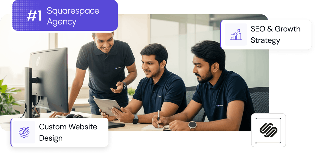
From custom website design to SEO strategy, we help businesses launch a site that looks professional and performs better.

About the Author
Walid | Squareko
Walid is the founder of Squareko, a Squarespace design agency specializing in creator, streamer, and video creator websites. Over the past 5+ years, he's designed 150+ websites for creators ranging from 1K to 500K+ followers across gaming, education, fitness, and business niches.
His expertise spans Squarespace design, conversion optimization, content strategy, and creator business models. Walid has helped creators increase sponsorship inquiries by 300%, launch successful merchandise lines, and build websites that generate sustainable income beyond ad revenue.
When he's not designing websites, Walid coaches creators on positioning, audience building, and monetization strategy. He's obsessed with the intersection of design, psychology, and business outcomes.
Squareko has been featured in Squarespace case studies and creator industry publications.