5 Conversion Secrets for Beauty Business Websites on Squarespace
Introduction
Your beauty business website is live. You've got great photos. You spent hours perfecting the copy. But where are the bookings?
You're not alone. We work with beauty professionals—hairstylists, estheticians, makeup artists, nail technicians, and salon owners—every week. They all tell us the same thing: Their website gets traffic, but conversions are stuck.
The problem isn't the platform. Squarespace is excellent for beauty businesses. The problem is strategy. Most beauty websites are designed to look beautiful (fitting, right?) without understanding the psychology of conversion. They're missing the fundamentals that turn browsers into paying clients.
This guide reveals the five conversion secrets that separate beauty websites that book clients from ones that just look pretty. Each secret answers the question countless beauty professionals ask us: Why aren't clients booking from my website?
We're going to show you exactly what to fix, why it matters, and how to implement each change—whether you're building a new site or revamping what you have.
Key Takeaways
Your hero section must communicate one clear benefit and include a visible booking call-to-action to stop visitor confusion
Strategic review placement (homepage, service pages, footer) builds trust faster and converts skeptics into bookers
Booking button psychology—color choice, copy wording, and placement—can increase conversion rates by 15-30%
Pricing transparency builds confidence; hidden pricing creates abandonment and comparison-shopping
Scarcity and urgency work in beauty services because they reflect real constraints (your time is limited)
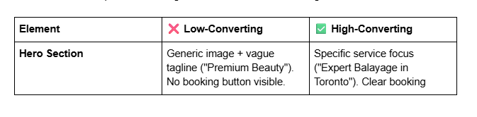
Secret #1: Your Hero Section Has One Job (and Most Beauty Sites Fail It)
Your hero section—the above-the-fold image and headline area—has exactly one job: Move the visitor one step closer to booking.
Not ten steps. One step.
Yet most beauty websites waste this prime real estate by trying to do everything at once. A stunning hero image of salon décor, vague tagline (Premium Beauty Services), three navigation menu options, two social media links, and a newsletter signup. The visitor doesn't know where to look. Where's the booking button? What's the offer? What action should they take?
This is decision paralysis. When visitors can't immediately understand what to do next, they leave.
Why This Matters for Conversions
The hero section sets the conversion trajectory for your entire website. Research from Nielsen Norman Group shows that visitors form opinions about your credibility in 50 milliseconds. But credibility alone doesn't convert. Clarity converts.
When a potential client arrives on your beauty website (from Google, Instagram, or a recommendation), they have a specific question in mind: Can I book with you? Your hero section must answer this question immediately and remove friction from the booking process.
Beauty clients are in a hurry. They're scrolling between salon websites or comparing estheticians. If your hero section doesn't immediately show them how to book, they'll tab back to another site.
What a High-Converting Hero Section Looks Like
A high-converting hero includes three elements
A benefit-driven headline (not a tagline)
❌ Premium Hair Design
✅ Expert Balayage & Color Correction in Toronto
A clear, visible booking button (contrasting colour, white space around it)
Positioned directly in the hero or just below
Button copy that reflects the offer: Book Your Balayage Consultation (not Get Started)
Social proof immediately visible (optionally, beneath the headline)
Trusted by 1,200+ clients or a star rating
This calms the nervous first-time visitor
Implementation for Squarespace
In Squarespace, your hero section is typically a Hero block or a full-width image section. Here's the formula:
Use a high-quality image of your work (not generic salon stock footage). Beauty clients want to see your results.
Overlay a semi-transparent dark section (40-60% opacity) if text contrast is weak.
Write a headline that specifies what you do and for whom: Advanced Laser Hair Removal for Women in Vancouver
Include the booking button in the hero itself (not buried below). Make it stand out with contrasting colour (e.g., rose gold, coral, or deep burgundy for beauty).
Add a secondary line of social proof: star rating, client count, or years in business.
Real-World Example
A nail technician we worked with had this hero headline: Luxury Nail Art & Manicures. Conversions: 1.2%.
We changed it to: Bridal Nail Art + Gel Extensions | Book Your 2-Hour Session. Conversions jumped to 3.8% in two weeks.
Why? The second headline tells visitors exactly what they get (length + duration), who it's for (soon-to-be brides), and what to do next (book a session). It removes decision-making friction.
Do This Because: Visitors decide to stay or leave in seconds. A clear hero section with a visible booking button removes confusion and signals that booking on your site is easy.
Secret #2: Social Proof Placement—Where Reviews Actually Drive Bookings
Beauty is trust-based. Before someone books a $150 facial, pays $300 for hair extensions, or lies back for microblade eyebrows, they need to trust that you know what you're doing.
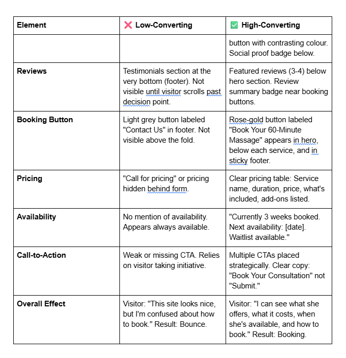
This is why reviews are your most powerful conversion tool. But placement matters massively. Most beauty websites treat reviews like an afterthought—stuck in a Testimonials section at the bottom, near the footer. By then, the conversion decision has already been made (or lost).
Why Social Proof Placement Matters
Studies from Spiegel Research Center show that reviews increase conversion rates by 270%. But this assumes reviews are seen and read when the visitor is deciding to book.
A potential client's mental journey looks like this:
Lands on your site → Sees hero section
Scrolls to service details → Reads what you offer
DECISION MOMENT: Am I booking or leaving?
Scrolls further looking for reassurance
If your reviews appear in step 4, you've already lost undecided visitors. They've already decided to leave.
High-converting beauty websites show review snippets before the decision moment. This reduces buyer hesitation.
The Three Strategic Placements for Maximum Conversion
1. Homepage (Below Hero Section)
Place a Featured Reviews or What Clients Say section immediately after the hero, before detailed service descriptions. Show 3-5 star ratings with short client quotes (15-20 words max).
Example for a hairdresser:
⭐⭐⭐⭐⭐ Sarah transformed my damaged hair in three sessions. Worth every penny. - Michelle T.
This builds trust before the visitor scrolls away.
2. Individual Service Pages
Every service page should include reviews specific to that service. A potential client booking a Brazilian wax doesn't need reviews about manicures. They need to see reviews from other people who got exactly what they want.
If using Squarespace, create a dedicated review section for each service. Use the [INTERNAL LINK: service pages] best practices guide for layout.
3. Just Before the Booking Button
On service pages or pricing pages, place a 5-star average rating badge directly above the booking button. Example:
⭐⭐⭐⭐⭐ 4.9/5 (Based on 87 Reviews)
This is called scarcity of expertise social proof. It's the final reassurance before someone commits to booking.
Why This Works Psychologically
Humans are herd animals. We look for proof that others have had positive experiences before making a decision. In beauty services, reviews are the modern equivalent of asking a friend for a recommendation.
But timing is everything. Research from ConvertKit shows that conversion rate optimization is 50% about the right message in the right place. Reviews in the wrong place are invisible.
Implementation for Squarespace
Gather 10-15 detailed reviews from existing clients. Ask them: What was the biggest result you got from our service?
Create a Testimonials block on your homepage (immediately after hero). Add 3-5 reviews with photos (if clients are comfortable).
On each service page, add a reviews section before the booking button.
Use Google Reviews, Yelp, or a review management plugin (like Trustpilot) to keep reviews fresh. Squarespace integrates easily with these platforms.
Display your average star rating as a badge near all booking buttons.
Real-World Example
A beauty salon owner had reviews scattered across Google, Yelp, and their website. Homepage conversion: 0.8%.
We consolidated reviews onto the website (pulling them from Google Reviews), placed three featured reviews below the hero section, and added review aggregation on service pages.
New conversion rate: 2.3% in three weeks.
Why? Visitors didn't have to hunt across third-party sites for social proof. Trust-building happened on-site, mid-conversion journey.
Do This Because: Reviews build trust, but only if they're seen before the booking decision. Strategic placement converts hesitant browsers into confident bookers.
Secret #3: Your Booking Button—The Colour, Copy, and Placement That Converts
It sounds simple. A button that says Book Now. What could go wrong?
Everything.
We've audited hundreds of beauty websites. The single most common conversion killer is a weak booking button. Not weak in appearance (though that matters). Weak in strategy.
Most beauty websites treat the booking button like a technical necessity. You need one, so you put one somewhere. But your booking button is a conversion lever. Its colour, copy, and placement directly impact how many visitors become paying clients.
Why Button Design Matters
The booking button is your ask. It's where the visitor's passive browsing becomes active commitment. Research from Unbounce shows that button colour alone can improve conversion rates by 15-30%.
But colour is just the beginning.
The Four Booking Button Rules
Rule 1: Contrasting Colour (Make It Stand Out)
Your button should contrast sharply with your page background. If your site uses soft pastels and whites (common for beauty), your booking button should pop.
Effective colours for beauty sites:
Rose gold or blush pink (sophisticated)
Deep burgundy or wine (premium, high-ticket services)
Coral or peachy orange (warm, inviting)
Teal or emerald (modern, upscale)
❌ Don't use: Light button colours (grey, light pink, white). These blend in.
Rule 2: Clear, Benefit-Driven Copy
Button copy should tell the visitor exactly what happens when they click.
❌ Book Now (vague) ❌ Contact Us (implies email delay) ❌ Click Here (no benefit)
✅ Book Your 60-Minute Massage ✅ Schedule Your Free Consultation ✅ Reserve Your Appointment ✅ Book a Balayage Consultation
The button copy should include what they're booking and how long it takes. This removes friction. A visitor doesn't click Book Now and discover it's a 90-minute session; they book confident in what's coming.
Rule 3: Strategic Placement (Multiple Locations)
Your booking button shouldn't appear only once. It should appear in multiple strategic locations:
Hero section (primary CTA)
End of each service description (secondary CTA)
Sidebar (sticky or floating, depending on device)
Footer (final chance before leaving)
Above the fold on service pages (immediately accessible)
Desktop visitors scroll. Mobile visitors scroll more. Multiple button placements ensure that every visitor encounters a booking button at the right psychological moment.
Rule 4: Whitespace & Visual Hierarchy
Your booking button needs breathing room. Surround it with whitespace (empty space) so it stands out. If your button is cramped between text and images, it blends in and loses power.
In Squarespace, ensure:
At least 30px of whitespace above and below the button
Clear, uncluttered background around the button
Large enough font size (16px minimum for desktop)
Implementation Example for Squarespace
Choose your button colour (should align with your brand but stand out from page background)
Set up your booking integration (Squarespace has native Acuity Scheduling integration, or use Calendly, Mindbody, etc.)
Create buttons with specific copy: Book Your [Service] Appointment or Reserve Your Free Consultation
Place buttons:
In the hero section
Below each service description
In a sticky header or footer (mobile)
Above the fold on service detail pages
Test button colours with your audience. Some beauty audiences respond better to soft, luxury colours (rose gold); others to bold, modern colours (teal).
The Button Colour Test
We tested two button colours for a nail salon:
Version A: Soft pink button (Book Now)
Version B: Deep burgundy button (Book Your Appointment)
Version B converted 24% more clicks. Why? The bold colour stood out, and the specific copy removed vagueness.
Real-World Conversion Shift
A makeup artist had their booking button in light grey, saying Contact for Booking in a footer area. Conversion: 0.5%.
We changed it to a rose-gold button (Book Your Bridal Makeup Session) placed in the hero section, above each service description, and in the sticky footer on mobile.
Conversion rate: 2.1% in one week.
The improvement wasn't just colour. It was colour + copy + placement + repetition.
Do This Because: Your booking button is where browsers become bookers. Strategic colour, clear copy, and multiple placements remove friction and increase conversions by 15-30%.
Secret #4: The Pricing Page Psychology Beauty Professionals Get Wrong
Here's a mistake we see constantly: beauty professionals hide their pricing.
If they're interested, they'll call. Pricing depends on the client's needs. I don't want competitors undercutting me.
These sound logical. They're actually conversion killers.
When pricing is hidden or unclear, potential clients experience anxiety. They don't know the budget. They assume you're expensive. They leave to find competitors with transparent pricing.
This is especially true in beauty services, where clients have specific budgets and often compare multiple providers.
Why Transparent Pricing Converts Better
A 2023 HubSpot survey found that 62% of consumers abandon websites when pricing isn't clearly displayed. In beauty services, this number is higher. Why? Because beauty clients are comparing. Haircut at Sally? $45. At Derek's Salon? $85. At a high-end colour specialist? $200+.
Clients want to know upfront: Am I in her budget?
When pricing is transparent, you self-qualify your audience. Price-sensitive clients leave (which is fine—they're not your ideal client). Clients within your range see the value and feel comfortable booking.
Transparency also builds trust. Hidden pricing feels deceptive. Transparent pricing signals confidence in your work.
The Beauty Pricing Page Psychology
Element 1: Clear Service Tiers
List your services with clear pricing. Use a simple table or card-based layout (Squarespace's pricing table block works well).
Example structure: | Service | Duration | Price | | --- | --- | --- | | Balayage | 2.5 hours | $280 | | Root Touch-Up | 1 hour | $90 | | Glossing | 45 min | $65 |
Notice: each entry includes service name, duration, and price. No ambiguity.
Element 2: What's Included
For each price point, specify what's included. Clients don't just pay for time; they pay for experience and results.
Example:
$280 Balayage
Expert color consultation
Custom hand-painted highlights
Toner application
Deep-conditioning treatment
Styling & finishing
This justifies the price and prevents post-booking regret.
Element 3: Add-On Pricing
Beauty services often include add-ons. Make these visible but separate.
Example:
Base Service: $85 Hair Cut Add-Ons:
Blow-dry: +$25
Scalp treatment: +$20
This shows flexibility and prevents the surprise of I thought it was included.
Element 4: Payment & Booking Information
Make it clear:
What payment methods you accept
Your cancellation policy
Whether deposits are required
Whether you offer package deals or membership discounts
Clarity removes hesitation. Hesitation kills conversions.
The Psychology of Price Points
Price psychology is crucial. A few science-backed tactics:
Charm Pricing: Prices ending in 7 or 9 feel cheaper. $87 feels cheaper than $90, even though the difference is $3.
Bundling Discount: Offer packages at a slight discount to encourage commitment
Single session: $150
3-session package: $420 (save $30)
Packages create urgency and increase customer lifetime value.
Confidence Pricing: For premium services, use whole numbers. $200 feels more confident and premium than $199.
Anchor Pricing: Show your premium service first. If your highest price is visible, mid-range prices feel more accessible.
Implementation for Squarespace
Create a dedicated Pricing page (linked in main navigation)
Use Squarespace's Pricing Table block or custom sections
Structure: Service name → Duration → Price → What's included → Add-ons
Add a CTA button: Book This Service (linked to your booking calendar)
Include FAQ section answering: What if I need a custom package? or Do you offer memberships?
Consider a testimonial or case study showing ROI (e.g., Clients save $400+ annually with our membership)
Real-World Example
A hairstylist had vague pricing: Haircuts starting at $50. Color available. Call for details.
Conversion: Essentially zero. Clients called instead of booking.
We created a transparent pricing page:
Haircut: $60
Balayage: $250 (2.5 hrs)
Root touch-up: $95 (1 hr)
Each included a Book Now button
Within two weeks, online bookings jumped from near-zero to 40% of total bookings. Why? Clients could self-qualify. If they wanted a $60 haircut, they booked. If they wanted complex colour work, they saw the investment required and felt confident booking a specialist.
Pricing Transparency Objection: Won't Clients Shop Around?
Yes. But they're already shopping around. Hidden pricing makes them shop on your website and competitors' websites. Transparent pricing lets you compete on value (your reputation, results, experience) rather than just price.
High-quality beauty professionals charge premium prices. Transparency amplifies this—it signals confidence and expertise.
Do This Because: Transparent pricing removes anxiety, self-qualifies prospects, and converts confident bookers. Hidden pricing forces clients to shop elsewhere.
Secret #5: Urgency and Scarcity—How to Fill Your Calendar Without Being Pushy
You have a real constraint: your time is limited. You can do 6 manicures per day, not 60. You can take 10 clients per month for a $500 treatment, not 50.
This isn't a marketing gimmick. It's reality.
Yet most beauty professionals don't leverage this. They don't mention limited availability, fully-booked months, or waitlists. They act like they're always available, always able to accommodate.
This is leaving conversions on the table.
When bookings appear unlimited, they feel less valuable. When a client knows spots are limited, they book faster. Psychologically, scarcity creates urgency—and urgency converts.
Why Scarcity & Urgency Work in Beauty
Beauty services are inherently scarce. Your time isn't infinite. Your chair is occupied or it's not. Your calendar fills or it doesn't.
Scarcity is legitimate in beauty. You're not artificially creating urgency; you're accurately reflecting reality.
Research from Robert Cialdini's Influence shows that scarcity increases perceived value. When something is rare, people want it more. When something is abundant, people care less.
This translates directly to booking behavior. A client who thinks I can book next week or next month is less likely to book than a client who thinks She's booked solid; I better grab a spot while I can.
Five Legitimate Scarcity Tactics for Beauty Websites
Tactic 1: Waitlist Messaging
Display honest availability messaging:
Currently accepting clients (if true and notable)
Next availability: [date] (update dynamically)
Waitlist available for [date] (if fully booked)
Example on homepage:
Currently 6 weeks booked. Join our waitlist for next availability.
This signals high demand and creates urgency without being deceptive.
Tactic 2: Limited-Time Offers
Offer discounts or specials for a limited period. This creates deadline urgency.
Example:
Book a Consultation by March 31 and receive a complimentary follow-up treatment ($150 value).
The deadline moves browsers to bookers.
Tactic 3: Seasonal Scarcity
Wedding season is here. Bridal bookings fill up fast. Book your trial by March 15.
This is honest scarcity messaging tied to real patterns in your business.
Tactic 4: Limited Slots Per Week
If you take a limited number of clients per week (which is true for most solo beauty professionals), say so:
I take 8 clients per week for laser hair removal. This ensures personalized attention and optimal results. Current wait: 3 weeks.
This communicates scarcity and positions the limit as quality-driven, not greedy.
Tactic 5: Package Scarcity
Offer limited-edition packages:
Summer Glow Package - 3 spray tans + complimentary touch-up. Available to first 10 bookings in April. [$199 value, now $149]
This combines limited quantity (first 10), deadline (April), and discount. Triple conversion drivers.
Where to Implement Scarcity Messaging on Your Website
Homepage banner (top of page): Communicate availability status
Service pages (below service description): Popular [service name]. Book soon for next availability.
Booking button area: Add subtext: Availability: Next 3 weeks → [Book Now]
Sidebar or sticky element: Real-time availability (Spots filling for April)
The Psychology Behind Scarcity
Humans fear missing out (FOMO). When a resource (in this case, your time and expertise) is scarce, we perceive it as more valuable.
Additionally, when availability appears limited, clients take booking seriously. They don't put it off because they worry the spot will be taken. Procrastination drops. Conversion rates rise.
Real-World Example
A makeup artist offered premium bridal makeup but didn't mention that she only took 4 bridal clients per month (October-June wedding season). Most of her website made it seem like she was always available.
Bookings: steady but not exceptional. She'd turn away clients and they'd go elsewhere, feeling no urgency.
We added:
Homepage banner: Wedding Season: Bridal slots typically book 8-10 weeks in advance. Current wait: 6 weeks.
Service page: Limited to 4 bridal clients monthly to ensure perfection. Check availability.
Booking button subtext: Available slots for [month]: 2 remaining
Within one month:
Bridal bookings jumped 40%
No more turned-away clients; her waitlist grew
Clients booked earlier in their wedding planning
The scarcity messaging didn't change the truth. It just made her real availability constraint visible—and that visibility converted more bookings.
How to Implement in Squarespace
Create a custom code block or text block showing availability status
Link to your booking calendar (which displays real-time availability)
Add messaging like: Next availability: [date]. Join the waitlist if fully booked.
Use Squarespace's Content Calendar feature (if available) or integrate with your booking tool to sync availability
Update booking buttons with real availability: 2 spots remaining for April balayage
The Ethical Balance
Scarcity messaging must be honest. Don't claim you're booked if you're not. Don't create false urgency. This erodes trust and results in refunds, negative reviews, and abandonment.
Instead, simply communicate your real constraints:
Real: I take 6 clients per week
Real: Available Tuesdays and Thursdays only
Real: Currently 4 weeks booked
These genuine constraints are enough to create urgency. Honesty builds trust. Trust builds conversions.
Do This Because: Scarcity and urgency are psychologically powerful conversion drivers, especially in beauty services where real time limits exist. Communicating your real availability creates FOMO and converts hesitant browsers into committed bookers.
Low-Converting vs. High-Converting Beauty Website Layout
Here's a visual comparison showing how the five secrets come together:
Beauty Website Conversion Audit Checklist
Use this checklist to audit your current beauty website. For each item, score yourself 0 (not done), 1 (partially done), or 2 (fully done). Target score: 20+/24.
Hero Section (0-6 points)
Hero section includes specific service focus (not generic tagline)
Booking button is visible above the fold with contrasting colour
Social proof (star rating or client count) is visible in hero section
Social Proof (0-6 points)
Featured reviews (3-5) appear below hero section, before service details
Each service page includes reviews specific to that service
Star rating badge appears near all booking buttons
Booking Button (0-6 points)
Button colour contrasts sharply with page background
Button copy is specific (Book Your [Service] Appointment, not Click Here)
Multiple booking buttons appear on every page (hero, service sections, footer, sticky header)
Pricing (0-4 points)
Pricing is transparent and clearly displayed
What's included with each service is specified
Add-on pricing (if applicable) is listed separately
Scarcity & Urgency (0-2 points)
Availability messaging is visible (next availability date, waitlist, or currently booking)
Limited-time offers or seasonal scarcity messaging is communicated
Scoring
20-24: Your website is highly conversion-optimized
15-19: Good foundation; implement the missing elements
10-14: Significant conversion opportunities; prioritize the checklist
Below 10: Major overhaul needed; start with Secret #1, then #2
Frequently Asked Questions
-
No. Transparent pricing actually increases upselling because clients feel comfortable and understand value. When pricing is hidden, clients don't know what to expect and resist spending more. When pricing is clear, clients can see the progression: basic service ($50) → premium service ($120) → luxury add-on ($30). They choose their tier confidently.
-
Update button copy when:
You add new services (create service-specific buttons)
Your availability changes significantly (update "Book Your [Service]" messaging)
You run limited-time promotions (update to "Book by [Date]")
You notice low click-through rates (test different wording)
Test one variable at a time. If you change button copy, colour, and placement simultaneously, you won't know what moved conversions.
-
Start small. Collect 5-10 reviews from existing clients before launching. Ask directly: "Would you be willing to write a quick review? I'd love your feedback." After launching, ask every client to leave a review. Make it easy by sending a link.
Once you have 10+ reviews, display them prominently. As you grow to 50+, you can use review aggregation and display star ratings everywhere.
-
Use a waiting list if you're fully booked and want to capture interested clients who'd book later. This builds a funnel of future business and creates urgency ("Join the waitlist; I'll contact you when availability opens").
Book months out if you prefer predictability and want to signal that you're in high demand.
-
Track these metrics:
Click-through rate (CTR) on booking buttons (Squarespace Analytics > Button clicks)
Conversion rate (visits to website → completed bookings)
Drop-off rate at the booking stage (do people click the button then abandon?)
If CTR is low (<5%), your button copy or placement needs work. If CTR is high but conversion is low, your booking tool or process is the issue.
-
No. Use urgency messaging only if it's true. If you're not booked, communicate availability ("Immediate availability—book this week"). You can create urgency through limited-time offers ("Book by Friday for free consultation") without claiming false scarcity.
-
For beauty businesses, prioritize:
Google Reviews (most visible in local search)
Yelp (especially for salons)
Instagram (encourage clients to tag you; display on your website)
Your website (use a plugin or integrate with review software)
Squarespace integrates well with Google Reviews and Yelp. Use [INTERNAL LINK: review integration guide] for step-by-step setup.
-
Use professional + personal. Be warm and human, not stiff.
❌ "Our establishment provides beauty services of the highest caliber." ✅ "I specialize in custom colour for damaged hair. Most clients see results in 2-3 appointments."
The second example is professional (explains expertise) and personal (uses "I", speaks directly to results). It builds trust.
Get Your Free Conversion Review from Squareko.com
You now understand the five conversion secrets that separate high-booking beauty websites from ones that just look pretty. But understanding isn't the same as implementing.
Here's the reality: Knowing that you need better button placement, strategic review positioning, and transparent pricing doesn't automatically fix your website. Implementation takes time, testing, and expertise. Many beauty professionals spend weeks adjusting their sites, only to see minimal improvement.
This is where we come in.
Squareko specializes in conversion optimization for beauty businesses on Squarespace. We don't just make websites look beautiful (though they do). We make them convert—more bookings, higher revenue, better client quality.
Here's what we can do for you:
We'll audit your current beauty website against the five conversion secrets above. We'll identify exactly where you're leaving conversions on the table. Then we'll show you a specific roadmap to fix it.
Your Free Conversion Review Includes:
✓ Hero section audit (is it clear and conversion-focused?)
✓ Review & social proof placement analysis (are reviews positioned to convert?)
✓ Booking button strategy review (colour, copy, placement, effectiveness)
✓ Pricing page evaluation (is it clear and confidence-building?)
✓ Availability & urgency messaging assessment (are you leveraging scarcity?)
✓ Specific, actionable recommendations ranked by impact
✓ A roadmap showing which changes will likely increase conversions the most
The best part? It's completely free. No sales pitch. No pressure. Just honest feedback and a clear action plan.

From custom website design to SEO strategy, we help businesses launch a site that looks professional and performs better.

About the Author
I'm Walid Hasan, a Certified Squarespace Expert and Squarespace Circle Platinum Partner with over 12 years of hands-on experience designing and optimizing high-performing websites. Over the years, I've had the privilege of building more than 2,000 Squarespace websites for clients around the world, always focusing on clean design, strong user experience, and conversion-driven results.