Squarespace Template for Financial Advisors: Compliance First
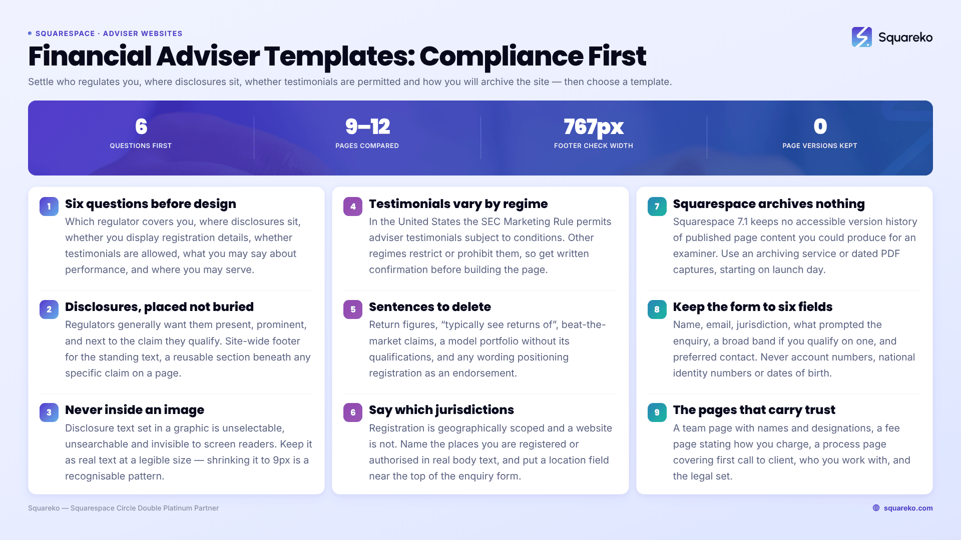
The short answer: For a financial adviser, the website copy is a regulated communication, and that decides the page structure before any design question does. Settle six things first — which regulator covers you, what disclosures must appear and where, whether you may use testimonials and on what conditions, what you may say about performance, which jurisdictions you can serve, and how you will keep records of what the site said. Then choose a template.
This post is not legal or compliance advice. Requirements vary substantially by regulator, by jurisdiction, and by whether you are a registered investment adviser, an appointed representative, a broker-dealer registered representative, an insurance-licensed agent or an unregulated financial coach. Everything below is a general practice to check against your own regulator's rules and your firm's compliance function. Where a specific rule is named, it is named as an example of one regime, not as a universal.
The six things to settle before choosing a template
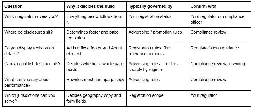
The pattern in adviser website projects that go wrong is always the same: the site is designed, written and built, then compliance reviews it and half the copy comes out. Doing the table above first costs a morning and saves a rebuild.
Your website is a promotion, not a brochure
In most regimes, a public-facing adviser website falls inside the definition of advertising, marketing or financial promotion — which means it is subject to review, retention and content standards rather than treated as neutral information.
In the United States, investment adviser advertising sits under the SEC's Marketing Rule, Rule 206(4)-1 under the Advisers Act, which was modernised in 2020 and set a compliance date eighteen months after its effective date. Broker-dealer communications sit under FINRA Rule 2210 instead, which has its own approval and filing expectations. In the United Kingdom, website content that invites or induces someone into an investment activity is a financial promotion and must meet the FCA's fair, clear and not misleading standard. Other jurisdictions run comparable regimes with different mechanics.
The practical consequence for the build is the same everywhere: assume every public page needs review before it goes live, and assume changes need review too. Design the site so that review is cheap — consistent structures, disclosures in reusable positions, and no clever one-off page layouts that require re-reading the whole site every time you edit something.
Disclosures and disclaimers: get the placement right, not just the wording
Regulators generally care about three things: that required disclosures are present, that they are prominent rather than buried, and that they sit close to the claim they qualify. A disclaimer that only exists on a Terms page linked from the footer often fails the second and third tests.
A workable structure on Squarespace 7.1:
Site-wide footer. Firm legal name, registration or reference details as required, the general disclaimer, and links to your privacy policy, terms and any required client documents. Squarespace footers are edited once and appear on every page, which is exactly the behaviour you want.
Page-level disclosure blocks. Any page making a specific claim gets its own qualifying text directly beneath the claim, in the same visual weight as body copy. Build this as a reusable saved section so the wording cannot drift between pages.
Never in an image. Disclosure text set inside a graphic is invisible to screen readers, unselectable, unsearchable and impossible to evidence later. Keep it as real text.
Never behind an interaction that hides it by default unless your compliance function has approved that specifically. Squarespace 7.1 Accordion blocks render server-side, so the text is technically present and crawlable even when collapsed — but "technically present" and "prominent" are different tests, and the second one is the one that matters.
Font size deserves a specific note. Shrinking disclosures to 9px is a recognisable pattern and regulators recognise it. Keep disclosure text at a legible size and let it be part of the design rather than an apology for it.
Displaying registration and regulator status
Most regimes require some form of firm identification on public communications, and several require specific reference numbers. The details differ enough that you must check your own — a UK firm typically states its registered name, company number and its FCA firm reference number with the prescribed statutory wording; a US registered investment adviser typically identifies the registrant and points to its Form ADV brochure; an appointed representative usually has to name its principal.
What is common across regimes is the shape: a fixed block, on every page, in the footer, containing the legal entity name rather than the trading brand, plus whatever identifiers your regulator specifies. Build it once as a footer element.
Two things advisers get wrong on Squarespace specifically. First, using the trading name in the footer and never the registered entity name — a common problem when the brand and the legal entity differ. Second, letting a template's footer design push the legal block onto a single cramped line on mobile. Squarespace 7.1's mobile breakpoint is 767px; check the footer at that width, because the legal block is the element most likely to become unreadable there.
Testimonials and reviews: the answer changed, and it still varies
This is the single most common thing advisers get wrong, usually because they read guidance written for a different regulator or a different decade.
In the United States, the SEC's Marketing Rule permits testimonials and endorsements in adviser advertising, which the previous regime effectively prohibited. It permits them subject to conditions: clear disclosure of whether the person giving the testimonial is a client and whether they were compensated, disclosure of material conflicts of interest, adviser oversight, written agreements with promoters above a compensation threshold, and disqualification provisions for certain bad actors. "Permitted with conditions" is not the same as "allowed", and the conditions determine your page design — the disclosures have to sit with the testimonial, not on a separate page.
Other regimes take different positions, and some prohibit or heavily restrict client testimonials for particular product types or licence categories. Insurance-licensed and broker-dealer-affiliated advisers frequently operate under stricter internal policies than the regulator's floor.
So the design decision is: do not build a testimonials page until you have written confirmation of what you may publish and what must accompany it. If the answer is no, the substitutes that generally survive review are process transparency, credentials, published fee structures, team biographies and third-party professional recognition — none of which imply a client outcome.
Performance claims and anything that sounds like one
Advertising rules in most regimes constrain performance presentation tightly. The SEC Marketing Rule, as one example, requires net performance alongside any gross performance, prescribes time periods for most presentations, restricts showing an extracted subset of a portfolio without the total, limits hypothetical performance to audiences for whom it is relevant, and prohibits any suggestion that the regulator has approved the adviser.
The practical translation for website copy is a list of sentences to delete:
"We've grown client portfolios by X%"
"Our clients typically see returns of…"
"Beat the market for over a decade"
Charts showing a model portfolio without the required qualifications
"SEC registered" phrased or positioned so it reads as an endorsement
Anything that guarantees, promises or implies a specific financial outcome
What replaces them is a description of process, philosophy, fees, service level and who you work with. Advisers often assume this is weaker marketing. It usually is not. A specific, confident explanation of how you make decisions and what you charge outperforms an unverifiable number, and it survives review.
Jurisdiction: say who you can actually serve
Registration is geographically scoped, and a website is not. An adviser registered in a limited set of states or authorised in a single country will get enquiries from outside that scope, and the site should manage that rather than absorb it.
Two elements handle it. First, a plain statement — in the footer and on the contact page — naming the jurisdictions in which you are registered or authorised and in which you may conduct business. Second, a location field near the top of your enquiry form, so an out-of-scope enquiry is identifiable before you have invested time in it.
This is also a search consideration. Naming the states, provinces or regions you serve in visible body text is how you become findable for "financial adviser in [place]" queries, and it is the same sentence that does the compliance job. Put it in real text, never on a map graphic — a map image is unreadable to search engines and screen readers alike.
Record-keeping: Squarespace does not archive your pages for you
Retention obligations for advertising and communications are a routine part of most adviser regimes — for example, the SEC's books and records rule requires advisers to retain copies of advertisements, and FINRA imposes its own recordkeeping expectations on communications with the public.
Squarespace 7.1 does not maintain an accessible version history of published page content that you can produce for an examiner. There is no "show me what this page said in March" feature. That gap has to be filled deliberately, and the usual options are:
A third-party website archiving service, which is the normal answer for firms with a compliance function.
A disciplined internal process: dated PDF captures of every public page at each approved revision, stored with the approval record.
Whichever you choose, decide it before launch, and capture the site on the day it goes live. Retro-fitting an archive after eighteen months of edits is not possible.
The trust architecture, once compliance is settled
With the constraints known, the persuasion work is straightforward and largely structural. Advisers convert on legibility, not on adjectives.
Team page with real photographs, full names, qualifications and designations. This carries more weight for a financial adviser than for almost any other profession. Include regulatory registration details where relevant and permitted.
Fee page. Whether you charge a percentage of assets, a flat retainer, hourly or a hybrid, saying so plainly is the strongest differentiator available to an independent adviser, because so many peers refuse to. Include what is and is not included.
Process page. What happens between the first call and being a client — discovery, data gathering, plan, implementation, review cadence. Prospective clients are trying to picture the experience, and this page is where they do it.
Who you work with. Written as a situation rather than a wealth bracket: "business owners approaching a sale", "professionals with equity compensation", "families managing an inheritance". Specificity here filters as effectively as any form field.
Ordinary legal pages — privacy policy, terms, cookie notice, complaints procedure where required, and any client-facing documents your regulator requires you to make available.
Squareko's Advisory template is built on 11 pages including a Pricing page and two legal pages alongside the blog — the two page types adviser sites most often have to add to a template that lacks them. Justify (demo) is the smallest in the shop at 9 pages and is structured for a professional-services firm with a Case Study page, which suits a small practice that wants little to maintain. Click Crafter (demo) runs to 12 pages with a Blog, Portfolio and Gallery for a larger firm publishing regularly. Judge any template by whether its page list already contains the legal and fee pages you need, because those are the ones that get bolted on badly.
The booking path, and what never goes in a website form
Use a two-step: a short enquiry form on the site, then a scheduled call. Acuity Scheduling — now the official name of what was Squarespace Scheduling — is the native route, embedded through a scheduling block, and its intake forms support text boxes, dropdowns, checkboxes, yes/no and file upload up to 5 MB, with no conditional or branching logic.
The rule that matters more than any of that: do not collect sensitive financial or identity data through a website form. No account numbers, no national insurance or social security numbers, no dates of birth, no portfolio values as free text, no document uploads containing statements. Form submissions are stored and notified by email, and email is not an appropriate channel for that data. Collect it later, in whatever secure client portal or document exchange your firm already uses.
An enquiry form for an adviser needs six fields: name, email, location or jurisdiction, a broad description of what prompted the enquiry, a broad asset or income band as a selector if you qualify on it, and preferred contact method. That is enough to decide whether a call happens.
Before you pick a template
Settle the six questions in the table, get the testimonial answer in writing, decide your archiving route, and write the fee page. Those four steps determine more about how the site performs than any template choice, and none of them require a designer.
The template then has one job: give you a footer you can put a legal block in, a page set that already includes pricing and legal pages, and a structure your compliance reviewer can read without a map.
If you would rather start from a page set that already includes those, our premium Squarespace templates are installed onto your site for you, so the build time goes into the copy that needs review rather than the layout. Plenty of advisers do this themselves — the sequencing above is the part worth getting right either way.
FAQ
-
It depends entirely on your regulator. In the United States, the SEC's Marketing Rule permits adviser testimonials subject to conditions — disclosure of client status and compensation, conflicts of interest, oversight and written promoter agreements. Other regimes restrict or prohibit them. Get written confirmation from your compliance function before building a testimonials page.
-
That varies by regulator, but the structure is consistent: a site-wide footer carrying the registered legal entity name and required registration identifiers, plus page-level qualifying text placed directly beneath any specific claim. Keep disclosures as real text at a legible size, never inside an image, and confirm exact wording with your compliance reviewer.
-
Most regimes require some form of firm identification on public communications, and several specify particular reference numbers and statutory wording. Build it as a footer block using your registered legal entity name rather than your trading brand, and check the layout at Squarespace's 767px mobile breakpoint where legal blocks commonly become unreadable.
-
No. Squarespace 7.1 has no accessible version history of published page content that you could produce for an examiner. If your regime imposes advertising retention obligations, use a third-party website archiving service or capture dated PDFs of every public page at each approved revision, starting on launch day.
-
Yes, if you speak on real stages. Half a page covering microphone preference, confidence monitors, slide format and aspect ratio, clicker, roving mics and your slide deadline. Publish it as an Accordion block on the Speaking page — Squarespace 7.1 accordions render server-side, so producers can skim it without downloading anything.
-
One whose page list already includes a Speaking page. Navigate (10 pages: Speaking, Podcast, Course, Blog) is the tightest fit; Storyline (13 pages) adds Testimonial and Booking; Advisory (11 pages) suits speakers whose talks feed advisory work; Luminary (11 pages) fits when speaking is one line among courses and products.

Author Bio
I'm Walid Hasan, a Certified Squarespace Expert and Squarespace Circle Platinum Partner with over 12 years of hands-on experience designing and optimizing high-performing websites. Over the years, I've had the privilege of building more than 2,000 Squarespace websites for clients around the world, always focusing on clean design, strong user experience, and conversion-driven results.