Squarespace Template for a Creative Agency
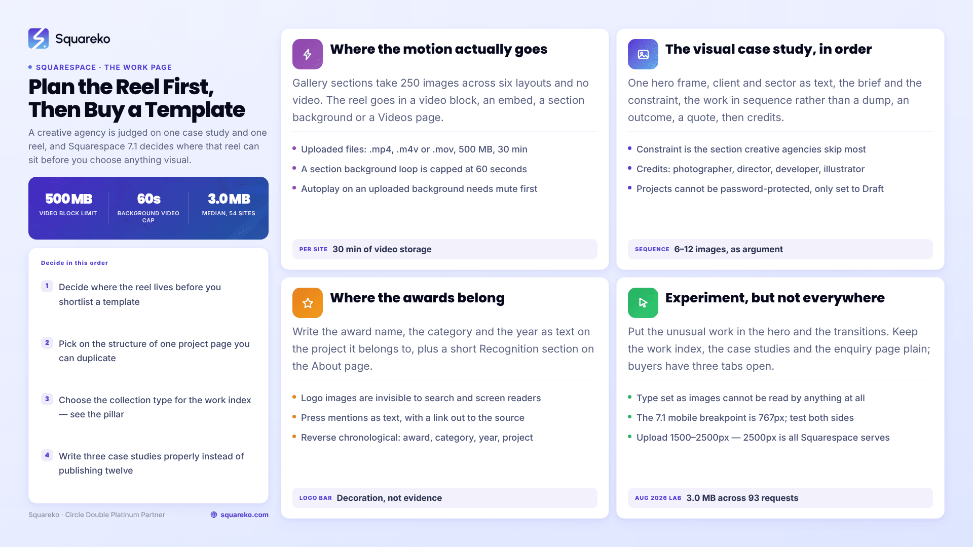
The short answer: for a creative agency the work is the argument, so choose the Squarespace template on the structure of a single case study — a project-detail page you can duplicate — and on where video can actually live. The trap catches almost everyone: Squarespace 7.1 gallery sections cannot hold video. If your showreel is central, plan its placement before you pick a template, not after you have built the work page.
Everything else on a creative agency site is negotiable. These four things are not.
Where video actually goes in Squarespace 7.1
Creative agencies lead with motion, and this is where Squarespace surprises people. Gallery sections hold up to 250 images across six layouts — Grid: Simple, Grid: Strips, Grid: Masonry, Slideshow: Simple, Slideshow: Full and Slideshow: Reel — and it is not possible to upload videos to them or add blocks inside them. So the showreel has to go somewhere else.
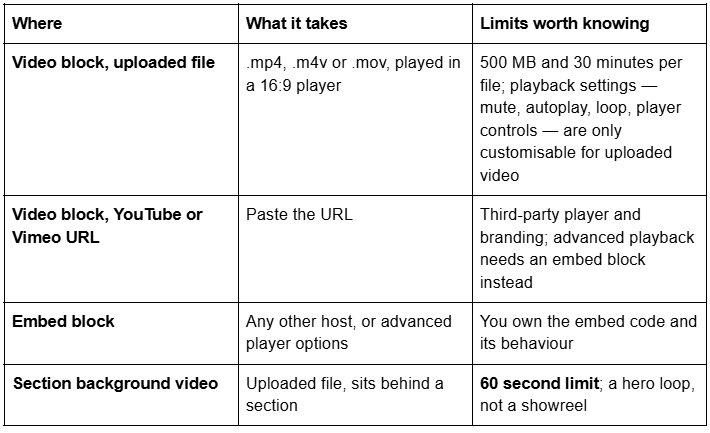

Storage is the constraint nobody plans for. Every Squarespace site includes 30 minutes of uploaded video storage in total. Beyond that you either upgrade your website plan or add a Digital Products subscription — and the standalone Digital Products plan closed to new signups on 23 July 2026, so check what is actually available on your plan before you design around self-hosted video. For most creative agencies the pragmatic answer is Vimeo for the reel and Squarespace-hosted video only for short loops.
The practical layout: a section-background loop at the top of the homepage under 60 seconds, one video block holding the full reel on a Work or Showreel page, and one video block per case study where the project had motion. Set uploaded background video to mute — autoplay requires mute to be enabled first.
The visual case study, and how to structure it
A creative agency case study is judged twice: once in three seconds on the index, and once properly by the person who is going to argue for you internally. Both need serving.
Structure each project page in this order:
One hero image or one frame of the reel. The strongest single asset. Not a collage.
Client, sector, and what you did in one line. Above the fold, as text.
The brief and the constraint. What the client actually needed and what made it hard. Constraint is the section that separates a case study from a portfolio entry, and it is the one creative agencies skip most often.
The work, in sequence. Not a dump. Six to twelve images ordered as an argument: the problem, the idea, the execution, the application.
A measured outcome. Awareness lift, sales, applications, footfall, press pickup, award. Where you cannot publish a commercial number, publish an operational one.
One client quote about the constraint, not about how pleasant you were.
Credits. Photographer, director, developer, illustrator. Creative buyers read credits closely and agencies that omit them look like they are claiming other people's work.
Three of these beat twelve galleries. If you have twelve projects and time to write three properly, publish three.
The work index is a separate design problem. The index is scanned, not read, and the only things doing work in that first screen are the image, the client name and the discipline. Titles like "Reimagining a legacy brand for a new generation" tell a scanning buyer nothing; "Halden Bakery — brand identity, packaging, retail" tells them everything. Put the client and the discipline in the project title field, because that title is also what the Portfolio layout renders and what Squarespace uses in the page's own markup.
And the NDA problem, which every creative agency has. Work you cannot show is not work you cannot describe. A project page with the constraint, the approach and the outcome written out, one abstracted image and the client sector instead of the client name, is worth publishing — far more than a locked-off placeholder. Squarespace 7.1 will not help you here: individual portfolio projects cannot be password-protected, only set to Draft. If a client requires a gated case study, build it as a separate page and put a page password on that page.
Portfolio pages versus a blog collection for the work
Squarespace 7.1 gives you three places to hold case studies and they behave differently.
Portfolio pages are the natural home. Five layouts — Grid: Simple, Grid: Overlay, Hover: Background, Hover: Fixed and Hover: Follow Cursor — and the three hover layouts are the ones that read as a design studio rather than a stock template. Each project gets its own SEO title, SEO description, featured image, social image and publication status, and projects are built from full page sections, so Fluid Engine, gallery sections and auto layouts are all available inside them.
The limits: up to 60 projects per portfolio page; projects cannot be turned into standalone pages; projects cannot be moved between portfolio pages; individual projects cannot be password-protected; and every project carries automatic next/previous pagination at the foot that cannot be hidden. You can style it, not remove it.
The one that changes architecture: summary blocks in Squarespace 7.1 do not support portfolio pages or gallery sections. Summary blocks pull from blog pages, calendar pages, store pages and videos pages only. So a "selected work" strip on your homepage, or a "related projects" row at the foot of a service page, cannot be generated from a Portfolio. You link to the portfolio, or you rebuild the grid by hand each time.
A blog collection solves exactly that — categories, tags, filterable summary blocks, no item cap — at the cost of the classic editor rather than Fluid Engine, and a dated framing that makes 2023 work look old. Plenty of good agency sites run the work as a blog collection with the date display switched off.
Plain layout pages give total control and no listing at all. Fine for five flagship projects, unmanageable at twenty.
The awards and recognition layer
Creative agencies win work partly on recognition, and most put it in the worst possible place: a grey strip of award logos on the homepage.
Logo images are invisible to search engines and to screen readers. If D&AD, Webby, Awwwards or a local industry body has recognised your work, write the award name, the category and the year as text — on the project it belongs to, not only in a homepage strip. An award attached to a specific case study is evidence. An award floating in a logo bar is decoration.
Three placements that work: a line of text on the project page under the client name; a short Recognition section on the About page listing award, category, year and project, in reverse chronological order; and press mentions written as text with an outbound link to the source. Outbound links to primary sources are one of the few measured positives for AI citation, and a press page full of unlinked logo images has none of that.
The experimental site versus the site that converts
Every creative agency wants a site that demonstrates it can build something unusual. This is legitimate — your site is a portfolio piece — and it is also where creative agency websites most often fail commercially.
The honest position: experiment in the hero and the transitions, and leave the work index, the case studies and the enquiry page conventional. A buyer who has three agencies open in three tabs will not learn your novel navigation pattern. They will leave.
Three specific things worth protecting:
Navigation that is visible without interaction. A hidden hamburger on desktop costs you more than it gains. Squarespace 7.1's mobile breakpoint is 767px; test what your header actually does either side of it.
Text that is text. Type set as images cannot be read by search engines, screen readers or an AI answer engine summarising your capabilities.
Weight discipline. Across 54 Squareko-built client sites measured in August 2026 — Playwright and Chromium, cloud datacentre, unthrottled, single run, load-only CLS, so lab data rather than field data — the median page weight was 3.0 MB across 93 requests and median mobile LCP was 2.01s, with 74% under Google's 2.5s threshold. A work index that is forty full-bleed images will not sit in that range. Uploaded images should be 1500–2500px wide; 2500px is the maximum Squarespace serves, and the CDN converts to WebP unconditionally.
If the site is genuinely the portfolio piece, build the experimental version as one page — a manifesto, a lab, a single project — and keep the commercial spine plain.
Which Squarespace templates suit a creative agency
Scored on the rubric published in the agency pillar: case-study surface, service architecture, credibility layer, enquiry path, and depth.

WeDecorefy — 23/25, the strongest structure in the range. Fifteen pages, tagged Interior & Home Design but built like an agency: Projects, a dedicated Project Details page, a Team page, Service and Offering pages, a Gallery, a Blog, a Shop, a Freebie page, a Contact page, two homepage variants, a Style Guide and a 404. Project Details is a worked example of one case study laid out as a page — duplicate it and every project on your site has the same rhythm. It is also the only template in the Squareko range that ships a Team page, and creative buyers want to see who will do the work.
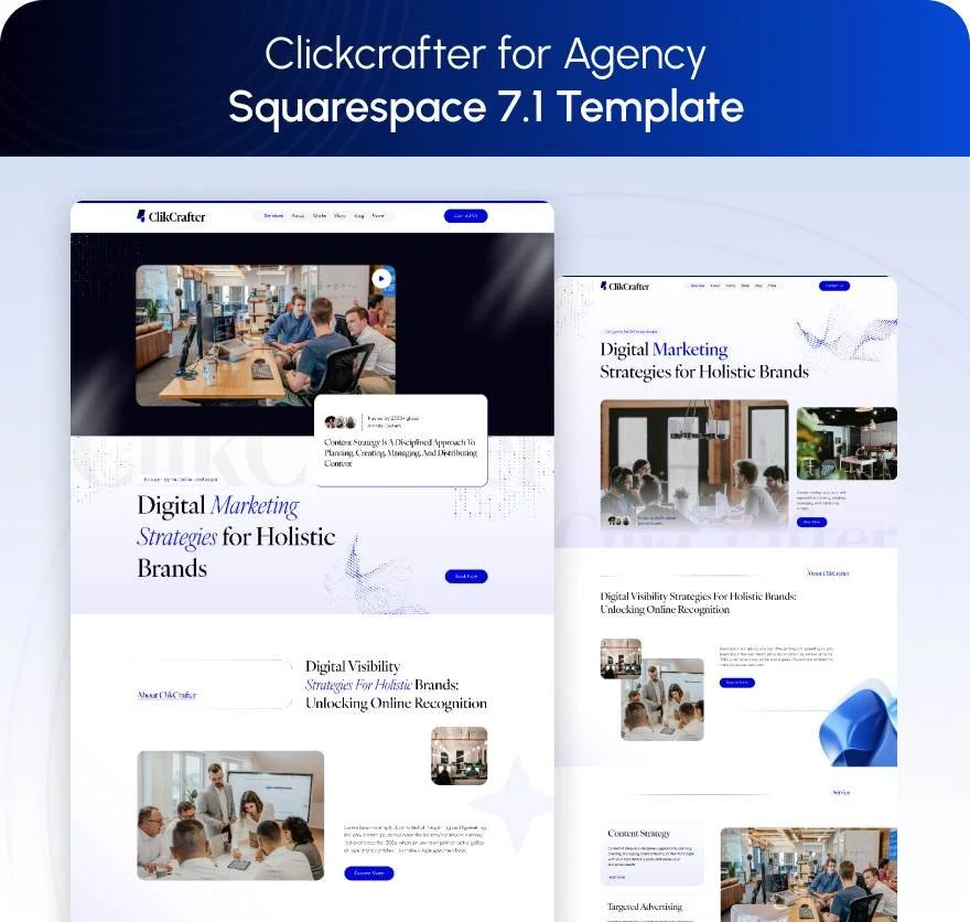
Click Crafter — 21/25, the purpose-built agency template. Twelve pages tagged Agency and Service-Based: Portfolio, Gallery, Services, Blog, Shop, Contact, a Freebie page, About, two homepage variants, a Style Guide and a 404. The Portfolio-plus-Gallery pairing is right for a design or branding studio — the Portfolio holds one project per item with its own SEO fields, gallery sections inside each project hold the imagery.

Harmony — 17/25, for a studio with a product line. Eleven pages with Services, Portfolio, Gallery, a Store, a Blog, a Freebies page and a Contact page. Right if you sell presets, type, templates or print alongside client work. No Team page and no testimonial structure.
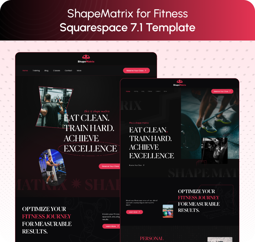
Shape Matrix is worth naming for its Portfolio and Gallery pairing and its Freebie page, with one honest caveat: Shape Matrix ships no About page, which for an agency selling on people is a gap you fill on day one.
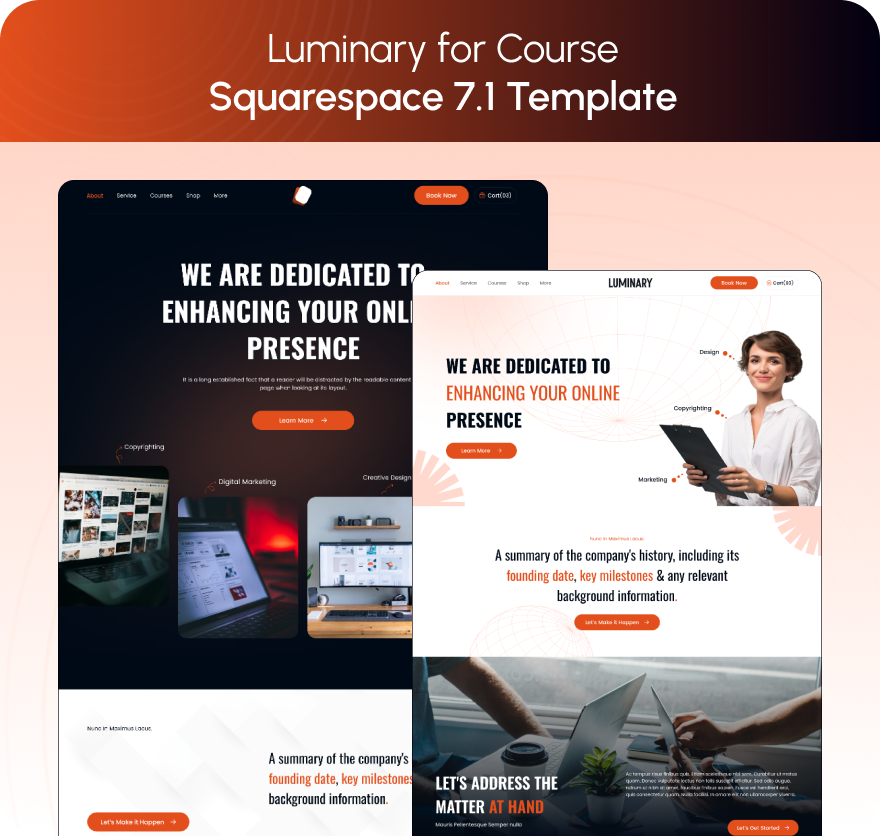
Luminary has a Portfolio, a Gallery, a Services page, a Courses page and a Shop across 11 pages — but Luminary ships no Contact page and no Blog page. For a creative agency, launching without an enquiry page is not a cosmetic problem.
Streamify is the one to ask about if motion is your core offer: 12 pages tagged Streaming and Videography with a Project structure, a Team page, a Pricing page, FAQs and a Blog. Its published live demo returns HTTP 401, so no demo link is given here — ask for a walkthrough rather than judging from a thumbnail.
Choosing one
Decide where the reel lives before you decide anything else, because gallery sections cannot hold it. Then choose the template on the structure of a single case study — a project-detail page you can duplicate is worth more than a striking homepage. Keep the work index and the enquiry page conventional and put the experiment in the hero. Then look at the design, because in Squarespace 7.1 the visual layer is the easiest thing to change and page architecture is the hardest.
If you would rather not run the install yourself, the premium Squarespace templates in our range arrive as a Squarespace contributor invitation rather than a file download, and can be installed onto an existing live site in around 48 hours without taking it down. Most creative agencies reading this will do it themselves, and WeDecorefy and Click Crafter are the two worth starting from.
FAQ
-
No. Squarespace 7.1 gallery sections hold up to 250 images across six layouts, and it is not possible to upload videos or add blocks to them. Video goes in a video block, an embed block, a section background — capped at 60 seconds — or a dedicated Videos page.
-
Use a video block on a Work or Showreel page. An uploaded file must be .mp4, .m4v or .mov, under 500 MB and under 30 minutes, and plays in a 16:9 player. Or paste a YouTube or Vimeo URL into the same block, which avoids Squarespace's 30-minute total video storage allowance.
-
Hero image, client and sector as text, the brief and the constraint, the work in sequence rather than as a dump, a measured outcome, one client quote about the constraint, and full credits. The constraint section is what separates a case study from a portfolio entry.
-
Portfolio pages give five layouts including three hover layouts, per-project SEO fields and Fluid Engine sections, but cap at 60 projects and cannot feed summary blocks. A blog collection gives categories, tags and filterable summary blocks with no cap, but uses the classic editor and shows dates unless you switch them off.
-
On the project they belong to, written as text — award name, category, year — plus a short Recognition section on the About page. Logo images are invisible to search engines and screen readers, so a grey strip of award logos on the homepage is decoration rather than evidence.
-
Fewer, written properly. Three case studies with a stated constraint and a measured outcome outperform twelve image galleries. A Squarespace portfolio page holds up to 60 projects, which is far more than any agency should publish.

Author Bio
I'm Walid Hasan, a Certified Squarespace Expert and Squarespace Circle Platinum Partner with over 12 years of hands-on experience designing and optimizing high-performing websites. Over the years, I've had the privilege of building more than 2,000 Squarespace websites for clients around the world, always focusing on clean design, strong user experience, and conversion-driven results.