18 Best Squarespace Portfolio Templates, Ranked by Use Case
The short answer: There is no single best Squarespace portfolio template, because a wedding photographer and an architecture practice need opposite things — one needs 200 images to load without stalling, the other needs six projects each with a long structured case study. Pick by discipline first, gallery behaviour second, and ignore the design until you've checked both.
Below are 18 templates sorted into seven creative disciplines, each scored against the same rubric.
How I scored these
Every template below was judged on five criteria, weighted. Scores are out of 5.
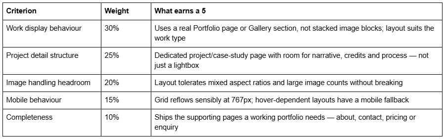
What this scoring is and isn't. It is a structural assessment made from each template's published page list, its live demo where one resolves, and 12 years of building on the platform. It is not a lab benchmark — I have not run Lighthouse against all 18 demos, and I'd distrust anyone who claims they have, because demo sites are loaded with placeholder imagery that has no relationship to what you'll upload. Where I cite performance figures, they are Squareko's own client-site measurements, clearly labelled as lab data.
Disclosure: Squareko sells eight of the templates below. Every one is marked (Squareko, $249) in the tables. Squarespace's own templates are free with a subscription and are genuinely the right answer for several disciplines here — I've said so where it's true.
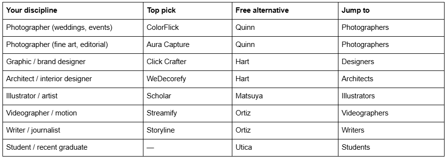
Quick pick by discipline
What actually makes a Squarespace portfolio template good
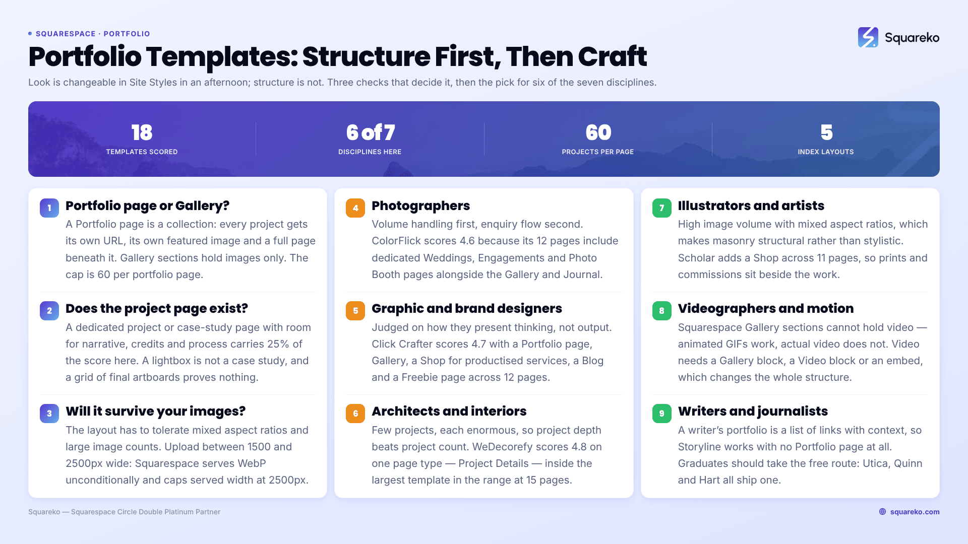
Most portfolio roundups describe how templates look. Look is the easy part — in Squarespace 7.1 every template runs the same engine, so any font, colour or spacing decision can be changed in Site Styles in an afternoon. What you cannot change cheaply is structure: which page types the template uses and how your work is organised inside them. That's what the four checks below test.
Check 1 — Is it built on a Portfolio page or a Gallery section?
These are different features and they behave differently.
A Portfolio page in Squarespace 7.1 is a collection, like a blog. Each project is a collection item with its own URL, its own featured image and its own full page underneath. Squarespace publishes five layouts for the index: Grid: Simple, Grid: Overlay, Hover: Background, Hover: Fixed and Hover: Follow Cursor. The cap is 60 projects per portfolio page, and projects cannot exist outside their parent portfolio.
A Gallery section is a set of images inside one page. Six layouts — Grid: Simple, Grid: Strips, Grid: Masonry, Slideshow: Simple, Slideshow: Full, Slideshow: Reel — with a cap of 250 images. No individual URLs, no per-image pages, and one thing that catches people out: gallery image edits save automatically and cannot be undone.
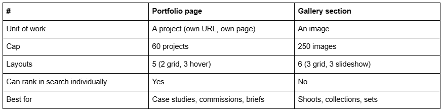
The rule: if a piece of work needs explaining, it needs a Portfolio page. If it only needs showing, a Gallery section is lighter and faster. Architects, designers and illustrators with a process story want the first. Photographers delivering a wedding set want the second — often both, with a Portfolio page as the shelf and Gallery sections inside each project.
Check 2 — Gallery loading behaviour
Squarespace lazy-loads images below the fold, which means the number that matters is not how many images the page holds but how many are visible before the first scroll. A Slideshow: Full hero commits the browser to a full-viewport image immediately; a four-column Grid: Simple commits to four thumbnails. That single choice moves Largest Contentful Paint more than any other template decision.
For context: across 54 Squareko-built client sites measured in August 2026 (Playwright/Chromium lab test, cloud datacentre, unthrottled, single run per site, load-only CLS), median mobile LCP was 2.01s, with 74% under Google's 2.5s "good" threshold. Median page weight was 3.0 MB across 93 requests. Image-led sites sat at the heavy end of that spread. Lab conditions flatter every site, so treat those as a ceiling, not a promise — but the ranking between templates holds: hero-slideshow layouts are consistently the slowest starting point, masonry grids the most forgiving.
Masonry is also the layout that hides mistakes. Grid: Simple crops everything to one aspect ratio, so a mixed portfolio of verticals and panoramas looks deliberate. Grid: Masonry keeps native ratios, which is honest but unforgiving if your work isn't consistently shot.
Check 3 — How work detail pages are structured
This is where most template shops stop paying attention, and it's the part that gets you hired. A project page that is nine stacked images and no words tells a prospective client nothing about whether you can think.
What to look for in a template's page list: a named Project Details, Case Study or Service Details page. Templates that ship one have had someone think about the second click. Templates that don't leave you designing it yourself — which is fine if you enjoy that, and a real cost if you don't.
Check 4 — Mobile behaviour
Two platform facts decide this. The 7.1 mobile breakpoint is 767px. And Fluid Engine maintains separate desktop and mobile layouts for the same section, written as inline styles — so a section you arranged beautifully on desktop has an independent mobile arrangement you must also arrange.
The specific trap for portfolios: the three Hover layouts have no hover on a touchscreen. Hover: Follow Cursor is spectacular on a laptop and collapses to a plain list of project titles on a phone. If most of your enquiries arrive from Instagram — which for photographers and illustrators they will — that is your primary layout, not your fallback. Use Grid: Simple or Grid: Overlay for those disciplines and keep hover layouts for desktop-dominant audiences like architecture practices pitching to developers.
One more: blog and portfolio featured images have no alt-text field in Squarespace. The item title is used as the alt text. Name your projects like a human describing the work, not "Project 04".
Portfolio templates for photographers
Photographers need volume handling above all else — many images, consistent treatment, fast enough that a phone on 4G doesn't give up. Enquiry flow matters second; nobody books a wedding photographer from a contact form buried in a footer.
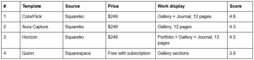
ColorFlick is the strongest fit for event and wedding photographers, because its 12 pages include dedicated Weddings, Engagements and Photo Booth pages alongside the Gallery and Journal. That structure matters more than it sounds: three service pages means three URLs that can each rank for a different intent, rather than one "Portfolio" page trying to rank for all of them. Weakness: it is genuinely colourful, and a photographer with a muted monochrome body of work will spend a session in Site Styles neutralising it.

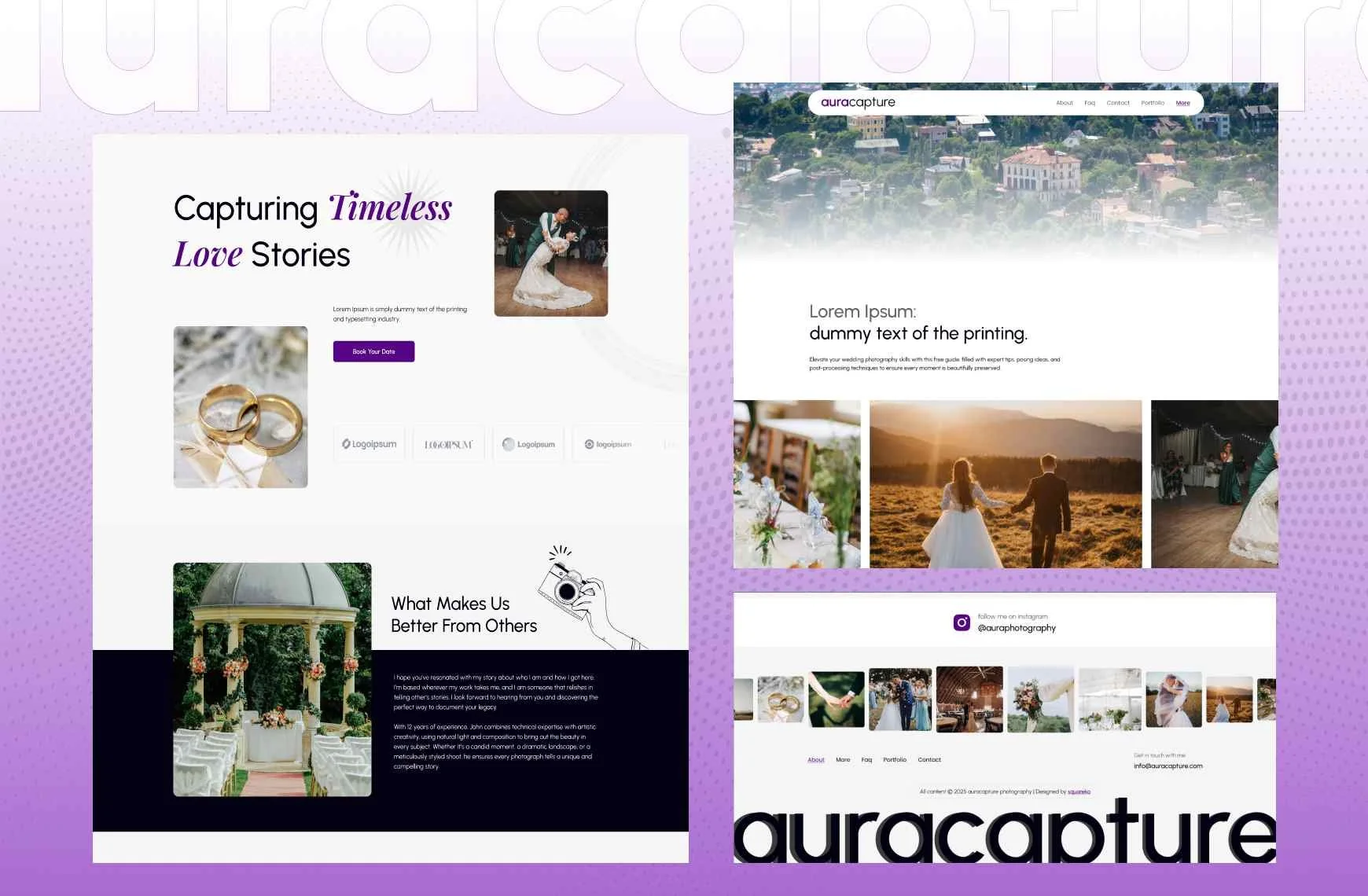
Aura Capture is the quieter sibling — Gallery, Weddings, Engagements and Events across 12 pages, with no blog. That last point is a real decision, not an oversight. If you have no intention of writing, a template without a blog is one fewer empty page to explain away. If you do intend to write, take ColorFlick or Horizon instead; adding a blog later is easy but you'll be designing it yourself.
Horizon is the one to know about. It's tagged Real Estate and Interior in the shop, but its actual pages are a photography site — Wedding, Engagement, Portraits, Photo Booth, Journal and Inquire, 13 pages, with both a Portfolio page and Gallery sections. Judge it by its pages, not its tag. The combination of a Portfolio collection (individually rankable shoots) and Gallery sections (bulk imagery inside them) is exactly the two-layer structure recommended above, and it's the only template here that ships with both configured.

Quinn is Squarespace's own, free, and honestly good. Clean gallery-led layout, no cost, no support to speak of. If you are a photographer with fewer than twenty finished images and no budget, start here — you can move to a paid template later without losing content, because 7.1 templates share one engine and switching does not destroy your pages.
Portfolio templates for graphic and brand designers
Designers are judged on how they present thinking, not just output. The Portfolio page with a proper project detail page is non-negotiable here — a designer's grid of pretty final artboards is indistinguishable from every other designer's grid of pretty final artboards.

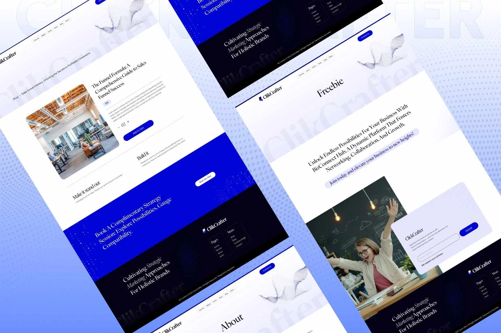
Click Crafter is the best-structured template in the Squareko range for a design studio: a Portfolio page and Gallery sections for the work, a Shop for productised services or templates, a Blog, and a Freebie page for a lead magnet. Twelve pages, all of them doing a job. It is built for agencies and service businesses rather than solo designers specifically, which shows in the tone of the demo layout — a one-person studio will want to strip a Team section.
Victoria from Big Cat Creative deserves naming because it does one thing better than anything in the Squareko range: it treats the blog as a first-class citizen with a side-by-side layout and featured-post module already built. Designers who write — and design writing is one of the few genuinely reliable ways to get found — should look at it seriously. Big Cat is the largest premium Squarespace shop and has the deepest template library; if none of the eight Squareko options fit, that's where I'd send you next.
Hart is Squarespace's free portfolio-first starting point. It gives you a Portfolio page and very little else, which is the honest description of what a free template is: a configuration, not a product. No support, no supporting pages, no launch guide.
Portfolio templates for architects and interior designers
This discipline has the opposite problem to photography. You have few projects, each enormous — drawings, renders, process, materials, credits, a client story. Project depth beats project count every time.

WeDecorefy is the highest-scoring template in this article and the reason is one page: Project Details. Fifteen pages — the largest in the Squareko range — including Projects, Gallery, Team, Shop, Blog and a Freebie. A practice with six built projects and a partner bio to sell is exactly the shape this template was drawn around. The trade-off is that 15 pages is 15 pages of copy to write before launch, and an architecture practice that hasn't written its project narratives yet will find that harder than choosing a template.

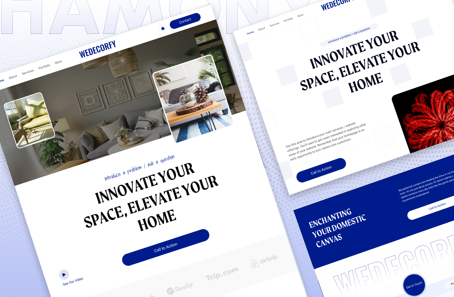
Harmony covers the same ground more compactly — Portfolio, Gallery, Blog and a Store, 11 pages — and suits an interior designer who also sells product. Vogue is tagged Real Estate and Interior with Portfolio, Gallery and a Shop across 11 pages; it's the one to take if your work photographs as property rather than as detail.
Also worth checking if you're a builder rather than a designer: BRIX Construction (13 pages, Projects, Service Details, FAQs) is structured around services and quoting rather than aesthetics.
On hover layouts for this discipline: architecture is the one field where Hover: Background genuinely earns its place. Your audience reviews work on a laptop, from a shortlist, at a desk. Use it — and still check the mobile fallback before launch.
Portfolio templates for illustrators and artists
Illustrators sit between photographers and designers: high image volume like the former, mixed aspect ratios like nobody else. This is the discipline where Grid: Masonry is not a style choice but a structural necessity — a square crop applied to a tall character sheet destroys the work.

Scholar is the pick, and the reason is the Shop. Illustrators who sell prints, brushes or commissions need commerce attached to the portfolio rather than parked on Etsy, and Scholar ships Portfolio, Gallery, Shop and a Freebie across 11 pages. It's tagged Fashion and Course as well, which tells you the visual register is editorial rather than playful — if your work is bright and character-led you'll be doing more restyling than an illustrator with a muted line-work practice.

Matsuya is Squarespace's free gallery-forward option and it is perfectly adequate for a first portfolio. Noire from Big Cat Creative is a good dark-mode alternative if your work needs a black ground, which line and ink work often does.
Set masonry, then check one thing: with mixed ratios, Grid: Masonry produces a different column arrangement at every breakpoint. Preview at 767px and just below it before you commit — the desktop arrangement tells you nothing about the phone one.
Portfolio templates for videographers and motion designers
The awkward truth: Squarespace Gallery sections cannot hold video. Animated GIFs work; actual video does not. Video goes in a Gallery block, a Video block, or an embed — which means a videographer's portfolio is structurally different from a photographer's, and most "portfolio template" recommendations ignore this entirely.

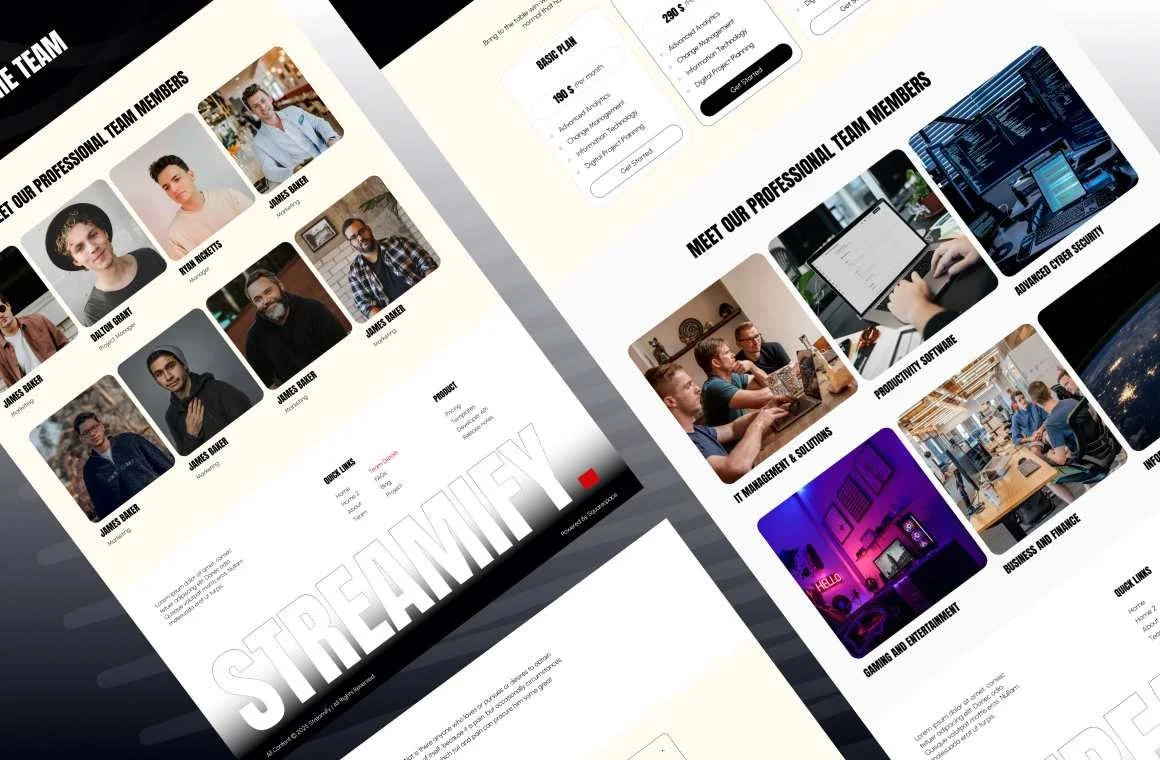
Streamify is tagged Streaming and Videography and is the only template in the Squareko range built for this discipline. Twelve pages including a Project page, Team, Pricing and FAQs — a production-company shape rather than a solo-shooter shape. Two honest caveats: its published demo link currently returns an authentication error, so you'll be buying on the page list and screenshots rather than a walkthrough; and video hosting is on you either way, since Squarespace's own video storage is limited and most working videographers embed from Vimeo or YouTube.
Ortiz is the free option and works fine as a scaffold for embedded reels.
Build note for any video portfolio: embedded players are the single heaviest thing you can put above the fold. Use a poster image that links through to the video rather than autoloading three players on the homepage. The desktop CLS figure across those 54 measured Squareko sites was 0.029 median with only 80% in the "good" band — noticeably weaker than mobile, and embeds are the usual reason.
Portfolio templates for writers and journalists
A writer's portfolio is a list of links with context. It does not need a gallery at all, which is why generic portfolio roundups serve this group so badly.

Storyline has no Portfolio page and is still the right answer for most working writers. Thirteen pages covering Blog, Podcast, Speaking, Testimonial and Booking — which is the actual anatomy of a writer's income. Build your clips list as a blog with a category per publication, and your "portfolio" is a filtered blog view that updates itself every time you publish.
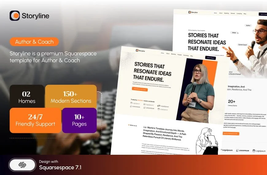
Luminary suits the writer who teaches: Portfolio, Gallery, Courses and a Freebie across 11 pages. Note that neither Squareko nor anyone else publishes whether Luminary's Course pages use Squarespace Member Areas or are simply designed pages — don't assume gated content is included, and ask before you buy if that's the deciding factor.

Portfolio templates for students and recent graduates

Take the free one. This is the segment where the honest answer costs me a sale. A graduate portfolio has three to six projects, changes every two months as you finish new work, and exists to get you into a room. A $249 template does not improve that outcome; a clearly structured project page and a legible CV do.
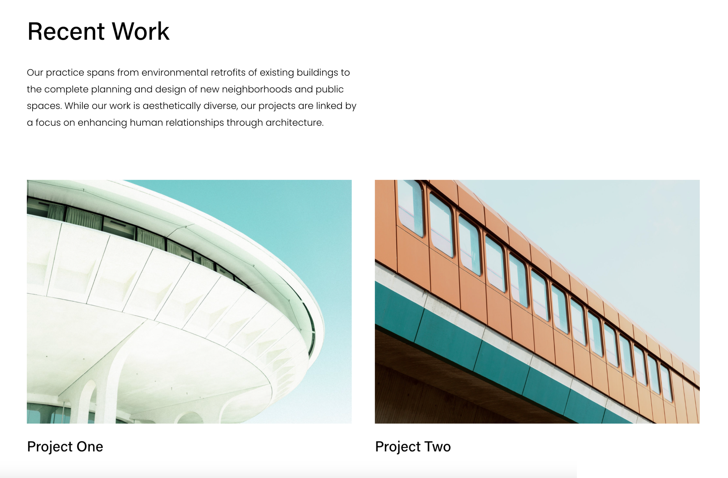
Utica, Quinn and Hart are all free with a Squarespace subscription and all give you a Portfolio page or Gallery sections. Use Grid: Simple, write two paragraphs per project explaining the brief and your decision, and spend the money you saved on printing.
Come back to a premium template when your portfolio stops changing weekly and starts having to sell something — services, prints, commissions, a booking slot. That's the point at which supporting pages, a shop and an installed setup start paying for themselves.
What a portfolio template doesn't fix
Three things worth knowing before you spend anything.
Demo images are not licensed for your live site. Every template you buy — from any shop — ships with placeholder photography you must replace. For a portfolio site this is barely a constraint, since your work is the imagery. For the About and Contact pages it means sourcing or shooting your own.
Upload at the right size or the CDN can't help you. Squarespace serves WebP unconditionally regardless of what you upload, and serves a maximum width of 2500px. Upload between 1500 and 2500px wide. And name your files properly before uploading, because filenames cannot be changed after upload — a portfolio full of DSC_4471.jpg is a small, permanent own goal.
A template is a starting configuration, not a locked design. All Squarespace 7.1 templates run the same rendering engine. Anything one 7.1 template can do, another can be configured to do. What you pay for is the configuration, the supporting pages, and — depending on the shop — someone installing it. Squareko's templates are delivered as a Squarespace contributor invitation rather than a file download, which removes the upload step entirely; installation onto an existing site is a manual process taking around 48 hours. Note also that all template sales are final — use the demo properly first.
If you've worked through the segments and you're still torn between two templates, the deciding question is almost always the second click: what does someone see after they tap a piece of work? If neither template answers that well, neither is right.
That's the sort of thing worth a second opinion on before you commit, and it's why the premium Squarespace templates in our shop are listed with their full page structure rather than just a homepage screenshot. Most people reading this will pick correctly from the tables above without any help — the segments exist so you don't need to ask.
FAQ
-
It depends on the work. For weddings and events, ColorFlick gives you separate Weddings, Engagements and Photo Booth pages, so each ranks for its own intent. For fine art or editorial, Aura Capture is quieter and gallery-only. Quinn is Squarespace's free option and is genuinely adequate for a first portfolio.
-
A Portfolio page treats each project as a collection item with its own URL and full page, capped at 60 projects. A Gallery section holds up to 250 images inside one page with no individual URLs. If a piece of work needs explaining, use a Portfolio page. If it only needs showing, use a Gallery section.
-
Grid layouts do. The three Hover layouts — Background, Fixed and Follow Cursor — depend on a cursor and degrade to a plain list of project titles on touchscreens. Squarespace 7.1's mobile breakpoint is 767px, and Fluid Engine keeps a separate mobile layout per section that you must arrange yourself.
-
For students, graduates and anyone with under twenty finished pieces, yes. Free templates like Quinn, Hart, Ortiz, Matsuya and Utica all give you a Portfolio page or Gallery sections. What you don't get is supporting pages, a style guide, installation or support. All 7.1 templates share one engine, so upgrading later doesn't destroy your content.
-
Between 1500 and 2500 pixels wide. Squarespace serves a maximum of 2500px and converts everything to WebP automatically regardless of source format. Name files descriptively before uploading — filenames cannot be changed afterwards, and portfolio featured images have no separate alt-text field.
-
Sixty. Projects are collection items dependent on their parent portfolio page and cannot exist as standalone pages. Gallery sections have a different cap — 250 images each — and gallery image edits save automatically and cannot be undone.

Author Bio
I'm Walid Hasan, a Certified Squarespace Expert and Squarespace Circle Platinum Partner with over 12 years of hands-on experience designing and optimizing high-performing websites. Over the years, I've had the privilege of building more than 2,000 Squarespace websites for clients around the world, always focusing on clean design, strong user experience, and conversion-driven results.