Are Squarespace Templates Responsive? Yes — With Four Caveats
Yes. Every Squarespace 7.1 template is responsive out of the box, and so is every premium template built on 7.1, because they all run the same underlying engine. You do not build a separate mobile site. When a Squarespace site looks broken on a phone, the cause is almost never the template — it is custom CSS written without a media query, or a Fluid Engine mobile layout nobody opened.
Here is what is genuinely automatic, what needs a look, and what actually breaks.
What is responsive by default, and what isn't
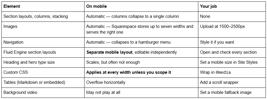
The Squarespace 7.1 mobile breakpoint is 767px
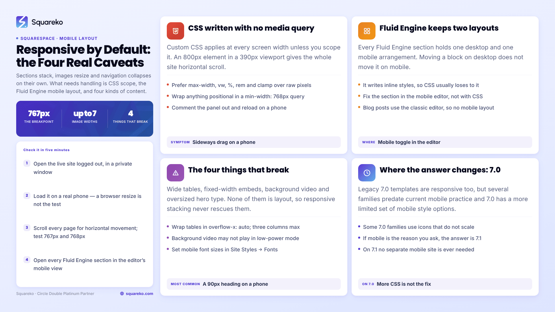
Squarespace 7.1's main mobile breakpoint is 767px. Below that width the site switches to its mobile presentation: columns stack, the navigation collapses, and Fluid Engine swaps to the mobile layout.
This one number is the reason most "my Squarespace template isn't responsive" complaints exist. A media query copied from a Bootstrap tutorial at 768px, or from a 7.0 guide at 640px, fires at the wrong moment — sometimes one pixel late, which is enough to leave a rule applying on desktop that was meant for phones.
/* Correct for Squarespace 7.1 */
@media screen and (max-width: 767px) {
h1 { font-size: 2rem; }
}
Test at 767px and 768px specifically. If the layout changes at 768 but your CSS changes at 640, you have found your bug.
Failure mode one: custom CSS written without a media query
This is the single most common reason a responsive Squarespace template stops being responsive.
CSS in Website → Website Tools → Custom CSS applies at every screen width unless you scope it. Any rule with a fixed pixel value — width: 800px, padding-left: 200px, font-size: 72px, margin: -150px — was written while looking at a desktop screen, and it will do the same thing on a 390px-wide phone. An 800px element inside a 390px viewport produces horizontal scroll across the entire site, which is the symptom people describe as "the template is broken on mobile".
Two habits fix it permanently:
Prefer relative units. max-width: 800px instead of width: 800px. vw, %, rem and clamp() all scale; raw pixels do not.
Scope anything positional. If a rule moves, overlaps or offsets an element, it needs a @media screen and (min-width: 768px) wrapper so it only ever applies on desktop.
If you inherited a site with a lot of custom CSS, the fastest diagnostic is to comment the whole panel out and reload on a phone. If the layout is suddenly fine, the template was never the problem.
Failure mode two: Fluid Engine keeps a separate mobile layout
Fluid Engine — the 7.1 page editor — maintains two independent layouts for every section: one desktop, one mobile. Moving a block on desktop does not move it on mobile. Squarespace generates a sensible mobile arrangement automatically when you first build the section, and then leaves it alone while you keep editing desktop.
That is why a Fluid Engine section can look perfect on a laptop and have overlapping text on a phone. The mobile layout is stale, not broken.
To check it: edit any page, click into a Fluid Engine section, and use the mobile view toggle in the editor toolbar. Drag and resize blocks there directly — the changes apply only to mobile. Do this for every section on every page before launch, and for any section you have substantially rebuilt since.
One thing worth knowing: because Fluid Engine writes layout values as inline styles on the elements themselves, custom CSS that repositions a Fluid Engine block usually loses to it. When a Fluid Engine section misbehaves on mobile, fix it in the mobile editor rather than fighting it with CSS.
Blog posts are the exception — Squarespace 7.1 blog posts still use the classic editor, not Fluid Engine, so they stack vertically and have no separate mobile layout to maintain.
The four things that genuinely break on mobile
Responsive layout handles sections and images. These four are not layout, and they need deliberate handling in any template:
Wide tables. Squarespace has no responsive table component. A Markdown table or embedded HTML table with five or six columns will exceed a phone viewport and either overflow the page or trigger horizontal scroll. The fix is to wrap the table in a container with overflow-x: auto so it scrolls inside its own box instead of dragging the page. On a phone, three columns is the practical ceiling for a table that should be read rather than scrolled.
Fixed-width code and embeds. Anything pasted into a Code Block with a hard-coded width — a third-party booking widget, an old iframe, a pricing table from another tool — keeps that width on mobile. Embeds you cannot edit need max-width: 100% applied to them, and iframes need a responsive aspect-ratio wrapper.
Background video. Squarespace states plainly that background videos "may not always display on mobile devices, depending on the visitor's connection speed and browser version", and that devices in low-power mode will not display them at all. If you have not set a mobile fallback image in the section's background settings, visitors get a background colour, or a video thumbnail with an unresponsive play button. Every background video section needs a fallback image set. Treat the video as the enhancement and the image as the real design.
Large hero type. Type scales down at the breakpoint, but a 90px display heading that was designed to sit on two lines on desktop routinely lands on five lines on a phone and pushes the call to action below the fold. Squarespace 7.1 lets you set separate mobile font sizes in Website → Site Styles → Fonts. Set them. This is the single most common visual problem in a template that is technically responsive and still looks wrong.
How to check a template on mobile in five minutes
Open the live site — logged out, in a private window. The editor injects its own wrapper markup and is not a reliable preview.
Load it on a real phone, not just a browser resize. Resizing does not reproduce touch targets, iOS Safari's viewport behaviour, or low-power video suppression.
Scroll the full length of every page and watch for horizontal movement. Any sideways drag means one element is wider than the viewport.
Check the breakpoint itself: 767px and 768px.
Open every Fluid Engine section in the editor's mobile view.
If you are evaluating a template before buying, run steps 1–3 against the demo site on your own phone. Every reputable premium template demo is a live Squarespace site, so what you see is what you get — and while you are there, it is worth checking whether the demo's page weight is reasonable, since a template's effect on site speed works the same way: the template is not the variable, the content it ships with is.
The one case where the answer changes
Legacy Squarespace 7.0 templates are the exception. They are responsive too, but several families predate current mobile practice, some use image-based icons that do not scale on high-density screens, and 7.0's mobile styling is controlled by a different, more limited set of Site Styles options. If you are on a 7.0 template and mobile is the reason you are asking, the fix is not more CSS — it is moving to 7.1.
Otherwise: the template is responsive. Check your CSS and your Fluid Engine mobile layouts first. Responsiveness is one of the things Squarespace 7.1 genuinely handles for you — the ceilings that do exist are documented in Squarespace template limitations, and mobile layout is not among them.
If you have worked through the custom CSS and the mobile layouts and a template still fights you on mobile, that is usually a sign the design was stretched past what the sections were built to do. Our premium Squarespace templates are built and tested on 7.1 with the mobile layout set on every section before handover, which removes most of this list before you start. Most readers do not need that — the five-minute check above resolves the overwhelming majority of mobile problems on templates people already own.
FAQ
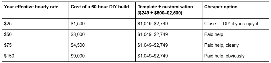
Two honest caveats on that table. Those 60 hours are not all recoverable — many people build the site in evenings that would not otherwise have been billed, which makes the opportunity cost lower than the arithmetic suggests. And you still have to supply the copy and the photographs on the paid route, which is 10 to 15 hours regardless. The table is a prompt to price your time, not a proof.
The threshold in practice is around $75 an hour. Above it, paying someone to do the build while you write the copy is almost always the cheaper project.
Situation 4: you've already tried, and the site still isn't live
This is the most common reason people finally hire, and the least discussed.
A DIY template build has no external deadline. Nothing fails if you skip a week. The site sits at 70% finished through a busy quarter, and the version live at the domain is either the old one or nothing. Meanwhile the business is running — you are just running it without the site you decided you needed nine months ago.
Two-thirds of the value of hiring, on projects like this, is not skill. It is that somebody else's calendar now depends on your copy arriving, and there is a launch date in an agreement rather than in your intentions.
The tell: if you have started the site more than once, or the draft has been at "nearly there" for over a month, the constraint is not the template. Buying a second template will not fix it. The smallest intervention that works is usually a paid customisation pass on the template you already own — someone finishes the build in two to four weeks while you supply copy against their deadline.
What hiring a designer does not buy you
Being clear about this is what makes the four situations above credible.
It does not buy rankings. Every Squarespace 7.1 site ships the same SEO baseline, and a designer changes none of it. Rankings come from keyword targeting, page depth, internal linking and time. The one genuine SEO deliverable in a build is the redirect map from Situation 2. What templates do and do not do for SEO is set out in are Squarespace templates SEO friendly.
It does not buy speed. Both routes produce the same markup from the same engine on the same CDN, which serves WebP unconditionally. Across 54 Squareko-built client sites measured in August 2026 — Playwright and Chromium, cloud datacentre, unthrottled, single run per site, load-only CLS, so lab data rather than field data — median mobile LCP was 2.01s with 74% under Google's 2.5s threshold, and median mobile CLS was 0.000. That set mixes template-derived and custom builds, and the distribution does not split by route. It splits by image discipline: only 48% of the sites came in under 3 MB. Desktop CLS is weaker at a 0.029 median, so this is not an unqualified claim in either direction.
It does not buy uniqueness past a point. A template restyled with your own type scale, colour system and photography is not recognisable as that template to anyone who is not a Squarespace designer. Your customers are not.
It does not buy capability the platform lacks. Nobody can edit Squarespace 7.1's generated HTML — the Developer Platform explicitly excludes 7.1 — run server-side code, or produce URL structures the platform will not mint. Those limits are the same at $249 and at $25,000, and they are set out in can you fully customise a Squarespace website.
The middle option most people should take
For readers who match one of the four situations but not two, the right answer is neither column: buy the template, then pay someone for a customisation pass on it.
This works because of the platform fact above. Since every 7.1 site shares one engine, a designer can restructure a purchased template exactly as freely as a blank site — nothing about starting from a template constrains the finished result. What it removes is the layout and section-building work you would otherwise pay a professional day rate for. Total lands around $1,000–$2,800 rather than $3,000 and up, and the timeline is two to four weeks rather than four to fourteen.
Squarespace template customisation service documents what that engagement includes, what it costs and what falls outside it.
Choose the template if… / Choose to hire if…
Choose the template, and build it yourself, if: the site is a brochure under about ten pages; your logo, colours and fonts already exist; you have 40 to 60 hours and a date you will hold; nothing on the site takes bookings or payments beyond a form and standard checkout; and you are not replacing a site with existing rankings. How to choose a Squarespace template covers selecting on structure rather than on the demo photography — and remember that demo images are not licensed for live use, so all of them have to be replaced regardless of route.
Choose to hire if: the site carries a revenue mechanism that has to work on day one; you are replacing a site that already ranks and the redirect map matters more than the design; your hourly rate is above $75; you have already stalled once; or your brand identity does not exist yet and the site is where it has to be defined.
Where this leaves you
Run the four conditions honestly. If none of them describe your project, the template route is the right answer and this post has done its job by talking you out of a purchase — spend the saved money on photography, which will change your outcome more than the build route ever does.
If one or two of them do describe it, the middle option is usually enough: your own template, finished by someone else, on their deadline. If three or four apply — a booking-driven site, replacing a ranked one, on a fixed launch date — that is the situation where custom Squarespace design is genuinely the cheaper project, and the redirect map and the accountability are what you are paying for rather than the pixels. Either way, decide on the four conditions rather than on how the finished examples look.
FAQ
-
Yes. Every Squarespace 7.1 template is responsive by default, and because all 7.1 sites share one template engine, premium templates are responsive too. Sections stack, images resize automatically, and navigation collapses to a hamburger menu without any work from you.
-
Squarespace's own guidance puts a freelance designer at $500–$2,000 for simpler work and developers at $50–$150 an hour. Specialist Squarespace studios commonly quote $2,500–$5,000 for a full build, and multi-person agencies $10,000–$25,000 and up. A customisation pass on a template you already own typically runs $800–$2,500.
-
Almost always custom CSS with fixed pixel widths applied at every breakpoint, or a Fluid Engine section whose mobile layout was never opened. Comment out your Custom CSS panel and reload on a phone; if the problem disappears, the template was never at fault.
-
Forty to eighty hours of actual work for a first-time builder, spread across whatever calendar you give it. The work is replacing every demo image, writing the copy, setting SEO titles and descriptions, wiring forms and checking each section at mobile width. The calendar slips because a DIY build has no external deadline.
-
Only within the fixed pattern. Blog post URLs are always /blog-page-slug/post-slug, with no arbitrary nesting or category paths. Changing a slug creates no automatic 301, so map old URLs by hand in URL Mappings using /old-url -> /new-url 301 before renaming anything indexed.
-
Generally yes. Across 54 Squareko-built client sites measured in August 2026 — lab data, single run, unthrottled — median mobile LCP was 2.01s with 74% under 2.5s, and median mobile CLS was 0.000. Desktop CLS is weaker at a 0.029 median. Page weight, not template choice, is the variable that matters.

Author Bio
I'm Walid Hasan, a Certified Squarespace Expert and Squarespace Circle Platinum Partner with over 12 years of hands-on experience designing and optimizing high-performing websites. Over the years, I've had the privilege of building more than 2,000 Squarespace websites for clients around the world, always focusing on clean design, strong user experience, and conversion-driven results.