Wedding Website Design Tips for Squarespace Conversion
Introduction
Your wedding website exists for one reason: to convert couples into clients. But here's the reality most wedding professionals face: they build websites that look beautiful but don't actually convert visitors into bookings. Gorgeous hero images, detailed service descriptions, and polished portfolios mean nothing if couples bounce away without filling out a contact form or picking up the phone.
This is where wedding website design tips for Squarespace shift from being about aesthetics to being about psychology and conversion strategy. When you design with conversion at the center—not as an afterthought—everything changes. Your layout decisions, copy placement, form design, and visual hierarchy start working together to guide couples toward saying yes to booking you.
If you've ever wondered, How do I get more bookings from my wedding website? you're asking the right question. The answer isn't more content. It's smarter design. Over the past several years, working with wedding professionals on Squarespace, we've identified the design patterns that actually move the needle on conversions. This post shares those patterns—and exactly how to implement them on Squarespace.
Key Takeaways Wedding Website Design Tips for Squarespace Conversion
Lead with emotion, not information: Your hero section should make couples feel something before they read anything. Use high-impact imagery and emotional CTAs to establish trust and desire immediately.
Design your inquiry form to remove friction: Fewer fields, smart placement, and transparent follow-up expectations convert more inquiries than lengthy forms buried in sidebars.
Deploy social proof strategically: Testimonials, reviews, and trust signals positioned near decision points (not just on a reviews page) dramatically increase booking confidence.
Use transparent pricing to pre-qualify leads: Showing prices on your wedding website filters out budget-misaligned couples and builds credibility with serious prospects.
Optimize for mobile-first engagement: Most engaged couples research late at night on their phones. A mobile-first design captures them when they're emotionally ready to book.
1. Lead With Emotion, Not Information: The Hero Section Strategy
Your hero section is the first impression couples have of your brand. Most wedding professionals use it as a portfolio showcase—stacking in beautiful images, their name, and a generic tagline like Capturing Your Love Story.
This approach is backwards. Your hero section isn't a portfolio entry. It's a conversion mechanism. It's the moment you establish trust, communicate value, and create an emotional reason for a couple to scroll down and explore further. If you don't create that emotional connection in the first three seconds, they're gone.
Why This Works
The psychology here is straightforward: couples don't hire based on information alone. They hire based on feeling safe, understood, and excited about working with you. Your hero section is where you create that feeling. When a photographer, planner, caterer, or designer leads with an emotionally resonant image and a headline that speaks directly to the couple's desires—not their needs—conversion rates climb.
Research from conversion optimization experts shows that emotionally-charged messaging paired with high-impact visuals increases click-through rates by 20-40% compared to information-heavy approaches. For wedding professionals, this translates directly to more form submissions and inquiries.
What to Do
Start with your hero image. It shouldn't be a random beautiful wedding photo. It should be an image that represents the emotional outcome of working with you. If you're a wedding photographer, show the moment where the couple's emotion is most genuine and vulnerable—not the Pinterest-perfect shot, but the one where genuine joy is undeniable. If you're a planner, show a couple completely at ease, surrounded by the organized, stress-free environment you create. If you're a florist or designer, show not just the arrangement but the bride's face when she first sees it.
Your headline should answer one question: What will this couple feel or experience by working with me? Not Award-Winning Wedding Photography but Photography That Captures the Real, Unguarded Moments That Matter Most. Not Full Wedding Planning Services but Imagine Walking Down the Aisle Completely Calm, Completely Ready.
Your CTA button should match this emotional tone. Instead of View Portfolio or Learn More, use See Our Story or Let's Create Yours. This shifts the button from information-gathering to emotional engagement.
Squarespace Implementation
On Squarespace, you control this through the Hero Block (Page Settings > Hero). Here's how to maximize conversion:
Hero Image: Upload a high-resolution, emotionally resonant image. Make sure it's at least 1920x1080 for desktop clarity. Use Squarespace's built-in image optimization—it automatically compresses for mobile without losing quality.
Content Overlay: Squarespace allows text overlay on your hero image. Keep this minimal. Use one powerful headline (8-12 words max) and one subheading that clarifies the emotional benefit. Avoid paragraphs in the hero—this isn't where couples read copy; it's where they feel.
Button Placement: Position your CTA button below the headline. Use Squarespace's button styling to make it contrast against the background image. A/B test button colors—on wedding websites, warm colors (coral, rose gold, warm white) typically outperform cool tones for CTAs.
Mobile Adaptation: In Squarespace's mobile editor, ensure your text remains fully visible and readable on small screens. The headline and button should take up no more than 50% of the visible mobile viewport.
Hero Height: Set hero height to Large (not Extra Large) for optimal scrolling behavior on mobile. You want couples to scroll and discover more content—not feel like they're swimming through whitespace.
By applying this strategy, couples don't just see your hero section. They feel understood, intrigued, and emotionally ready to learn more.
2. Make Your Inquiry Form Irresistible: Friction Reduction & Clarity
A contact form is often the highest-friction interaction on a wedding website. It asks couples to stop browsing, identify themselves, and commit to a conversation. Most wedding websites make this harder than it needs to be.
The standard approach: a nine-field form (name, email, phone, wedding date, venue, guest count, budget, services needed, message) buried somewhere on a separate Contact page. Couples open the form, see the length, and leave. It's that simple.
Why This Works
Every additional form field reduces submission rates by approximately 3-5% according to conversion research by marketing firms like Unbounce and HubSpot. A nine-field form doesn't give you nine times more useful information—it gives you about 30-40% fewer submissions. When you're trying to convert more bookings, fewer form submissions is a losing game.
The second principle: transparency about what happens next is a hidden conversion lever. Couples hesitate to fill out forms because they're uncertain. Will you spam them? Will you pressure-sell? Will you respond quickly? The more explicit you are about the next step, the more willing couples are to submit their information.
What to Do
Redesign your form with two principles: ruthlessness and transparency.
First, ruthlessness. Ask only what you absolutely need to move to the next step. For most wedding professionals, that's:
Name
Email
Phone
One service-specific question
A message field (optional, not required)
That's it. Five fields maximum. You'll get their address, dietary restrictions, and vendor preferences after you've started the conversation, not before.
Second, transparency. Add a single sentence above or below your form: We'll respond within 24 hours with next steps. Or Schedule a quick call to discuss your vision and our availability. This removes uncertainty and increases conversion by 15-25%.
Form Placement Strategy
Don't bury your form on a Contact page couples may never visit. Use multiple form placements:
Sticky Contact Button (bottom-right corner, visible on every page, mobile & desktop)
Hero Section CTA (if they're emotionally engaged in your hero, capture them immediately)
After Social Proof Section (after they've read testimonials and seen your work, trust is highest)
Dedicated Contact Page (for couples who explicitly search for contact information)
For detailed guidance on implementing these strategies, see our Squarespace Form Optimization guide.
Each placement serves a different moment in the couple's journey. Some are emotionally triggered immediately. Others need social proof first. By offering multiple form entry points, you don't force couples into one conversion funnel—you give them options.
Squarespace Implementation
Form Block Setup: Use Squarespace's Form Block (not a third-party form plugin, which adds friction). On Squarespace, go to Page > Insert Block > Form.
Field Configuration: In Form Settings, add only your five essential fields. For each field, make the label and placeholder text crystal clear. Instead of Message, use Tell us about your wedding vision. Instead of Phone, use Best number to reach you.
Required Fields: Mark only name, email, and phone as required. Make service-specific questions optional but visible (couples fill them out if relevant).
Button Text: Change your form submission button from Submit to action-oriented text like Schedule My Consultation or Check Availability.
Confirmation Message: Set up an auto-response. In Form Settings > Confirmation, create a message that confirms receipt and sets expectations: Thanks! We'll review your details and reach out within 24 hours to discuss availability and next steps.
Sticky Contact Button: Use Squarespace's Code Injection (Settings > Advanced > Code Injection > Footer) to add a simple, sticky contact button. Here's a basic implementation:
<div style="position:fixed;bottom:20px;right:20px;z-index:999;">
  <a href="#contact-form" style="background-color:#d4a574;color:white;padding:12px 20px;border-radius:50px;text-decoration:none;font-weight:bold;box-shadow:0 4px 12px rgba(0,0,0,0.15);">
    Get in Touch
  </a>
</div>
Mobile Optimization: In Squarespace's mobile editor, ensure form fields stack vertically (they do by default) and the button spans full width. Test the form submission on an actual mobile device to confirm smooth interaction.
When your form is simple, clearly labeled, transparently positioned, and trustworthy, couples fill it out. Simple as that.
3. Use Social Proof Strategically, Not Just Decoratively
Most wedding websites feature a Testimonials or Reviews section. It's there, couples might read it, it looks professional. But it's passive. Social proof becomes conversion-focused when it's positioned where couples are making decisions.
Why This Works
The psychology of social proof is well-established: when we're uncertain about a decision, we look to others who've made that decision and were satisfied. For wedding professionals, couples are rarely 100% certain about hiring before they see proof that others like them had great experiences.
Standard testimonials sections don't convert as well because they're optional reading. Couples might skip them entirely. Strategic social proof placement puts proof in the path of the conversion journey. Testimonials right before the contact form, review badges near your pricing, before/after images in your portfolio—these placements tie proof directly to decision-making moments.
Research shows that strategically-placed reviews increase conversion rates by 30-50% compared to reviews on a dedicated reviews page.
What to Do
Inventory your strongest social proof. This includes:
Text testimonials
Written reviews
Quantifiable results
Media mentions or recognitions
Before/after visuals
User-generated content
Now, strategically place this proof throughout your website:
Right Before the Contact Form: Position a 2-3 testimonial carousel or a grid of review highlights directly above your main inquiry form. The psychology: Look, other couples loved this. You should too.
On Your Pricing Page (if you have one): A review badge or star rating near your packages. This builds confidence that the price is justified.
In Your Portfolio: Instead of just portfolio images, add a small quote from the couple whose wedding/event is shown.
We were nervous about the timeline, but Sarah managed everything beautifully paired with an image is more powerful than just the image.
On Your Homepage, Below the Fold: Create a dedicated social proof section with 4-6 of your strongest testimonials in a clean grid or carousel format.
In Your About Section: One testimonial that speaks to your character or approach, not just your service quality.
Review Schema & Trust Signals
Implement Schema Markup for reviews. This tells Google that your reviews are legitimate, and Google may display your star rating in search results. This is a subtle but powerful conversion booster—couples see 4.9 stars / 47 reviews in Google search results before they even visit your website.
Squareship Implementation
Testimonial Block: Use Squarespace's native Testimonials Block (Insert > Testimonials). This allows you to add client names, photos, and text testimonials in a carousel or grid layout. Design is automatically mobile-responsive.
Image Overlay: For portfolio items, add a transparent overlay with a quote. In Squarespace's image gallery settings, you can add alt text that displays on hover. Use this to feature a client quote.
Review Badge Integration: If you use Google Reviews, Facebook Reviews, or Trustpilot, display your badge prominently. You can embed badges using Squarespace's Embed Block (Insert > Embed > Custom). Most review platforms provide embed code.
Review Schema Markup: Add this to your site's header (Settings > Advanced > Code Injection > Header):
{
  "@context": "https://schema.org",
  "@type": "LocalBusiness",
  "name": "[Your Business Name]",
  "image": "[Your Logo URL]",
  "description": "[Your Service Description]",
  "address": {
    "@type": "PostalAddress",
    "streetAddress": "[Your Address]",
    "addressLocality": "[City]",
    "postalCode": "[ZIP]"
  },
  "aggregateRating": {
    "@type": "AggregateRating",
    "ratingValue": "4.9",
    "reviewCount": "47"
  }
}
When social proof is strategic, not decorative, it converts. Couples see proof at the exact moment they're deciding whether to take the next step.
4. Design a Pricing Page That Pre-Qualifies the Right Clients
This might be the most misunderstood conversion strategy in the wedding industry. Many wedding professionals hide their pricing. It depends on the wedding, they say, or Let's talk first. The assumption is that transparency loses deals.
It's the opposite. Transparent pricing pre-qualifies leads and increases conversion rates for the right clients.
Why This Works
When you hide pricing, you attract two types of inquiries:
Serious couples who want to work with you but are frustrated by the lack of transparency. They'll still inquire, but they're skeptical.
Budget-misaligned couples who have unrealistic expectations. They inquire, you talk, and when they hear your prices, they're shocked and offended.
When you show pricing, you attract one type:
Pre-qualified couples who understand your value tier and are genuinely interested.
Your form submission rate might drop by 20-30% when you show prices. But your conversion rate (inquiries to bookings) increases by 40-60%, because the inquiries you do receive are from couples who can afford you and respect your positioning.
More importantly for wedding websites specifically: transparent pricing is a trust signal. It says, I'm confident in my pricing and I'm not trying to hide anything. This builds credibility, especially with couples who've been burned by surprise costs before.
What to Do
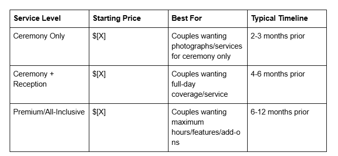
Create a pricing page or pricing section that includes:
Tiered Packages: Most wedding professionals offer 2-4 price tiers. Create names that communicate value levels, not features:
Instead of Bronze, Silver, Gold, use Essential, Signature, Premium or Ceremony, Ceremony + Reception, Full Day
Include 3-5 key deliverables for each tier (not exhaustive lists—just the highlights)
Show the starting price clearly
What's Included vs. What Costs Extra: Couples want clarity. Be explicit about what's bundled and what costs additional fees (timeline extension, rush planning, extra prints, etc.).
Timeline & Process: Underneath or next to your pricing, show your process: Initial Consultation (Free) → Package Selection → Contract & Deposit → Wedding Day/Event.
FAQ About Pricing: Answer common questions directly on this page:
Why does pricing vary?
Can I customize a package?
What payment terms do you require?
Do prices include travel?
A Comparison Table (optional, for multiple service providers or tiers):
A CTA Near Pricing: Not sure which package is right for you? Schedule a free 15-minute consultation. This gives budget-conscious or uncertain couples a way to engage without committing, while still capturing their inquiry. For more on this strategy, see our article on Wedding Website Pricing Strategy.
Squarespace Implementation
Pricing Block: Use Squarespace's native Pricing Block (Insert > Pricing). Squarespace allows you to create multiple pricing tiers with:
Tier name
Price
Description
Feature list
Button text and action (can link to contact form)
Customization: Style your pricing block to match your brand. Highlight your most popular tier (usually the middle option) with a different background color or Recommended badge.
Table Implementation: For comparison tables, use Squarespace's Table Block or create a simple grid layout with text blocks. Ensure the table is responsive on mobile (stacks vertically).
Add a FAQ Accordion: Below your pricing, add an accordion (Insert > Accordion) with your 5-6 most common pricing questions. This keeps the page clean while allowing couples to dive deeper.
Mobile Responsive: Test your pricing page on mobile. Ensure:
Pricing tiers stack vertically
Price is large and legible
CTA buttons are full-width and easily tappable
Table (if used) scrolls horizontally on small screens
Link from Multiple Locations: Link to your pricing page from your homepage, navigation menu, and near inquiry forms. Make it easy to find.
Transparent pricing doesn't lose deals. It attracts better deals. Couples who book you do so with clear expectations and no sticker shock.
5. Optimize for Mobile-First Browsing
Here's a fact that changes everything: 70-80% of couples researching wedding vendors do so on mobile devices, often late at night or early morning. They're scrolling in bed, on their commute, or sneaking time away from work to plan.
Yet most wedding websites are designed for desktop, then adapted for mobile. This is backwards.
Why This Works
Mobile-first design means designing for the mobile experience first, then expanding to larger screens. For wedding websites, this fundamentally changes how you structure information, design forms, and present images. Our guide to Mobile-First Website Design covers this strategy in depth.
When couples are on mobile, they have different needs:
They need to load your site quickly (mobile users abandon after 3 seconds of load time)
They need to scroll through content easily (long paragraphs are harder to read on small screens)
They need clear CTAs (tapping small buttons is frustrating)
They want to see images in high quality (blurry images on small screens are a red flag)
Websites optimized for mobile-first convert 30-50% more on mobile devices because they match how couples actually use the internet.
What to Do
Design with these mobile-first principles:
Fast Load Times: Compress images aggressively. Large, unoptimized images are the #1 reason wedding websites load slowly on mobile. Aim for full-page load time under 3 seconds on a 4G connection.
Simple Navigation: On mobile, avoid dropdown menus. Use a hamburger menu (three-line icon) that reveals a simple, single-column menu. Couples should reach any major page in 2 taps.
Large, Readable Text: Minimum 16px font size for body copy on mobile. Headlines can be larger. Avoid small, decorative text.
Full-Width CTAs: Buttons should span the full width of the mobile screen (with small margins). A button that's 60% width is a button that doesn't get tapped.
Whitespace: Mobile screens are small. Use whitespace strategically to prevent overwhelming the viewer. Short sections, breathing room between content blocks.
Vertical Scrolling Prioritized: Design with the assumption that mobile users scroll vertically. Horizontal scrolling (common on desktop for portfolios) is frustrating on mobile.
Form Optimization: As mentioned earlier, ensure form fields stack vertically, are large and easy to tap, and don't auto-zoom on focus (which zooms text input fields on older iOS devices and breaks the experience).
Image Gallery Optimization: Portfolio or wedding imagery should display full-width on mobile, with minimal borders or padding that reduce the image size.
Squarespace's Mobile Editor
Squarespace allows you to customize mobile layout separately from desktop. This is powerful.
Device-Specific Design: In the editor, click the mobile icon (looks like a phone) to switch to mobile editing mode. You can rearrange blocks, hide blocks, or resize elements specifically for mobile.
Hiding Elements on Mobile: Some decorative elements that work on desktop are clutter on mobile. Use Squarespace's mobile visibility settings to hide them. Example: a large hero image sidebar might hide on mobile, allowing the headline to take center stage.
Stacking & Reordering: In mobile view, ensure that multi-column layouts (like a 2-column testimonial grid) stack into a single column. Squarespace handles this automatically, but verify it in the mobile editor.
Image Optimization: Squarespace automatically compresses images and serves them at the appropriate resolution for each device. This is good, but you still want to upload high-quality source images (2000px+ width) so Squarespace has plenty of detail to compress from.
Test on Actual Devices: Don't just use the mobile editor. Test your site on an actual phone (both iOS and Android). Open your site in Safari or Chrome and interact with forms, buttons, and galleries as a real couple would.
Mobile-First Navigation: Ensure your site navigation is mobile-friendly. Squarespace allows you to customize the mobile menu separately. Keep it simple: Home, About, Portfolio/Services, Pricing (if applicable), Contact.
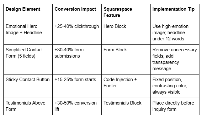
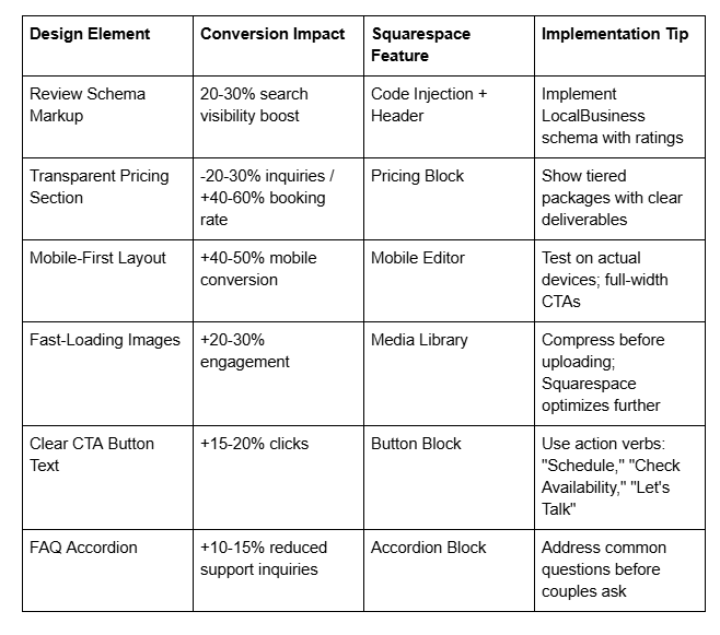
Design Element | Conversion Impact | Squarespace Feature
To summarize these strategies, here's a quick reference table of key design elements, their conversion impact, and how to implement them on Squarespace:
The Conversion-Focused Design Audit: 10 Questions to Ask About Your Wedding Website
Before you redesign or optimize, audit your current website against these ten conversion-focused questions. Each answer reveals opportunities:
Hero Section: When a couple lands on your homepage, do they immediately feel something that makes them want to learn more? Or do they see information that could be on any competitor's site?
Form Friction: How many fields does your contact form have? If it's more than five, you're losing inquiries. Can you remove any without losing critical information?
Form Placement: Is your contact form easy to find and accessible from every major page? Or is it hidden on a Contact Us page couples might never visit?
Social Proof Location: Are your best testimonials and reviews positioned near decision points (before the contact form, on pricing page, in portfolio)? Or are they on a separate reviews page couples might skip?
Pricing Transparency: Do you show your pricing clearly? If not, how many inquiries do you get from budget-misaligned couples?
Next Steps Clarity: When a couple fills out your form, do they know what happens next? Is there an auto-response that sets expectations?
Mobile Experience: Have you actually tested your site on a mobile phone (not just the mobile editor)? Are forms, buttons, and images optimized for small screens?
Load Speed: Using Google Page Speed Insights, is your site loading in under 3 seconds on mobile 4G? If not, couples are bouncing before they see your best work.
CTA Button Language: Are your buttons using conversational, action-oriented language or generic terms ?
Competitive Differentiation: When a couple compares your website to your top 3 competitors' sites, can they immediately identify why you're different? Or do all your sites look the same?
Your answers reveal quick wins. Often, a 2-3 hour optimization sprint (simplifying forms, moving testimonials, clarifying CTAs) increases conversion rates by 20-30%.
Frequently Asked Questions
-
A: Yes. Transparent pricing pre-qualifies leads and builds trust. While you may receive fewer total inquiries, you'll receive higher-quality inquiries from couples who can afford you and take your proposal seriously. The conversion rate from inquiry to booking increases 40-60% when pricing is transparent. Couples who find your prices misaligned will self-select out, which saves you time in sales conversations that won't convert.
-
A: Five maximum. Name, email, phone, one service-specific question (wedding date, guest count, etc.), and an optional message field. Each additional field reduces form submission rates by 3-5%. You'll gather additional information during the consultation—the form's job is to start the conversation, not collect your entire proposal upfront.
-
A: Place them strategically at decision points: directly above your contact form (social proof right before the commitment moment), on your pricing page (building confidence in your value), and within your portfolio (connecting proof to specific work). A dedicated "Testimonials" page is fine for detailed reviews, but don't rely on it alone. Couples often skip pages they have to intentionally navigate to.
-
A: Design for full-width image galleries on mobile (images should span the screen width with minimal padding). Use whitespace and vertical scrolling to make the mobile experience feel intentional, not cramped. Test on actual devices. A full-width, beautiful image on mobile outperforms a small image with extra whitespace. Also, ensure images load quickly—compression is critical.
-
A: Use action-oriented language that speaks to the couple's desire: "Schedule My Consultation," "Check Our Availability," "Let's Create Your Wedding," "Book Your Timeline," "See How We Work." Avoid generic "Contact Us" or "Submit." Your button text should feel like the natural next step, not a form submission.
-
A: Show your pricing (budget-misaligned couples self-select out), add a one-line expectation-setter in your form ("We respond within 24 hours with next steps"), and implement a simple qualification question in your form (e.g., "What's your wedding date?" — couples planning 18+ months out or with unrealistic timelines often self-disqualify). You can also add a reCAPTCHA verification to your Squarespace form to reduce bot submissions.
-
A: Yes, strategically. A short (30-60 second) video of you speaking directly to couples ("Here's who we work best with and what you can expect") builds connection and authority. Video on the homepage or About section increases time-on-site by 2-3 minutes and builds trust. Portfolio videos (highlight reels of your work) are lower-priority—couples primarily want to see still images of your work. Ensure video loads quickly and is optimized for mobile.
How to Get More Bookings From Your Wedding Website: Your Conversion Strategy Starts Now
You've learned the five design principles that actually convert wedding website visitors into bookings. But knowing them and implementing them are different things.
Here's what Squareko does: We design and build wedding service websites on Squarespace that are beautiful and built for conversion from the start. We don't add design elements because they look nice. We add them because they move couples toward booking decisions.
Your website should be working for you 24/7, qualifying leads, building trust, and converting curious visitors into booked couples. If your current website isn't doing that—if you're getting the same number of inquiries despite great work—your design is holding you back.
Here's what happens in a discovery call with us:
We'll spend 20-30 minutes understanding your business: who your ideal couple is, what your current conversion rate is, what's working and what's not. We'll ask about your form submissions, your booking close rate, and the feedback you get from couples who don't book.
Then, we identify the biggest conversion opportunity in your current website. Often, it's form friction. Sometimes, it's weak social proof placement. Occasionally, it's pricing transparency (or the lack of it).
We'll outline a concrete optimization plan: specific changes to your website that are designed to increase your conversion rate. This isn't a design overhaul—it's strategic optimization.
Ready to convert more wedding couples?
Squareko Discovery Call Book a free 30-minute discovery call and let's talk about how your website can work harder for your business. We'll identify your biggest conversion opportunity and show you exactly how to fix it.
No sales pitch. No obligation. Just a real conversation about your website and how to get more couples saying yes.

From custom website design to SEO strategy, we help businesses launch a site that looks professional and performs better.

About the Author
I'm Walid Hasan, a Certified Squarespace Expert and Squarespace Circle Platinum Partner with over 12 years of hands-on experience designing and optimizing high-performing websites. Over the years, I've had the privilege of building more than 2,000 Squarespace websites for clients around the world, always focusing on clean design, strong user experience, and conversion-driven results.