How to Optimise Your Squarespace Product Pages for More Sales
Introduction
If you're running an ecommerce business on Squarespace, your product pages are where the magic happens. They're the critical link between browsing customers and paying customers. Yet most Squarespace store owners treat product pages as an afterthought—a place to simply list what they're selling rather than actively persuade visitors to buy.
The reality is stark: a poorly optimised product page can cost you thousands in lost sales. A shopper lands on your page, scrolls for three seconds, and leaves. Another visits, reads a vague product description, and buys from a competitor instead. These lost conversions represent real revenue walking out the door.
When we audit ecommerce stores on Squarespace, we consistently find the same optimization gaps. Product photography that doesn't showcase the item properly. Descriptions that read like instruction manuals. Missing trust signals that make potential customers hesitate at checkout. A clunky buying experience that adds friction where there should be flow.
The good news? Optimising your Squarespace product pages for more sales doesn't require a complete overhaul or advanced technical skills. It requires understanding what actually drives conversions and applying proven conversion rate optimisation (CRO) principles to your product pages.
This guide walks you through everything you need to know. We've structured the advice around five core elements that high-converting product pages share: Photography, Description, Social Proof, Urgency, and Easy Checkout. Implement these changes, and you'll see your conversion rates improve.
Key Takeaways
Product photography is your first salesperson. High-quality, multiple-angle shots with lifestyle images increase conversion rates significantly.
Write descriptions that sell, not just describe. Focus on benefits, use scannable formatting, and address common objections.
Social proof builds confidence. Customer reviews, ratings, and testimonials reduce purchase anxiety and drive sales.
Urgency motivates action. Limited stock indicators and time-sensitive offers push hesitant shoppers toward checkout.
Simplify the checkout process. Every extra step or confusing element costs you sales. Make buying frictionless.
Use Squarespace tools effectively. The platform offers excellent built-in features for product pages that most sellers underutilise.
The Five Elements of a High-Converting Product Page
Before diving into specifics, understand this framework. Every high-converting product page shares five fundamental components. They might appear in different orders or with different emphasis, but they're always present in some form.
These five elements work together to remove objections, build confidence, and guide visitors toward purchase. Neglect any one of them, and your conversion rate suffers. Master all five, and you create a product page that sells.
Think of your product page as a conversation. Your customer has landed on it with a question in their mind: "Is this right for me? Can I trust this? Is it worth the price?" Your job is to answer that conversation with compelling product photography, clear descriptions, visible proof that others love it, reasons to buy now rather than later, and a buying process so simple that second thoughts don't have time to creep in.
Element 1: Master Your Product Photography
Your product photography is often the first and most powerful thing a visitor experiences on your product page. It's your chance to make a strong impression before they've read a single word.
Poor photography tanks conversions. We're talking blurry images, awkward angles, inconsistent lighting, and products photographed against featureless white backgrounds with no sense of scale or context. These pages look cheap and unprofessional, regardless of your product quality.
Good photography does the opposite. Clear, multiple-angle shots let customers examine what they're buying. Lifestyle images show the product in use, helping buyers imagine it in their own lives. Zoom functionality lets them inspect details. These pages feel trustworthy and professional.
Here's what high-converting product pages include:
Multiple angles. Show your product from at least 4–5 different angles. Show the front, back, sides, and any important details. On Squarespace, you can upload multiple images to a product and visitors can click through them. Use this. A single image leaves too much to imagination.
Lifestyle shots. Include images showing your product in actual use. Someone wearing that jumper. The lamp illuminating a real room. The water bottle being held by a hand. These contextual images help customers visualise the product in their lives and increase perceived value.
Detail close-ups. For products where texture, craftsmanship, or construction matter (leather goods, jewellery, textiles), include zoomed shots that showcase quality. Squarespace's zoom feature lets customers examine these details themselves, which builds confidence.
Consistent lighting and background. All your product images should share a consistent visual style. Inconsistent lighting or jarring background changes make your store look disorganised. Invest in a simple backdrop (white, grey, or a tasteful colour that matches your brand) and consistent lighting setup. This doesn't require expensive equipment—many sellers get professional results with natural light and a £50 backdrop stand.
Scale reference. For items where size matters (jewellery, small home goods), include a reference object in at least one shot. Hands are perfect for this. Alternatively, note dimensions clearly in your description.
Before/after images. If your product creates a visible transformation (beauty products, skincare, cleaning supplies), before/after images are conversion gold. These work exceptionally well because they show tangible results.
On Squarespace, use the built-in image uploader to add multiple product images. Ensure each image is at least 1200 pixels wide for clarity. Optimise file sizes so pages load quickly—slow pages increase bounce rates.
Element 2: Write Compelling Product Descriptions
Now your customer is looking at your product. Time to convince them why they need it.
This is where most Squarespace sellers stumble. They write descriptions like technical specs lists: "Made from 100% cotton. Dimensions: 50cm x 30cm. Available in five colours." Technical accuracy matters, but this approach doesn't sell.
High-converting descriptions sell benefits, not features. They address customer pain points. They use psychology and clarity. They speak directly to the buyer's desires.
The difference between features and benefits:
Feature: "Made from organic cotton" Benefit: "Breathable organic cotton that keeps you cool and comfortable all day, even in warm weather"
Feature: "Waterproof up to 30 metres" Benefit: "Fully waterproof, so you're protected during beach trips, rainy commutes, and poolside days"
Feature: "LED bulbs, 40,000-hour lifespan" Benefit: "Switch on less often. These LED bulbs last 20+ years, saving you time and money on replacements"
Structure your description this way:
Opening line. Lead with the most compelling benefit. What's the primary reason someone would want this? Make it clear immediately. "The sustainable everyday bag that replaces five other bags in your wardrobe" works better than "Multipurpose fabric bag."
Problem/solution section. What frustration does your product solve? "Tired of switching between work bags, gym bags, and weekend bags? This one does everything." This speaks to real customer pain points.
Key features and benefits. List 3–5 key features, but always pair them with the benefit. Use short paragraphs or bullet points. Squarespace makes this easy with its rich text editor.
Materials/construction. If quality or materials matter (which they usually do), explain why you chose them. "Vegetable-tanned leather develops character over time, becoming more beautiful with use" is more persuasive than "Vegetable-tanned leather."
Care and longevity. Address the unspoken question: "Will this last?" Include care instructions and expected lifespan. This builds confidence and reduces returns.
Objection handling. Anticipate the most common objections and address them in your description. Is it pricey? Explain the value proposition: "Costs more upfront, but lasts five times longer than cheaper alternatives, making it better value long-term." Is sizing potentially confusing? Include a size guide. Will customers wonder about something? Answer it.
Call to action. End your description with a subtle CTA. "Add to your wardrobe" or "Explore our collection" works. Squarespace's button shows automatically, so keep this brief.
Format for scannability. Most visitors scan product pages rather than reading every word. Use:
Short paragraphs (2–3 sentences max)
Bullet points for key features
Bold text to highlight important words
Subheadings if your description is longer than 150 words
Word count. Aim for 100–250 words. This is enough to sell without overwhelming browsers.
Element 3: Build Social Proof and Reviews
Your customer is almost convinced. But doubt creeps in: "How do I know this is actually good? What if it's not what I'm expecting?"
This is where social proof enters. Social proof is evidence that other people have bought your product, found it valuable, and are happy with it. It's profoundly persuasive because humans trust the opinions of others, especially strangers without a financial incentive to lie.
Types of social proof that work:
Customer reviews and ratings. These are the most powerful. Squarespace lets you enable customer reviews on your product pages (Settings > Products > Customer Reviews). Encourage customers to leave reviews after purchase. Even one or two reviews dramatically increase conversion rates on new products. Here's why: a real customer's words carry more weight than your own sales copy.
Star ratings. Squarespace displays star ratings automatically when reviews exist. A product with 4.5 stars and 12 reviews converts better than the same product with zero reviews. A customer seeing this rating immediately thinks: "Other people bought this and liked it. It's probably good."
Customer testimonials. Collect written testimonials from happy customers (with permission) and feature them prominently. A line like "Changed my morning routine completely" or "Finally found a work bag that actually works" is worth more than any claim you make yourself.
User-generated content. Encourage customers to tag your brand on Instagram or submit photos using your product. Feature this content on your product page (or create a dedicated gallery). Seeing real people using your product is incredibly persuasive.
Trust badges and certifications. Do you use sustainable materials? Have you won any awards? Are you certified organic? Include these. Squaresco lets you add custom HTML to product pages, so you can include certification logos and trust badges.
How many reviews do you need? Even one or two change customer psychology. Aim for at least 5–10 reviews per product once you've reached that volume. Prioritise collecting reviews from your best customers.
How to encourage reviews on Squarespace:
Send a follow-up email to customers 2–3 weeks after purchase (Squarespace doesn't automate this, but you can do it manually or use an email service).
Make leaving a review easy—minimise form fields.
Offer a small incentive (a discount code for their next purchase) for leaving a review.
Include review links in order confirmation emails.
Element 4: Create Urgency Without Being Pushy
Urgency is the final nudge that converts a "maybe later" into "I'm buying now."
Without urgency, customers bookmark your page intending to return later. They rarely do. Life gets busy. They forget. They find a competitor. The sale is lost.
Urgency works because it creates a light psychological pressure that moves hesitant shoppers toward action. The key word is "light"—heavy-handed urgency tactics (screaming all-caps messages, fake countdown timers) backfire and damage trust.
Effective urgency tactics:
Stock indicators. If your product has limited stock, say so. "Only 3 left in stock" is genuine urgency if it's true. Squarespace lets you set inventory levels and display low-stock messages. Enable this.
Seasonal or temporary offers. "Winter collection—available this season only" creates real urgency because there's an actual deadline. This works especially well for seasonal products.
Time-limited discounts. Flash sales or temporary discounts create urgency. "15% off this week only" motivates faster decisions. Squarespace lets you set discount codes with expiry dates.
Free shipping thresholds. "Free shipping on orders over £50" motivates customers to add more items to reach that threshold.
Bundle pricing. "Buy two, get 15% off" creates urgency because customers realise they're getting a limited-time deal.
Urgency on the product page itself:
Include a small, subtle urgency message near the add-to-cart button. "Only 4 left in stock—order soon" or "Free shipping on orders this week" works. Keep it factual. Never lie about inventory or deadlines—customers notice and trust erodes immediately.
Squarespace's product inventory system handles low-stock displays automatically if you enable them. Use this feature.
Element 5: Optimise Your Checkout Flow
You've done everything right. Your customer has seen beautiful product photography, read a compelling description, checked reviews, and decided to buy. Now they hit your checkout. If the checkout experience is confusing or clunky, they abandon the cart and leave.
This happens constantly. Research suggests 70% of online shopping carts are abandoned, often because of checkout friction.
Optimise your Squarespace checkout:
One-page checkout. Squarespace supports this by default. Customers enter all information (shipping, billing, payment) on one page rather than multiple steps. This feels faster and reduces friction.
Minimal form fields. Every field you ask customers to fill is a point where they might drop off. Only ask for essential information. Optional fields should be marked clearly as optional.
Guest checkout option. Not everyone wants to create an account. Squarespace allows guests to purchase without registering. Always include this option—many customers prefer it.
Multiple payment methods. Offer several payment options: credit/debit cards, PayPal, Apple Pay, Google Pay. Different customers prefer different methods. More options mean more conversions.
Clear shipping costs. Display shipping costs before customers reach checkout, not as a surprise during payment. Squarespace shows this automatically, but verify it's clear on your product pages.
Reassurance statements. Near your "Place Order" button, include statements that reduce purchase anxiety:
"Your payment is secure" (especially with an SSL badge)
"30-day returns guaranteed"
"Order confirmation sent to your email"
These small phrases significantly reduce checkout abandonment.
Mobile optimisation. Over 50% of ecommerce traffic comes from mobile devices. Your Squarespace store should be fully mobile-responsive. Test checkout on your phone to ensure it's smooth.
Review before purchase. Let customers see exactly what they're buying, shipping costs, and total price before finalising payment. Squarespace does this by default in the order review section.
The 20-Item Product Page Audit Checklist
Use this checklist to audit your existing product pages and identify gaps:
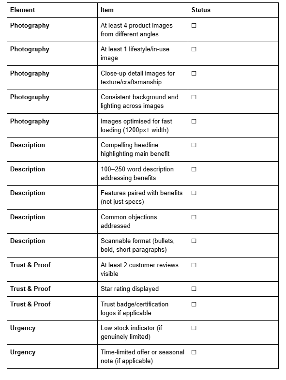
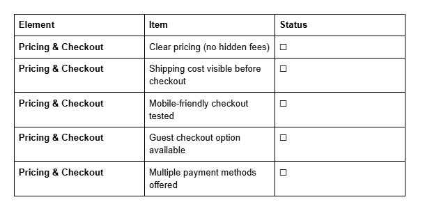
Print this checklist and audit 5–10 of your product pages. You'll likely identify several quick wins that can improve conversions immediately.
Frequently Asked Questions
-
Critical. Studies show that 93% of customers cite visual appearance as the key deciding factor in a purchase. High-quality product photos directly increase conversion rates, reduce returns, and build trust. Invest in good photography—it's not optional.
-
No. Authentic product photography of your actual items always outperforms stock images. Customers can tell the difference, and real photos build trust. If you can't photograph products yourself, invest in a professional photographer for at least your top-selling items.
-
Enough to address benefits and objections, not so much that customers lose interest. If you need more space, use Squarespace's expandable description sections or tabs.
-
You'll sell without them, but conversion rates improve with reviews. New products will sell, but once you've made 5–10 sales, actively encourage customers to leave reviews. This accelerates your growth.
-
No. It damages trust when customers discover the deception. If you use urgency, make it genuine (real low stock, actual limited-time offers). Customers appreciate honesty.
-
Yes. Squarespace's built-in product page features are robust. You can enable reviews, set inventory levels, add custom descriptions, and create a smooth checkout without any third-party apps. However, some plugins (like review apps with email reminders) can help automate workflows.
-
Review them quarterly. Refresh product photos occasionally, update descriptions based on customer questions, add new reviews. Product pages aren't static—they benefit from ongoing optimisation.
-
Squarespace handles product variations well. Create variants for each option and set different images for each if they look meaningfully different. Update stock levels by variant so customers see accurate inventory.
Final Thoughts: The Continuous Optimisation Mindset
Optimising your Squarespace product pages for more sales isn't a one-time project. It's an ongoing process of testing, learning, and refining.
Start with the five elements covered here. Audit your current pages using the 20-item checklist. Implement the changes that matter most. Then measure results.
Watch your analytics. Which product pages have the highest conversion rates? What do they have in common? (Probably better photography, more reviews, or clearer descriptions.) Which pages underperform? What's missing?
Use Squarespace's built-in analytics to track:
Product page views
Add-to-cart rates
Completed purchases
Cart abandonment
These metrics reveal what's working and what needs improvement.
Small improvements compound. A 10% increase in product photography quality might boost conversions by 5%. Adding customer reviews might boost them another 5%. Clearer descriptions another 5%. Suddenly you're seeing 15% more sales from the same traffic.
That's the power of systematic optimisation.
The businesses that thrive on Squarespace aren't necessarily those with the most innovative products. They're the ones who obsess over the details of their product pages, remove friction, build trust, and make buying frictionless.
You now have the framework and the tools to do exactly that.
Call to Action
Ready to optimise your Squarespace product pages and see your sales grow?
Start with the 20-item audit checklist above. Identify your three weakest product pages and improve them this week. Upgrade photography. Refresh descriptions. Enable customer reviews. Watch your conversion rates improve.
For more Squarespace ecommerce strategies, guides, and tips, visit Squareko, where we help Squarespace sellers build profitable online stores.

From custom website design to SEO strategy, we help businesses launch a site that looks professional and performs better.

About the Author
Walid | Founder, Squareko
I'm Walid Hasan, a Certified Squarespace Expert and Squarespace Circle Platinum Partner with over 12 years of hands-on experience designing and optimizing high-performing websites. Over the years, I've had the privilege of building more than 2,000 Squarespace websites for clients around the world, always focusing on clean design, strong user experience, and conversion-driven results.