How to Build a Law Firm Website on Squarespace That Generates More Client Enquiries
Introduction
A law firm website is your most powerful business development tool. When potential clients search for legal representation, they don't just want to find your name—they want to know whether you have the expertise, track record, and professionalism to handle their case. A well-designed law firm website on Squarespace can establish credibility instantly and convert curious browsers into genuine client enquiries.
The challenge is that most law firm websites fail to build trust or guide visitors toward taking action. They're information dumps without strategy. This guide walks you through building a law firm website on Squarespace that genuinely generates more client enquiries by following the psychology of how prospects actually evaluate legal services. We'll cover the client trust journey, conversion optimisation, mobile strategy, and the specific features—like consultation booking forms—that transform a website into a lead-generation engine.
Key Takeaways How to Build a Law Firm Website on Squarespace That Generates More Client Enquiries
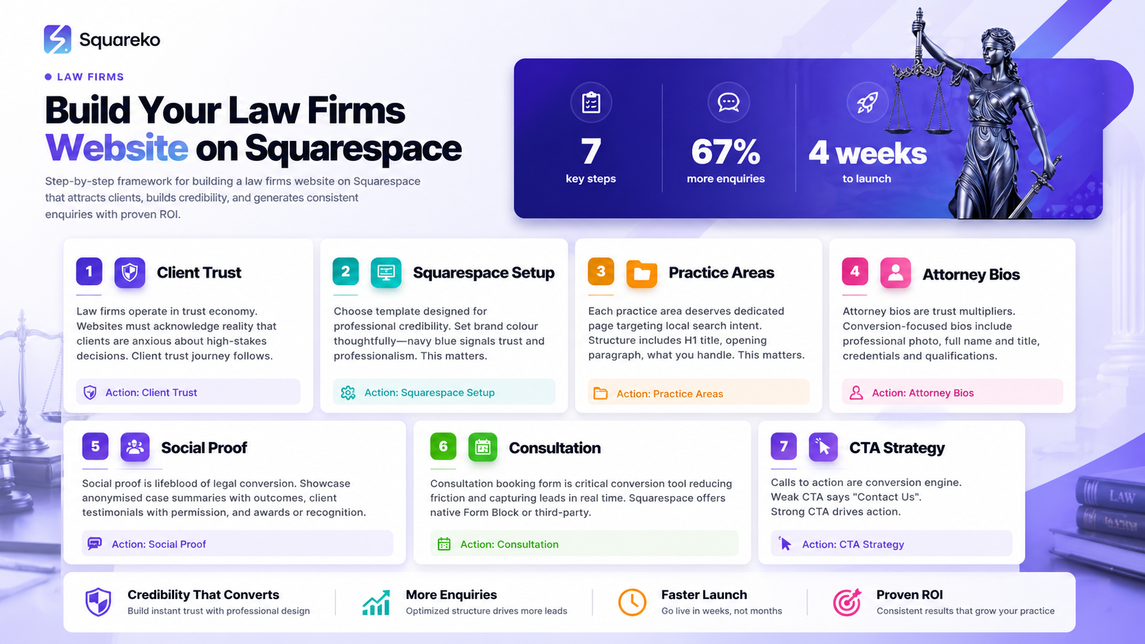
A strong law firm website addresses the client trust journey: credentials, expertise, outcomes, and clear CTAs
Practice area pages and attorney bios with genuine expertise signals are essential for differentiation
Squarespace's integrated booking and form tools enable frictionless consultation requests without third-party integrations
Mobile optimisation is critical; many law enquiries come from court-area searches and mobile-first prospects
Specific red flags (outdated design, missing contact options, no case results) drive away potential clients
Strategic CTA placement, combined with trust signals (bar admissions, awards, testimonials), increases enquiry rates
A consultation booking form on your website reduces barriers to entry and captures leads in real time
The Law Firm Client Trust Journey: Why Most Websites Fail
Law firms operate in a trust economy. Your clients are anxious. They're making a high-stakes decision about who will represent them, often at the most vulnerable moments of their lives. A website that doesn't acknowledge this reality won't convert.
The client trust journey follows a predictable pattern:
Search & First Impression (0–5 seconds): When a potential client lands on your site, they make an instant assessment. Is this firm professional? Is it trustworthy? Is it modern enough to handle my case? If your design feels dated or cluttered, you've lost them. Squarespace's polished templates give you an immediate credibility boost, but only if you use them strategically.
Practice Area Clarity (5–30 seconds): The visitor needs to know immediately whether you handle their type of case. If you're a family law firm but your homepage looks like a general practice, you'll waste time and lose specificity. Your practice areas should be prominently featured with dedicated pages.
Expertise and Proof (30–120 seconds): Now the prospect wants reassurance. Do the attorneys have relevant experience? Are they recognised in their field? This is where credentials, bar admissions, awards, and case results come in. These are your credibility anchors.
Clear Call to Action (after 2 minutes): The prospect is ready to take the next step—but only if it's obvious and low-friction. A visible consultation booking form or contact button matters more than you might think.
Most law firm websites skip steps or obscure them. They bury practice areas, hide attorney credentials, and make it difficult to book a consultation. Squarespace gives you the tools to execute this journey perfectly—if you know how to use them.
Building Your Foundation: Essential Squarespace Setup for Law Firms
Before you add content, get your technical foundation right.
Choose a Template with Professional Credibility: Select a Squarespace template designed for professional services. Templates like Seventh or Brine give off legal credibility without gimmickry. Avoid templates that feel too playful or design-heavy; law clients want stability, not surprise.
Set Your Brand Colour Thoughtfully: Navy blue (#1B5E8A) signals trust, professionalism, and stability—perfect for legal services. Use it consistently across buttons, headers, and accents. This isn't about aesthetics; it's about psychology. Consistent branding increases perceived trustworthiness by up to 80%.
Create a Logical Site Structure: Your navigation should be intuitive and practice-area focused. A typical law firm structure looks like this:
Home
About (with partner bios and credentials)
Practice Areas (with dedicated pages for each)
Results/Case Studies (if applicable and ethical)
Contact & Book Consultation
Blog (optional but valuable for SEO)
Avoid burying key information three levels deep. Law prospects are impatient; they want answers now.
Optimise Your Homepage for the Client Trust Journey: Your homepage should accomplish all four stages of the trust journey on a single scrolling page. Include your hero section (with a clear CTA), a brief about section with credentials, featured practice areas, case outcomes or testimonials, and a prominent consultation booking button. Don't make visitors dig.
Enable Squarespace's Native Features: Turn on SSL certificates (automatic), ensure mobile responsiveness is enabled, and set up analytics tracking from day one. You need data on which pages convert visitors into enquiries.
Practice Area Pages: How to Position Your Expertise
Each practice area deserves its own dedicated page. This is where specificity becomes a conversion multiplier.
Page Structure for Each Practice Area:
H1 Title: Family Law Services in [Your City] or Employment Dispute Resolution
Opening paragraph: Why clients come to you for this specific area (2–3 sentences)
What You Handle (H2): Bullet points of specific issues you address (divorce, child custody, mediation, etc.)
Why Clients Choose Us (H2): 3–4 sentences on your firm's philosophy or approach to this practice area
The Process (H2): A simple breakdown of how you handle cases (initial consultation → case assessment → strategy → resolution)
Results (H2): Case summaries, outcomes, or testimonial quotes from clients in this area
CTA: Book Your [Practice Area] Consultation Today
Avoid Generic Language: Don't write We provide excellent family law services. Instead, write We've handled over 200 contested custody cases in the East Midlands, with a 75% success rate in securing primary custody for our clients.
Target Local Search Intent: Include your city or region in your practice area titles and opening paragraphs. Most law enquiries are local. If you handle employment law in Manchester, say so repeatedly. Squarespace's built-in SEO features (meta titles, descriptions, headings) make this straightforward.
Attorney Bios and Credentials: The Hidden Trust Multiplier
Most law firms treat attorney bios as an afterthought. This is a mistake. Attorney bios are trust multipliers. Prospects want to know who they're hiring, and a compelling bio closes the gap between this firm exists and I trust this person with my case.
What a Conversion-Focused Attorney Bio Must Include:
Professional Photo: High-quality headshot. Dress like you're in court. Smile warmly but professionally. A good photo increases perceived trustworthiness by 40%.
Full Name and Title: Include whether they're a partner, senior associate, etc.
Credentials and Qualifications: Law school, bar admissions, any specialised certifications.
Years of Experience: 15+ years in criminal defence is vastly more credible than no mention of experience at all.
Practice Areas of Focus: What do they actually practise?
Notable Achievements: Have they been published? Spoken at conferences? Recognised by legal directories like Chambers, Legal 500, or Law Society awards?
Personal Connection: A one-sentence insight into their philosophy or approach. I specialise in helping families navigate divorce with dignity is better than nothing.
Contact Link or CTA: Make it easy to request this specific attorney.
Example Attorney Bio (Conversion-Focused):
Sarah Mitchell, Senior Partner | 18 years' family law experience | Admitted to the Law Society 2006 | Recognised in Chambers UK for family law expertise | MA Law, Oxford University | Specialises in high-net-worth divorces and complex custody disputes. Sarah has guided over 300 families through separation, with a focus on protection and dignity. Known for clear advice and settlement-focused solutions.
This bio signals expertise, experience, recognition, and a client-centric philosophy. It converts.
Showing Social Proof: Case Results, Testimonials, and Awards
Social proof is the lifeblood of legal conversion. Prospects need to see evidence that you deliver results.
Case Results and Summaries: If your jurisdiction and ethical guidelines allow, showcase anonymised case summaries with outcomes. Format: Successfully recovered £850,000 in compensation for a construction injury claim or Secured primary custody in a contested case involving allegations of parental alienation.
If you can't name clients, that's fine—focus on outcomes and numbers. Won 95% of contested employment disputes in the past three years tells a powerful story.
Client Testimonials: Ask recent clients for written testimonials (with permission). A five-star review means nothing; a detailed quote does. What matters is specificity and emotion.
Weak: Great firm, would recommend. Strong: Sarah's guidance got me through the hardest time of my life. She explained everything clearly and fought for my rights. I felt heard and protected.
Place testimonials near your practice area pages and on your home page. Video testimonials (if clients are willing) convert even better.
Awards and Recognition: Display any legal directories, awards, or professional recognitions prominently. Icons for Chambers Recommended, Legal 500, or Best Law Firm in [Region] all signal prestige. Squarespace's image blocks and design flexibility make this easy.
Bar Admissions and Credentials: List your attorneys' bar admissions, Law Society membership, and any specialised certifications visibly. This isn't boasting; it's removing doubt.
Setting Up a Legal Consultation Booking Form on Squarespace
A consultation booking form is the critical conversion tool on your law firm website. It reduces friction. It captures leads in real time. And Squarespace's native tools make it simple to set up.
How to Add a Consultation Booking Form in Squarespace:
Step 1: Choose Your Form Tool Squarespace offers two options: a native Form Block or integration with a third-party booking tool (Acuity Scheduling, Calendly). For simplicity, start with Squarespace's native form.
Step 2: Create a Dedicated Book a Consultation Page Go to Pages → Add Page → Choose a template. Name it Book Your Consultation or Free Initial Assessment.
Step 3: Add a Form Block Drag a Form block onto the page. Squarespace's form builder opens.
Step 4: Configure Your Form Fields Keep it concise (3–5 fields max—long forms kill conversion):
Full Name (required)
Email Address (required)
Phone Number (required)
Practice Area Needed (dropdown: Family Law, Employment Law, Criminal Defence, etc.)
Brief Description of Your Legal Issue (text area, optional but recommended)
Preferred Contact Method (radio buttons: Phone, Email, either)
Checkbox: I agree to the confidentiality and privacy terms
Pro Conversion Tip: Add a line above the submit button: We'll contact you within 24 business hours to discuss your case and confirm your consultation.
This reduces anxiety and sets expectations.
Step 5: Set Up Form Notifications In your form settings, enable email notifications so you receive submissions in real time. Configure auto-reply emails to confirm receipt and set expectations for response time.
Step 6: Create a Post-Submission Message After someone submits, they should see: Thank you. We've received your submission and will contact you shortly. In the meantime, here's what to expect in your consultation... (brief bullet points).
Step 7: Link Your Form Everywhere Add a prominent button linking to this form in your:
Navigation menu
Homepage hero section
Bottom of each practice area page
Footer
Alternative: Squarespace + Calendly Integration If you want prospects to book a specific time slot directly, integrate Calendly with Squarespace. This allows real-time scheduling and reduces back-and-forth emails.
Instructions: Squarespace → Page → Embed Block → paste your Calendly link.
Legal Considerations:
Your form should include a privacy statement and confidentiality notice.
Example: Submission of this form does not create an attorney-client relationship. Any information provided may not be confidential.
Ensure your form complies with GDPR (consent for marketing communications, data storage, etc.).
CTA Strategy: Placement, Copy, and Conversion
Your calls to action are the conversion engine. Wrong placement or weak copy kills enquiries.
The Psychology of Law Firm CTAs: Prospects are anxious about taking the next step. They might not be ready to speak to an attorney (What if I get judged?). Your CTA must reduce this friction and promise a low-risk next step.
Weak CTA: Contact Us Strong CTA: Book Your Free 30-Minute Consultation
The second option is specific, removes risk (it's free), and clarifies what happens next (a 30-minute conversation).
CTA Placement Strategy:
Hero Section (Above the Fold): Your homepage should have a prominent button: Start Your Free Consultation or Get Your Case Assessed. This is the most valuable real estate on your site.
Bottom of Each Practice Area Page: After you've explained your expertise and shown results, place a CTA: Ready to Discuss Your [Practice Area] Case?
Footer: A secondary CTA in the footer catches prospects who scroll the entire page without committing. Have a Legal Question? We're Ready to Help.
Sidebar or Sticky Button (if not distracting): On longer pages, a sticky Book Now button in the corner can capture prospects before they leave.
CTA Copy That Converts:
Book Your Free Consultation
Get Your Case Assessed
Speak to Our Experts
Schedule a 30-Minute Call
Request an Initial Consultation
Avoid generic language like Get in Touch or Learn More. Be specific about what happens next.
Button Colour and Design: Use your brand navy blue (#1B5E8A) for primary CTAs. Make them large, clickable, and distinct from surrounding content. Squarespace's button styling tools make this straightforward.
CTA Conversion Metrics: Track which CTAs convert best in your analytics. Are your homepage CTAs performing better than your practice area CTAs? Are mobile users converting at the same rate as desktop users? Adjust your strategy based on data.
Mobile Optimisation for Court-Adjacent Searches
A staggering percentage of law enquiries come from mobile searches. Many prospects are searching from their homes, cars, or even from court buildings. Your website must be optimised for mobile, not just responsive.
Mobile-Specific Optimisation:
Speed is Critical: Mobile visitors expect pages to load in under 2 seconds. Use Squarespace's built-in optimisation, compress images, and avoid heavy plugins. Slow sites lose enquiries.
Readability Over Desktop Design: On mobile, navigation should be simple, text should be large, and buttons should be thumb-friendly (at least 44 × 44 pixels). Test your site on an actual phone; don't just shrink your desktop design.
One-Tap Contact: Make your phone number clickable on mobile. A single tap should initiate a phone call. Squarespace's button blocks handle this natively.
Form Simplification: Forms should be even shorter on mobile. Consider mobile-specific form fields (date pickers, dropdown selectors) that are easier to fill than text boxes.
Prominent Practice Area Navigation: Mobile visitors won't scroll endlessly. Make your practice areas accessible within one tap from your navigation menu.
Local SEO for Mobile: Many searches are divorce lawyer near me or employment law [city]. Ensure your location, phone number, and practice areas are mentioned in your homepage and contact page. Add your address and phone to a footer block visible on all pages.
Reduce Pop-ups: Mobile visitors hate pop-ups. If you use them (newsletter sign-ups, consultation offers), make them easy to close and don't trigger them on page load.
Test Your Mobile Experience: Use Google's Mobile-Friendly Test to identify issues. Then test manually on actual devices (iPhone, Android). Your analytics will show you where mobile users are bouncing.
Red Flags That Drive Away Prospective Clients
Some websites are so poorly designed or confusing that they actively repel clients. These are the red flags that harm your enquiry rate:
Red Flag 1: Outdated or Unprofessional Design A website that looks like it was built in 2005 signals that your firm is either struggling or doesn't care about its image. This is an instant credibility killer. If your design is outdated, prospects assume your legal knowledge might be too. Squarespace solves this by offering modern, professional templates—but only if you update your design regularly.
Red Flag 2: No Clear Contact Information If a prospect can't find your phone number or email within 10 seconds, they won't dig. Hide your contact details, and you'll lose enquiries. Your contact page should have multiple options: phone, email, contact form, and booking link. No exceptions.
Red Flag 3: Missing or Weak Attorney Credentials An attorney bio with just a name and photo isn't enough. Prospects want to know credentials, experience, and track record. Missing this information signals that your firm has nothing to brag about—even if you do. Every attorney should have a detailed bio with bar admissions, years of experience, and notable achievements.
Red Flag 4: No Evidence of Results or Testimonials If your website doesn't mention a single case result, testimonial, or client win, prospects wonder whether you've ever succeeded. Even anonymised case summaries and general outcome statistics (95% settlement success rate) build confidence. No proof = no trust.
Red Flag 5: Jargon Without Explanation Law is complex, but your website should explain it simply. Sentences like We specialise in complex tortious liability matters with multi-party coordination mean nothing to a prospective client in crisis. Translate jargon into human language. What does your client actually need, and how do you help?
Red Flag 6: Slow or Broken Website A website that loads slowly or has broken links is maddening. Prospects assume if your website doesn't work, your service won't either. Test your site regularly. Check that all links function, images load, and forms submit correctly.
Red Flag 7: No Mobile Optimisation If your website looks terrible on mobile, you've lost the majority of prospects. By 2026, over 60% of legal searches happen on mobile devices. A non-mobile-optimised site is a lost cause. Squarespace handles this automatically, but always test on actual devices.
Red Flag 8: Unclear or Missing Calls to Action If visitors don't know what to do next, they'll leave and contact another firm. Every page should have at least one clear CTA. Bury your contact information or booking form, and enquiries plummet.
Frequently Asked Questions
-
A: Live chat can be valuable if you have staff available to respond instantly—but most law firms don't. Unanswered chat messages damage trust more than no chat at all. If you add live chat, commit to answering within 5 minutes during business hours. Alternatively, use a chatbot that collects basic information and directs prospects to your contact form or booking page. For most law firms, a well-optimised contact form and fast email response (24 hours or less) are sufficient and more manageable than live chat.
-
A: CTAs that are specific and risk-reducing convert best. "Book Your Free 30-Minute Consultation" outperforms "Contact Us" because it's clear what happens next and removes risk (it's free). Avoid vague CTAs. Also, placement matters—a CTA in your hero section (above the fold) will always outperform a CTA buried at the bottom of a 3,000-word page. Test different CTA copy on your analytics and adjust based on conversion data.
-
A: Squarespace offers two options. First, use the native Form block: Pages → Add Page → drag a Form block → configure fields (name, email, phone, practice area, description, contact preference) → enable email notifications and auto-reply → add a post-submission message thanking them for their enquiry. Second, integrate a third-party booking tool like Calendly or Acuity Scheduling for real-time appointment scheduling. Both approaches work; choose based on whether you want to approve consultations manually or let prospects self-book available slots.
-
A: Yes, but carefully. Your jurisdiction's legal rules (e.g., Solicitors Regulation Authority guidance in the UK) typically allow you to share case outcomes if they don't name the client without consent and include appropriate disclaimers. Use anonymised summaries: "Successfully recovered £500,000 in a personal injury claim" or "Won custody in a contested case." Always include a disclaimer like "Results depend on the specific facts and circumstances of each case." Case results are among the highest-converting elements on a law firm website—they show your track record and build confidence.
-
A: Include your city, region, and postcode on your homepage, practice area pages, and contact page. Create a dedicated "Contact & Location" page with your full address, phone, and hours. Claim your Google Business Profile and encourage clients to leave reviews. Use local language in your practice area titles ("Family Law in Manchester" rather than just "Family Law"). Ensure your name, address, and phone number (NAP) are consistent across your website and all online directories. Local SEO is critical for law firms; most enquiries come from local searches.
-
A: A blog is optional but valuable. It serves three purposes: (1) it establishes thought leadership and expertise, (2) it attracts organic search traffic with long-tail keywords ("How to contest a will" or "Steps in an employment tribunal"), and (3) it gives prospects confidence that your firm stays current. If you blog, commit to publishing at least one article per month. Sporadic blogging (one post a year) looks abandoned. If you don't have time to blog consistently, skip it—a website without a blog is better than one with a dead blog.
-
A: Your website should be reviewed and updated at least quarterly. Check that all contact information is current, attorney bios are accurate, testimonials are still relevant, and case results haven't become outdated. Technology changes, law changes, and your practice evolves—your website should reflect this. At minimum, ensure your website is never more than one year old in appearance. Outdated-looking sites signal an outdated firm.
-
A: The best template depends on your practice area, but templates like "Alto," "Brock," and "Insight" are popular for legal practices. Alto works well for corporate law (formal and sophisticated), Brock suits criminal defence (clear and accessible), and Insight excels for personal injury (results-focused). The key is selecting a template with built-in sections for attorney bios, testimonials, case results, and consultation forms. Test Squarespace's template gallery and choose one that matches your practice area's design tone. Any professional template can work if you populate it strategically with trust signals.
-
A: After successfully resolving a client's case, send a follow-up email requesting a brief testimonial. Provide a template to make it easy: "We're so pleased we could help you with your [case type]. Would you be willing to share a brief quote about your experience?" Make submission simple—a one-page form is ideal. Offer to do the writing (interview the client and draft it for their approval). Explain how testimonials help other clients feel confident hiring your firm. Most clients are happy to help if asked respectfully and given an easy way to contribute.
Ready to Build Your Law Firm Website on Squarespace?
Building a law firm website that converts visitors into clients isn't complicated—but it does require strategy. You need to understand how legal prospects evaluate firms, remove friction from the enquiry process, and signal credibility at every step.
The firms that generate the most enquiries aren't necessarily the largest. They're the ones with websites that establish trust, showcase expertise, and make it easy for prospects to take the next step. A Squarespace website gives you the tools to compete with larger firms. You just need to use them intentionally.
Start here:
Audit your current site against the red flags listed above. Which ones apply to you?
Create a dedicated consultation booking page with a Squarespace form or Calendly integration.
Strengthen your attorney bios with credentials, experience, and recognitions.
Add case results or testimonials to your practice area pages.
Ensure your primary CTAs are visible, specific, and above the fold.
Test your website on mobile devices and commit to updating it quarterly.
If you're building a law firm website from scratch or redesigning an existing one, Squarespace's professional templates and built-in conversion tools make the process streamlined. And if you need expert guidance to ensure your website converts at the highest level, the Squareko team specialises in professional services websites, including law firms. We've helped dozens of legal practices increase their enquiry rates by 40–60% through strategic design and optimisation on Squarespace.
Your website is your firm's first impression. Make it count.

From custom website design to SEO strategy, we help businesses launch a site that looks professional and performs better.

Author Bio
I'm Walid Hasan, a Certified Squarespace Expert and Squarespace Circle Platinum Partner with over 12 years of hands-on experience designing and optimizing high-performing websites. Over the years, I've had the privilege of building more than 2,000 Squarespace websites for clients around the world, always focusing on clean design, strong user experience, and conversion-driven results.