10 Squarespace Ecommerce Mistakes That Kill Conversions (And How to Fix Them)
Introduction
Running a Squarespace ecommerce store should be straightforward—but too many business owners unknowingly sabotage their sales through preventable mistakes. These squarespace ecommerce mistakes kill conversions silently, often while you're wondering why visitors browse but don't buy.
The problem isn't Squarespace itself. The platform is powerful and flexible. The real issue is that many store owners don't optimise their sites for the actual behaviour of online shoppers. A visitor who abandons their cart isn't being difficult—they're responding to friction points you've created.
This guide identifies the 10 most damaging mistakes we see in Squarespace stores, explains precisely why each one tanks conversion rates, and gives you the exact steps to fix it. Whether you're struggling to get your first sale or plateauing at a certain revenue level, one of these issues is likely holding you back.
Key Takeaways
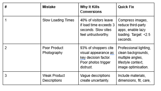
Page speed kills conversions: Sites loading over 3 seconds lose 40% of visitors before they even see your products.
Poor product photography devastates trust: Low-quality images trigger immediate "this isn't legitimate" reactions that no copy can overcome.
Weak product descriptions lose sales to uncertainty: Visitors need specific details, dimensions, materials, and use cases—vague descriptions guarantee cart abandonment.
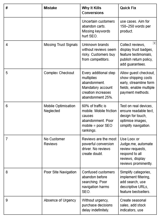
Absent trust signals create buyer hesitation: No reviews, security badges, or guarantees mean customers shop elsewhere.
Complex checkout processes destroy conversion rates: Every additional step multiplies abandonment; streamline ruthlessly.
Mobile optimisation isn't optional: Over 60% of ecommerce traffic is mobile; ignoring it means abandoning most of your audience.
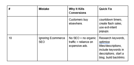
Missing customer reviews and urgency messaging leave money on the table: Social proof and scarcity-driven messaging both convert better than alternatives.
Mistake 1: Slow Loading Times
The Mistake
Your Squarespace store takes 4–6 seconds to load. Images aren't optimised. You've added multiple third-party apps that fire simultaneously. The homepage has auto-playing video, animated backgrounds, and five different banner carousels. Analytics show visitors arriving, but nobody stays.
Why It Kills Conversions
Speed directly impacts conversion. Research shows that each additional second of load time reduces conversion rates by 7%. At 3 seconds, you've already lost 40% of potential customers. At 5 seconds, you're down to barely half your audience.
But it's worse than that. Slow sites train customers to leave before engaging. They create a psychological sense that your store is untrustworthy or poorly run. Meanwhile, your competitors' fast sites earn the "professional" perception that drives purchases.
Slow pages also harm your SEO rankings, meaning fewer qualified visitors arrive in the first place.
How to Fix It
Step 1: Audit Your Current Speed Use Google PageSpeed Insights or GTmetrix to measure your site's load time. Squarespace gives you a baseline, but many stores run 2–3 seconds slower than necessary.
Step 2: Optimise Your Images This is the single biggest impact. Compress images ruthlessly. Use modern formats (WebP). Remove unoptimised images from sliders and backgrounds. Each unoptimised image adds 200–500KB. A homepage with five unoptimised images adds 1–2 seconds to load time.
Step 3: Reduce Third-Party Apps Each integration (email capture, live chat, social feeds, analytics) fires requests that slow your site. Audit every app. If it doesn't directly increase conversions, remove it.
Step 4: Simplify Homepage Design Auto-playing videos, animated backgrounds, and heavy carousels feel impressive but destroy speed. Use static images. Use simple fades instead of complex animations.
Step 5: Enable Lazy Loading Configure lazy loading in Squarespace settings so images load as visitors scroll. This dramatically improves perceived speed.
Target: Your store should load in under 2.5 seconds on 3G connections. Test on actual mobile devices, not just desktop.
Mistake 2: Poor Product Photography
The Mistake
Your product photos are phone snapshots taken in irregular lighting. Items are photographed against walls or cluttered backgrounds. There's no size reference. Some images are blurry or poorly composed. You've used the same boring angle for every product.
Why It Kills Conversions
Product photography is your store's first impression—and it carries disproportionate weight. Studies show that 93% of online shoppers cite visual appearance as the key factor in purchasing decisions.
Poor photography triggers an immediate "this isn't legitimate" response. Customers assume that if you couldn't invest 30 minutes in decent product photos, you won't invest in quality products either. They click to competitors with professional imagery and never return.
Additionally, poor images fail to show details. Without close-ups, size references, or lifestyle context, buyers can't visualise the product in their life. This uncertainty drives abandonment.
How to Fix It
Step 1: Establish Consistent Lighting Photography is 80% lighting. Use natural light from a window, or invest in a basic three-point lighting kit (£40–80). Consistent lighting makes products look professional and trustworthy.
Step 2: Use a Clean Background White or neutral backgrounds (for product shots). Lifestyle context images (showing the product in use) on secondary photos. Never cluttered backgrounds.
Step 3: Create Multiple Angles Show the product front, back, sides, and close-ups. Show it from angles customers will actually view when using it. Include scale references (show it in someone's hand, or next to a familiar object).
Step 4: Add Lifestyle Photos Include images showing the product being used. This helps customers visualise ownership and justifies price points.
Step 5: Maintain Consistency All products should follow the same visual style. Consistent lighting, consistent backgrounds, consistent styling. This builds trust and looks professional.
Step 6: Optimise for Web Even great photos load slowly if uncompressed. Compress images to 150–300KB per image using tools like Tinify or ImageOptim.
Investment: You don't need a £5,000 camera. A smartphone, natural light, and 30 minutes per product delivers professional results.
Mistake 3: Weak Product Descriptions
The Mistake
Your product descriptions are one or two sentences. "High-quality blue shirt. Available in sizes S–L." No details about material, dimensions, fit, care instructions, or use cases. Customers leave because they can't answer basic questions.
Why It Kills Conversions
Product descriptions bridge the gap between visual interest (created by photos) and purchase confidence. They answer the questions keeping customers from buying: What is this exactly? How does it fit? What's it made from? Will it work for me?
Weak descriptions create uncertainty. Uncertain customers don't buy—they browse your site, then purchase from a competitor with better information. Additionally, vague descriptions fail to target search intent, meaning customers searching for specific solutions (e.g., "sustainable linen dress") never find your product.
How to Fix It
Step 1: Structure Every Description Around WIIFM (What's In It For Me) Start with the benefit. "Premium linen dress that breathes in summer heat and doesn't wrinkle easily." Then provide proof.
Step 2: Include Specific Details
Materials: "100% organic cotton, sustainably sourced."
Dimensions: "Length: 28 inches. Width at shoulders: 16 inches."
Fit: "Runs one size small. Best for pear-shaped figures."
Care: "Machine wash cold. Lay flat to dry."
Weight/Thickness: For apparel, "Medium weight (250gsm)."
Step 3: Answer FAQs Within the Description What questions do customers ask most? Address them in the description. "This is vegan leather, not genuine leather, so it requires different care." "This pillow is best for side sleepers."
Step 4: Include Use Cases "Perfect for casual Fridays at the office, weekend errands, or travelling." Help customers visualise ownership.
Step 5: Use Scannable Formatting Break descriptions into sections: Overview, Materials, Dimensions, Care, FAQs. Use bullet points. Never paragraph after paragraph of text.
Step 6: Optimise for Search Include relevant keywords naturally. If customers search for "waterproof yoga mat," and your description includes that phrase, your product appears in their search results (on Google and within Squarespace).
Target: 150–250 words per product. Specific enough to answer all questions, but focused enough that customers read it.
Mistake 4: Missing Trust Signals
The Mistake
Your store has no reviews. No trust badges. No security seals. No guarantees. No testimonials. You've not mentioned your return policy. Customers see a store from an unknown brand with no proof that others have purchased successfully.
Why It Kills Conversions
Trust is the gatekeeper to conversion. A first-time shopper on an unknown brand's website naturally hesitates. They're asking: "Is this real? Will I get my money? If the product is terrible, what happens?" Without explicit trust signals, they assume the worst and shop elsewhere.
Conversely, trust signals dramatically increase conversion rates. Reviews increase conversion 4.6×. Trust badges increase conversion 2.1×. Guarantees overcome objections and drive action.
How to Fix It
Step 1: Implement Customer Reviews Use apps like Loox or Judge.me to collect post-purchase reviews. Squarespace supports several review plugins. Initially, ask satisfied customers directly for reviews (email them a link). Once you have 10–15 reviews, the system becomes self-sustaining.
Step 2: Display Trust Badges Add security badges (Trustwave, McAfee) and payment badges (Visa, Mastercard) to your footer and checkout page. These reduce purchase anxiety.
Step 3: Feature Testimonials Add a "Customer Stories" section with photos and names. Use short video testimonials if possible. "Five stars from Emma T., Edinburgh" carries more weight than generic copy.
Step 4: Publish Your Returns Policy Make it prominent: "30-day money-back guarantee. No questions asked." This single sentence addresses the biggest unspoken concern ("What if I hate it?") and dramatically increases conversion.
Step 5: Provide Business Information Add an About page with your story, qualifications, and team photos. Include contact information and customer service details. Unknown brands feel riskier; humanising your brand builds trust.
Step 6: Add Guarantees "100% organic cotton or your money back." "Arrives in 5 days or it's free." Guarantees overcome objections and prove confidence in your product.
Mistake 5: Complex Checkout Process
The Mistake
Your checkout requires account creation before purchase. Shipping costs appear only after entering an address. You've added multiple optional fields. Customers must fill in extensive billing information even when shipping to the same address. The process spans five pages.
Why It Kills Conversions
The checkout process is the final barrier between interest and conversion. Friction here is devastating. Research shows that 28% of online shoppers abandon carts specifically because checkout is too complicated.
Every additional step multiplies abandonment. Requiring account creation increases abandonment by 25%. Requiring excessive information increases abandonment. Surprising customers with shipping costs mid-checkout increases abandonment.
How to Fix It
Step 1: Allow Guest Checkout Remove mandatory account creation. Offer account creation as an option after purchase ("Create an account to track your order").
Step 2: Show Shipping Costs Early Calculate and display shipping costs before checkout—on the product page or cart page. Surprising customers with shipping fees at the final step guarantees abandonment.
Step 3: Streamline Form Fields Only require essential information: name, address, email, phone, payment method. Remove optional fields. In Squarespace, customise checkout fields in site settings.
Step 4: Auto-Fill Billing Address Provide a checkbox to use the shipping address as billing address. This eliminates duplicate entry and saves 60 seconds per checkout.
Step 5: Simplify to One Checkout Page Consolidate shipping, billing, and payment to a single page if possible. If multiple pages are necessary, show clear progress (Step 1 of 3).
Step 6: Enable Multiple Payment Methods Offer credit cards, PayPal, Apple Pay, and Google Pay. Supporting multiple options increases conversion. Squarespace integrates these natively.
Step 7: Communicate Security Display SSL badges and security language at checkout: "Your information is encrypted and secure." This overcomes last-minute purchase anxiety.
Target: Checkout completion in under 90 seconds. Fewer than four form fields. Clear progress indication.
Mistake 6: Mobile Optimisation Neglected
The Mistake
Your desktop store looks great, but on mobile, buttons are tiny. Text is unreadable. Product images are compressed and unclear. Checkout requires horizontal scrolling. Search functionality doesn't work on mobile. The store isn't optimised for touch navigation.
Why It Kills Conversions
Over 60% of ecommerce traffic is mobile. Yet many Squarespace stores prioritise desktop design. This is strategy backwards.
Mobile optimisation isn't an extra feature—it's essential. Mobile users are typically browsing with intent, ready to purchase. But even minor friction (hard-to-tap buttons, slow loading, unclear product information) triggers abandonment. Additionally, Google prioritises mobile-optimised sites in search rankings, meaning poor mobile optimisation harms both conversion and traffic.
How to Fix It
Step 1: Test on Actual Mobile Devices Don't just resize your browser. Test on real phones (both iPhone and Android). Try 4G connections, not just WiFi. This reveals actual user experience.
Step 2: Ensure Readable Text Font size must be at least 16px on mobile. Contrast must be high enough to read in daylight. Line length must not exceed 50 characters (break text into narrow columns).
Step 3: Design for Touch Buttons must be at least 44×44 pixels. Space buttons apart to prevent accidental clicks. Avoid hover-based interactions (they don't work on touch screens).
Step 4: Optimise Images for Mobile Images must load quickly on 3G. Compress aggressively. Use responsive image sizes (different sizes for different devices). Lazy load images so the page doesn't wait for images below the fold.
Step 5: Simplify Navigation Use a hamburger menu (collapsible navigation) on mobile. Avoid dropdown menus (they're clunky on touch). Ensure search is easily accessible.
Step 6: Test Checkout on Mobile Test the entire purchase flow on mobile. Ensure autofill works. Ensure form fields expand when tapped. Ensure the submit button is visible without scrolling.
In Squarespace, mobile optimisation is mostly automatic, but don't assume. Test thoroughly and customise as needed.
Mistake 7: No Customer Reviews
The Mistake
You've launched your store. You've made sales. But you haven't asked customers for reviews. Your products have zero ratings and zero feedback. New visitors see no social proof.
Why It Kills Conversions
Customer reviews are the most powerful conversion driver you control. They address the buyer's core question: "Has anyone else bought this and were they satisfied?" One five-star review increases conversion more than any marketing copy you can write.
Conversely, no reviews create doubt. New customers assume either nobody has bought, or (worse) reviews are so bad that you're hiding them. The absence of reviews is itself a trust killer.
Additionally, reviews provide the keywords customers use to search for products. If someone reviews your product as "breathable" and "perfect for gym use," future customers searching those terms find your product.
How to Fix It
Step 1: Choose a Review Platform Squarespace-native options include Loox and Judge.me. These integrate directly, automatically request reviews from customers, and display reviews in various formats.
Step 2: Automate Review Requests Configure automatic post-purchase review emails. Aim for 7–14 days after purchase (giving time for product satisfaction). Keep requests brief and make review submission friction-free (one click ideally).
Step 3: Actively Encourage Reviews Early reviews are critical. Email past customers directly asking for reviews. Offer small incentives (£1 discount on next purchase) for review completion. Include a review link in product packaging.
Step 4: Respond to All Reviews Reply to positive reviews: "Thank you! We loved hearing this." Reply to negative reviews professionally: "Sorry to hear. Please email us—we'd love to make this right." Responding increases customer loyalty and shows that you're engaged.
Step 5: Display Reviews Prominently Show review ratings and counts on product pages. Show recent reviews. Consider featuring a "most helpful" review. High-visibility reviews drive conversions.
Step 6: Use Video Reviews Video reviews convert even better than written reviews. Incentivise customers to submit short video testimonials.
Target: Within six months, 20+ reviews. Average rating 4.5+ stars. Reviews on all bestselling products.
Mistake 8: Poor Site Navigation
The Mistake
Your products are poorly categorised. Customers can't find what they're looking for. There's no search functionality, or search doesn't work properly. Your main navigation is confusing. You have 40 product categories but no filtering. Customers spend five minutes looking for a specific product, then give up.
Why It Kills Conversions
Navigation is the path between arrival and purchase. When navigation is confusing, even interested customers abandon. They don't message you asking for help—they simply leave for a competitor.
Additionally, poor navigation increases bounce rate, which harms SEO rankings. A visitor who can't find a product and leaves signals to Google that your site isn't relevant. Over time, this tanks rankings.
How to Fix It
Step 1: Simplify Main Categories Keep main navigation to 5–7 categories maximum. "Women's Clothing," "Men's Clothing," "Accessories," "Sale" rather than "Dresses," "Tops," "Bottoms," "Outerwear," "Activewear," "Jumpsuits" etc. Let filtering handle the detail.
Step 2: Implement Smart Filtering Add filters to product pages: Size, Color, Price, Material, Fit. Squarespace supports this natively. Filters dramatically improve browsing experience and allow customers to narrow quickly.
Step 3: Add Search Functionality Customers who can't browse often search. Ensure search works and returns relevant products. Test it repeatedly: search for common terms and verify results are correct.
Step 4: Use Descriptive Product URLs URLs like "blueshift.com/product?id=12849" tell visitors nothing. URLs like "blueshift.com/organic-cotton-yoga-pants" communicate what the product is and help both users and Google.
Step 5: Implement Breadcrumb Navigation Breadcrumbs (e.g., "Home > Clothing > Dresses > Blue Dresses") help visitors understand where they are and navigate back.
Step 6: Feature Bestsellers Add a "Bestsellers" or "Popular" collection. Customers often prefer established, popular products. This simplifies choice and increases conversion.
Step 7: Provide Clear Internal Linking Link related products. If someone's viewing a yoga mat, link "matching yoga blocks" and "recommended yoga straps." Internal linking increases browsing depth and average order value.
Target: A customer should find any product in under 30 seconds via browsing or search.
Mistake 9: Absence of Urgency
The Mistake
Your store has no sense of urgency. No limited-time offers. No "low stock" notices. No seasonal messaging. No countdown timers. Products seem like they'll always be available. Customers browse, add items to cart, and think "I'll buy tomorrow." They never come back.
Why It Kills Conversions
Urgency is a psychological principle that drives immediate action. Without it, purchase decisions slip indefinitely. A visitor interested in a £40 jumper thinks "I'll think about it" and never returns (meanwhile, they forgot about your store and bought elsewhere).
Conversely, limited-time offers and low-stock messaging trigger action. The threat of missing out (FOMO) is powerful. A "48-hour sale" or "only 3 items left" drives the visitor to complete the purchase immediately rather than delay.
How to Fix It
Step 1: Create Seasonal Sales Plan sales around key dates: New Year (January), Valentine's Day (February), Easter, Summer, Back-to-School (September), Black Friday (November), Christmas. Each sale creates urgency. Email customers two days before sale ends: "Sale ends in 48 hours."
Step 2: Add Stock Indicators Display "Only 2 items left in stock" on low-stock products. This simple message increases conversion rate by 15–20%. Squarespace supports inventory tracking natively.
Step 3: Use Countdown Timers If running a limited-time offer, add a visible countdown timer. "Sale ends in: 2 days, 14 hours, 23 minutes." This visual creates urgency and combats procrastination.
Step 4: Offer Limited Bundles "This week only: Get our bestselling bundle at 20% off." Limited-time, limited-quantity bundles drive urgency.
Step 5: Create Flash Sales Occasionally (monthly or quarterly), run a flash sale for 24 hours. Announce it via email. The time limitation drives action.
Step 6: Use Exit-Intent Popups When a visitor attempts to leave without purchasing, show a popup: "Wait! Use code SAVE15 for 15% off your first purchase." This captures abandoners.
Step 7: Implement Scarcity for High-Price Items For products over £100, consider genuinely limited quantities. "Handmade, limited to 10 units per month." Scarcity justifies price and drives faster decision-making.
Target: Every visitor should encounter at least one urgency message. Conversions from urgency messaging should account for 20–30% of sales.
Mistake 10: Ignoring Ecommerce SEO
The Mistake
You've built a beautiful Squarespace store but haven't done SEO. You haven't researched keywords. Product page titles are unhelpful: "Product 47." You haven't optimised descriptions for search. You have no blog. You haven't submitted your sitemap to Google. Organic search drives zero traffic.
Why It Kills Conversions
Even a perfect store drives no conversions if nobody visits. SEO is the path that brings qualified customers to your door. Customers searching for your products are the highest-intent traffic you can get—they're already looking to buy.
Without SEO, you rely on ads (expensive) or social media (unpredictable). With SEO, qualified customers find you organically, reducing customer acquisition costs and improving profit margins.
How to Fix It
Step 1: Research Keywords Identify the terms customers use to search for your products. Use tools like Google Keyword Planner, Ahrefs, or SEMrush. Find keywords with decent search volume (100+ searches/month) and low competition.
For example, if selling "organic cotton yoga pants," research: "organic cotton yoga pants," "sustainable yoga leggings," "eco-friendly yoga bottoms," etc. Target keywords in product descriptions and titles.
Step 2: Optimise Product Page Titles and Meta Descriptions Product page titles should include the product type and key keyword: "Organic Cotton Yoga Pants, Breathable Fit | Blueshift Activewear"
Meta descriptions should be 150–160 characters and include keywords: "Shop breathable organic cotton yoga pants designed for movement. Sustainable, comfortable, ethically made. Free returns."
Step 3: Optimise Product Descriptions with Keywords Include target keywords naturally within product descriptions. If your target keyword is "sustainable linen dress," include this phrase in the description. Don't keyword-stuff—write naturally, but include your target keyword at least once.
Step 4: Create SEO-Friendly Category Pages Write detailed category page descriptions. For "Summer Dresses," include a 200-word introduction explaining your summer dress selection, materials, and brand story. Include relevant keywords. This improves rankings and gives customers more reason to browse.
Step 5: Start a Blog Publish 1–2 blog posts monthly targeting long-tail keywords and customer questions. "How to Care for Linen Garments," "Best Yoga Pants for Different Body Types," etc. Blog posts drive traffic and link to your product pages.
Step 6: Build Backlinks Pitch your products to relevant bloggers and journalists. Get mentioned on reputable sites. Each backlink improves your SEO authority.
Step 7: Submit Your Sitemap In Google Search Console, submit your Squarespace sitemap. This tells Google about all your pages.
Step 8: Monitor Performance Use Google Search Console and Google Analytics to track which keywords drive traffic and conversions. Focus on keywords that convert, not just high-volume keywords.
Target: 30–50% of traffic from organic search within 12 months. Keywords ranked in top 10 for your main products.
Summary Table: The 10 Mistakes and Fixes at a Glance
Frequently Asked Questions
-
Most fixes can be implemented within 2–4 weeks. Image optimisation and mobile testing take the most time. SEO and review collection are ongoing processes. Start with mistakes 1–3 (speed, photography, descriptions) as they have the highest impact.
-
This varies by store, but poor product photography and slow loading times are typically the biggest culprits. Start by auditing your site speed (Google PageSpeed Insights) and evaluating your product photos honestly.
-
Not necessarily. Most fixes (descriptions, navigation, urgency messaging) you can implement yourself. Image photography and compression require basic skills. Hiring professionals for SEO and copywriting speeds results, but you can start alone.
-
Cost varies widely. Mobile and speed optimisation: free to £200 (tools and time). Photography: £200–800 depending on products and equipment. Professional copywriting: £800–2,000. These are investments that typically pay for themselves within one month.
-
No. Prioritise mistakes 1, 2, and 3 (speed, photography, descriptions) as they have the highest impact. Then add mistakes 5 and 7 (checkout and reviews). Mistakes 8–10 (navigation, urgency, SEO) are next. This staged approach prevents overwhelm.
-
Monitor these metrics: conversion rate (sales ÷ visitors), average order value, cart abandonment rate, and bounce rate. Tools: Google Analytics, Squarespace analytics, heatmaps (Hotjar). Measure before changes, then weekly for 4 weeks after implementing fixes. Expect 15–30% improvement in conversion rate.
-
Squarespace handles most (navigation, mobile optimisation, mobile-friendly checkout, trust badges, categories). For reviews, use Loox or Judge.me. For advanced SEO, consider SEMrush or Ahrefs. For pop-ups, use Klaviyo or Privy. Squarespace is sufficient for the basics; apps enhance functionality.
-
Quarterly. Run a speed audit every three months. Refresh product photos seasonally. Collect new reviews continuously. Update navigation based on customer behaviour. SEO is ongoing. Treat your store as a living system that improves steadily rather than a set-and-forget website.
Call to Action
These 10 mistakes are costing you sales right now. Every day your store has slow loading times, weak photos, or a confusing checkout, money walks out the door.
But here's the good news: fixing these mistakes is straightforward. You don't need a developer or a designer. You need a systematic approach and the right guidance.That's where we help.At Squareko, we specialise in diagnosing exactly which mistakes are destroying your conversion rate—and fixing them. We've helped hundreds of Squarespace store owners recover tens of thousands in lost revenue.
Ready to stop leaving money on the table?
Book your free Squarespace store audit today. We'll analyse your site against these 10 mistakes, identify your biggest opportunity, and show you exactly how to fix it. No commitment. No sales pitch. Just honest analysis and actionable recommendations.

From custom website design to SEO strategy, we help businesses launch a site that looks professional and performs better.

About the Author
Walid | Founder, Squareko
I'm Walid Hasan, a Certified Squarespace Expert and Squarespace Circle Platinum Partner with over 12 years of hands-on experience designing and optimizing high-performing websites. Over the years, I've had the privilege of building more than 2,000 Squarespace websites for clients around the world, always focusing on clean design, strong user experience, and conversion-driven results.