12 Best Squarespace Landing Page Templates for Conversions
The short answer: Squarespace 7.1 has no landing page type. Cover pages were a version 7.0 feature and are not available in 7.1 — a landing page in 7.1 is an ordinary page with the header and footer hidden. And before design matters at all, open the form's Storage tab. A Squarespace form with no storage destination will not submit, and it fails quietly.
That last point is the reason this post starts with mechanics and gets to templates afterwards. A beautiful landing page with a broken form converts at zero, and it does so without an error message.
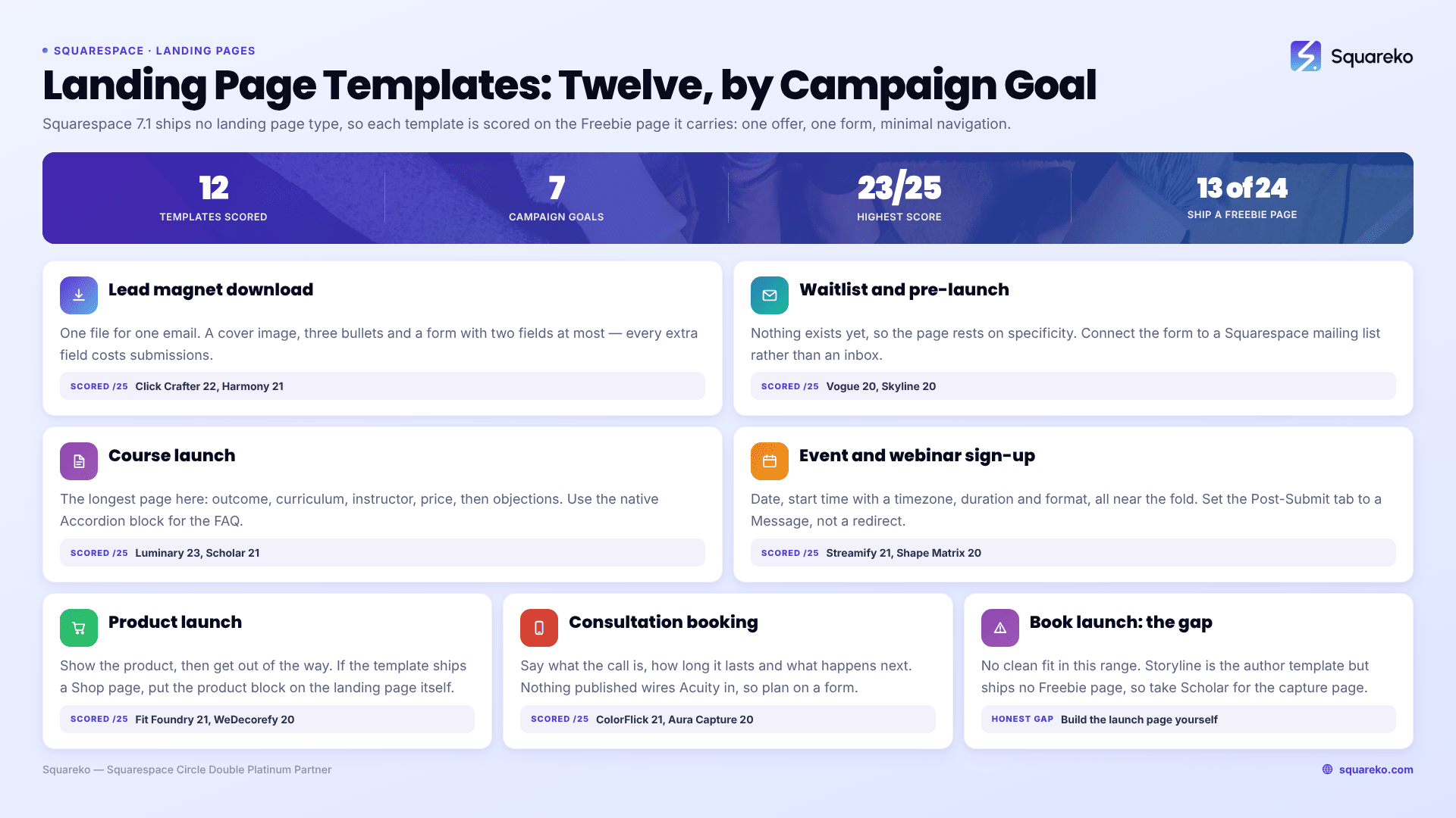
The twelve, by campaign goal
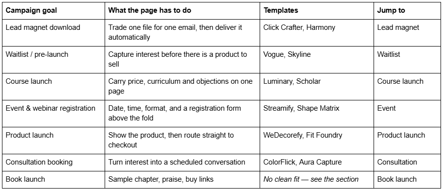
What actually makes a landing page convert on Squarespace
Generic landing page advice applies here as it does anywhere. The platform-specific parts are where Squarespace sites lose money.
Cover pages are gone, and that is fine
Squarespace 7.0 had a dedicated cover page type — a single-screen, navigation-free page builder. Squarespace's own documentation is unambiguous: "Cover pages aren't available in version 7.1. To create a similar look, you can hide the header and footer on certain pages."
So in Squarespace 7.1 a landing page is a normal page that you strip down. That is better, not worse: cover pages were limited to a handful of fixed layouts, whereas a 7.1 page gives you Fluid Engine, every section type, and real SEO fields.
Removing the navigation is a CSS job
Squarespace 7.1 has no per-page toggle for hiding the header. You do it with Custom CSS scoped to that page's collection ID, in Website → Website Tools → Custom CSS (Core plan or above):
/* Hide header and footer on one page only. Get the collection ID from the  class list in your inspector. */
#collection-6421a9f0c1e8b2001d7a4c33 {
  #header,
  #footer-sections {
    display: none;
  }
}
Two supporting steps: move the page into the Not Linked section of the Pages panel so it never appears in navigation, and remember that the logo in the header is often the only way back to the site — removing it is deliberate on a paid-traffic landing page and a mistake on an organic one.
The form storage destination — the expensive one
This is the failure that costs real money and almost never gets diagnosed, because nothing on the page says it is broken.
Every Squarespace form has a Storage tab, and the platform's documentation states it plainly: "At least one storage option is required per form. If you don't select a storage option, the form won't have a place to send submissions, and visitors won't be able to submit the form."
The available destinations are Squarespace mailing lists, the form submitters list (visible in the Contacts panel), an email address, Google Drive, Mailchimp and Zapier. You can connect more than one.
Where it goes wrong: someone duplicates a page, or pastes a form section from another template, or disconnects a Mailchimp account that was the form's only destination. The form still renders. It still looks submittable. Nothing arrives.
How to confirm it in 60 seconds: open the form block → Storage tab → check at least one destination is connected and, if it is an email address, that the address is one you actually read. Then submit the form yourself while logged out, and confirm the submission appears in the destination — not just that the page said thank you.
Two related settings live in the Post-Submit tab: you choose either a message or a redirect. Squarespace notes that "post-submit redirects won't work while logged into your site", so a redirect that appears broken during testing may be fine in production. Test logged out, always. And if your form has a file upload field, Google reCAPTCHA is required.
Delivering the lead magnet automatically
Squarespace does not attach files to form confirmation emails. The supported route is Email Campaigns → Automations, which offers a Form Response trigger that fires when a visitor submits a form containing an email address, alongside the "Welcome new subscribers" subscriber-activity preset. Automations are available on all current Email Campaigns plans.
The alternative, if you would rather not add an email subscription: set the Post-Submit tab to Redirect and point it at an uploaded file or an unlisted delivery page. It works instantly and costs nothing, but you get no follow-up sequence and no record of who downloaded what beyond the form storage.
Above the fold, and what actually belongs there
One offer, one action. The hero has to carry what it is, who it is for, and the single thing to do next, without a scroll on a 390px-wide phone. Everything else — the long-form pitch, the FAQ, the testimonials — belongs below.
The most common structural error in Squarespace landing pages is a full-bleed image hero with the headline vertically centred, which on mobile pushes the form entirely off-screen. Fluid Engine keeps separate desktop and mobile layouts for the same section, so fix that in the mobile layout rather than fighting it with CSS.
Speed, honestly
Landing pages should be the lightest pages on a site, and usually are not, because they inherit the demo's hero imagery. Across 54 Squareko-built client sites measured in August 2026 — a Playwright/Chromium lab test, cloud datacentre, unthrottled, single run per site, load-only CLS, so lab data rather than field data — median mobile LCP was 2.01s with 74% under Google's 2.5s threshold, but median page weight was 3.0 MB across 93 requests and only 48% of pages came in under 3 MB.
Squarespace's CDN serves WebP unconditionally and resizes to seven widths up to 2500w, which handles a lot for you. What it cannot do is undo a hero video, three embedded players and a 14-image gallery on a page whose only job is to capture an email address.
How these twelve were scored
Thirteen of Squareko's 24 templates ship a dedicated Freebie page — which is, structurally, a lead-magnet landing page: one offer, one form, minimal navigation pull. That is the honest basis for this list rather than a claim that these templates were designed as landing page templates. They were not. They contain a page that behaves like one.
Each is scored out of 25, five points on each of five criteria:
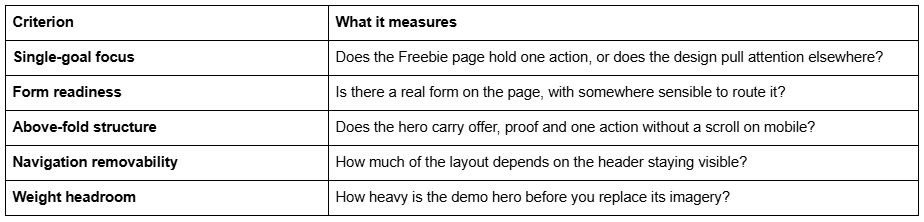
The thirteenth template with a Freebie page, Horizon, is excluded: its Freebie page sits inside a wedding photography site with no pricing or commerce pages behind it, so it scores below the cut on form readiness. Aesthetics were not scored. Neither were section counts, since all 24 templates advertise 150+ sections, nor the star ratings on product pages, which name no review platform and carry no dates.
All twelve are $249, Squarespace 7.1 with Fluid Engine, delivered as a contributor invitation rather than a file download. A Squarespace subscription is separate.
Lead magnet download
The purest form of the job: one file, one email address, automatic delivery. The page needs a cover image of the asset, three bullets on what is inside it, a form with two fields at most, and nothing else. Every additional field measurably costs submissions, and a phone number field on a PDF download is a tax on your own conversion rate.
Click Crafter — 12 pages: Home, Home 2, About, Services, Shop, Blog, Portfolio, Contact, Freebie, Gallery, 404, Style Guide. Built for agencies and service businesses, and the Freebie page is the cleanest single-action page in the range. 22/25.
Harmony — 11 pages with Portfolio, Gallery, Services, Blog, Store and a Freebies page. Softer, interiors-leaning register; the Store page gives you somewhere for the paid product the free one leads to. 21/25.
Waitlist and pre-launch capture
A waitlist page sells something that does not exist yet, which means the whole page rests on specificity: what it is, roughly when, and what the person on the list gets that the general public does not. Vague waitlist pages collect addresses that never open an email.
Connect the form to a Squarespace mailing list rather than an email address here — you are building a segment you will mail later, and a list of submissions in an inbox is not a segment.
Vogue — 11 pages with Portfolio, Gallery, Shop, Services and Freebie. The gallery-forward layout suits a product not yet shippable, because you can show the work without showing a price. 20/25.
Skyline — 12 pages including Services, Shop, Blog, Portfolio, Gallery and Freebie, and one of only two templates in the range that ships a Figma file, which is worth having if a designer is adapting the page for a specific campaign. Its published overview text describes a different template entirely; judge it on the page list and the demo. 20/25.
Course launch
A course landing page is the longest page on this list, because it has to do four things: establish that you can teach the thing, lay out the curriculum, state the price, and answer objections before the checkout. Cutting any one of them raises refund requests rather than lowering them.
Structurally: a hero with the outcome, a curriculum section, an instructor section, testimonials, pricing, then an FAQ accordion. Use the native Accordion block for the FAQ — it renders server-side, so the questions and answers are crawlable, unlike a <details> block pasted into a code block.
Luminary — 11 pages: Home, Home 2, About, Services, Shop, Courses, Portfolio, Freebie, Gallery, 404, Style Guide. The only template pairing a Courses page with a Freebie page, which is the actual funnel — free thing captures, course page sells. Nothing published states whether the Courses page uses Squarespace Member Areas, so treat it as a designed sales page, not a delivery platform. 23/25.
Scholar — 11 pages with Portfolio, Gallery, Shop, Services and Freebie, in an editorial register that suits writing, design and craft courses. 21/25.
Event and webinar registration
Registration pages fail on missing information more than on weak persuasion. Date, start time with a timezone, duration, format, whether it is recorded, and what happens if you cannot attend live — all above or immediately below the fold. Half of webinar registration friction is someone unable to work out whether they will be awake.
Set the Post-Submit tab to a Message containing the joining details rather than a redirect, so the information survives the moment the tab is closed, and add an Email Campaigns Form Response automation to repeat it.
Streamify — 12 pages: Home, Home 2, About, Team, Pricing, Blog, Contact, Project, FAQs, Freebie, 404, Style Guide. The Pricing and FAQs pages are the reason it works for paid workshops. One caveat, stated plainly: its published Live Demo button omits the password parameter and returns an authentication error, so there is no demo to link. Ask for a walkthrough before buying. 21/25.
Shape Matrix — 11 pages with Training, Classes, Portfolio, Gallery and Freebie. Built for movement and fitness, and the Classes page is a natural schedule for recurring live sessions. 20/25.
Product launch
A product launch page has a shorter job than a course page and a harder one: show the product properly, then get out of the way. The failure mode is a page that describes the product beautifully and then makes someone navigate to a separate shop to buy it.
If the template has a Shop page, put the product block on the landing page itself so the buy action happens in place.
WeDecorefy — the largest template in the range at 15 pages, with Shop, Projects, Project Details, Offering, Team and Freebie. Overkill for a single launch, ideal if the launch is one campaign inside a larger site. 20/25.
Fit Foundry — 11 pages: Home, Home 2, About, Service, Blog, Contact, Shop, FAQs, Freebie, 404, Style Guide. The Shop-plus-FAQs pairing handles the two things a launch needs most, and the Freebie page gives you a pre-launch capture page for the same campaign. 21/25.
Consultation and enquiry booking
Booking pages convert on friction reduction, not persuasion. Say what the call is, how long it lasts, what it costs or that it is free, and what happens next. Then one form.
Squareko publishes nothing about booking integrations on any template, so do not assume Acuity is wired in. Plan on a form, and add scheduling separately if you need it.
ColorFlick — 12 pages: Home, Home 2, Weddings, Engagements, Portraits, Photo Booth, Inquire, Journal, Gallery, Freebie, 404, Style Guide. Enquiry-first by design, with Inquire in top-level navigation rather than buried in a footer. 21/25.
Aura Capture — 12 pages including Weddings, Engagements, Events, FAQs, Contact, Gallery and Freebie. The FAQs page absorbs the pricing and turnaround questions that otherwise arrive one at a time. 20/25.
Book launch: the honest gap
There is no clean fit in this range, and pretending otherwise would be the sort of thing that makes a roundup worthless.
Storyline is the author and speaker template — 13 pages including Speaking, Consulting, Podcast, Blog, Testimonial and Booking — and it is the right structure for an author's site. But it has no Freebie page, so there is no built-in capture page for a sample chapter, and its demo link is one of the six that currently return an authentication error.
If you are launching a book on Squarespace, the practical build is: take Scholar for the Freebie page and use it as the sample-chapter capture, then construct the launch page itself from the template's own sections — hero with the cover, a praise section using the testimonial sections, a buy-links row, and an author bio. Connect the Freebie form to a Squarespace mailing list and run the sample chapter out through an Email Campaigns Form Response automation. That is roughly a day's work on top of the template, and it is honest to say so rather than to score a template 22/25 for a job it was not built to do.
The full score matrix
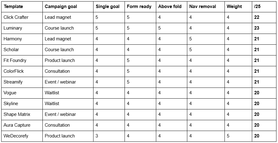
The scores cluster tightly, which is itself the finding: these are twelve variations on one well-built Freebie page inside twelve differently styled sites. Choose on the supporting pages — Pricing, FAQs, Shop, Courses — because that is where they genuinely differ, not on the landing page itself.
What a template will not do for you
Demo images are not licensed for live use. Every one has to be replaced before launch. On a landing page that usually means commissioning or shooting a single strong hero image, which is often the highest-return hour you will spend on the whole campaign.
All sales are final. Squareko's digital products cannot be returned, exchanged or refunded under any circumstances. The demo is your entire due diligence, so open it on a phone and check the Freebie page specifically rather than the homepage.
Support is 60 days of email support; customisation is not included. Installation onto an existing site is a paid add-on and a manual process taking around 48 hours. The alternative is a new 12-month trial site that Squareko builds and hands over, with your current site live throughout.
And there are shops with more landing-page-specific ranges. Big Cat Creative has the largest premium Squarespace catalogue and sells individual landing page templates rather than only full sites — if you want one page and nothing else, that is a better shape than buying a 12-page template for its Freebie page. Applet Studio sits around $225 with dedicated industry pages. Squareko's advantage is that installation is done for you and nothing is downloaded or uploaded, not that the range is uniquely suited to landing pages.
Before you buy anything, test the form
The template decides how the page looks. The Storage tab decides whether it works. Whichever of these twelve you choose, the first thing to do after installation is submit your own form while logged out and confirm the submission lands somewhere you will see it — then check the Post-Submit tab is doing what you think, and add an Email Campaigns Form Response automation if the offer needs delivering.
If you would rather see the whole range before narrowing to campaign goals, the premium Squarespace template range covers all 24 at $249 with installation included. Where hiring genuinely makes sense is narrower: a multi-step form, conditional logic, or a landing page that has to feed a CRM Squarespace does not integrate with natively — those are builds, and no template purchase gets you there. For a straightforward lead magnet, waitlist or course page, most people reading this will install one of the twelve above themselves in an afternoon.
FAQ
-
Not as a page type. Cover pages were a version 7.0 feature and are not available in 7.1, so a landing page is an ordinary page with the header and footer hidden using Custom CSS scoped to that page's collection ID. Several premium templates ship a Freebie page that is structurally a landing page.
-
Almost always a missing storage destination. Squarespace requires at least one storage option per form; without one the form has nowhere to send submissions and visitors cannot submit it. Open the form block, check the Storage tab, connect a destination, then test the form while logged out.
-
Add Custom CSS at Website → Website Tools → Custom CSS, scoped to the page's collection ID, setting #header and #footer-sections to display: none. Then move the page into the Not Linked section of the Pages panel so it stays out of navigation entirely. Requires a Core plan or above.
-
Yes, through Email Campaigns Automations, which offers a Form Response trigger that fires when someone submits a form containing an email address. Automations are included on all current Email Campaigns plans. The no-cost alternative is setting the form's Post-Submit tab to redirect to an uploaded file.
-
Luminary, because it is the only one in the Squareko range pairing a Courses page with a Freebie page — the free offer captures, the course page sells. Nothing published confirms whether its Courses page uses Squarespace Member Areas, so treat it as a sales page rather than a delivery platform.
-
Faster than the rest of the site, since it has one job. Across 54 Squareko-built sites measured in August 2026 (lab data), median mobile LCP was 2.01s but median page weight was 3.0 MB over 93 requests. Replace the demo's hero video and trim galleries before launching a campaign.

Author Bio
I'm Walid Hasan, a Certified Squarespace Expert and Squarespace Circle Platinum Partner with over 12 years of hands-on experience designing and optimizing high-performing websites. Over the years, I've had the privilege of building more than 2,000 Squarespace websites for clients around the world, always focusing on clean design, strong user experience, and conversion-driven results.