Best Squarespace Templates for Chiropractors and Chiropractic Clinics in 2026
Introduction
Choosing the right website template is one of the most important decisions you'll make as a chiropractor or clinic owner. Your website is often the first impression potential patients have of your practice. It needs to communicate credibility, professionalism, and trustworthiness while making it dead simple for visitors to book an appointment. On Squarespace, several templates stand out for chiropractic practices—but not all are created equal. This guide reviews the best templates for solo chiropractors, multi-chiropractor clinics, and specialist practices, with specific guidance on what features matter most for compliance and conversion.
Key Takeaways
Forma, Clune, Bailard, and Hester are the strongest Squarespace templates for chiropractic clinics in 2026
GCC registration number display must be prominent and non-negotiable—choose templates that accommodate this naturally
Your template choice depends on practice type: solo practitioners need personal brand flexibility; multi-chiropractor clinics need strong team display capabilities
Clean, clinical-but-warm design builds patient trust; avoid cluttered or overly trendy aesthetics
Appointment booking CTA prominence is critical—templates with built-in Squarespace Scheduling integration simplify patient onboarding
Why Template Choice Matters for Chiropractors
Your website template isn't just about aesthetics. For chiropractors, it's a compliance tool, a patient trust builder, and a conversion engine rolled into one. Unlike many service industries, chiropractic has specific regulatory requirements in the UK. The General Chiropractic Council (GCC) legally requires that you display your registration number on your website. ASA/CAP advertising standards restrict the types of condition claims you can make. Your template must accommodate these requirements without looking awkward or cramped.
Beyond compliance, your template affects patient journey flow. Can visitors easily see what conditions you treat? Can they see photos of your clinic and team? Is the booking button impossible to miss? Does the design communicate clinical competence or does it feel like a generic wellness spa?
Most importantly, your template must match your practice type. A solo chiropractor building personal brand requires different visual hierarchy than a five-person clinic that needs to showcase team credentials. A sports chiropractic practice needs a different aesthetic than a family wellness clinic.
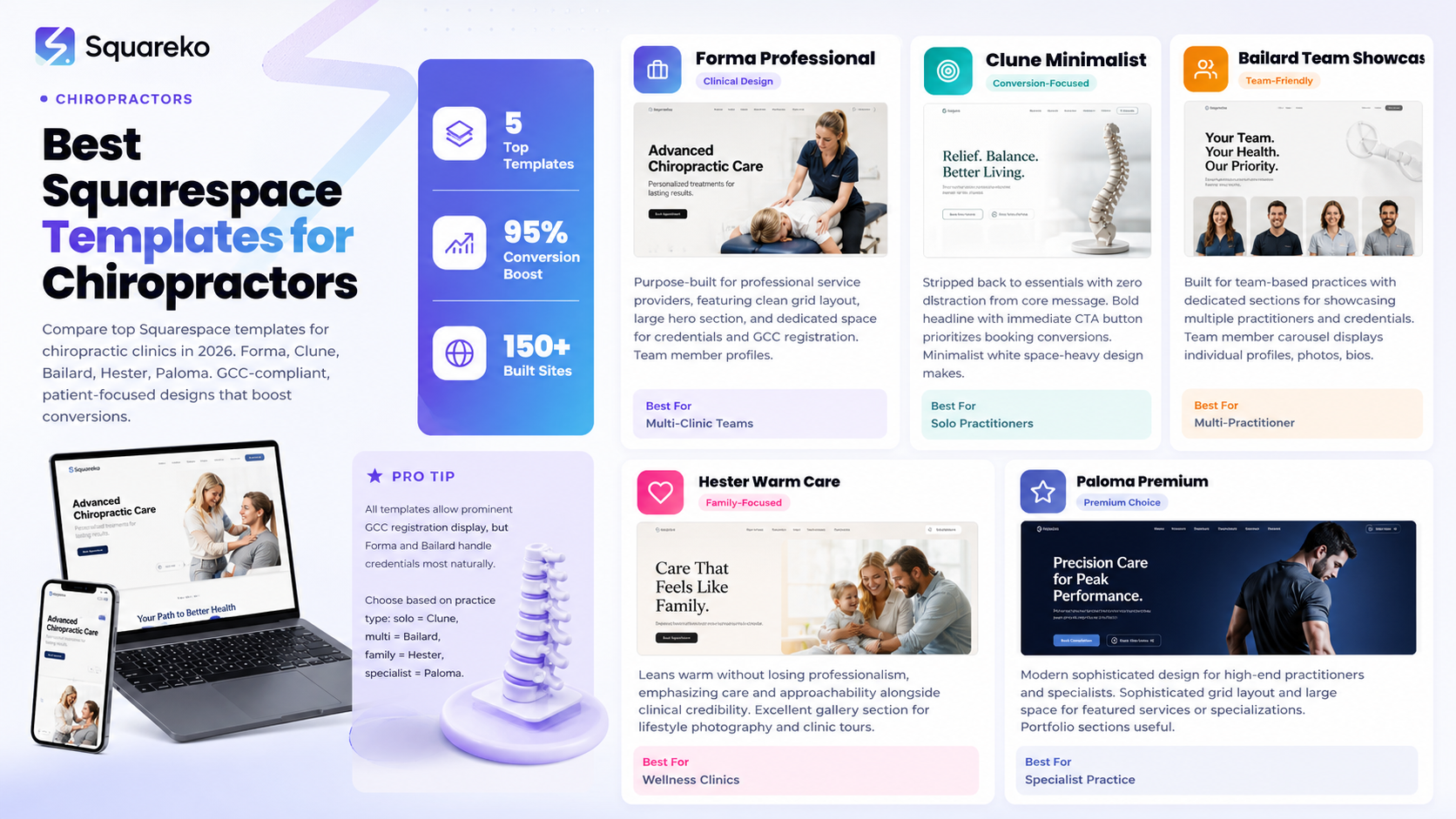
Top 5 Squarespace Templates for Chiropractic Clinics
Forma: Professional and Clinical
Forma is purpose-built for professional service providers, and chiropractors fit perfectly into its design DNA. The template features a clean grid layout, large hero section, and professional typography that screams competence without being sterile.
Strengths for chiropractors:
Dedicated space for credentials and professional affiliations (ideal for GCC number, BCA membership badges)
Team member profiles with bio sections—excellent for multi-chiropractor clinics
Large service section with visual hierarchy that accommodates different treatment modalities
About section with plenty of room for qualifications and years of experience
Professional footer with full contact details and embedded map
Design characteristics: Clean, modern, clinical-but-approachable. The white space and professional typography build trust immediately. The color palette is easily customizable to your clinic branding.
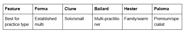
Best for: Established multi-chiropractor clinics and practices that want to emphasize clinical credentials and professional standing.
Customization needs: Minimal. Forma works well with default settings. You may want to add clinic photography to the hero section and ensure GCC registration display is prominent.
Clune: Clean, Minimalist, Conversion-Focused
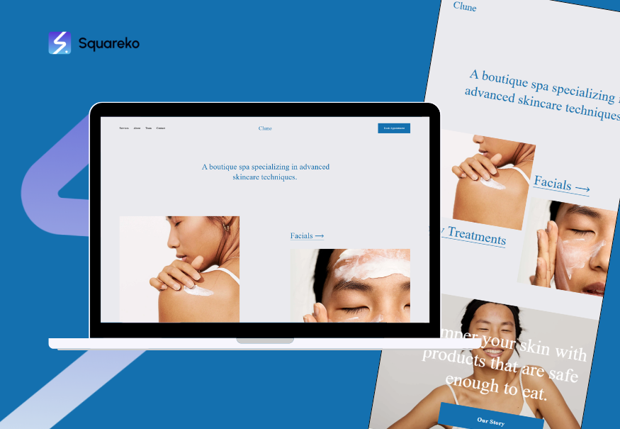
Clune is stripped back to essentials. It's minimalist by design, which means zero distraction from your core message: what you do, why you're good at it, and how to book.
Strengths for chiropractors:
Hero section with bold headline and immediate CTA button—booking conversions are the priority
Simple service listing that's easy to scan
Testimonials section with room for patient stories (within GDPR constraints)
Contact/booking section that's visually dominant
Fast load times due to minimal design elements
Design characteristics: Minimalist, white space-heavy, typography-focused. The design makes every section feel intentional. There's nowhere to hide—copy quality matters enormously.
Best for: Solo chiropractors or small clinics that want maximum conversion focus and don't need extensive team/service displays.
Customization needs: Moderate. You'll want to carefully craft your hero headline and ensure the booking CTA is perfectly positioned. You'll need good quality clinic photos to avoid sterile appearance.
Bailard: Multi-Practitioner Team Showcase
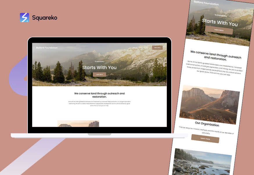
Bailard is built for team-based practices. It has dedicated sections for showcasing multiple practitioners, their credentials, and their specializations.
Strengths for chiropractors:
Team member carousel with individual profiles, photos, and bios—critical for multi-chiropractor clinics
Multiple practitioner pages with full credential display
Service pages organized by practitioner specialization
Gallery section for clinic photos, treatment rooms, equipment
Built-in scheduling integration visibility
Design characteristics: Professional, team-focused, warm but clinical. The design emphasizes relationships and practitioner expertise.
Best for: Chiropractic clinics with 2+ practitioners that want to showcase individual credentials and specializations.
Customization needs: Moderate-to-high. You'll want professional headshots of each practitioner, full bio copy for each team member, and clear GCC registration numbers for each.
Hester: Warm, Approachable, Family-Friendly
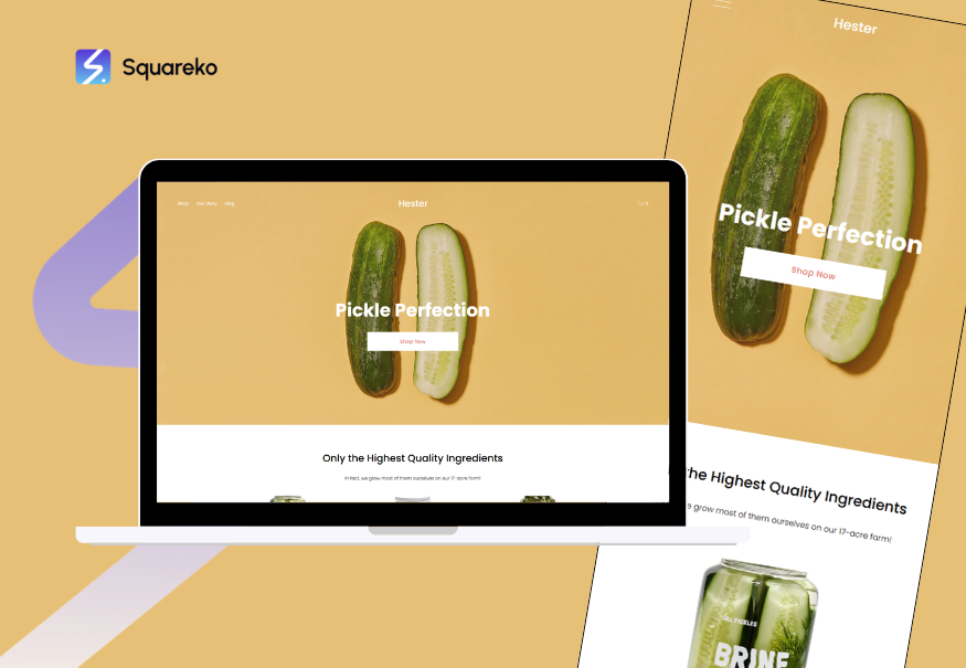
Hester leans warm without losing professionalism. It's designed for wellness and healthcare providers who want to feel accessible and approachable while maintaining clinical credibility.
Strengths for chiropractors:
Hero section that communicates care and approachability
Gallery section excellent for lifestyle photography and clinic tours
About section with storytelling space
Testimonials with easy GDPR-compliant review management
Soft, warm color palette that feels less clinical than others
Design characteristics: Warm, approachable, human-centered. The design emphasizes care alongside competence. It works well for family chiropractic practices.
Best for: Chiropractors focusing on family wellness, pediatric chiropractic, or practices that want to emphasize a warm, approachable patient experience.
Customization needs: Moderate. Lifestyle photography matters more here—you'll want photos of practitioners with patients, family-friendly clinic imagery, and warm color customization.
Paloma: Premium, Modern, High-End Aesthetic
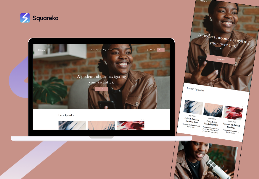
Paloma is the premium option. It's modern, sophisticated, and designed for high-end service providers. If you're positioning as a top-tier or specialist chiropractic practice, Paloma communicates that immediately.
Strengths for chiropractors:
Sophisticated grid layout and typography
Large space for featured services or specializations
Portfolio/case study sections (useful for before/after or condition outcome stories)
Premium aesthetic that justifies higher pricing
Customizable color and typography for brand consistency
Design characteristics: Sophisticated, modern, premium. The design feels contemporary without being trendy. It works well for sports chiropractic, corporate wellness, or high-end private practices.
Best for: Specialist chiropractors (sports, corporate wellness, high-net-worth clientele) positioning as premium practitioners.
Customization needs: High. Paloma requires thoughtful design decisions—color palette, photography quality, and copy need to match the premium aesthetic. Generic default settings will cheapen the look.
Design Considerations Specific to Chiropractic Compliance
GCC Registration Display
Your GCC registration number isn't optional—it's a legal requirement. Your template must accommodate this prominently. The best approaches:
Header/Navigation Footer: Add your GCC registration number to the footer, visible on every page
About/Credentials Section: Display it prominently in the About section alongside your qualifications
Contact/Legal Page: Include it in the contact/legal information area
CTA Elements: Never hide it below the fold or in small print
Templates like Forma and Bailard have natural footer space. Templates like Clune require you to ensure footer customization is clean and uncluttered.
ASA/CAP Advertising Compliance
Your template affects your ability to comply with advertising standards. Keep these in mind:
Service Descriptions: Use language aligned with GCC Code of Practice. Focus on musculoskeletal assessment and treatment rather than disease treatment claims
Testimonials: Display them in a context that's clearly patient feedback, not medical claims. ASA/CAP allows testimonials but requires context
Condition Language: Say "low back pain management" not "cures sciatica." Focus on patient experience improvement
Visual Hierarchy: Don't let condition-specific claims dominate above your GCC credentials. Clinical credibility should come first
Patient Photos and Privacy
If you're using patient photos (testimonials, before/after, treatment photos), your template must:
GDPR Compliance: Ensure you have explicit written consent (not just verbal agreement)
Privacy in Design: Consider private consultation/treatment room photos rather than patient identifiable photos
Testimonial Context: Ensure testimonial photos have clear context and aren't presented as clinical evidence
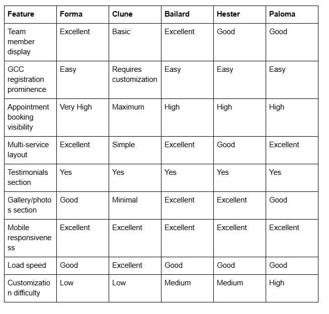
Template Features Comparison Chart
Frequently Asked Questions
-
Technically yes, but not all templates are equally suitable. Templates without adequate space for credentials, testimonials, and clear booking CTAs will hurt conversions. Templates that don't allow prominent GCC registration display create compliance issues. Stick with purpose-built professional service templates like Forma, Clune, Bailard, Hester, or Paloma.
-
Clune is ideal for solo practitioners. It's conversion-focused, requires minimal customization, and doesn't include unnecessary sections for team members or complex service displays. You can scale into a more elaborate template later if you grow.
-
Indirectly, yes. All Squarespace templates are technically optimized for SEO, but your template's structure affects your ability to implement good SEO practices. Templates with clear service page structure, good heading hierarchy, and schema markup support (like Forma and Bailard) make SEO implementation easier. However, your actual SEO success depends far more on content quality and link building than template choice.
-
Critical. Displaying your GCC registration number is a legal requirement under GCC Code of Practice. Choose templates where this display feels natural and prominent—not squeezed into small footer text. Templates like Forma, Bailard, and Hester handle this naturally. If a template makes credential display awkward, pick a different one.
-
Yes, but it's disruptive. Changing templates means redesigning your content structure, page layouts, and potentially URLs (which can hurt SEO if not handled carefully with redirects). Choose your template thoughtfully from the start. That said, Squarespace templates are similar enough that you can usually migrate content between them without catastrophic issues.
-
All Squarespace templates can work for chiropractic clinics if customized properly. However, these five templates are proven best-fits specifically for professional healthcare services. If you prefer a different template, ensure it has: prominent credentials/GCC registration space, appointment booking CTA visibility, testimonials section, and professional-but-warm aesthetic.
-
Professional photography significantly improves conversion for all templates, but it's essential for Hester (which relies on lifestyle imagery) and Paloma (which requires premium aesthetic). Forma and Bailard also benefit from professional clinic and team photos. Clune, being minimalist, can work with lower-quality photos, but professional imagery is still recommended.
-
Colors matter for healthcare. Blues and greens communicate trust and calm—excellent for chiropractic. Greys and blacks communicate professionalism but can feel cold if overused. Warm neutrals (taupes, off-whites) communicate approachability. Most Squarespace templates offer excellent color customization. Match your color palette to your patient demographic: family practices benefit from warmer tones; high-end corporate practices can go cooler/more sophisticated.
Ready to Build Your Chiropractic Website?
Choosing the right Squarespace template is the foundation of a successful online presence, but it's only the first step. Your template needs to be customized for chiropractic compliance, optimized for local search visibility, and designed to convert visitors into booked patients. At Squareko, we specialize in building Squarespace websites for UK chiropractors and chiropractic clinics. We ensure your GCC registration is prominently displayed, your patient journey is optimized for bookings, and your site ranks locally on Google. Whether you're starting fresh or redesigning your existing site, we'll guide you through template selection, compliance setup, and conversion optimization.

From custom website design to SEO strategy, we help businesses launch a site that looks professional and performs better.

About the Author
Walid is the founder of Squareko,
I'm Walid Hasan, a Certified Squarespace Expert and Squarespace Circle Platinum Partner with over 12 years of hands-on experience designing and optimizing high-performing websites. Over the years, I've had the privilege of building more than 2,000 Squarespace websites for clients around the world, always focusing on clean design, strong user experience, and conversion-driven results.