5 Common Law Firm Website Mistakes That Cost You Clients (And How to Fix Them on Squarespace)
Key Takeaways 5 Common Law Firm Website Mistakes That Cost You Clients
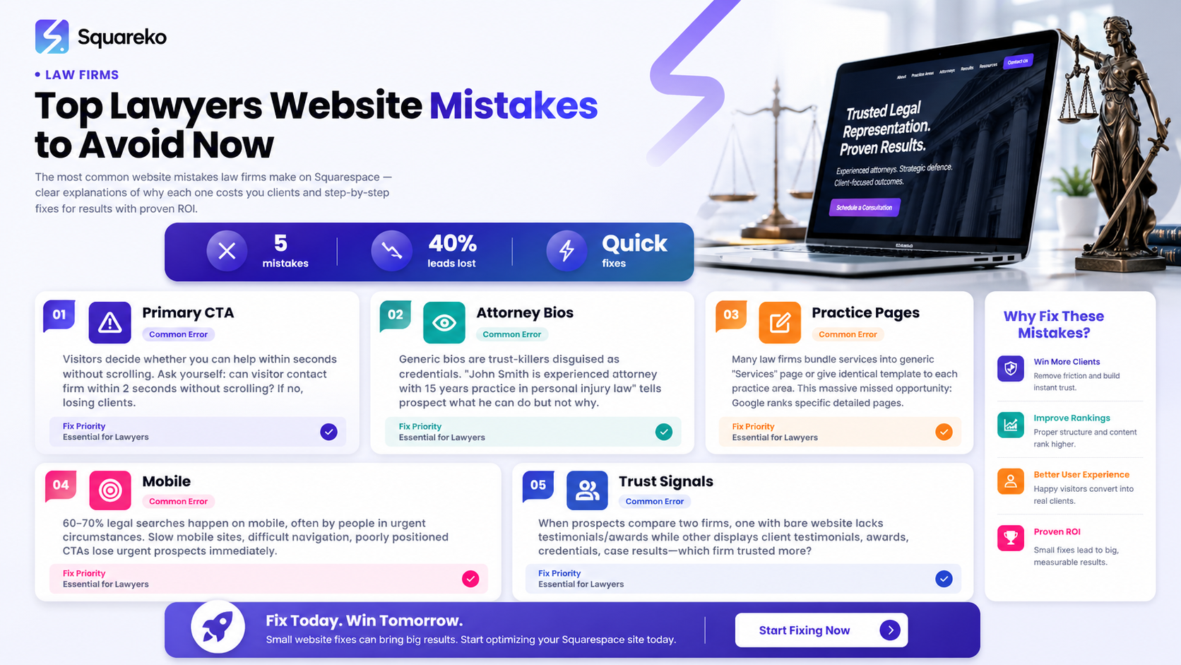
Clear CTAs above the fold are non-negotiable: visitors should know how to contact you within 2 seconds, not after scrolling
Generic attorney bios destroy credibility: prospects want to know your specific experience, philosophy, and win record—not just credentials
Weak practice area pages leave money on the table: specific, detailed pages for each practice area dramatically improve search visibility and conversions
Mobile optimisation isn't optional: 60%+ of legal searches happen on mobile devices; slow or unresponsive sites lose urgent clients
Missing trust signals make prospects hesitant: testimonials, awards, bar memberships, and case results transform browsers into clients
Squarespace offers built-in solutions for all five mistakes, eliminating excuses for poor execution
A professional audit reveals hidden revenue opportunities in your current website's performance data
Introduction
Your law firm website is often the first impression potential clients have of your practice. Yet many law firms unknowingly sabotage their online presence through preventable design and content mistakes. These aren't minor aesthetic oversights—they're conversion killers that directly impact your bottom line.
When prospective clients land on your website, they're typically in one of two states: urgent and anxious (they need a lawyer immediately) or researching carefully (they're comparison shopping). Either way, your site has seconds to answer their fundamental questions:
Can you help me?
Can I trust you?
How do I get started?
If your website fumbles any of these, clients move to your competitors.
The good news? Most law firm website mistakes are fixable. Whether you're on Squarespace or considering a migration, this guide identifies the five most damaging mistakes we see—and provides concrete solutions to address them. Understanding these pitfalls isn't just about aesthetics; it's about reclaiming lost revenue and building a website that genuinely converts visitors into retainers.
Mistake #1: No Clear Primary CTA Above the Fold
Why This Loses Clients
Ask yourself: When someone lands on my homepage, can they find a way to contact me within the first 2 seconds without scrolling?
If the answer is no, you're losing clients.
The above the fold concept—the part of your webpage visible before scrolling—is where you make or break the impression. A visitor landing on your site is either in panic mode (immediate legal need) or research mode (comparing firms). Neither category wants to hunt for your phone number or contact form.
When your hero section features only a stunning banner image with no visible CTA button, you're essentially hiding your practice. The visitor's cognitive load increases: Where do I click? What's the next step? How do I get help? Frustrated, they navigate back to Google and try the next firm in the search results.
Weak CTAs also include buttons that say vague things like Learn More or Explore. These lack urgency and clarity. A visitor doesn't need more information—they need representation. Urgent clients, especially those searching on mobile, won't tolerate ambiguity.
The Squareko Fix
Your homepage hero section should include:
A primary CTA button that appears immediately – Schedule Your Free Consultation or Contact Us Now in high contrast (using your brand colour or a complementary accent). Make it impossible to miss.
Your phone number prominently displayed – either in the top-right corner of your header or embedded within the hero CTA button. Urgent clients prefer clicking a phone number to filling out a form.
Secondary CTAs scattered throughout the page – don't rely on just one button. Include contact options at the bottom of each major section, so visitors have multiple opportunities to convert regardless of where they scroll.
Sticky header on scroll – when visitors scroll down exploring your content, your contact button should travel with them. Squarespace's native sticky headers keep your CTA visible and accessible.
On Squarespace, you can design this in minutes using the platform's button styling tools and header customisation options. The key is testing: does your CTA button contrast sharply against your hero image? Can you tap it easily on a phone without zooming?
Mistake #2: Generic Attorney Bio Pages That Don't Build Trust
Why This Loses Clients
Imagine visiting a law firm's website and reading: John Smith is an experienced attorney with 15 years of practice in personal injury law. He holds a Juris Doctor from XYZ University and is licensed to practise in [state].
Now ask yourself: Why would I hire this person instead of their competitor across the street?
Generic bios are trust-killers disguised as credentials. They tell a prospect what an attorney can do (practise law) but not why they should trust this specific attorney to handle their specific problem. Every attorney has a law degree and a license. Most have 10+ years of experience. These facts don't differentiate.
Worse, generic bios suggest the firm isn't confident enough to let the human behind the credentials shine. They feel like copy-paste templates rather than a real relationship-building tool.
Prospects in legal distress are making a deeply personal decision: trusting someone with their case, reputation, finances, or freedom. They want to know:
What is your philosophy about client service?
What's your track record with cases like mine?
Do you actually care, or am I just a file number?
Have you solved this problem before, and won?
A generic bio answers none of these questions.
The Squareko Fix
Transform your attorney bios into trust-building narratives:
Lead with your philosophy and approach, not your degree. I fight to ensure injured clients get the compensation they deserve—without settling for less. Over 12 years, I've recovered over £4.2M for my clients in personal injury claims. This immediately answers Can you help me? and What have you done for clients like me?
Include specific case results and practice focus – reference actual (anonymised) cases you've won. I specialise in complex road traffic accident claims, particularly cases involving multiple vehicles or disputed liability. Last year, I secured a £320K settlement for a client with catastrophic injuries where the other party disputed fault.
Add a professional photo with context – not a stiff corporate headshot, but a genuine image that humanises the attorney. A photo of you in your office, or in front of your practice area focus, helps visitors connect emotionally.
Share your background story – briefly explain why you chose this practice area. After a close friend suffered a serious injury due to negligent care, I realised how few solicitors genuinely understand the client's perspective. That experience drives my commitment to thorough, empathetic representation.
Include client testimonials under their bio – a quote from a past client validates your approach and builds social proof. John didn't just get me a settlement; he made me feel heard throughout a terrifying process.
List specific credentials and memberships relevant to the practice area – rather than just Licensed to practise, mention memberships in the Law Society, specialist accreditations, or relevant professional associations.
On Squarespace, use the team member or staff templates, which allow rich text formatting, image placement, and even embedded testimonials. Each attorney should have a dedicated page (not just a bio box on the main team page) so Google can index them separately and prospects can find specific solicitors.
Mistake #3: Missing or Weak Practice Area Pages
Why This Loses Clients
Ask yourself: Does my website have a dedicated page for each practice area my firm handles?
Many law firms bundle all their services into one generic Services page or give each practice area a thin, identical template page that reads like a generic legal directory entry.
This is a massive missed opportunity for three reasons:
Search visibility suffers – Google ranks specific, detailed pages higher than generic overviews. A prospect searching
family law solicitor in Manchester is more likely to find a detailed family law page than a vague Our Services page that mentions family law in a bulleted list alongside seven other practice areas.
Conversion rates plummet – a visitor landing on your family law page doesn't want to scroll through divorce advice, then criminal defence advice, then employment law advice before finding relevant information. Specific pages allow prospects to instantly see this page is about my exact problem.
You appear unfocused – if your firm handles eight practice areas and gives each only 150 words on a shared page, you look like a generalist struggling to find clients. By contrast, a dedicated practice area page with 1,200 detailed words on family mediation looks like a genuine specialist.
The Squareko Fix
For each practice area, create a detailed page following this structure:
Clear headline clarifying the practice area – not just Family Law, but Family Law & Mediation: Guiding You Through Separation with Dignity & Care
An empathetic opening – address the emotional reality of the problem. Divorce and separation are rarely clean. Emotions run high. Costs spiral. Without the right guidance, you risk losing custody rights, financial security, or months of your life to unnecessary conflict.
Specific service sub-sections – don't list all services in one blob. Break them into H3 headings: Divorce Proceedings, Child Custody & Care Arrangements, Financial Settlements, Mediation & Collaborative Law, Post-Divorce Modifications.
Real-world examples and outcomes – without breaching client confidentiality, explain how you've solved this problem. One client feared losing contact with her children during a contentious separation. Through strategic negotiation, we secured a custody agreement that prioritised her relationship with the children whilst fairly resolving the financial settlement.
Address common client fears – what keeps prospects up at night? For family law: Will I lose contact with my children? How much will this cost? How long will it take? Create an H3 for each major fear and answer it directly.
Include a specific CTA for that practice area – not just Contact Us, but Discuss Your Family Law Matter – Free Initial Consultation.
Add testimonials from clients served in that practice area – a family law testimonial on the family law page is more credible than a generic testimonial in the sidebar.
On Squarespace, create a dedicated page for each practice area using your template. Use consistent formatting, but customise the content entirely. Ensure each page has its own SEO title and meta description optimised for that practice area's search terms .
Mistake #4: No Mobile Optimisation for Urgent Searches
Why This Loses Clients
Consider this stat: 60–70% of legal searches happen on mobile devices, often by people in urgent circumstances. Someone searching DUI solicitor near me at 11 PM is likely using their phone. Someone researching employment law dismissal is often doing so on their lunch break on their mobile.
If your website is slow on mobile, difficult to navigate on a small screen, or displays CTA in places where thumbs can't easily tap them, you lose these urgent prospects immediately.
Common mobile mistakes include:
Slow page load times – prospects won't wait 5+ seconds for your site to load, especially on 4G networks.
Horizontal scrolling or tiny text – forces visitors to pinch-zoom constantly, creating friction.
CTAs positioned poorly – buttons placed in corners or near the edge of the screen are frustratingly hard to tap on mobile.
Form fields that require excessive typing – a prospect on mobile won't fill out a detailed inquiry form; they'll call a competitor instead.
Slow or unresponsive navigation menus – jerky, laggy menus suggest an unprofessional operation.
The worst part: mobile-unfriendly websites aren't just losing mobile visitors—they're being penalised by Google. Mobile-first indexing means Google primarily crawls and ranks the mobile version of your site. A terrible mobile experience directly damages your search rankings across all devices.
The Squareko Fix
Ensure your Squarespace site is mobile-responsive – Squarespace templates are responsive by default, but test yours thoroughly on actual devices (not just in browser dev tools). Preview your site on an iPhone, Android phone, and tablet.
Optimise images for mobile – large, uncompressed images tank mobile load times. Squarespace compresses images automatically, but verify your pages load in under 3 seconds on a 4G connection. Use tools like Google PageSpeed Insights to identify bottlenecks.
Create mobile-specific CTAs – on mobile, add a Call Now button (with auto-dialling capability) that's prominent and easy to tap. Many prospects prefer calling to filling out a form on mobile.
Simplify your mobile navigation – your main menu might have 12 items on desktop, but mobile should streamline this. Use a collapsible hamburger menu, and ensure the most important pages (Practice Areas, Contact, Team) appear at the top.
Use mobile-friendly forms – if a form must exist, make it one-field-per-screen or limit it to 3–4 essential fields (Name, Phone/Email, Brief Description). Don't ask for address, company, and bio on mobile. Simplicity converts.
Test urgency pathways on mobile – a prospect searching for an emergency family law solicitor should be able to call your firm with one tap, within 3 seconds of landing on your site.
Ensure your phone number is clickable – on mobile, clicking your phone number should auto-dial your firm. This is a basic feature Squarespace supports out of the box, but verify it's enabled.
Squarespace's mobile editor allows you to customise your site specifically for small screens, so you can ensure your critical elements (logo, CTA, phone number) are perfectly positioned and sized for thumbs, not cursors.
Mistake #5: Missing Trust Signals and Social Proof
Why This Loses Clients
Imagine a prospect comparing two law firm websites:
Firm A has a bare website with bios and service descriptions. No client testimonials. No awards. No mention of bar memberships or professional affiliations.
Firm B displays client testimonials, a Best Family Law Solicitor award from a local publication, membership badges from the Law Society and relevant specialist associations, and case results.
Which firm does the prospect trust more? Obviously Firm B.
When prospects are deciding between law firms, they're not just evaluating credentials—they're assessing risk. If I hire this firm, will they actually deliver? Will they care about my case? Have they solved problems like mine?
Trust signals answer these questions through social proof. They say: Others have hired us. Others were satisfied. Experts have recognised us. This firm is legitimate, established, and delivers results.
Common missing trust signals include:
No client testimonials – the single most credible form of social proof
No published case results – many firms shy away from posting outcomes due to confidentiality concerns, but anonymised results are ethical and powerful
No award badges or recognitions – if your firm has been recognised ( Best in Family Law, Rising Star, etc.), you're not displaying them
No bar association memberships – visitors want to see visible proof you're a legitimate, registered solicitor
No specialist accreditations – if you're a Law Society Accredited Specialist, this should be prominently featured
No media mentions or publications – if you've been quoted in publications or done media, feature it
No client count or firm statistics – simple facts like Serving 2,000+ clients or 15 years in practice build confidence
The Squareko Fix
Collect and display client testimonials prominently – after a successful case, ask satisfied clients to provide a brief testimonial (3–5 sentences). Feature these on practice area pages, the homepage, and in a dedicated testimonials section. Video testimonials are even more powerful than written ones.
Publish anonymised case results – create a Results & Outcomes page or section within each practice area. For example: Secured £320K settlement in multi-vehicle road traffic accident claim where defendant denied liability or Negotiated reduced sentencing from 5 years to 2.5 years in complex fraud matter.
Display award and accreditation badges – use Squarespace's image blocks to prominently display:
Law Society Accreditation badges
Best of awards (even local publications carry weight)
Specialist qualifications
Professional association memberships
Create a Why Choose Us section – summarise your competitive advantages, backed by facts: Specialising exclusively in employment law since 2010. 200+ successful tribunal representations. 94% settlement rate. Average compensation recovery: £28K per client.
Feature media mentions and publications – if you've been quoted in publications, created articles, or done interviews, showcase these. Even mentions in local business publications or legal blogs build authority.
Add a team credentials section – display your team's combined experience: Combined experience of 75+ years or 8 specialist accreditations across the team. This builds collective credibility.
Implement review widgets – integrate Google Reviews (if applicable) or other review platforms directly into your website. Real, unfiltered reviews are incredibly credible.
On Squarespace, use the testimonials feature (available in most templates), image blocks for badges and logos, and rich text blocks to create a Trust Signals or Recognition & Results section. The goal is to make visitors feel: This firm is established, legitimate, expert, and has delivered for clients like me.
How Squarespace Solves These Problems
Squarespace isn't just a website builder—it's a platform designed to help professional service firms address exactly these five mistakes:
Built-in sticky headers and prominent CTA buttons – design your contact button to stay visible as visitors scroll, with Squarespace's native customisation tools.
Rich templates for team bios – dedicated team member pages allow detailed, trustworthy attorney bios with photos, testimonials, and practise area focus.
Flexible page layouts for practice areas – create detailed, customised pages for each practice area without technical friction. SEO tools for title and meta description customisation are built in.
Responsive mobile-first design – all Squarespace templates are responsive, and the platform prioritises mobile performance. Google PageSpeed scores are competitive, and load times are optimised out of the box.
Native testimonials, image galleries, and review integrations – display social proof without needing third-party tools or custom code.
Built-in SEO tools – customise page titles, meta descriptions, URL slugs, and header hierarchy. Squarespace generates sitemaps automatically and handles mobile indexing correctly.
If your firm is currently on a custom WordPress build or an outdated website platform, migration to Squarespace can eliminate technical debt and unlock these features. If you're starting fresh, Squarespace's out-of-the-box functionality means you can launch a conversion-optimised, trust-building website in weeks, not months.
Frequently Asked Questions
-
Non-converting websites typically fail on one of three fronts: visibility (visitors can't find you), clarity (visitors land but don't understand your services), or credibility (visitors don't trust you enough to engage).
The five mistakes outlined above address all three. If your website isn't converting, start by auditing your homepage: Can a visitor contact you in 2 seconds without scrolling? Is your primary CTA clear and prominent? If the answer is no, conversion will remain low regardless of traffic quality.
Beyond the homepage, check your practice area pages. Are they detailed and specific, or generic lists? Check your team bios. Do they build trust, or do they read like template copy? And check your trust signals. Are you displaying testimonials, awards, case results, and credentials? If these are missing, prospects have no reason to believe you'll deliver.Finally, test your site on mobile. If it's slow or difficult to navigate, you're losing the 60%+ of visitors searching on phones. -
Research consistently shows prospects evaluate law firm websites on four dimensions: expertise, trustworthiness, accessibility, and personal connection.
Expertise comes from practice area focus, case results, and specialist credentials. A detailed family law page with specific case outcomes communicates expertise far better than a generic "We handle family law" statement.
Trustworthiness comes from social proof (testimonials), transparency (bios that go beyond credentials), and recognition (awards, accreditations, professional memberships). Prospects want evidence that you've delivered for clients like them.
Accessibility means your contact information is immediately visible, your CTAs are clear, and your phone number is prominent. Make it frictionless to get in touch.
Personal connection comes from bios that show personality and philosophy, not just qualifications; from language that acknowledges the prospect's emotional reality (not just legal terminology); and from transparency about your approach and values.A well-designed law firm website addresses all four. If your site is weak on any dimension, fix that first. -
If any of these apply, redesign is overdue:
Your site wasn't built with mobile-first design (i.e., it's older than 5 years or was built before 2015)
Your bounce rate is above 60% (meaning visitors arrive and leave almost immediately)
Your conversion rate on contact forms is below 2% (meaning very few visitors take action)
Your site isn't ranking for your key practice area terms in Google
You're losing leads to competitors who appear higher in Google
Your team bios are generic or outdated
You have no testimonials or social proof displayed
Your homepage CTA is unclear or buried below the fold
Your site feels cluttered, outdated, or unprofessional compared to competitors
You're getting questions from prospects that should be answered on your website
Additionally, mobile traffic is now the majority for law firm websites. If your analytics show mobile bounce rates significantly higher than desktop, this signals mobile usability issues.
At Squareko, we recommend a comprehensive website audit every 18–24 months. Your website is your 24/7 business development tool; treating it as static or "good enough" costs you clients monthly. -
Both platforms can power effective law firm websites, but they have different strengths.
WordPress is highly customisable and can be powerful in the hands of experienced developers. However, it requires ongoing maintenance (plugin updates, security patches, backups), can be slower than modern platforms, and often requires coding knowledge to optimise for conversions. WordPress sites also tend to demand more technical support.
Squarespace prioritises ease of use and out-of-the-box functionality. No coding required. Mobile-first design is baked in. Security updates and hosting are handled automatically. Built-in features like sticky headers, testimonial widgets, SEO tools, and form builders eliminate the need for third-party plugins. Load speeds are optimised by default. This means you can launch a professional, conversion-optimised site faster and maintain it with less technical support.
For most law firms without dedicated IT staff, Squarespace offers a better balance of functionality, ease of use, and professional results. The trade-off is less deep customisation, but for addressing the five mistakes above, Squarespace's built-in tools are more than sufficient. -
There's no strict minimum, but aim for 800–1,200 words per practice area page. This is enough space to:
Explain the practice area clearly (150–200 words)
Address common client fears and questions (300–400 words across multiple H3 sections)
Include specific examples or case outcomes (200–300 words)
Provide a clear CTA and next steps (100 words)
Shorter pages (under 500 words) rarely convert well and often fail to rank for competitive search terms. Longer pages are fine if the content is valuable and organised clearly with subheadings. Avoid filler or repetition, though. Every paragraph should either educate the visitor or move them closer to a decision.
-
Update at minimum quarterly. However, update strategy depends on your priorities:
Client testimonials and case results – add new ones at least quarterly as cases close
Team bios – update whenever team members join/leave, or annually to refresh accomplishments
Practice area pages – review and refresh annually, especially if law changes in your area
Blog content – publish new articles monthly if you're running a blog, or quarterly at minimum
CTAs and conversion elements – test and refine continuously, at least semi-annually
Websites that haven't been updated in 12+ months visually appear outdated, even if the design is modern. Regular updates signal to visitors that your firm is active and current—especially important in law, where statutory changes happen frequently.
Ready to Build Your Law Firm Website on Squarespace?
If you recognised any of these five mistakes on your current website, you're not alone. We work with law firms across the UK who've discovered their websites were losing them clients—sometimes hundreds of pounds worth monthly.
The good news? All five mistakes are fixable. Whether you're redesigning an existing site, migrating from WordPress or another platform, or building from scratch, Squarespace provides the tools and flexibility to address them all.
At Squareko, we specialise in designing high-converting law firm websites on Squarespace. We combine strategic design, persuasive copywriting, and technical optimisation to build websites that don't just look professional—they generate leads and convert browsers into retainers.
Ready to audit your current website's performance? We offer a Free Law Firm Website Audit that identifies exactly where you're losing prospects and losing revenue. We'll analyse your:
Homepage CTA effectiveness
Practice area page structure and keyword optimisation
Mobile usability and load speed
Trust signal presence (testimonials, awards, credentials)
Competitive positioning against other firms in your area

From custom website design to SEO strategy, we help businesses launch a site that looks professional and performs better.

Written by the Squareko Team | Squarespace Web Design
I'm Walid Hasan, a Certified Squarespace Expert and Squarespace Circle Platinum Partner with over 12 years of hands-on experience designing and optimizing high-performing websites. Over the years, I've had the privilege of building more than 2,000 Squarespace websites for clients around the world, always focusing on clean design, strong user experience, and conversion-driven results.